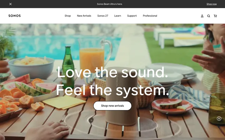
North star · Keep the interface quiet and spacious so lifestyle photography and product imagery carry the visual energy.
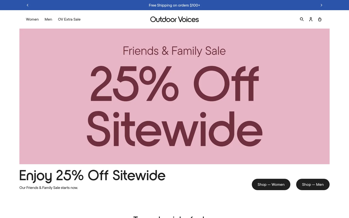
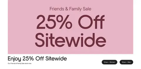
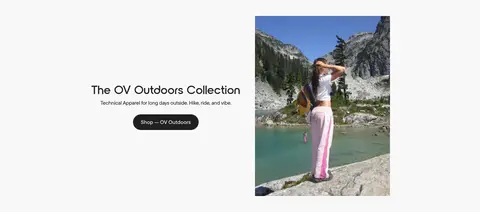
The page uses a white canvas and near-black typography as a quiet frame for large, image-led merchandising. The first viewport introduces the sale with a blue announcement strip, a simple centered wordmark, and a large blush-pink campaign visual; that pink is campaign imagery rather than a measured brand token. Measured surface gray appears in softly differentiated content bands, while deep blue is used sparingly for the shipping announcement and focus accents. TTCommonsPro gives navigation, buttons, and display moments a clean, rounded sans-serif voice; NordiquePro supplies the distinctive, lightly tracked body and heading style. The layout moves from a wide hero into centered product carousels, alternating lifestyle features, and compact category grids. Generous white space separates these modules, while product photography supplies most of the color and texture. Black pill-shaped CTAs provide clear, consistent actions without adding heavy borders or shadows.
Display text, navigation, captions, and button labels.
Aa 设计
NordiquePro
网络字体 · 字重 400 · 占比 34%
免费替代:Jost
Headings, body copy, and text links.
角色
示例
字号
字重
行高
字距
特大标题
Prominent campaign and display messaging.
Outdoor Voices
80px
400
1.1
-0.025em
一级标题
Primary hero and page-level heading.
Outdoor Voices
70px
400
1.15
0.009em
二级标题
Major section headings above product and feature modules.
Outdoor Voices
60px
400
1.15
0.01em
三级标题
Secondary headings within editorial feature content.
Outdoor Voices
48px
400
1.2
0.012em
四级标题
Smaller subheadings and supporting module titles.
Outdoor Voices
36px
400
1.2
0.017em
正文
Product descriptions and general explanatory copy.
The quick brown fox 敏捷的狐狸
16px
400
1.4
0.038em
辅助文字
Compact labels and secondary product details.
The quick brown fox 敏捷的狐狸
13px
500
1.4
-0.154em
按钮
Shopping and collection call-to-action labels.
The quick brown fox 敏捷的狐狸
16px
500
1.2
0.013em
导航
Header navigation and utility links.
The quick brown fox 敏捷的狐狸
16px
500
1.4
0
链接
Product names and inline text links.
The quick brown fox 敏捷的狐狸
16px
400
1.4
0.038em
间距与布局
基准单位 4px · 密度:适中
48px版块间距
4px元素间距
—卡片内边距
1280px内容最大宽度
2px
4px
8px
10px
12px
14px
16px
18px
20px
21px
24px
32px
35px
40px
48px
50px
Use a centered, wide desktop composition with a measured maximum content width of 1280px. Keep the header and announcement bar compact, then alternate full-width campaign imagery with contained merchandising modules. Product sections use horizontally browsable rows and centered headings; category and activity modules use four-column image grids. Feature stories alternate image and text placement. The measured spacing scale supports a comfortable rhythm, with a 48px section gap and small, tidy gaps within controls and product details.
圆角与层次
按钮 · 9999px
没有测到阴影:页面是扁平的,层次靠底色和描边区分。
The page is predominantly flat: white and soft-gray section surfaces provide separation instead of shadows. The measured data contains no shadows and no decorative gradients. Use restrained boundaries and spacing to organize content, with black rounded CTAs as the strongest component shape. Images provide most of the depth and contrast.
组件
下面的预览按实测的按钮、输入框、徽标、卡片样式重建(字体用替代字体)。
Announcement bar
A slim Outdoor Blue (#2b54ab) strip at the top with centered white shipping copy and small directional controls.
Store header
White header with left-aligned category links, centered wordmark, and compact search, account, and bag icons on the right.
Campaign hero
Large campaign image paired with a headline, supporting sale copy, and dark pill-shaped shopping CTAs.
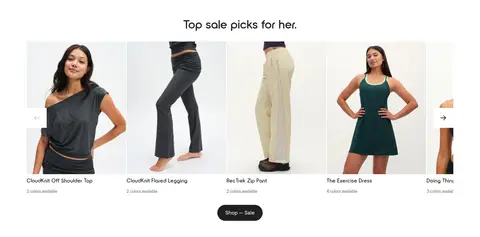
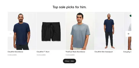
Product carousel
Centered section title above a horizontal product-image row with product names, color availability, and carousel controls.
Editorial feature
Image-and-copy feature modules that alternate composition, use concise descriptions, and end with a dark rounded collection link.
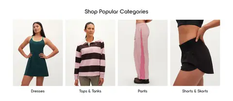
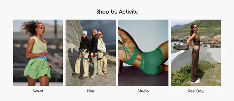
Image category grid
Four-column image tiles for popular categories or activities, each with a short centered label.
Social gallery
A wide, compact row of lifestyle images below a centered heading, with simple carousel arrows.
Imagery · Use authentic lifestyle and apparel photography rather than illustration or 3D. Show garments on people and in outdoor or activity settings, mixing close product views with full-body framing. Let campaign imagery introduce seasonal color, while product grids remain visually consistent and clean. Keep photography large and edge-aligned within its module; avoid decorative image filters that compete with the clothing.
Keep the canvas predominantly white and uncluttered.
Use Soft Ink (#202020) for primary text and shopping actions.
Reserve Outdoor Blue (#2b54ab) for announcements and focus accents.
Let lifestyle photography provide seasonal color and texture.
Center section titles above product and category collections.
Use rounded, high-contrast primary shopping buttons.
Leave clear breathing room between distinct merchandising modules.
✕ 不该做
Do not treat campaign pink as a measured brand color token.
Do not add gradients or prominent shadows.
Do not crowd the header with extra controls or copy.
Do not use heavy borders to divide every card.
Do not let decorative elements overpower apparel photography.
Do not make every section use the same image-and-text arrangement.
给 AI 的提示词
想快速出一个同风格的新页面,把这段话连同 DESIGN.md 一起发给 AI。
Build a new Outdoor Voices-style commerce page with a calm, image-led editorial feel. Use Gallery White (#ffffff) as the main canvas, Soft Ink (#202020) for headings and primary pill CTAs, Cloud Gray (#f8f8f8) for occasional section bands, and Quiet Gray (#737373) for secondary copy. Use Outdoor Blue (#2b54ab) sparingly for a slim announcement or focus treatment. Pair TTCommonsPro-like clean sans-serif navigation and buttons with NordiquePro-like lightly tracked headings and body text. Create a compact header, spacious campaign feature, centered product carousels, alternating lifestyle features, and image-led category grids. Keep the structure wide and comfortable, favor photography over decoration, and rely on whitespace rather than shadows or borders. Make calls to action obvious and concise.