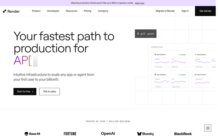
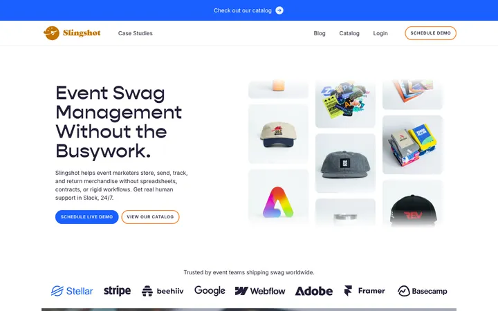
North star · Keep the page predominantly white and typographic, using violet sparingly for action and colour-rich motion previews to demonstrate the product.
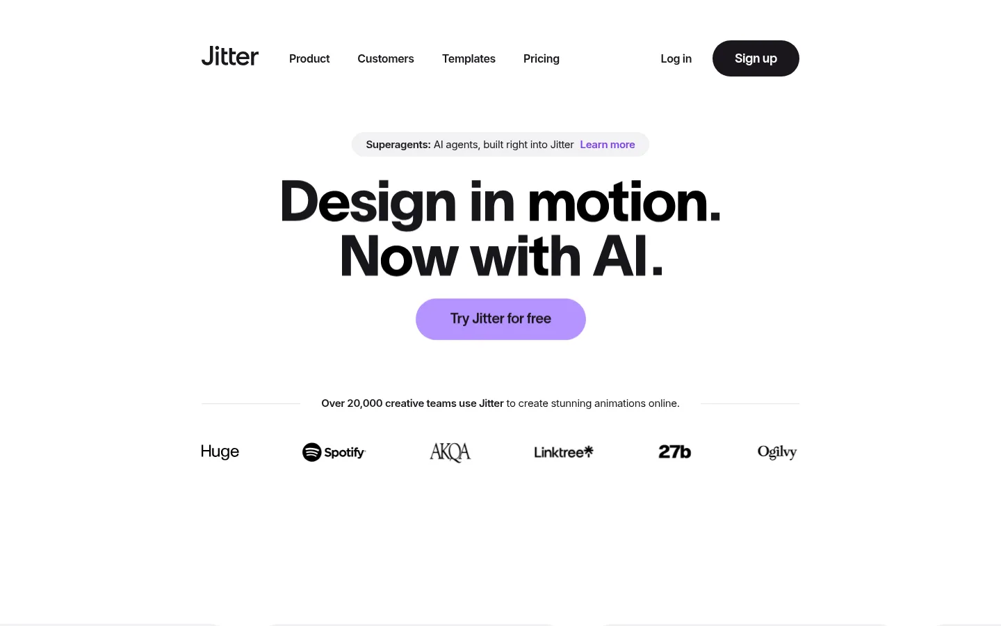
The visual strategy starts with a near-white canvas that keeps attention on oversized black headlines and a small number of high-contrast actions. Violet is the brand’s main accent: it appears in the hero CTA, compact labels, and selected product imagery, while cyan and other vivid hues belong primarily to motion previews rather than the core interface palette. TWK Lausanne gives display headings their dense, tightly tracked character; Inter handles navigation, body copy, and small labels with a quieter rhythm. The page alternates between centered, spacious narrative sections and denser grids of rounded preview cards, maintaining a consistent alignment and generous white space. Product artwork is shown as colourful, cropped motion-design samples within pale neutral frames. Soft shadows add depth to selected cards without making the otherwise flat page feel heavy; subtle gray hairlines divide content where needed.
Navigation, body copy, captions, and compact card labels.
Aa 设计
TWK Lausanne
网络字体 · 字重 600 / 800 / 700 / 750 · 占比 41%
免费替代:Inter
Display headlines, section headings, and prominent CTA links.
角色
示例
字号
字重
行高
字距
特大标题
Large hero or standout campaign headline.
Jitter
72px
750
1
-0.04em
一级标题
Primary hero headline.
Jitter
48px
800
1
-0.04em
二级标题
Major section headings.
Jitter
40px
800
1
-0.037em
三级标题
Feature and testimonial headings.
Jitter
36px
700
0.95
-0.017em
四级标题
Card and subsection titles.
The quick brown fox 敏捷的狐狸
21px
800
0.95
-0.02em
正文
Paragraphs and feature descriptions.
The quick brown fox 敏捷的狐狸
16px
400
1.5
-0.02em
辅助文字
Compact template labels and attribution details.
The quick brown fox 敏捷的狐狸
12px
400
1.4
0
导航
Top-level navigation links.
The quick brown fox 敏捷的狐狸
16px
400
1.5
-0.022em
链接
Prominent calls to action and feature links.
The quick brown fox 敏捷的狐狸
20px
600
1
-0.01em
间距与布局
基准单位 4px · 密度:适中
60px版块间距
12px元素间距
11px卡片内边距
860px内容最大宽度
3px
4px
5px
8px
10px
12px
20px
30px
40px
44px
50px
60px
A centered desktop composition uses a measured 860px page max width, with a restrained navigation row above the hero. The hero is center-aligned, followed by a logo strip and wide product-preview cards. Later sections alternate between centered statements, split feature layouts, and multi-column grids. Measured spacing uses a 4px base unit, with comfortable density, a 60px section gap, and a 12px element gap. Keep the page airy and let card-heavy sections provide the main density changes.
圆角与层次
卡片 · 40px
导航 · 20px
链接 · 9999px
xl · card
xl · text
hairline · heading
xl · card
Most sections are flat against white, with subtle pale card surfaces and fine gray borders. Product-preview cards use large measured corner radii, while selected artwork gains soft, layered shadows for depth. Avoid heavy outlines or persistent dark panels; contrast comes primarily from typography and colourful media.
组件
下面的预览按实测的按钮、输入框、徽标、卡片样式重建(字体用替代字体)。
Navigation
Centered horizontal navigation with the Jitter wordmark, plain dark links, account access, and a dark rounded signup pill.
Hero
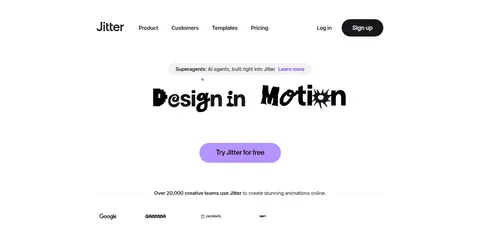
Centered announcement capsule, tightly stacked bold headline, and violet pill CTA, followed by social proof and a monochrome logo row.
Template preview cards
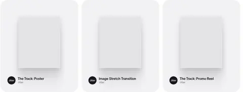
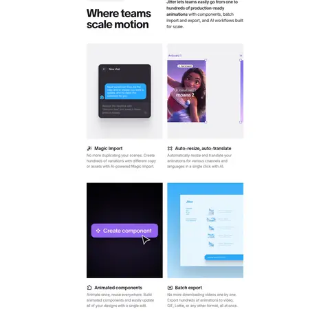
Large pale cards with rounded corners, prominent motion-design artwork, and compact Inter labels and template links.
Feature cards
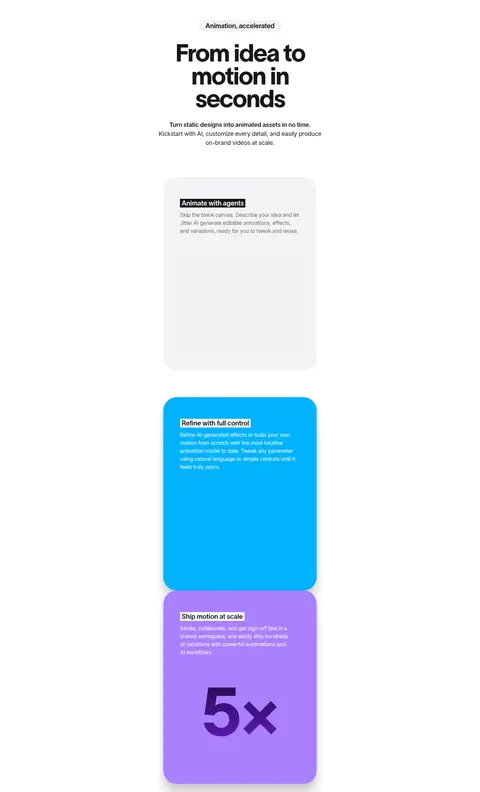
Grid of rounded pale preview panels pairing colourful product imagery with short bold titles and muted descriptions.
Testimonial
Large centered bold quote with selected words emphasized by colourful motion artwork, followed by a small author attribution.
Capability grid
Compact feature descriptions arranged in columns, with small icons, bold labels, and muted supporting copy.
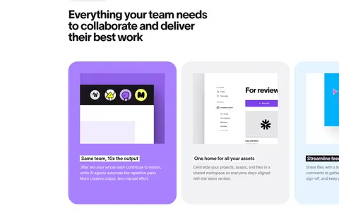
Team feature carousel
Rounded, horizontally arranged feature panels, including violet and cyan accents, product screenshots, and concise copy.
Imagery · Use product UI and motion-design previews rather than decorative lifestyle photography. Samples are colourful, varied, and often presented as cropped posters, animation frames, or interface demonstrations inside pale, rounded cards. Keep the core layout quiet so artwork carries the colour; use shadows sparingly to lift selected previews. Brand and customer logos appear as a simple monochrome row.
Set headlines in bold, tightly tracked display type.
Reserve violet for calls to action and selected highlights.
Let motion previews provide most of the vivid colour.
Alternate spacious centered sections with compact grids.
Use rounded pale cards to frame product imagery.
✕ 不该做
Do not turn the whole page into a purple interface.
Do not use dense, edge-to-edge text blocks.
Do not add heavy borders around every component.
Do not let product artwork overpower the headline hierarchy.
Do not use generic decorative imagery in place of product previews.
Do not invent additional palette colours for interface elements.
给 AI 的提示词
想快速出一个同风格的新页面,把这段话连同 DESIGN.md 一起发给 AI。
Build a new page in Jitter’s visual style: keep Gallery White (#ffffff) dominant, with Near Ink (#19171c) for headlines, body text, navigation, and dark actions. Use Soft Mist (#f2f1f3) and Quiet Line (#e5e4e7) for restrained card surfaces and separators. Apply Jitter Violet (#a981ff) selectively to the primary CTA and small highlights; Lavender Haze (#d0bafe), Plum Shadow (#140726), and Electric Iris (#711de2) belong in limited gradients, not broad page fills. Use bold, tightly tracked TWK Lausanne-style headings and readable Inter-style supporting text. Center the hero, then alternate generous narrative sections with rounded product-preview grids and feature layouts. Use colourful motion-design imagery as the main source of visual variety. Keep shadows soft, card borders subtle, and spacing comfortable. Match the supplied measured values rather than inventing new sizes or colours.