North star · Keep the canvas quiet and dark, then let oversized serif headlines and luminous product imagery carry the visual emphasis.
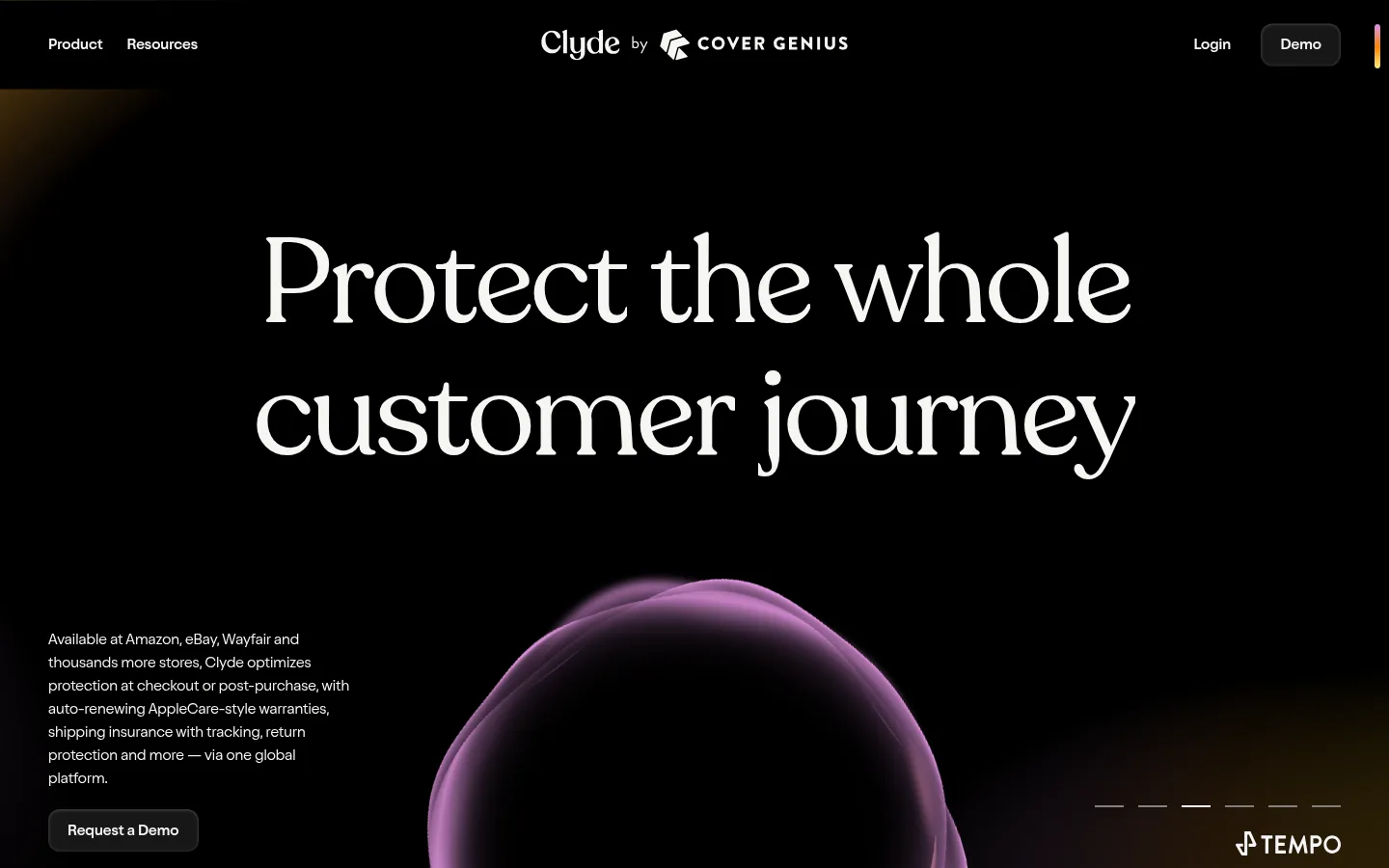
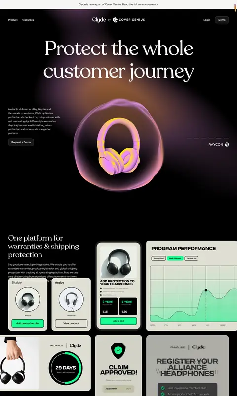
The visual system is anchored by a near-black canvas (#000000) and warm off-white typography (#f6f6f4), creating strong contrast without relying on bright section bands. Recoleta supplies oversized, editorial serif headlines; Oldschool Grotesk handles compact navigation, body copy, and actions. The first viewport centers a two-line hero headline, then balances a narrow copy column against a luminous 3D product orb. Across the page, dark cards and interface mockups sit directly on the canvas, while muted glow and a yellow-orange-pink gradient add color primarily to imagery rather than ordinary text or controls. The layout uses a wide page frame, generous section pauses, and asymmetrical compositions; small labels and dense supporting text contrast with spacious headline areas. Softly rounded cards, restrained hairlines, and subtle inset highlights lend depth without turning the page into a conventional boxed dashboard.
Display headings and prominent editorial statements.
Aa 设计
Oldschool Grotesk Compact
网络字体 · 字重 400 · 占比 2%
免费替代:Barlow Condensed
Small uppercase captions and eyebrow labels.
角色
示例
字号
字重
行高
字距
特大标题
Oversized editorial statements and prominent hero-scale display text.
Clyde
125px
400
1.1
-0.03em
一级标题
Main hero headline, set as a large two-line serif statement.
Clyde
80px
400
1
-0.03em
二级标题
Major section headlines introducing customer outcomes and features.
Clyde
61px
400
1.1
-0.03em
三级标题
Secondary feature and testimonial headlines.
Clyde
47px
400
1.1
-0.02em
四级标题
Smaller card headings and supporting section titles.
Clyde
36px
400
1
-0.01em
正文
Light-weight explanatory copy and paragraph text.
The quick brown fox 敏捷的狐狸
15px
300
1.6
0
辅助文字
Compact uppercase labels, annotations, and small metadata.
The quick brown fox 敏捷的狐狸
12px
400
1.8
0.03em
按钮
Demo and case-study action labels.
The quick brown fox 敏捷的狐狸
15px
400
1.6
0
导航
Prominent serif navigation treatment where used in expanded menus.
Clyde
36px
400
1
-0.01em
链接
Inline links and compact navigation actions.
The quick brown fox 敏捷的狐狸
15px
400
1.6
0
眉题
Short uppercase section labels above headings.
The quick brown fox 敏捷的狐狸
12px
400
1.8
0.03em
间距与布局
基准单位 2px · 密度:适中
92px版块间距
25px元素间距
10px卡片内边距
1340px内容最大宽度
3px
5px
10px
20px
25px
30px
50px
Use a wide, centered frame with a measured maximum width of 1340px and comfortable density. The hero places a large centered headline above an asymmetrical lower composition, with narrow supporting copy at the left and a dominant visual nearby. Later sections alternate spacious text-led moments with image-heavy, layered card arrangements. Keep alignment varied but deliberate, leave generous pauses between sections, and use compact copy blocks to preserve the contrast between open canvas and dense product detail.
圆角与层次
按钮 · 12px
卡片 · 16px
图片 · 50%
inset · text, button, card
Keep most sections visually flat against the black canvas. Separate dark cards with subtle graphite surfaces, measured rounded corners, and restrained hairlines; reserve soft shadow and inset highlight for controls and card depth. Use imagery glow and overlapping mockups for the strongest layering, not heavy drop shadows.
组件
下面的预览按实测的按钮、输入框、徽标、卡片样式重建(字体用替代字体)。
Top navigation
Sparse dark header with left-aligned product and resource links, centered Clyde and Cover Genius identity, and right-side login and demo actions.
Hero headline
Large two-line Recoleta statement centered over the black canvas, with a compact explanatory column and prominent glowing product visual below.
Demo button
Dark, softly rounded action surface with Warm Porcelain text in Oldschool Grotesk; use for demo requests without introducing a bright fill.
Product mockup collage
Pale interface screenshots and product panels overlap on the dark canvas, combining registration, claim, and performance visuals.
Feature statement
Large serif benefit lines set with ample surrounding space, creating a quiet editorial pause between denser showcase areas.
Case-study cards
Dark rounded cards pair customer identifiers and short proof points with bright product imagery and compact case-study actions.
Imagery · Favor luminous 3D product scenes and interface mockups over conventional lifestyle photography. The hero orb frames product objects against black, with soft orchid and warm gradient light; product cards show pale dashboard surfaces, charts, and registration flows. Crop imagery boldly, allow glow to spill into the surrounding dark space, and keep mockup text subordinate to the page’s editorial headings.
Set major statements in a tight-tracked editorial serif.
Keep navigation and supporting copy compact and restrained.
Use gradient accents chiefly in product imagery and ambient glow.
Layer pale interface mockups against dark surrounding space.
Preserve generous pauses between dense showcase sections.
✕ 不该做
Do not replace the dark canvas with bright section bands.
Do not use accent colors as routine paragraph or control colors.
Do not crowd the hero with multiple competing headlines.
Do not make every content block a bordered dashboard card.
Do not rely on heavy shadows for depth.
Do not stretch small supporting copy into wide text blocks.
给 AI 的提示词
想快速出一个同风格的新页面,把这段话连同 DESIGN.md 一起发给 AI。
Build a new Clyde-style SaaS page on a dominant #000000 Deep Canvas, using #f6f6f4 Warm Porcelain for high-contrast text and #1a1a1a Soft Graphite for understated controls and cards. Set major headlines in an editorial serif close to Recoleta, large and tightly tracked; use a clean, lightweight grotesk for navigation, body copy, and actions. Create spacious, asymmetrical compositions with a wide centered frame, compact copy blocks, and clear pauses between sections. Let product mockups or 3D objects provide the visual focus, with #feed7a Lemon Glow, #ff8400 Signal Orange, and #df91f7 Orchid Light reserved mainly for luminous gradient imagery. Use rounded dark cards and subtle inset depth sparingly. Keep the overall page calm, dark, and editorial rather than dashboard-dense.