North star · Keep the interface calm and legible in warm neutrals, then use oversized rounded gradient imagery to make each product benefit tangible.
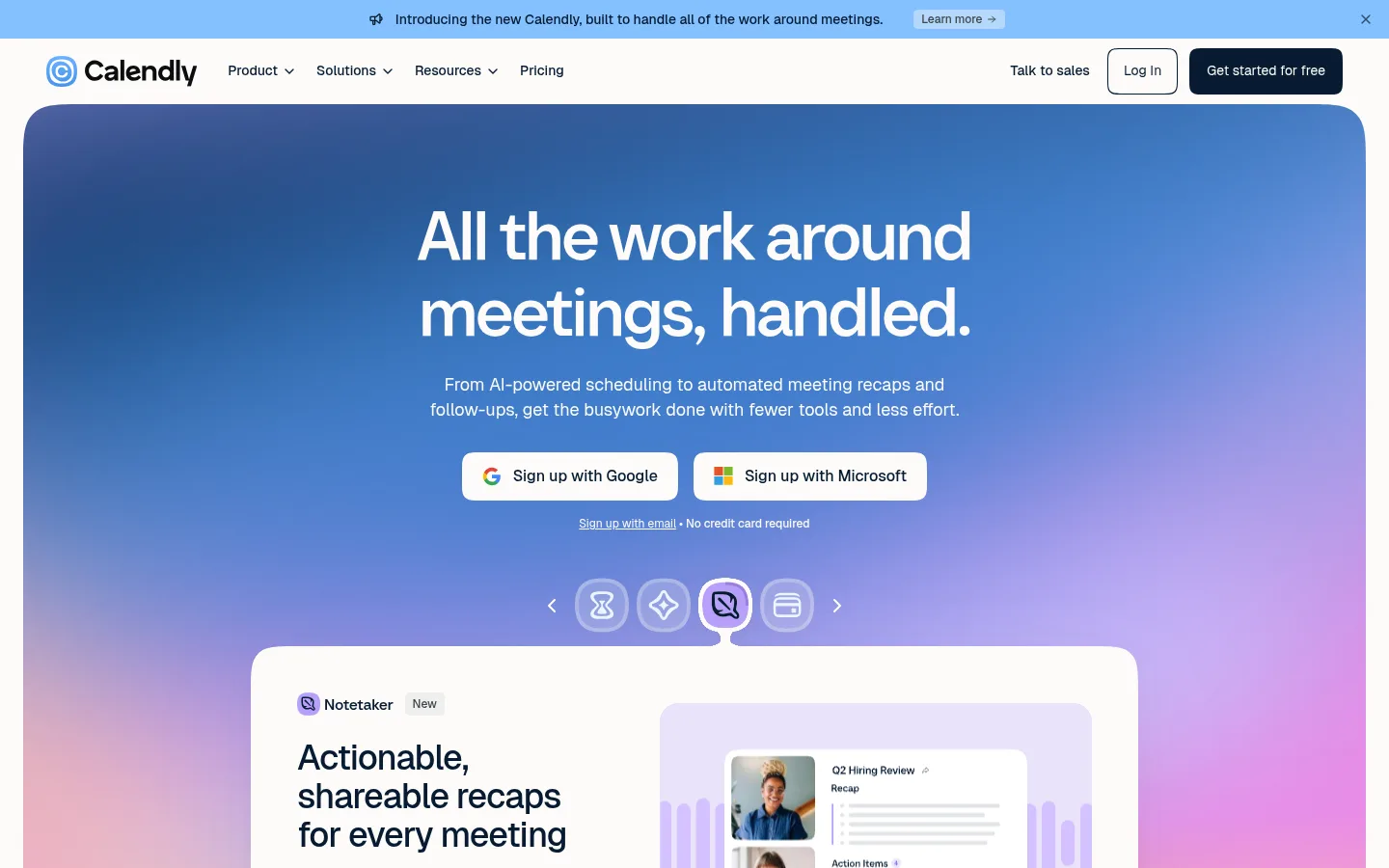
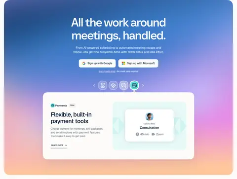
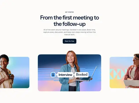
The page uses a warm off-white canvas as a quiet frame for deep navy text and expansive, colorful product storytelling. The hero’s blue-to-lilac-to-peach gradient is a prominent visual moment, while later feature panels repeat softer blue, mint, and lavender tones around UI mockups. Treat those vivid hues as media-led illustration colors, not as a replacement for the measured core palette. Geist handles navigation, body copy, and controls; Calendly Sans gives display headings a clean, rounded presence, while Wulkan Text adds a more editorial contrast to selected headings. The layout alternates centered statements and split feature rows, with generous vertical breathing room and broad, rounded media surfaces. Compact navigation, understated dividers, and dark navy CTAs keep the experience grounded. The overall effect balances playful product imagery with a composed, readable SaaS interface.
Navigation, body copy, captions, buttons, and interface labels.
Aa 设计
Calendly Sans
网络字体 · 字重 500 · 占比 17%
免费替代:Inter
Display, H1, and H3 headings.
Aa 设计
Wulkan Text
网络字体 · 字重 500 · 占比 11%
免费替代:DM Serif Display
H2 and H4 editorial-style headings.
角色
示例
字号
字重
行高
字距
特大标题
Oversized hero statement and major promotional headlines.
Calendly
72px
500
1.1
-0.028em
一级标题
Primary page headline and major section statements.
Calendly
60px
500
1.1
-0.033em
二级标题
Editorial-style feature and content section headings.
Calendly
48px
500
1.1
-0.042em
三级标题
Feature titles and secondary prominent headings.
Calendly
36px
500
1.1
-0.028em
四级标题
Smaller editorial feature and card headings.
Calendly
28px
500
1.2
0
正文
Feature descriptions, supporting paragraphs, and standard copy.
The quick brown fox 敏捷的狐狸
16px
400
1.4
0
辅助文字
Compact supporting labels and helper text.
The quick brown fox 敏捷的狐狸
14px
400
1.4
0
按钮
Primary and secondary action labels.
The quick brown fox 敏捷的狐狸
14px
500
1.4
0
导航
Header navigation labels and menu items.
The quick brown fox 敏捷的狐狸
14px
400
1.4
0
眉题
Uppercase section labels above major headings.
The quick brown fox 敏捷的狐狸
12px
600
1
0.083em
间距与布局
基准单位 8px · 密度:宽松
120px版块间距
8px元素间距
—卡片内边距
1200px内容最大宽度
2px
4px
8px
12px
16px
24px
32px
40px
48px
56px
120px
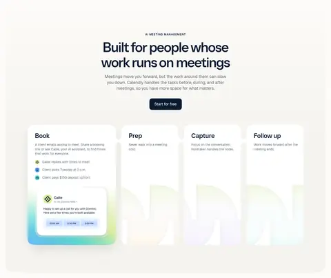
Use a spacious, centered composition with content aligned to a measured 1200px maximum width. The top hero is full-bleed within a large rounded panel, followed by a quiet workflow showcase and alternating two-column feature rows. Center the hero and major integration and closing CTA headings; use left-aligned copy in feature splits. Keep section spacing generous, with restrained content density and clear transitions between story beats. Small navigation and utility elements sit above the broad editorial content.
圆角与层次
按钮 · 8px
卡片 · 48px
导航 · 4px
链接 · 48px
lg · card
Keep most content flat against the warm canvas, using thin neutral rules to divide feature details. Reserve subtle, broad shadows for floating product or testimonial cards. Rounded panels create the main sense of layering; avoid heavy outlines or deep, dramatic shadows.
组件
下面的预览按实测的按钮、输入框、徽标、卡片样式重建(字体用替代字体)。
Announcement bar
A slim sky-blue banner above navigation with a short product announcement, learn-more link, and dismiss control.
Primary CTA
Dark navy fill with warm-white text; compact label and softly rounded corners, used for the main conversion action.
Feature showcase card
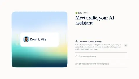
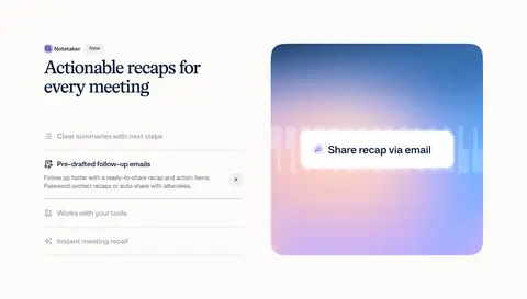
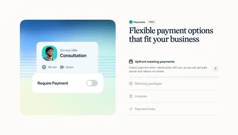
Large rounded white or warm-neutral surface pairing concise feature copy with a crisp scheduling or payments UI mockup.
Feature split row
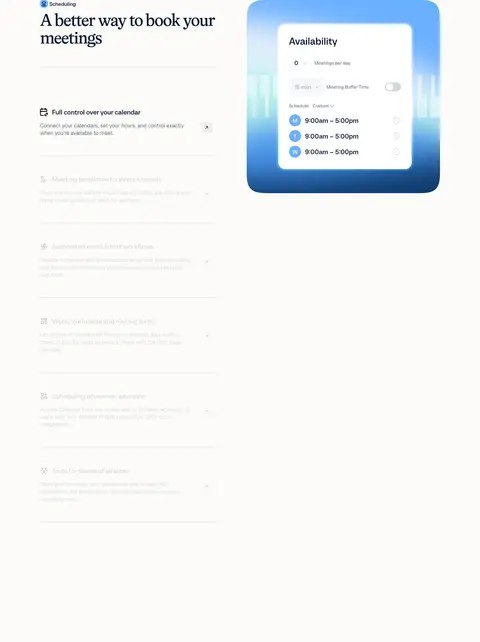
Two-column alternating image-and-copy layout with a feature heading, short description, and fine horizontal separators between details.
Testimonial carousel
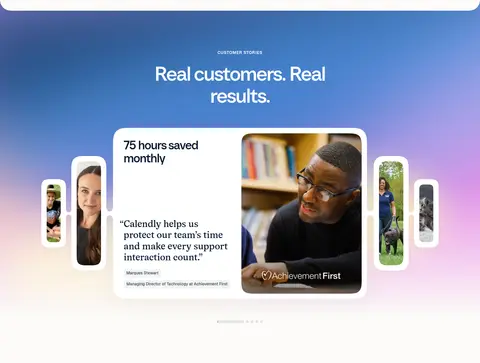
Gradient-backed customer story section with a prominent rounded quote card, customer portrait, and smaller side cards.
Integration tiles
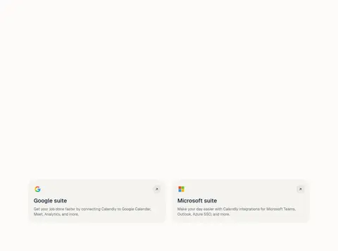
Centered integration logo display with soft oat-colored ecosystem cards and compact explanatory copy.
Footer
Deep navy rounded footer panel with a large brand statement, grouped link columns, Calendly branding, and low-emphasis utility links.
Imagery · Use product UI mockups and illustrative panels as the primary imagery, with occasional customer photography in the testimonial carousel and closing gallery. Frame interfaces inside large, rounded white or softly tinted cards. Hero and feature art use luminous blue, lilac, mint, and warm gradients with crisp, legible UI overlays. Keep logos in a compact integrations display; avoid making photography the dominant visual language.
Use Warm Canvas #fcfbf8 as the dominant page field.
Set important text and primary CTAs in Midnight Ink #071a31.
Use large gradient artwork to frame product UI, not replace the core interface palette.
Alternate centered hero moments with left-aligned feature details.
Give cards and media panels generous rounded forms.
Use fine rules and Slate Copy #5f6d77 for quiet supporting information.
✕ 不该做
Don't make every section a gradient panel.
Don't use bright accent colors for long body copy.
Don't crowd the page with dense grids or tight vertical spacing.
Don't add heavy borders or dramatic shadows to ordinary cards.
Don't treat illustration colors as the default page background.
Don't use display typography for navigation or long paragraphs.
给 AI 的提示词
想快速出一个同风格的新页面,把这段话连同 DESIGN.md 一起发给 AI。
Build a new SaaS page in Calendly’s visual language. Use Warm Canvas #fcfbf8 for the main background, Midnight Ink #071a31 for headings and primary actions, and Slate Copy #5f6d77 for supporting text. Keep the interface spacious and centered within the measured 1200px content width. Use Geist for navigation, body copy, and controls; use Calendly Sans for clean display headings and Wulkan Text selectively for editorial headings. Introduce large, rounded product panels with vivid blue, lilac, and mint gradient artwork, keeping those hues within illustration and mockup regions. Alternate centered statement sections with split feature rows, fine dividers, and calm cards. Add a compact top announcement and navigation, clear CTA hierarchy, and a deep navy footer. Favor readable product UI over decorative effects.