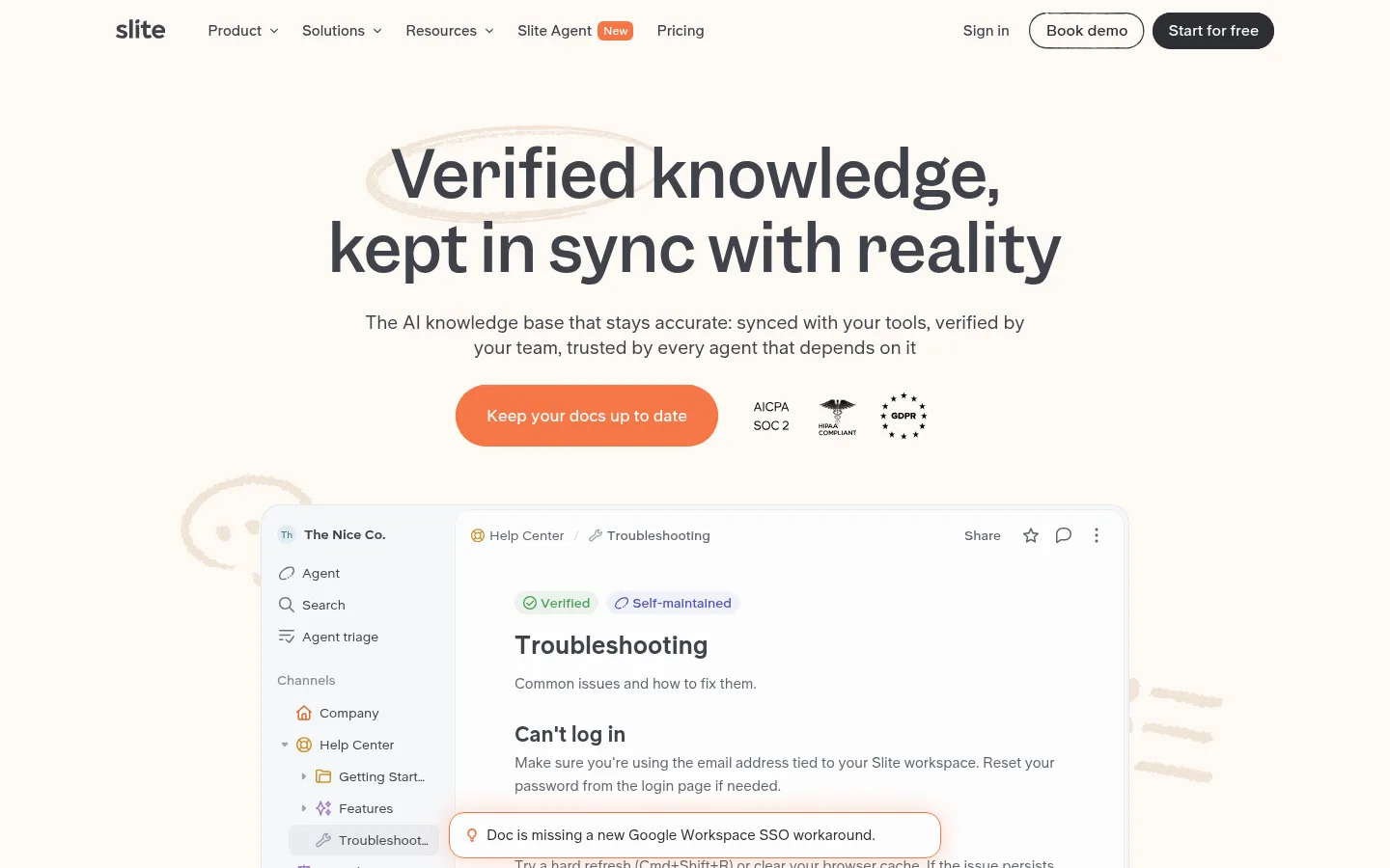
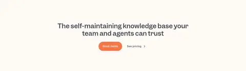
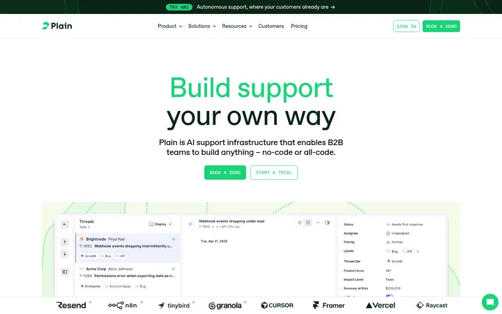
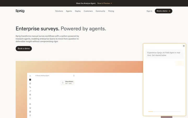
Slite 首页以温暖的米白底色、醒目的标题和橙色行动按钮呈现产品。产品界面图、宽松的版块节奏与柔和卡片,让 AI 知识库显得清晰易懂。
North star · Keep the warm canvas and spacious, editorial rhythm dominant; use bright accents only to mark actions or meaningful product status.
The page is built around a warm, nearly continuous off-white canvas (#fdf9f4), with white product surfaces and restrained hairlines providing contrast without creating hard section breaks. Dark charcoal headlines establish hierarchy; Garnett gives them a rounded editorial character, while UniversalSans carries navigation, body copy, labels, and product UI. The accent orange (#f67748) is reserved for the main CTA, selected badges, and a testimonial panel, so it draws attention without overwhelming the neutral palette. Soft blue is used sparingly for links and one testimonial card; red, green, and violet are mostly small status signals or UI details rather than core brand colours. Centered headings alternate with broad product demonstrations, compact feature cards, testimonials, and pricing. Screenshots and interface mockups are framed in pale panels with rounded corners and subtle shadows. The generous spacing keeps a long page readable and gives each product story room to land.
配色 点色块复制色值。用途说明来自对页面的实测位置(背景、文字、描边、按钮)与截图判读。
品牌色
Warm Parchment
#fdf9f4
Dominant page canvas behind the navigation, hero, content sections, and footer.
强调色
Signal Coral
#f67748
Primary hero CTA, selected badges, highlighted borders, and orange testimonial panel.
Soft Sky Blue
#74a6f1
Sparse link accent and blue testimonial card; use as a supporting highlight.
表层色
Clean White
#ffffff
Product mockup panels, cards, navigation details, and reversed text on accent fills.
中性色
Charcoal Ink
#2d2f34
Primary headings, prominent text, and dark filled CTA treatment.
Slate Graphite
#3f434a
Navigation text, secondary copy, and text on pale warm badges.
Quiet Slate
#5e646e
Muted supporting copy and secondary badge text.
Interface Hairline
#ecedef
Subtle card, button, and interface dividers.
Stone Divider
#d7d4d0
Subtle neutral outline or decorative interface detail.
Deep UI Gray
#4a4a4a
Secondary text within measured product-interface content.
Cool UI Gray
#6a707c
Muted text details within product mockups.
Warm UI Gray
#989592
Low-emphasis interface copy and details.
功能色
Status Red
#d0453a
Negative change indicators in small product-interface status badges.
Status Green
#4c9a41
Verified and positive change indicators inside product UI.
Grid Mist
#9da3af
Fine grid-like details in measured decorative gradients, not a defining page colour.
UI Violet
#5a5ab8
Occasional small product badge or interface detail, not a primary brand colour.
Muted Terracotta
#d3775d
Border detail on select pricing or product cards; mostly confined to interface elements.
文字 背景 对比度 WCAG #2d2f34 Charcoal Ink#fdf9f4 Warm Parchment12.78:1 AAA #2d2f34 Charcoal Ink#ffffff Clean White13.39:1 AAA #3f434a Slate Graphite#fdf9f4 Warm Parchment9.48:1 AAA #3f434a Slate Graphite#ffffff Clean White9.94:1 AAA #5e646e Quiet Slate#fdf9f4 Warm Parchment5.68:1 AA #5e646e Quiet Slate#ffffff Clean White5.96:1 AA
字体 字号阶梯:Major Third(比例约 1.266,正文 14px)。示例用免费替代字体渲染,数值为实测。
Aa 设计
UniversalSans 网络字体 · 字重 400 / 600 / 500 / 700 · 占比 82%
免费替代:Inter
Navigation, body copy, buttons, labels, and most interface text.
Aa 设计
Garnett 网络字体 · 字重 500 / 400 / 700 · 占比 18%
免费替代:DM Sans
Display headings and editorial section titles.
角色 示例 字号 字重 行高 字距 一级标题 Centered hero headline introducing verified, current knowledge.
Slite
36px 500 1.2 0 二级标题 Section headlines and major product-story transitions.
Slite
28px 500 1.25 0 三级标题 Feature and subsection headings within product narratives.
The quick brown fox 敏捷的狐狸
24px 400 1.4 0 四级标题 Compact card titles and emphasized UI headings.
The quick brown fox 敏捷的狐狸
22px 700 1.3 0 正文 Buttons, key copy, labels, and concise product descriptions.
The quick brown fox 敏捷的狐狸
14px 600 1.14 0 辅助文字 Supporting notes, interface annotations, and testimonials’ attribution.
The quick brown fox 敏捷的狐狸
13.5px 400 1.88 0 导航 Primary navigation labels across the top bar.
The quick brown fox 敏捷的狐狸
15px 600 1 0
间距与布局 基准单位 8px · 密度:宽松
120px 版块间距
8px 元素间距
14px 卡片内边距
1200px 内容最大宽度
1px
2px
4px
6px
8px
12px
14px
16px
20px
24px
32px
40px
48px
120px
A centered page uses a measured maximum content width of 1200px, with broad margins and a spacious vertical rhythm. The hero and many section titles are centered; later product-context content includes left-aligned text beside interface imagery. Sections alternate between full-width storytelling and two-, three-, or four-column card arrangements. The density is intentionally low: whitespace separates ideas, while screenshots and mockups provide detail. Navigation is a single compact horizontal row.
圆角与层次 md · other, card, media
lg · card
sm · badge
hairline · nav
Most of the page stays flat against the warm canvas. Product screens and selected cards sit on white or near-white surfaces with subtle layered shadows; fine pale borders define pricing and interface edges. Avoid strong depth: the visual hierarchy comes from spacing, contrast, and mockup composition.
组件 下面的预览按实测的按钮、输入框、徽标、卡片样式重建(字体用替代字体)。
Top navigation Single horizontal brand and link row in UniversalSans; dark neutral text, compact labels, outlined Book demo, and dark filled Start for free pill.
Primary CTA Rounded coral button with white semibold text; the hero’s main action is visually stronger than nearby trust marks.
Product mockup panel White interface surface with rounded corners, fine pale dividers, subtle shadow, and layered doc or agent UI.
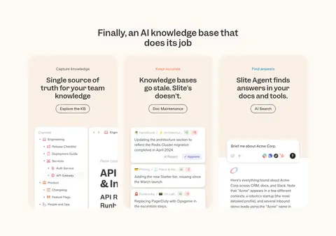
Feature cards Pale warm or white cards with rounded corners, concise titles, small labels, and embedded product screenshots.
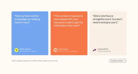
Testimonial cards Three side-by-side quote panels; coral and blue accents contrast with a pale neutral card, with small attribution details.
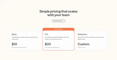
Pricing cards Three clean plan panels on the warm canvas; the recommended plan receives a coral border and top label.
Status badges Small rounded interface labels use restrained green, red, or violet for verified states and change indicators.
Imagery · The visual centerpiece is product-interface imagery: large, layered knowledge-base and agent mockups show real-looking docs, search, and maintenance workflows. Small customer logos, trust marks, and integration icons support credibility. Screens are generally placed in pale rounded panels, with faint shadows and occasional hand-drawn decorative marks. Testimonials use flat coloured cards rather than photography-led layouts; portraits appear sparingly as small attribution details.
页面版块 共 10 个版块,按页面从上到下排列,每个都标了类型、布局和交互套路。
该做与不该做 ✓ 该做 Use #fdf9f4 as the dominant page canvas. Set display headings in Garnett and supporting UI in UniversalSans. Keep generous breathing room between major content sections. Use #f67748 to emphasize primary actions and selected highlights. Frame product screens in pale, rounded surfaces with subtle shadows. Use muted status colours mainly inside product-interface details. ✕ 不该做 Do not turn the page into a dark or high-contrast theme. Do not use accent colours as large, repeated section backgrounds. Do not compress the layout into dense rows of text. Do not add heavy shadows or thick borders to every card. Do not treat incidental UI status colours as core brand colours. Do not replace the product mockups with unrelated decorative imagery. 给 AI 的提示词 想快速出一个同风格的新页面,把这段话连同 DESIGN.md 一起发给 AI。
复制 Build a new Slite-style SaaS page with a warm, editorial product feel. Use Warm Parchment (#fdf9f4) as the continuous canvas, Charcoal Ink (#2d2f34) for headlines, and Slate Graphite (#3f434a) for navigation and supporting copy. Set display titles in Garnett or a close alternative such as DM Sans; use UniversalSans or Inter for interface text. Keep the layout centered and spacious, with compact top navigation, clear section headings, and alternating product showcases and simple card grids. Make the primary action Signal Coral (#f67748) with white text. Use Clean White (#ffffff) panels, Interface Hairline (#ecedef) dividers, and restrained shadows for product UI. Reserve Soft Sky Blue (#74a6f1) and status colours for small highlights. Keep the page calm, legible, and product-led.
DESIGN.md Tailwind v4 CSS 变量 Design Tokens
---
title: "Slite design system"
variant: extended
source: https://slite.com/
captured_at: 2026-10-12
theme: light
industry: ai
generator: Design DNA (https://four.wiralomi.com/style/slite-com)
ai_generated: true
ai_label: "本文件由 AI 辅助生成:数值取自公开网页的实测样式,命名、用途说明与建议为模型解读。商标归原所有者。 / AI-assisted content"
---
# Slite · Design System
> Warm, clear product storytelling with a human touch
**Theme:** light · **Industry:** ai · **Source:** https://slite.com/ · **Captured:** 2026-10-12 (1440×900 desktop)
_AI-assisted content: values are measured from the public page at capture time; names, roles and guidance are model-written interpretations. Trademarks belong to their owners._
Slite’s homepage pairs a warm off-white canvas with confident typography and orange calls to action. Product-interface imagery, spacious section pacing, and soft-edged cards make a complex AI knowledge product feel approachable.
## North star
Keep the warm canvas and spacious, editorial rhythm dominant; use bright accents only to mark actions or meaningful product status.
## Overview
The page is built around a warm, nearly continuous off-white canvas (## Colors
| Name | Hex | Token | Group | Role |
|---|---|---|---|---|
| Warm Parchment | ` | `--color-warm-parchment` | brand | Dominant page canvas behind the navigation, hero, content sections, and footer. |
| Charcoal Ink | ` | `--color-charcoal-ink` | neutral | Primary headings, prominent text, and dark filled CTA treatment. |
| Signal Coral | ` | `--color-signal-coral` | accent | Primary hero CTA, selected badges, highlighted borders, and orange testimonial panel. |
| Slate Graphite | ` | `--color-slate-graphite` | neutral | Navigation text, secondary copy, and text on pale warm badges. |
| Quiet Slate | ` | `--color-quiet-slate` | neutral | Muted supporting copy and secondary badge text. |
| Status Red | ` | `--color-status-red` | semantic | Negative change indicators in small product-interface status badges. |
| Status Green | ` | `--color-status-green` | semantic | Verified and positive change indicators inside product UI. |
| Grid Mist | ` | `--color-grid-mist` | semantic | Fine grid-like details in measured decorative gradients, not a defining page colour. |
| Interface Hairline | ` | `--color-interface-hairline` | neutral | Subtle card, button, and interface dividers. |
| Clean White | ` | `--color-clean-white` | surface | Product mockup panels, cards, navigation details, and reversed text on accent fills. |
| UI Violet | ` | `--color-ui-violet` | semantic | Occasional small product badge or interface detail, not a primary brand colour. |
| Muted Terracotta | ` | `--color-muted-terracotta` | semantic | Border detail on select pricing or product cards; mostly confined to interface elements. |
| Stone Divider | ` | `--color-stone-divider` | neutral | Subtle neutral outline or decorative interface detail. |
| Deep UI Gray | ` | `--color-deep-ui-gray` | neutral | Secondary text within measured product-interface content. |
| Cool UI Gray | ` | `--color-cool-ui-gray` | neutral | Muted text details within product mockups. |
| Warm UI Gray | ` | `--color-warm-ui-gray` | neutral | Low-emphasis interface copy and details. |
| Soft Sky Blue | ` | `--color-soft-sky-blue` | accent | Sparse link accent and blue testimonial card; use as a supporting highlight. |
### Semantic aliases
`--color-canvas` → ` (Warm Parchment) · `--color-surface` → ` (Clean White) · `--color-text` → ` (Charcoal Ink) · `--color-text-muted` → ` (Slate Graphite) · `--color-text-subtle` → ` (Quiet Slate) · `--color-border` → ` (Interface Hairline) · `--color-accent` → ` (Signal Coral) · `--color-accent-2` → ` (Soft Sky Blue) · `--color-on-accent` → ` (Clean White)
### Contrast (WCAG 2.x)
| Text | Background | Ratio | Level |
|---|---|---|---|
| ` | ` | 12.78:1 | AAA |
| ` | ` | 13.39:1 | AAA |
| ` | ` | 9.48:1 | AAA |
| ` | ` | 9.94:1 | AAA |
| ` | ` | 5.68:1 | AA |
| ` | ` | 5.96:1 | AA |
| ` | ` | 2.62:1 | fail |
| ` | ` | 2.74:1 | fail |
### Gradients
- `linear-gradient(to right, rgb(157, 163, 175) 1px, rgba(0, 0, 0, 0) 1px), linear-gradient(rgb(157, 163, 175) 1px, rgba(0, 0, 0, 0) 1px)`
- `linear-gradient(to right, rgb(246, 119, 72) 1px, rgba(0, 0, 0, 0) 1px), linear-gradient(rgb(246, 119, 72) 1px, rgba(0, 0, 0, 0) 1px)`
- `linear-gradient(in oklab, rgb(253, 253, 253) 0%, rgba(0, 0, 0, 0) 100%)`
## Typography
| Family | Token | Source | Weights | Role | Free substitute |
|---|---|---|---|---|---|
| UniversalSans | `--font-body` | webfont | 400, 600, 500, 700 | Navigation, body copy, buttons, labels, and most interface text. | Inter |
| Garnett | `--font-display` | webfont | 500, 400, 700 | Display headings and editorial section titles. | DM Sans |
- **UniversalSans:** Use clean sans-serif styling; navigation and key body text are semibold, with regular weights for supporting copy.
- **Garnett:** Medium-weight headings, sentence case, and neutral tracking; keep line breaks deliberate and compact.
### Type scale — Major Third (ratio ≈ 1.266, base 14px)
| Role | Size | Weight | Line height | Letter spacing | Case | Family | Used for |
|---|---|---|---|---|---|---|---|
| h1 | 36px | 500 | 1.2 | 0 | — | Garnett | Centered hero headline introducing verified, current knowledge. |
| h2 | 28px | 500 | 1.25 | 0 | — | Garnett | Section headlines and major product-story transitions. |
| h3 | 24px | 400 | 1.4 | 0 | — | Garnett | Feature and subsection headings within product narratives. |
| h4 | 22px | 700 | 1.3 | 0 | — | UniversalSans | Compact card titles and emphasized UI headings. |
| body | 14px | 600 | 1.14 | 0 | — | UniversalSans | Buttons, key copy, labels, and concise product descriptions. |
| caption | 13.5px | 400 | 1.88 | 0 | — | UniversalSans | Supporting notes, interface annotations, and testimonials’ attribution. |
| nav | 15px | 600 | 1 | 0 | — | UniversalSans | Primary navigation labels across the top bar. |
OpenType features in use: `"ss14", "ss15", "ss19"` .
## Spacing & layout
- Base unit **8px**, density **spacious**.
- Scale (most used values): 1, 2, 4, 6, 8, 12, 14, 16, 20, 24, 32, 40, 48, 120 px.
- Section rhythm 120px · element gap 8px · card padding 14px · max content width 1200px.
A centered page uses a measured maximum content width of 1200px, with broad margins and a spacious vertical rhythm. The hero and many section titles are centered; later product-context content includes left-aligned text beside interface imagery. Sections alternate between full-width storytelling and two-, three-, or four-column card arrangements. The density is intentionally low: whitespace separates ideas, while screenshots and mockups provide detail. Navigation is a single compact horizontal row.
## Shape & elevation
- Radius: button `9999px` · card `16px` · media `50%` · badge `6px` · nav `9999px` · link `10px` · xs `6px` · sm `8px` · md `10px` · lg `12px` · xl `14px` · 2xl `16px` · pill `9999px`
- Shadow `md` (other, card, media): `rgba(0, 0, 0, 0.1) 0px 1px 3px 0px, rgba(0, 0, 0, 0.05) 0px 2px 6px 0px, rgba(0, 0, 0, 0.01) 0px 4px 12px 0px`
- Shadow `lg` (card): `rgba(0, 0, 0, 0.05) 0px 2px 6px 0px, rgba(0, 0, 0, 0.08) 0px 10px 24px 0px`
- Shadow `sm` (badge): `rgba(0, 0, 0, 0.2) 0px 2px 6px 0px`
- Shadow `hairline` (nav): `rgba(0, 0, 0, 0) 0px 1px 0px 0px`
- Shadow `sm-2` (other): `rgb(246, 119, 72) 0px 0px 8px 1px`
- Shadow `lg-2` (text): `rgba(0, 0, 0, 0.01) 0px 4px 16px 0px, rgba(0, 0, 0, 0.04) 0px 4px 16px 0px, rgba(0, 0, 0, 0.06) 0px 2px 12px 0px, rgba(0, 0, 0, 0.08) 0px 1px 4px 0px`
- Motion: standard transition `0.25s cubic-bezier(0.215, 0.61, 0.355, 1)` on interactive elements.
Most of the page stays flat against the warm canvas. Product screens and selected cards sit on white or near-white surfaces with subtle layered shadows; fine pale borders define pricing and interface edges. Avoid strong depth: the visual hierarchy comes from spacing, contrast, and mockup composition.
## Imagery
The visual centerpiece is product-interface imagery: large, layered knowledge-base and agent mockups show real-looking docs, search, and maintenance workflows. Small customer logos, trust marks, and integration icons support credibility. Screens are generally placed in pale rounded panels, with faint shadows and occasional hand-drawn decorative marks. Testimonials use flat coloured cards rather than photography-led layouts; portraits appear sparingly as small attribution details.
## Components
### Top navigation
Single horizontal brand and link row in UniversalSans; dark neutral text, compact labels, outlined Book demo, and dark filled Start for free pill.
### Primary CTA
Rounded coral button with white semibold text; the hero’s main action is visually stronger than nearby trust marks.
### Product mockup panel
White interface surface with rounded corners, fine pale dividers, subtle shadow, and layered doc or agent UI.
### Feature cards
Pale warm or white cards with rounded corners, concise titles, small labels, and embedded product screenshots.
### Testimonial cards
Three side-by-side quote panels; coral and blue accents contrast with a pale neutral card, with small attribution details.
### Pricing cards
Three clean plan panels on the warm canvas; the recommended plan receives a coral border and top label.
### Status badges
Small rounded interface labels use restrained green, red, or violet for verified states and change indicators.
### Measured component styles
- **Primary button** (“Keep your docs up to date”): background ## Do
- Use ## Don't
- Do not turn the page into a dark or high-contrast theme.
- Do not use accent colours as large, repeated section backgrounds.
- Do not compress the layout into dense rows of text.
- Do not add heavy shadows or thick borders to every card.
- Do not treat incidental UI status colours as core brand colours.
- Do not replace the product mockups with unrelated decorative imagery.
## Agent prompt
Build a new Slite-style SaaS page with a warm, editorial product feel. Use Warm Parchment (## Page sections (top to bottom)
| # | Type | Layout | UX patterns | UI patterns |
|---|---|---|---|---|
| 1 | hero | Centered headline and subcopy above CTA and trust marks, followed by a large product-interface mockup. | Primary action, Trust signals, Product preview | Warm canvas, Coral pill CTA, Layered interface mockup |
| 2 | feature-grid | Centered section title followed by three equal feature cards with product imagery. | Capability overview, Explore feature | Three-column cards, Pale warm panels, Embedded screenshots |
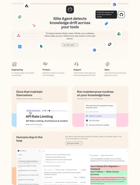
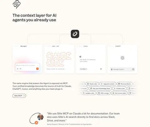
| 3 | product-showcase | Centered product story with surrounding integration marks, followed by use-case labels and wide interface panels. | Workflow explanation, Role-based examples | Integration icons, Central product illustration, Wide mockup cards |
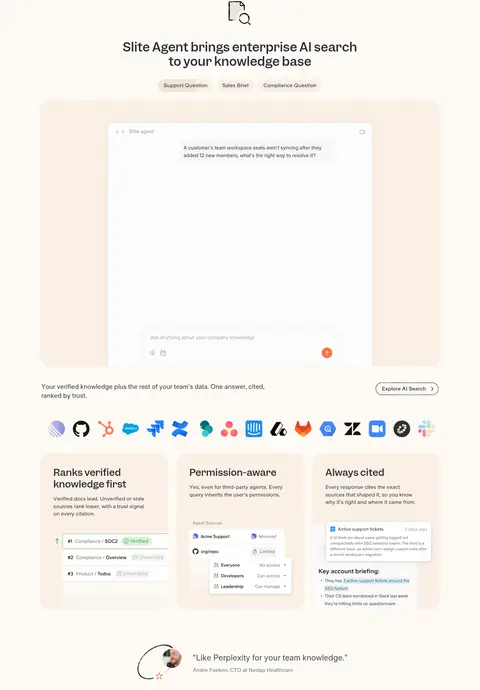
| 4 | product-showcase | Centered title and query labels above a broad agent interface, integration logos, and three supporting cards. | Search demonstration, Permission reassurance, Cited answers | Large white interface, Pale outer panel, Three feature cards |
| 5 | integrations | Left-aligned section title and copy paired with a connected row of tool panels and compact action chips. | Integration discovery, MCP explanation | Connected product panels, Outlined chips, Small testimonial |
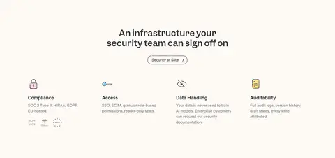
| 6 | feature-grid | Centered heading above four compact security and access features. | Security proof, Capability scanning | Simple icon-led items, Compact columns, Trust badges |
| 7 | testimonials | Three quote cards in a row, followed by a brief customer proof line and link. | Social proof, Customer stories | Coral and blue quote cards, Pale neutral card, Small attributions |
| 8 | pricing | Centered heading and pricing link above three horizontal plan cards. | Plan comparison, Recommended plan | Three pricing cards, Coral recommendation treatment, Minimal borders |
| 9 | cta | Single centered closing headline with two adjacent actions. | Conversion prompt, Primary and secondary action | Centered composition, Coral pill button, Minimal secondary link |
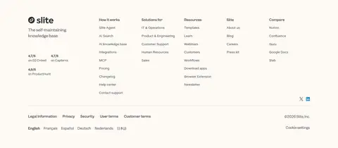
| 10 | footer | Multi-column footer with brand and ratings at left, link groups, then legal and locale rows. | Resource navigation, Ratings, Locale selection | Dense link columns, Fine divider, Compact legal footer |
## Source CSS custom properties (selected)
```css
--font-size-0: 3.5rem;
--font-size-1: 2.8rem;
--font-size-2: 2.25rem;
--font-size-3: 1.5rem;
--font-size-4: 1.2rem;
--font-size-5: 1.1rem;
--font-size-6: 1rem;
--font-size-7: .85rem;
--font-size-8: .75rem;
--font-size-smallest: 10px;
--font-size-smaller: 11px;
--font-size-small: 12px;
--font-size-normal: 13px;
--font-size-large: 14px;
--font-size-semilarger: 16px;
--font-size-larger: 20px;
--font-size-largest: 26px;
--font-weight-light: 300;
--font-weight-regular: 400;
--font-weight-medium: 500;
--font-weight-semibold: 600;
--font-weight-bold: 700;
--font-weight-extrabold: 800;
--font-family-title: "Garnett", FixEmoji, sans-serif;
--font-family-slite-title: "Garnett", FixEmoji, sans-serif;
--font-family-monospace: "Geist Mono", "Source Code Pro", Inconsolata, Monaco, Consolas, "Courier New", Courier, monospace;
--font-feature-settings-monospace: "ss15", "ss19", "ss14", "liga" 0, "clig";
--border-width-small: 1px;
--border-width-medium: 2px;
--border-width-large: 4px;
--radius-smaller: 1px;
--radius-small: 2px;
--radius-normal: 4px;
--radius-large: 8px;
--radius-larger: 10px;
--radius-xlarger: 12px;
--radius-semilarger: 16px;
--radius-largest: 50px;
--box-shadow-smaller: 0px 1px 2px rgba(0, 0, 0, .06), 0px 1px 4px rgba(0, 0, 0, .04);
--box-shadow-small: 0px 4px 12px rgba(0, 0, 0, .01), 0px 2px 6px rgba(0, 0, 0, .05), 0px 1px 3px rgba(0, 0, 0, .1);
```
---
本文件由 AI 辅助生成:数值取自公开网页的实测样式,命名、用途说明与建议为模型解读。商标归原所有者。
Generated by Design DNA · https://four.wiralomi.com/style/slite-com