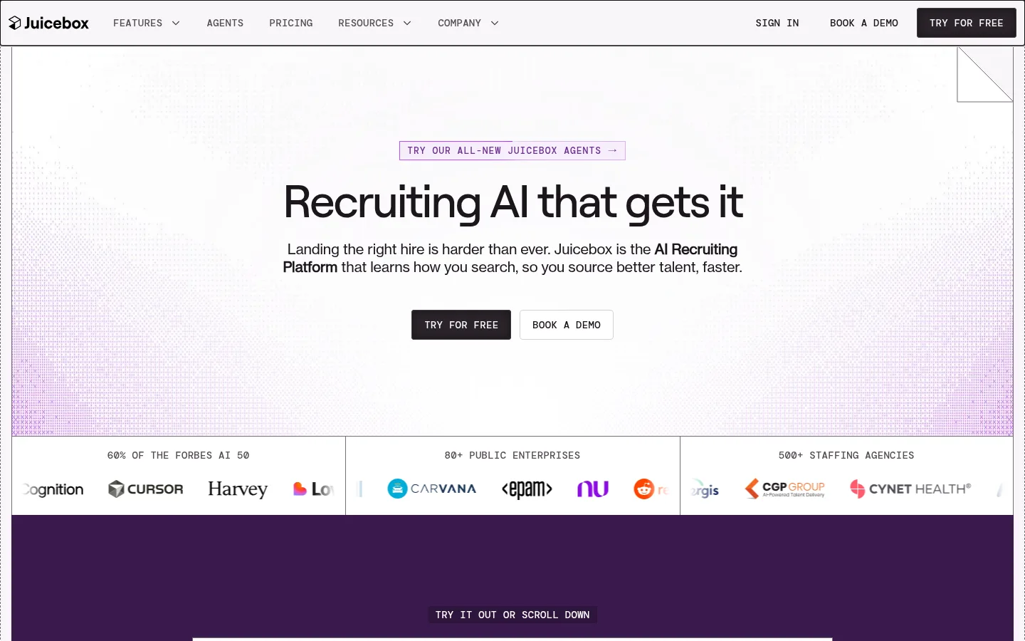
North star · Keep the interface editorial and mostly white, using purple only to frame product moments and guide attention.
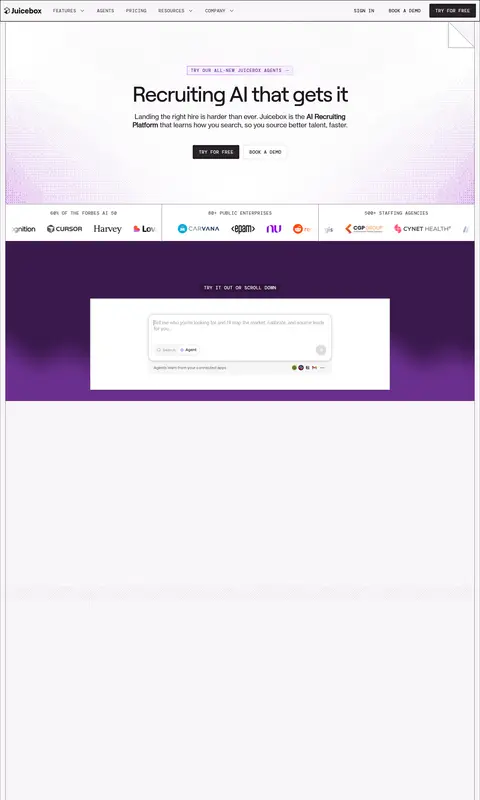
The page uses white as its dominant canvas, with near-black headings and muted gray copy creating a crisp, editorial reading experience. Purple is reserved for moments that need emphasis: the deep full-width product band, geometric product backdrops, small outlined announcement label, and soft violet textures near the hero edges. Rounded or softly colored surfaces stay limited, so the overall interface remains precise rather than playful. Roobert Medium gives large headings a compact, confident silhouette; Haas Grot Text carries readable body copy, while DM Mono supplies uppercase navigation and section labels with a technical recruiting-tool feel. The layout alternates centered introductions, broad visual demonstrations, split feature rows, and bordered logo or FAQ grids. Generous white intervals separate dense modules, while fine rules organize content without heavy card decoration. Interface imagery and geometric line work carry the visual story instead of lifestyle photography.
Body copy, paragraphs, and readable interface text.
Aa 设计
DM Mono
网络字体 · 字重 500 · 占比 13%
免费替代:DM Mono
Navigation, eyebrow labels, captions, and technical microcopy.
Aa 设计
Roobert Medium
网络字体 · 字重 500 · 占比 11%
免费替代:Manrope
Display and section headings.
Aa 设计
Neue Haas Grotesk Text
系统字体 · 字重 400 · 占比 1%
免费替代:Inter
Rare system-fallback text and supporting interface copy.
Aa 设计
Haas Grot Text Web 65 Medium
网络字体 · 字重 500 · 占比 1%
免费替代:Inter
Occasional medium-emphasis text.
角色
示例
字号
字重
行高
字距
特大标题
Large lead display treatment for high-impact page messaging.
Juicebox
64px
500
1
-0.04em
一级标题
Primary hero headline and major section titles.
Juicebox
48px
500
1
-0.02em
二级标题
Feature section and prominent content headings.
Juicebox
40px
500
1.15
-0.02em
三级标题
Subsection headings in feature and proof modules.
Juicebox
28px
500
1.25
-0.02em
四级标题
Compact card and FAQ question headings.
The quick brown fox 敏捷的狐狸
20px
400
1.25
-0.01em
正文
Paragraphs, feature descriptions, and general interface copy.
The quick brown fox 敏捷的狐狸
16px
400
1.25
-0.01em
辅助文字
Uppercase mono labels and small supporting captions.
The quick brown fox 敏捷的狐狸
14px
500
1.14
0.02em
眉题
Compact uppercase section markers above headings.
The quick brown fox 敏捷的狐狸
13px
500
1
0.077em
代码
Technical-style uppercase labels and interface microcopy.
const style = 1;
14px
500
1.14
0.02em
间距与布局
基准单位 2px · 密度:紧凑
32px版块间距
10px元素间距
32px卡片内边距
1408px内容最大宽度
2px
4px
6px
8px
10px
12px
13px
14px
16px
24px
32px
64px
A wide, centered page with a measured maximum width of 1408px and a compact base spacing system. The homepage moves between centered hero content, full-bleed purple product demonstrations, split feature rows, and fine-rule grids for logos, integrations, and FAQs. The hero centers its headline and actions; feature content alternates text and interface imagery. Generous blank intervals punctuate the long page, while compact labels and closely grouped buttons keep individual modules efficient.
圆角与层次
按钮 · 4px
卡片 · 2px
图片 · 50%
链接 · 4px
inset · button
sm · card
md · card
sm · other
The page is mostly flat and organized by thin borders and tonal shifts, not floating cards. Use subtle card shadows only where interface mockups need separation. Small-radius buttons and restrained card corners keep the product interface crisp; purple bands provide depth and contrast through color rather than shadow.
组件
下面的预览按实测的按钮、输入框、徽标、卡片样式重建(字体用替代字体)。
Primary action button
Compact dark CTA with a small corner radius, uppercase mono-style label, and restrained inset shadow.
Secondary action button
White, lightly outlined companion action, commonly paired beside a dark CTA.
Technical eyebrow
Small uppercase DM Mono label with expanded tracking, used above section and feature headings.
Product demonstration band
Broad purple section with geometric line work and a centered recruiting interface mockup.
Logo proof strip
Three-column customer proof band with fine vertical rules, mono captions, and clipped horizontal logo rows.
Feature split row
Product imagery and explanatory text arranged side by side, separated by fine rules and ample white space.
FAQ accordion
Question rows grouped in bordered pale surfaces, with concise answers and small expand controls.
Imagery · Visuals are predominantly product-interface mockups, candidate and recruiting workflow screens, logos, and geometric line-pattern backdrops rather than lifestyle photography. Product panels sit on white or saturated purple fields, often framed by thin, precise outlines. The hero uses a restrained dotted violet texture toward its edges; later product imagery is presented as broad demonstrations with supporting text. Logo marks and customer evidence appear in orderly bands and grids.
Reserve saturated purple for product emphasis and section bands.
Set section labels in uppercase, expanded-tracking mono.
Organize long content with fine rules and clear modules.
Pair dark primary actions with quiet white secondary actions.
✕ 不该做
Do not make every section purple.
Do not add decorative shadows to every card.
Do not use lifestyle photography as the main visual language.
Do not replace the crisp rules with heavy borders.
Do not turn technical labels into oversized headings.
Do not crowd the space between major page modules.
给 AI 的提示词
想快速出一个同风格的新页面,把这段话连同 DESIGN.md 一起发给 AI。
Build a new recruiting SaaS page in Juicebox's editorial product style. Use Gallery White (#ffffff) as the dominant canvas, Ink Plum (#1d161d) for headings, and muted gray-violet copy such as Muted Plum (#574e57). Bring in Juice Purple (#61367d) for one or two product-focused bands, with Night Aubergine (#3a194d) and Blackberry Dusk (#261132) reserved for deep gradient moments. Use Roobert-like compact display headings, readable neutral sans body copy, and uppercase DM Mono-style labels. Structure content in centered introductions, split feature demonstrations, and fine-rule grids. Keep CTAs compact, dark, and paired with quiet outlined alternatives. Favor product mockups and geometric line textures over photography; avoid excess shadows and decoration.