North star · Use warm editorial contrast—serif storytelling over earthy surfaces, with lime and terracotta reserved for clear actions and emphasis.
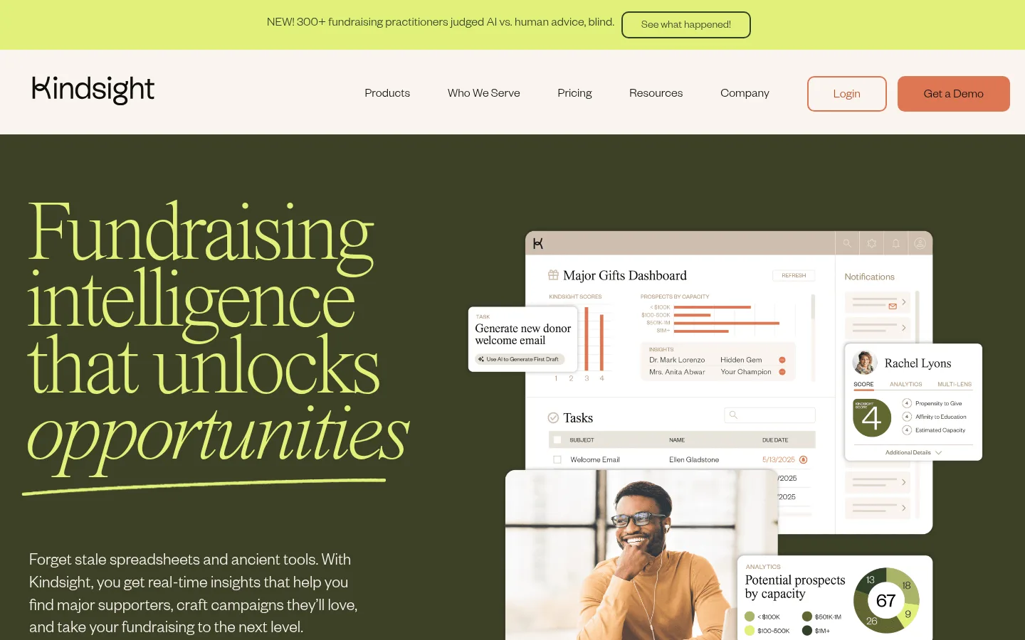
The visual identity balances a warm off-white canvas with an olive-dark hero and footer, creating a clear transition from calm reading space to high-impact brand moments. Citrus lime provides the hero headline and a key CTA accent; muted terracotta marks the primary demo action. Times Now brings an expressive, lightly italic editorial quality to large headings, while Founders Grotesk keeps navigation, body copy, and controls restrained and readable. The hero uses a two-column composition: oversized headline and supporting copy on the left, layered fundraising-product interface imagery on the right. Below, generous blank space and centered proof content slow the pace before feature narratives and compact card groups. Cards are pale, softly rounded, and visually quiet rather than heavily elevated. The lower CTA band shifts to a light grey-beige, then the dark olive footer closes the page with reversed text and a newsletter form.
Navigation, body copy, buttons, captions, and interface text.
Aa 设计
Times Now
网络字体 · 字重 200 / 300 · 占比 16%
免费替代:Cormorant Garamond
Display headings and large editorial section titles.
角色
示例
字号
字重
行高
字距
特大标题
Oversized hero headline and other high-impact display moments.
Kindsight
120px
200
0.78
-0.05em
一级标题
Primary hero heading and major page-level statements.
Kindsight
80px
200
0.9
-0.04em
二级标题
Section headings for proof, features, and solutions.
Kindsight
60px
200
0.84
-0.04em
三级标题
Feature and supporting editorial headings.
Kindsight
50px
200
1
-0.064em
四级标题
Card titles and smaller section subheads.
Kindsight
40px
300
0.9
-0.017em
正文
Explanatory paragraphs and feature descriptions.
The quick brown fox 敏捷的狐狸
18px
300
1.4
-0.017em
辅助文字
Navigation, labels, metadata, and compact supporting copy.
The quick brown fox 敏捷的狐狸
14px
300
2
0
按钮
Demo and in-page action labels.
The quick brown fox 敏捷的狐狸
18px
300
1.4
0
导航
Small navigation and footer link text.
The quick brown fox 敏捷的狐狸
14px
300
2
0
链接
Prominent text links such as solution actions and sector links.
The quick brown fox 敏捷的狐狸
24px
500
1.17
-0.008em
间距与布局
基准单位 2px · 密度:紧凑
40px版块间距
12px元素间距
52px卡片内边距
1398px内容最大宽度
7px
8px
9px
10px
12px
14px
15px
16px
18px
20px
21px
24px
25px
27px
28px
32px
The page uses a broad centered desktop composition within a measured maximum width of 1398px. A horizontal announcement strip sits above the navigation, followed by a full-width, two-column hero. Most content sections return to the warm canvas, with centered headings or split feature narratives and occasional three-column card groups. The overall density is compact in controls and cards but spacious between major content moments, with especially generous open space after the early proof section. The footer uses multiple aligned link columns.
圆角与层次
按钮 · 10px
输入框 · 9999px
卡片 · 24px
没有测到阴影:页面是扁平的,层次靠底色和描边区分。
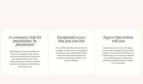
The visual system is mostly flat: strong section color changes create hierarchy instead of shadows. Cards use pale porcelain surfaces with generous internal breathing room and rounded corners. Keep borders limited to outlined buttons and fine interface details; layered hero panels provide depth through overlap, not heavy effects.
组件
下面的预览按实测的按钮、输入框、徽标、卡片样式重建(字体用替代字体)。
Announcement strip
A lime band above the navigation with centered short news copy and a compact outlined action.
Primary demo button
Terracotta fill, dark text, measured 10px radius, and a substantial horizontal button footprint.
Hero composition
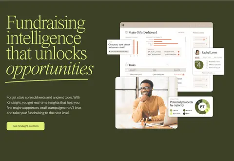
Olive-dark full-width section with lime serif headline and a layered product-dashboard and donor imagery collage.
Solution card
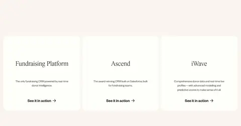
Porcelain card with 24px radius, generous measured padding, dark text, and a prominent action link.
Feature story
Editorial heading and concise explanatory copy paired with product or supporting imagery on a light canvas.
Newsletter form
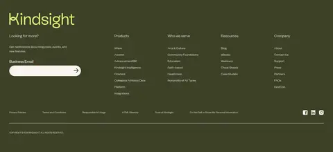
Footer email field presented as a light pill with a simple arrow action against the dark olive surface.
Footer link columns
Multiple compact groups of light-colored navigation links arranged across the olive footer.
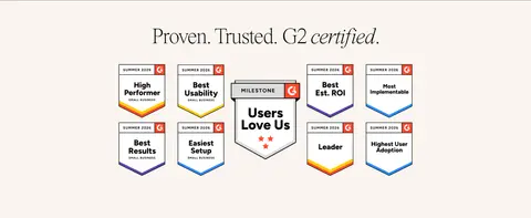
Imagery · The hero layers clean product-dashboard screenshots, donor-profile panels, charts, and a human photograph into an overlapping collage; keep the product UI crisp and the person naturally framed. Trust badges and customer logos appear as supplied graphic assets, so preserve their intrinsic colors rather than treating them as brand palette. Later sections rely more on cards and text than decorative imagery.
Keep the warm cream canvas dominant across content sections.
Use the dark olive surface for the hero and footer anchors.
Set large storytelling headings in a delicate editorial serif.
Reserve lime for high-visibility emphasis and select calls to action.
Use terracotta for the primary demo action.
Layer product screenshots with restraint in the hero.
Let open space separate major content chapters.
✕ 不该做
Do not introduce gradients or decorative shadows.
Do not turn every section into a dark band.
Do not use lime as a general body-text color.
Do not crowd the hero collage with extra decoration.
Do not make card surfaces visually heavy or densely bordered.
Do not replace the editorial serif hierarchy with uniform sans-serif headings.
给 AI 的提示词
想快速出一个同风格的新页面,把这段话连同 DESIGN.md 一起发给 AI。
Build a new Kindsight-style page using a warm, editorial SaaS visual language. Use Gallery Cream (#faf5f0) as the main canvas, Olive Dusk (#3d4128) for major anchor bands, and Porcelain (#fefffa) for quiet cards. Set expressive headlines in a light Times Now-like serif with tight tracking; use a Founders Grotesk-like sans for readable body copy, navigation, and controls. Use Citrus Lift (#e1f079) for selective emphasis and Clay Signal (#de7653) for the primary demo action, with Soft Ink (#0e0f0a) text. Compose content in a broad centered layout, pairing a strong editorial heading with product imagery where useful. Favor open section rhythm, softly rounded cards, flat surfaces, and image overlap over shadows. Keep CTAs clear and avoid introducing unmeasured colors or decorative effects.