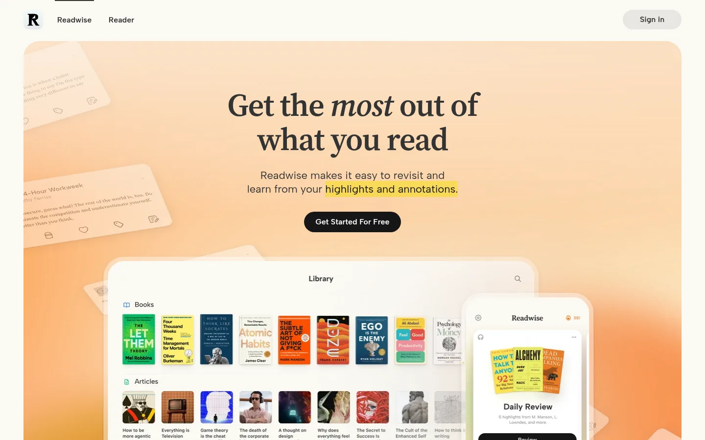
North star · Let warm editorial typography and cream space frame tangible product imagery, reserving strong contrast for the primary action.
The page is built on a warm cream canvas (#fbf9f3), with white product surfaces and dark charcoal text providing a calm, book-like foundation. Large headlines use Source Serif 4, often with tight tracking, while Albert Sans handles compact headings, navigation, buttons, and interface labels; Inter appears in testimonial-style content. The hero and later promotional panels use soft orange-peach imagery, but these colors belong to the artwork rather than the core interface palette. The composition alternates centered headline-led moments with spacious split feature rows and compact multi-column cards. Product screenshots and reading artifacts are framed as tangible objects, layered over subtly tinted backgrounds. Cards rely on pale borders and occasional soft shadows instead of heavy outlines. Blue is a sparse link accent, while black pill-shaped calls to action create clear focal points. Section spacing feels generous and orderly despite the measured compact density of interface elements.
配色
点色块复制色值。用途说明来自对页面的实测位置(背景、文字、描边、按钮)与截图判读。
品牌色
强调色
表层色
中性色
功能色
页面底色 · Reading Cream表层 · Paper White主文字 · Book Ink次要文字 · Quiet Gray描边 · Parchment Line强调 · Reader Blue
Display and main editorial headings; also measured in body copy.
Aa 设计
Inter
网络字体 · 字重 400 / 600 / 500 · 占比 30%
免费替代:Inter
Testimonial and quote-card content.
Aa 设计
Albert Sans
网络字体 · 字重 400 / 600 / 500 · 占比 25%
免费替代:DM Sans
Navigation, buttons, secondary headings, captions, and larger links.
角色
示例
字号
字重
行高
字距
特大标题
Hero-scale editorial headline.
Readwise
64px
600
1.1
-0.02em
一级标题
Primary page headline and major section heading.
Readwise
54px
600
normal
-0.02em
二级标题
Feature and promotional section headings.
Readwise
40px
600
normal
-0.02em
三级标题
Feature-card and secondary section headings.
Readwise
28.5px
600
1.33
0
四级标题
Compact subheadings and interface group titles.
The quick brown fox 敏捷的狐狸
24px
600
normal
0
正文
Supporting editorial copy and descriptive paragraphs.
The quick brown fox 敏捷的狐狸
13px
400
1.16
0
辅助文字
Small labels, ratings, and card metadata.
The quick brown fox 敏捷的狐狸
12.5px
600
1.11
0
按钮
Primary and secondary action labels.
The quick brown fox 敏捷的狐狸
16px
600
1.38
0
导航
Header navigation links.
The quick brown fox 敏捷的狐狸
16px
500
1.38
0
链接
Prominent inline links and integration links.
The quick brown fox 敏捷的狐狸
22px
400
1.27
0
间距与布局
基准单位 2px · 密度:紧凑
32px版块间距
4px元素间距
3px卡片内边距
1344px内容最大宽度
3px
4px
6px
8px
10px
11px
12px
13px
15px
16px
17px
23px
24px
31px
32px
36px
A centered, wide page composition uses a measured maximum width of 1344px, with a compact header followed by a full-bleed-feeling hero panel inset from the canvas. The page alternates centered headline sections, two-column feature rows, and a three-column capability area. Testimonials form a wide card-filled band, while the footer resolves into several compact link columns. Section spacing is notably open, giving product imagery room to breathe; alignment shifts between centered promotional blocks and left-aligned feature copy.
圆角与层次
按钮 · 16px
卡片 · 11px
图片 · 1px
链接 · 16px
inset · media
sm · link
inset · button
xl · card
Most page areas remain flat against the cream canvas. White cards use fine parchment-colored borders, with soft shadows reserved for selected floating cards and layered product previews. Rounded corners and overlap create depth without heavy outlines or dramatic ambient effects.
组件
下面的预览按实测的按钮、输入框、徽标、卡片样式重建(字体用替代字体)。
Header navigation
Minimal brand mark and product links sit on the cream canvas; secondary Sign in control uses a light gray pill treatment.
Primary CTA
Use a dark #161616 pill with white semibold Albert Sans text, matching the prominent Get Started For Free action.
Product preview cards
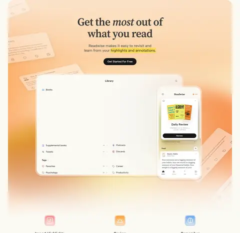
White interface panels with dark text and pale borders present reading libraries, reviews, and mobile product screens.
Feature split
Pair a short editorial heading and supporting copy with a product screenshot; alternate image and text sides down the page.
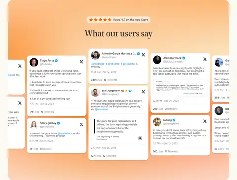
Testimonial cards
Arrange white quote and social-post cards over a warm orange-peach section backdrop; use restrained borders and soft shadow.
Integration links
Show a compact row of recognizable app marks with a small blue link beneath, keeping the surrounding area spacious.
Footer link columns
Group product, support, connect, and legal links in muted text beneath the closing promotional panel.
Imagery · Product UI is the primary visual material: library screens, mobile previews, highlights, and integration examples appear as layered interface mockups. Warm peach and orange gradients surround the hero, testimonial band, and closing CTA, while feature imagery sits on pale, softly tinted backplates. Small product artifacts and book covers add color inside screenshots; treat those as content imagery, not as the core palette.
Use warm gradients as contained promotional artwork.
Reserve #2675de for sparse links and accents.
Make primary actions dark, rounded, and easy to find.
✕ 不该做
Do not turn the whole page into an orange gradient.
Do not use heavy borders around every section.
Do not make every heading sans serif.
Do not treat screenshot colors as the brand palette.
Do not crowd feature rows with dense copy.
Do not use bright blue as a large background.
给 AI 的提示词
想快速出一个同风格的新页面,把这段话连同 DESIGN.md 一起发给 AI。
Build a new Readwise-style page on a #fbf9f3 Reading Cream canvas, using #333333 Book Ink for the main text and Source Serif 4 for editorial headlines. Use Albert Sans for navigation, controls, captions, and secondary headings. Keep content centered within a wide page frame, with generous gaps between alternating image-and-copy feature rows. Show the product through layered white UI previews, pale borders, and occasional soft shadows. Use warm peach-orange gradients only as contained hero, testimonial, or CTA artwork—not as the site-wide palette. Make the main action a dark #161616 pill with white text. Use #2675de Reader Blue sparingly for inline links, and finish with muted footer link columns.