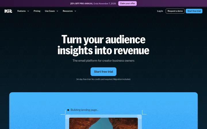
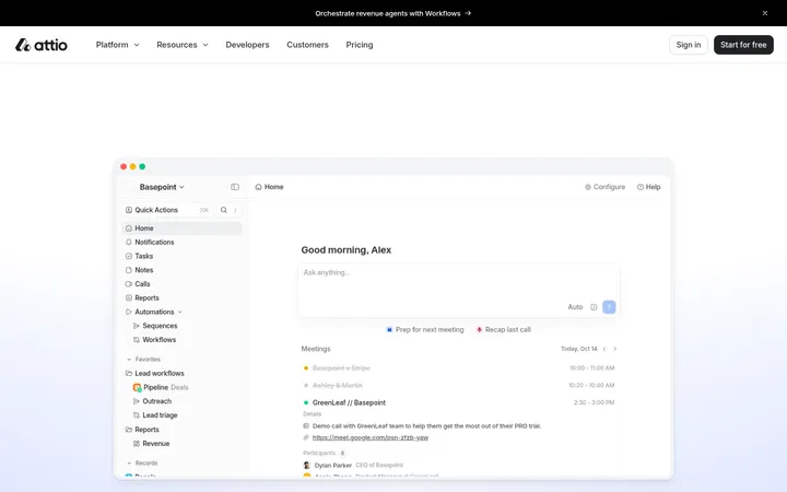
North star · Let oversized, precise typography and generous warm-neutral space carry the story, using bright accents only to mark key ideas and actions.
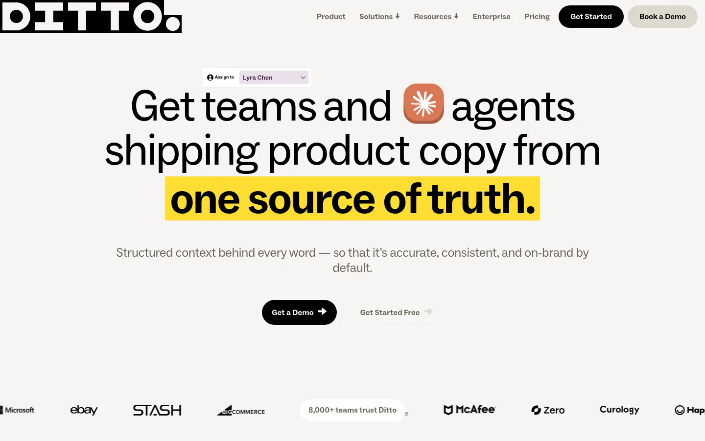
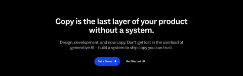
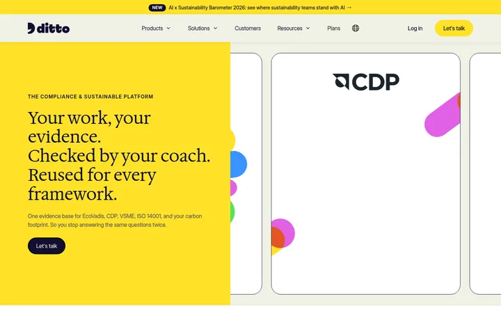
The page uses a warm near-white canvas (#f7f5f3) as its continuous backdrop, giving black typography a softer setting than pure white. Large, centered hero copy leads the first screen; a bright yellow highlight isolates the key phrase, while rounded black and blue CTAs provide clear action contrast. ABC Social carries the system with clean sans-serif forms, compact navigation, and confident display scale. The layout alternates centered statements and product demonstrations with broad, spacious intervals, then shifts into a black platform showcase, an orange proof-points band, and a dark closing/footer area. Product UI captures and a small isometric system illustration supply visual detail; their vivid greens, purples, and blues belong to product media rather than the core brand palette. Pills, restrained hairlines, and mostly flat surfaces keep the page crisp and approachable.
Primary family for display, headings, body copy, navigation, and controls.
Aa 设计
ABC Social Extended
网络字体 · 字重 700 · 占比 5%
免费替代:Space Grotesk
Small measured share of typography, likely reserved for selective emphatic display treatment.
角色
示例
字号
字重
行高
字距
特大标题
Oversized hero headline and highlighted key phrase.
Ditto
89.5px
400
1
-0.024em
一级标题
Primary page or major section headline.
Ditto
48px
700
1
-0.02em
二级标题
Centered statements and prominent section titles.
Ditto
45px
700
1.1
0
三级标题
Feature headings and supporting product-story titles.
The quick brown fox 敏捷的狐狸
26px
300
1.2
-0.014em
四级标题
Secondary feature and interface-adjacent headings.
The quick brown fox 敏捷的狐狸
25px
400
1.2
-0.01em
正文
Explanatory paragraphs beneath headlines and feature titles.
The quick brown fox 敏捷的狐狸
18px
400
1
0
辅助文字
Compact labels, proof-point details, and emphasized small copy.
The quick brown fox 敏捷的狐狸
16px
700
1
0.008em
导航
Top-level navigation labels and compact controls.
The quick brown fox 敏捷的狐狸
16px
700
1
0.008em
间距与布局
基准单位 2px · 密度:宽松
100px版块间距
8px元素间距
5px卡片内边距
792px内容最大宽度
2px
5px
6px
8px
9px
10px
14px
15px
16px
20px
24px
28px
30px
40px
50px
60px
The page is a long, spacious single-column narrative, punctuated by full-width color bands and a two-column black product showcase. The measured content max width is 792px; keep copy blocks constrained while allowing section backgrounds and select media to bleed wider. Hero and statement sections center their text, while later feature sections alternate text and interface media. The measured spacing system is generous, with a 100px section gap and 8px element gap. Most sections share the same canvas, so rhythm comes from scale, alignment, media, and color changes rather than boxed cards.
圆角与层次
按钮 · 9999px
输入框 · 9999px
图片 · 24px
导航 · 9999px
链接 · 9999px
没有测到阴影:页面是扁平的,层次靠底色和描边区分。
The visual system is mostly flat: broad color fields and typography define hierarchy, not stacked cards or pronounced shadows. Use restrained borders and hairlines where product media or controls need separation. Buttons are pill-shaped; product media may have rounded corners, while the hero highlight remains a simple flat rectangle.
组件
下面的预览按实测的按钮、输入框、徽标、卡片样式重建(字体用替代字体)。
Pill CTAs
Compact, bold ABC Social labels in fully rounded controls. Use black with light text for the primary action, yellow for showcase emphasis, and blue for the demo action.
Hero highlight
A flat #ffdd33 rectangular highlight sits directly behind a short, bold phrase within the oversized centered headline.
Product showcase
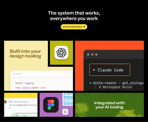
A black section pairs centered light headline text and a yellow CTA with a dense, colorful montage of product imagery.
Feature rows
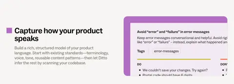
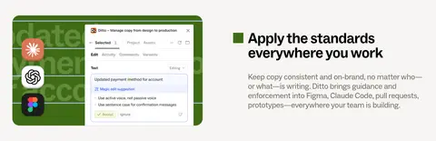
Feature copy and interface imagery alternate sides on the warm canvas, with small colored markers and compact supporting text.
Proof-points band
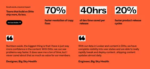
A full-width #ff6137 section combines concise customer messaging, bold metrics, and testimonial quotations in a multi-column arrangement.
Footer signup
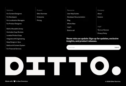
The black footer combines grouped navigation links, a newsletter input with a light pill treatment, a large wordmark, and fine-print details.
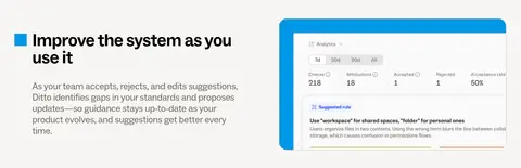
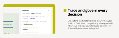
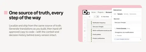
Imagery · The page favors product UI screenshots, partner marks, and an isometric system illustration over lifestyle photography. Interface captures sit in framed panels with vivid colored accents, while the hero illustration is a compact geometric path-and-node diagram. Keep screenshots legible and crop them like product evidence; allow strong colors inside media without promoting them to global brand colors.
Set headlines in ABC Social with confident scale and tight tracking.
Highlight only a short key phrase in #ffdd33.
Use black pill CTAs for the primary action.
Alternate concise copy with clear product evidence.
Reserve full-width color fields for meaningful section transitions.
✕ 不该做
Do not introduce gradients or decorative shadows as a new visual theme.
Do not use bright product-screenshot colors as global brand colors.
Do not crowd the hero or feature sections with extra content.
Do not turn every content block into a bordered card.
Do not use uppercase labels as the default typographic style.
Do not scatter accent colors without a clear hierarchy.
给 AI 的提示词
想快速出一个同风格的新页面,把这段话连同 DESIGN.md 一起发给 AI。
Build a new Ditto-style SaaS page using #f7f5f3 Warm Paper as the main canvas, #000000 Anchor Ink for typography and dark sections, and #6a6559 Quiet Taupe for secondary copy. Use ABC Social or a close sans-serif substitute, with oversized, tightly tracked headlines and restrained body copy. Create clear, spacious sections with centered headline moments, alternating text-and-product-media rows, and occasional full-width bands. Use #ffdd33 Highlight Yellow sparingly for a key phrase or CTA, #ff6137 Signal Tangerine for one meaningful feature or proof band, and #1345eb Action Blue only for a standout action. Keep surfaces mostly flat, buttons pill-shaped, and product imagery vivid but contained within its own frames. Favor crisp hierarchy and generous breathing room over decoration.