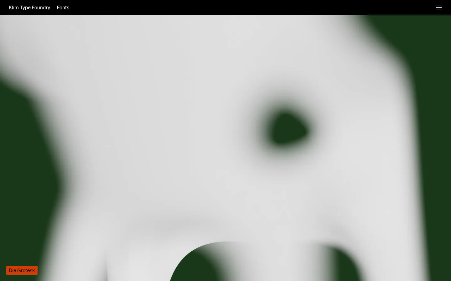
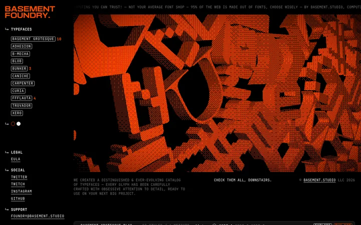
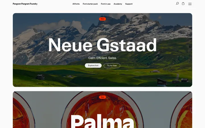
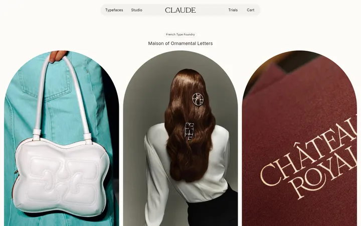
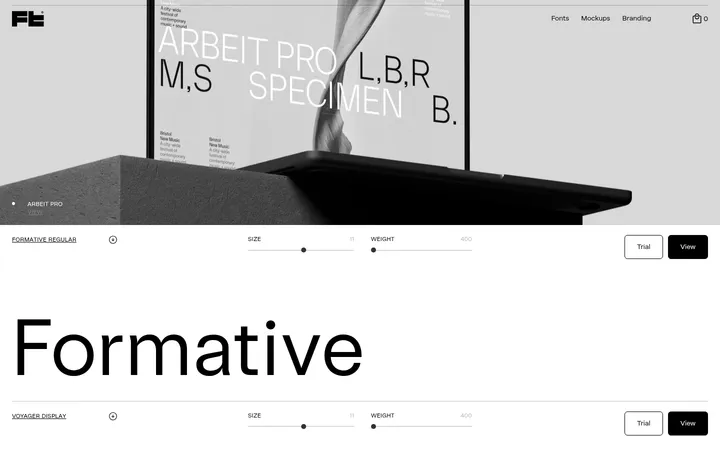
Klim Type Foundry 首页以黑色为主调,通过字体展示、精选项目与博客内容呈现独立字体工作室的作品。全幅影像与克制的字体列表、简洁导航和信息丰富的页脚形成对比。
North star · Let the type specimens and campaign media carry the visual expression, held together by a quiet black canvas and restrained interface chrome.
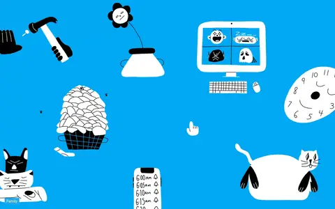
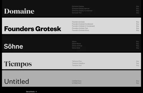
The page uses a nearly continuous black canvas (#000000), making white typography and large media the defining visual elements. The vivid orange-red hero is part of the featured campaign imagery, not a general site-wide background rule; subsequent campaigns likewise bring their own cyan, photographic, or blue tones. SOEHNE provides a clean, compact sans-serif voice across navigation, labels, body copy, and links, while the font catalogue lets the typefaces themselves become the display treatment. The first half of the page uses tall, full-bleed campaign panels with small identifying labels. Lower sections shift to denser editorial grids: font families, in-use project images, and blog cards. White and pale panels appear within the font listings as contrast devices, not as a replacement canvas. Muted grays handle secondary links and footer information; thin dark-gray borders define restrained controls and separators. Spacing is generous between major content blocks, while card captions and catalogue rows remain compact. Keep corners barely rounded and avoid decorative shadows.
配色
点色块复制色值。用途说明来自对页面的实测位置(背景、文字、描边、按钮)与截图判读。
品牌色
强调色
表层色
中性色
页面底色 · Foundry Black表层 · Charcoal Panel表层 2 · Slate Teal表层 3 · Deep Green表层 4 · Night Panel主文字 · Paper White次要文字 · Quiet Graphite弱文字 · Ash Gray描边 · Rule Gray强调 · Signal Cyan强调 2 · Foundry Vermilion强调 3 · Signal Red
文字
背景
对比度
WCAG
#ffffff Paper White
#000000 Foundry Black
21:1
AAA
#ffffff Paper White
#1c1c1c Charcoal Panel
17.04:1
AAA
#ffffff Paper White
#3c585f Slate Teal
7.63:1
AAA
#ffffff Paper White
#101c19 Deep Green
17.47:1
AAA
#555555 Quiet Graphite
#000000 Foundry Black
2.82:1
不达标
#555555 Quiet Graphite
#1c1c1c Charcoal Panel
2.29:1
不达标
字体
字号阶梯:Custom(比例约 2.25,正文 16px)。示例用免费替代字体渲染,数值为实测。
Aa 设计
SOEHNE
网络字体 · 字重 400 / 700 · 占比 99%
免费替代:Inter
Site-wide interface and editorial text, including headings, body, navigation, buttons, and links.
Aa 设计
SOEHNE_IKON
网络字体 · 字重 400 · 占比 1%
免费替代:Material Symbols
Small interface iconography, including the compact menu glyph.
角色
示例
字号
字重
行高
字距
一级标题
Primary page or section heading, set bold and tightly led.
Klim Type Foundry
36px
700
0.98
0
正文
Supporting descriptions, catalogue details, captions, and footer copy.
The quick brown fox 敏捷的狐狸
16px
400
1.19
0
按钮
Compact subscription and utility control labels.
The quick brown fox 敏捷的狐狸
16px
400
normal
0
导航
Header links and navigation labels.
The quick brown fox 敏捷的狐狸
16px
400
1.5
0
链接
Typeface names, project links, editorial links, and inline actions.
The quick brown fox 敏捷的狐狸
16px
400
1.33
0
间距与布局
基准单位 2px · 密度:适中
69px版块间距
10px元素间距
—卡片内边距
1400px内容最大宽度
2px
4px
5px
7px
8px
10px
20px
30px
34px
69px
137px
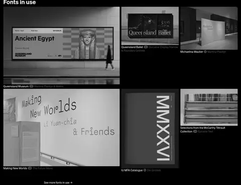
The page spans a measured maximum width of 1400px, with a single-column sequence of tall, full-bleed campaign panels at the top. Below these, content shifts into a two-column font catalogue, a four-column project gallery, and a three-column blog feed, then a two-column newsletter and footer region. Major sections have generous vertical separation; within grids, captions and rows stay compact. Most content sits flush to the dark canvas, with alignment and media crops defining the hierarchy rather than visible containers.
圆角与层次
按钮 · 2px
输入框 · 2px
卡片 · 2px
图片 · 2px
导航 · 2px
链接 · 2px
没有测到阴影:页面是扁平的,层次靠底色和描边区分。
The interface is predominantly flat: no measured shadows or gradient system. Thin gray borders separate footer and control details, while dark cards sit directly on the black canvas. Layering comes from full-bleed media and occasional text overlays, not raised surfaces. Controls and cards use a restrained 2px corner radius.
组件
下面的预览按实测的按钮、输入框、徽标、卡片样式重建(字体用替代字体)。
Compact header
Black top bar with white foundry and Fonts links at left and a small menu glyph at right; typography stays at the measured 16px interface scale.
Campaign feature
Tall, full-bleed image or video panel with a small typeface or collection label near an edge; campaign media supplies its own colors.
Font family list
Two-column catalogue of family names, variants, and Buy links; contrast selected rows with pale panels against the black canvas.
Project gallery
Asymmetric, four-column area of work-in-use images with compact captions and varied image sizes.
Blog feed
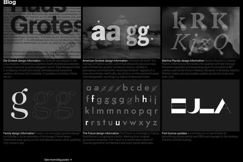
Three-column editorial card grid pairing type-led artwork with short muted descriptions and links.
Newsletter form
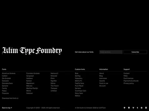
Footer email input on a #1c1c1c surface with white text, subtle border treatment, and a restrained Subscribe control.
Footer directory
Dense multi-column link directory for fonts, custom fonts, information, and support, using white and muted gray text.
Imagery · Campaign sections use large edge-to-edge video or image media, including product-like scenes, people, editorial interiors, illustrations, and graphic compositions. Images retain their distinct palettes and are not forced into one uniform filter. Lower project and blog areas use a mix of documentary photography and type-focused artwork in compact cards; preserve clean rectangular crops and small overlaid or adjacent labels.
Keep the page canvas black and let content establish local contrast.
Use SOEHNE-style sans-serif text for navigation, captions, and interface copy.
Give campaign media full-bleed space and label it with small, quiet text.
Use generous gaps between major sections and compact spacing inside lists.
Allow type specimens and font-family names to act as visual display elements.
Use muted gray for secondary links and thin borders for subtle separation.
✕ 不该做
Do not apply the hero’s vermilion palette to every section.
Do not add gradients or shadows absent from the measured design.
Do not place every gallery image in identical cards or crops.
Do not turn the layout into a rounded, elevated SaaS dashboard.
Do not overstate rare cyan, red, mint, or yellow accents as primary UI colors.
Do not crowd the tall campaign panels with extra interface controls.
给 AI 的提示词
想快速出一个同风格的新页面,把这段话连同 DESIGN.md 一起发给 AI。
Build a new Klim Type Foundry-style page on a Foundry Black (#000000) canvas, using a restrained SOEHNE-like sans serif for navigation, captions, and supporting copy. Keep the header compact and white, then give featured work room to run edge-to-edge; campaign colors such as Foundry Vermilion (#d33c03) should come from the media, not from a site-wide theme. Organize lower content into carefully aligned font lists, image-led project cards, and editorial grids with generous section breaks and compact labels. Use Paper White (#ffffff) for primary text, Ash Gray (#8d8d8d) or Midtone Link (#7f7f7f) for secondary information, and Rule Gray (#383838) only for subtle dividers. Keep surfaces flat, corners barely rounded, and avoid shadows, gradients, or generic oversized CTAs. Let the featured typefaces supply the expressive visual voice.