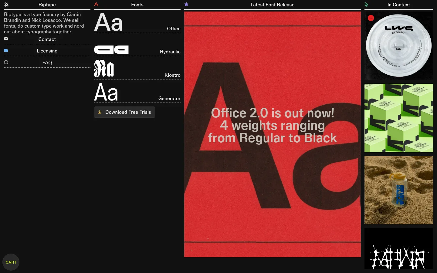
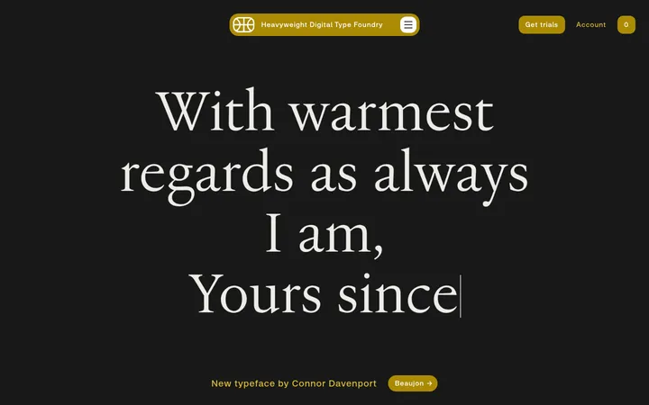
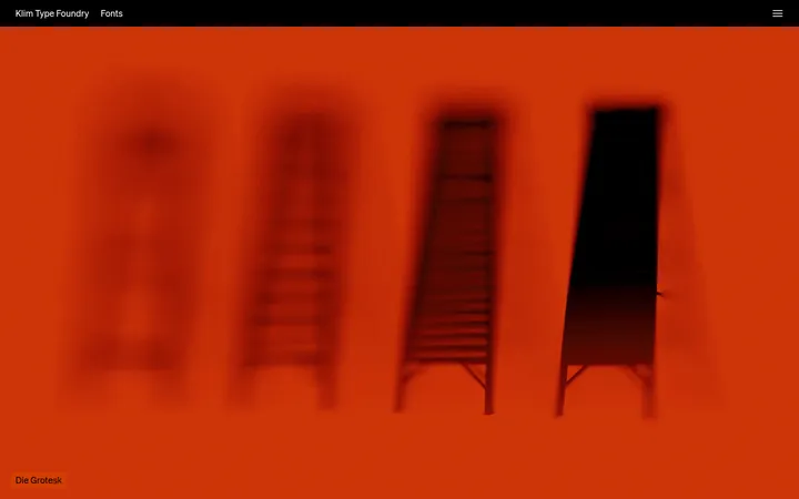
North star · Let a disciplined dark catalogue grid frame expressive type specimens and artwork without competing with them.
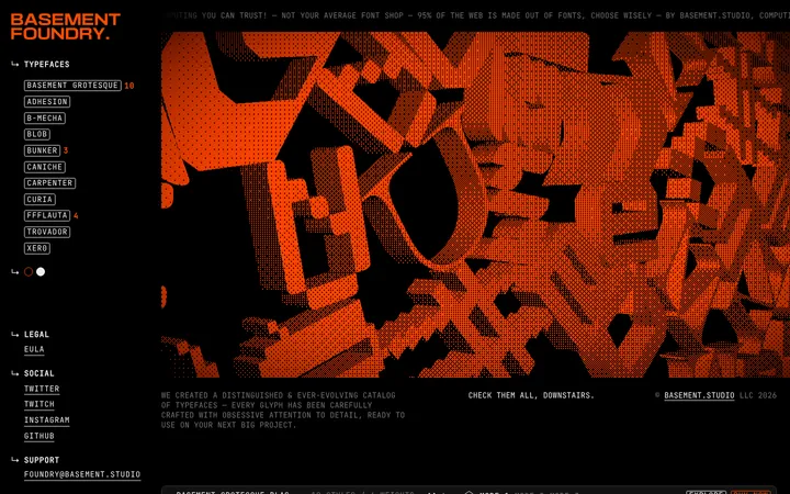
The page is built on a nearly continuous #121212 canvas, with no broad light section bands to interrupt the composition. White headings and restrained gray copy keep the foundry information legible while leaving the featured release artwork to supply the strongest color. In the screenshot, its saturated red poster is image content, not a measured interface accent; the contextual column likewise contains varied product and project imagery. Office is used throughout, with expressive specimen glyphs providing contrast through the letterforms themselves rather than a second UI typeface. A compact introduction and font list sit beside a dominant release panel, while a narrow right-hand strip stacks contextual images. Small muted labels, fine divider rules, and close column relationships create catalogue-like organization. Spacing is economical but not cramped: text groups are separated clearly, and image panels carry most of the visual weight. Rounded cart and trial controls are subdued against the flat, dark interface.
All measured page text, including headings, body copy, links, captions, and controls.
角色
示例
字号
字重
行高
字距
一级标题
Prominent page and section headings, set in bold Office.
Riptype Foundry
43px
700
0.95
0
正文
Foundry introduction and descriptive text.
The quick brown fox 敏捷的狐狸
16px
400
1.19
0.016em
辅助文字
Small, widely tracked labels and secondary metadata.
The quick brown fox 敏捷的狐狸
12px
400
1.58
0.083em
链接
Navigation and inline destination text.
The quick brown fox 敏捷的狐狸
16px
400
1.19
0.016em
间距与布局
基准单位 2px · 密度:适中
—版块间距
7px元素间距
—卡片内边距
—内容最大宽度
6px
7px
8px
12px
13px
14px
Use a full-width, asymmetric editorial grid rather than a centered marketing-page column. The screenshot places foundry introduction and font specimens on the left, a dominant release-art panel in the middle, and a narrow contextual-image strip on the right. Align compact labels and headings to their columns, with fine horizontal rules separating list rows. Keep content tightly grouped but legible; preserve open dark canvas around the lower portions of the left columns. No measured maximum width or section gap is specified.
圆角与层次
按钮 · 50%
没有测到阴影:页面是扁平的,层次靠底色和描边区分。
The interface is predominantly flat, with the dark canvas doing most of the structural work. Thin gray rules divide navigation and specimen rows; subdued dark buttons have fine borders and no measured shadows. Use image panels and contrast, not layered cards or floating surfaces, to establish hierarchy.
组件
下面的预览按实测的按钮、输入框、徽标、卡片样式重建(字体用替代字体)。
Foundry introduction
Compact white and gray copy in the left column, followed by centered contact, licensing, and FAQ links with fine separators.
Font specimen list
Stacked typeface rows pair large glyph previews with names; thin rules keep the compact catalogue orderly.
Trial download
Dark rectangular button with a thin #1e1e1e border, white 16px Office text, and restrained padding.
Release artwork
Dominant central image panel presents the current font release; its vivid poster color belongs to the artwork.
Context gallery
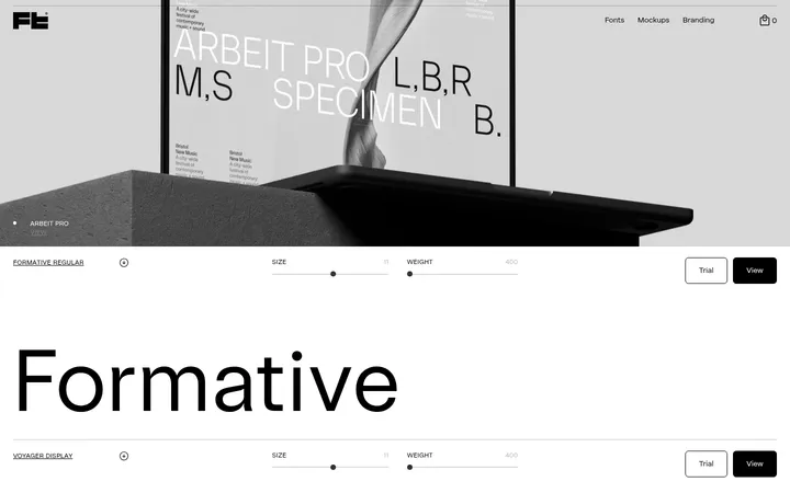
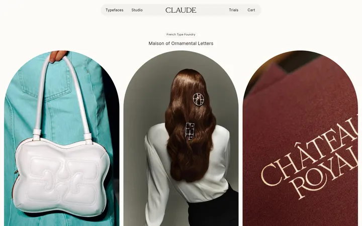
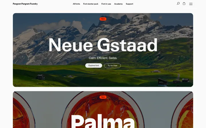
Narrow right-hand stack of project and product images under a compact column label.
Cart control
Small, pill-shaped #2a2a2a control with a bright yellow-green label; treat this measured color as control-specific.
Imagery · The main visual is a large, portrait-like release poster with oversized type and saturated red artwork. A narrow right column stacks contextual project images, including product and packaging examples. Preserve the source artwork’s color and crop as image content; do not reuse its red as a general interface accent. The font list also uses oversized glyph specimens as visual previews.
Reserve white for headings and prominent navigation.
Use gray text and rules to build quiet hierarchy.
Give font specimens generous visual prominence.
Keep the release image central and image-led.
Use fine dividers to organize compact lists.
✕ 不该做
Do not turn the release poster’s red into a site-wide accent.
Do not center all content in a generic single-column layout.
Do not add gradients or decorative shadows.
Do not make secondary copy as bright as headings.
Do not wrap every content group in a card.
Do not replace glyph previews with generic icons.
给 AI 的提示词
想快速出一个同风格的新页面,把这段话连同 DESIGN.md 一起发给 AI。
Build a new Riptype-style page as a dark, editorial type-foundry catalogue. Use Foundry Black (#121212) across the canvas, Studio White (#ffffff) for headings and key links, Soft Pewter (#d0d0d0) for explanatory copy, and Quiet Graphite (#a0a0a0) for secondary details and dividers. Use Office throughout, or a close sans-serif substitute, with regular body text and bold headings. Compose an asymmetric, full-width grid: a compact information and specimen area beside one dominant artwork panel, with a narrow column for contextual imagery. Make glyph forms the visual signature. Keep rules fine, controls subdued in Charcoal Surface (#2a2a2a), and borders restrained. Treat vivid image colors as artwork, not interface tokens; avoid gradients, heavy card framing, and shadows.