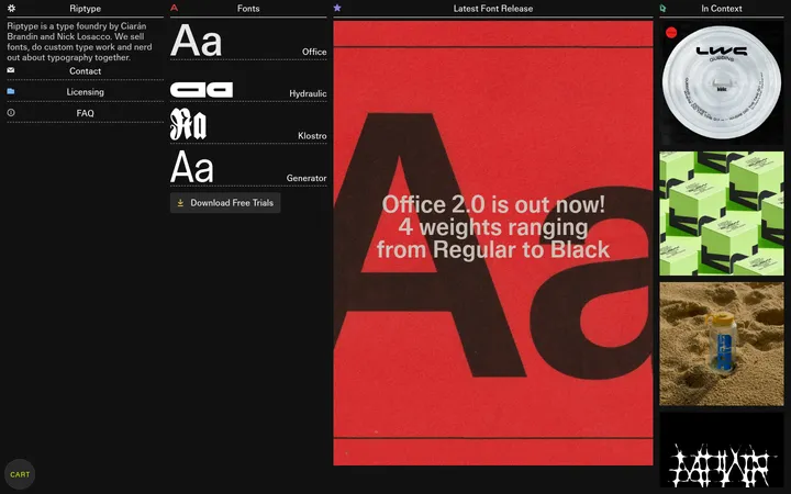
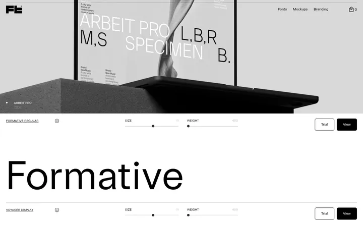
North star · Keep the interface quiet and spacious so expressive type specimens and campaign imagery carry the visual emphasis.
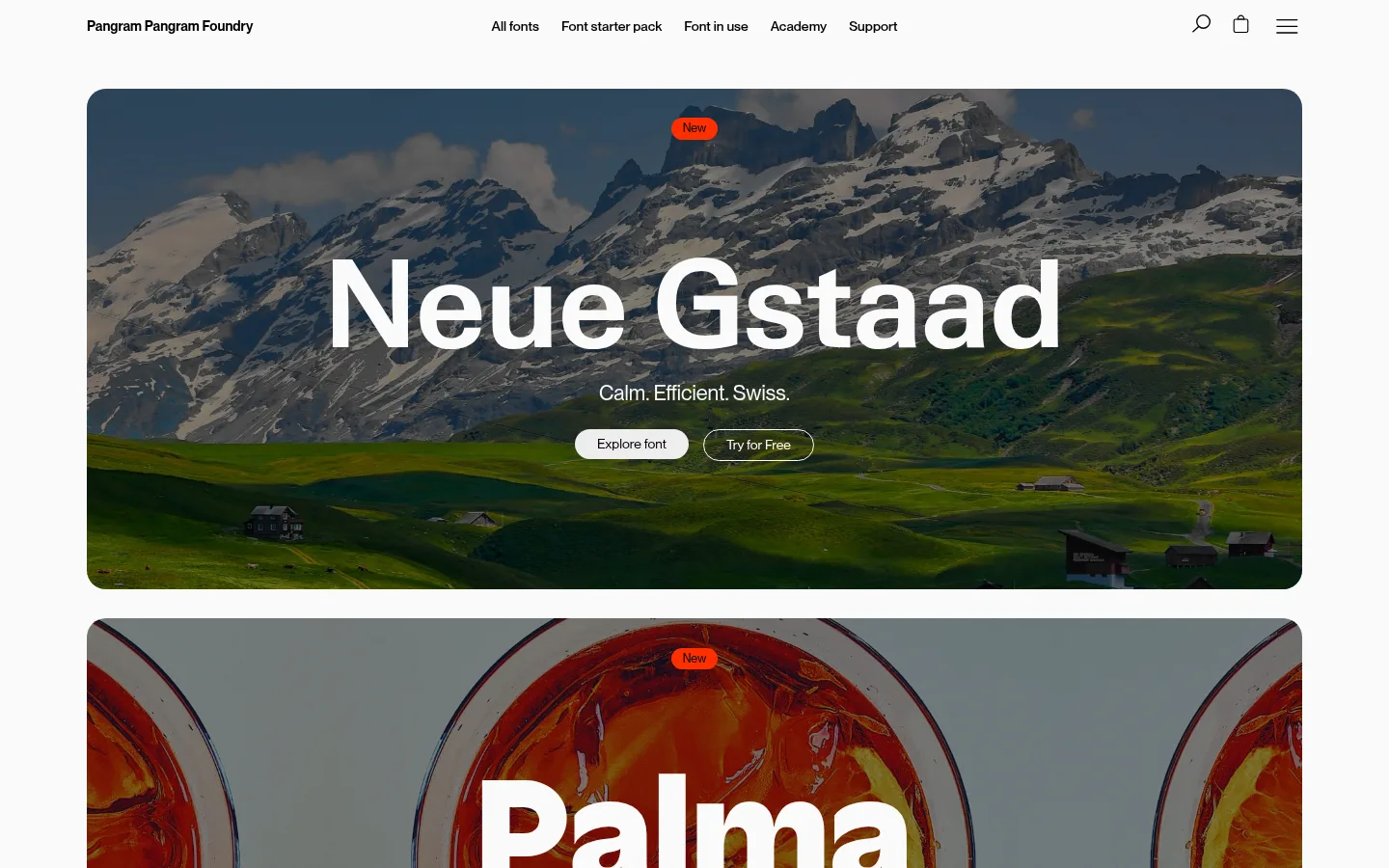
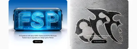
The page is built on a pale, near-white canvas, with black typography and restrained vivid orange reserved for new badges, selected links, and standout actions. Rounded cards and broad, image-led banners create a soft framework without competing with the fonts. Neue Montreal carries most interface and reading text, while large centered specimen headlines demonstrate each featured family directly. The result is editorial rather than conventionally transactional: typography acts as both product and visual identity. Layout alternates full-width campaign panels with dense but airy font grids, project imagery, brand logos, and educational articles. Large gaps separate major chapters, while compact card labels and navigation keep scanning efficient. Campaign photographs are often darkened behind white type for contrast; catalog specimens return to a light neutral ground so letterforms remain easy to compare. The palette measured for interface chrome is distinct from photographic colors inside campaign artwork.
配色
点色块复制色值。用途说明来自对页面的实测位置(背景、文字、描边、按钮)与截图判读。
品牌色
强调色
表层色
中性色
功能色
页面底色 · Soft Graphite Mist表层 · Paper Light表层 2 · Typeface Ink主文字 · Typeface Ink次要文字 · Caption Gray弱文字 · Paper Light描边 · Foundry Ember强调 · Foundry Ember
Primary interface, navigation, body copy, and most display headings
Aa 设计
neue-york-normal-bold
网络字体 · 字重 700 · 占比 2%
免费替代:DM Serif Display
Occasional bold editorial heading and font-specific display specimen
Aa 设计
neue-gstaad-normal-bold
网络字体 · 字重 700 · 占比 2%
免费替代:Inter
Font-specific specimen display
Aa 设计
neue-montreal-semibold
网络字体 · 字重 600 · 占比 2%
免费替代:Inter
Emphasized Neue Montreal headings and interface labels
Aa 设计
palma-fizzy-heavy
网络字体 · 字重 800 / 400 · 占比 1%
免费替代:Nunito Sans
Palma font specimen and campaign display
Aa 设计
altera-carve-semibold
网络字体 · 字重 600 / 400 · 占比 1%
免费替代:Cormorant Garamond
Altera specimen display
角色
示例
字号
字重
行高
字距
特大标题
Oversized featured font names and campaign specimen headlines.
Pangram Pangram Foundry
72.5px
600
1
0
一级标题
Primary page or major section headings.
Pangram Pangram Foundry
48.5px
600
1
0
二级标题
Section titles and prominent editorial statements.
Pangram Pangram Foundry
36px
400
1
0
三级标题
Card headlines and selected serif editorial titles.
Pangram Pangram Foundry
29.5px
700
1.1
0
四级标题
Supporting headings and secondary feature titles.
The quick brown fox 敏捷的狐狸
22px
400
1.3
0
正文
Descriptions, explanatory copy, and card details.
The quick brown fox 敏捷的狐狸
14px
400
1.3
0
辅助文字
Compact metadata, labels, and specimen annotations.
The quick brown fox 敏捷的狐狸
12.5px
400
1.17
0
按钮
Action labels in pill-shaped CTA controls.
The quick brown fox 敏捷的狐狸
12.5px
400
normal
0
导航
Header navigation and prominent menu links.
The quick brown fox 敏捷的狐狸
14px
530
1.3
0
链接
Inline actions and catalog or editorial links.
The quick brown fox 敏捷的狐狸
14px
400
normal
0
间距与布局
基准单位 2px · 密度:宽松
367px版块间距
8px元素间距
26px卡片内边距
1260px内容最大宽度
4px
8px
12px
15px
23px
26px
31px
A centered, spacious desktop composition uses a measured maximum content width of 1260px. The header is a slim horizontal row with the wordmark, centered navigation, and utility icons. Long single-column campaign panels lead into four-column specimen cards, followed by wider image carousels and mixed editorial grids. Major sections have generous separation; card interiors remain compact and consistently padded. Headings are often centered in hero panels and left-aligned in catalog or content sections. Keep the overall density low while allowing catalog grids to become information-rich.
圆角与层次
按钮 · 9999px
输入框 · 20px
卡片 · 20px
徽标 · 9999px
链接 · 20px
没有测到阴影:页面是扁平的,层次靠底色和描边区分。
The interface reads as mostly flat: no measured shadows or gradients define its hierarchy. Rounded card surfaces sit directly on the pale canvas, with spacing doing more work than elevation. Use occasional fine borders for controls or image edges, and rely on dark overlays within campaign imagery to support text contrast rather than floating UI layers.
组件
下面的预览按实测的按钮、输入框、徽标、卡片样式重建(字体用替代字体)。
Campaign hero
Large rounded photographic panel with centered font name, short descriptor, a small accent badge, and paired pill-shaped actions.
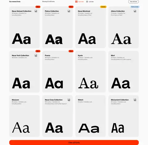
Font specimen card
Rounded #ededed card with black font-family metadata, compact labels, and a large Aa sample.
Pill CTA
Compact rounded action, commonly white with black text, neutral with black text, or black with white text.
Accent badge
Small fully rounded status pill; use #ff2f00 for New and reserve alternate badge colors for rare status variations.
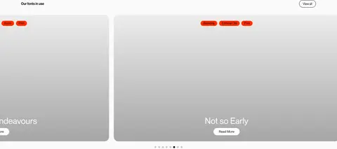
Project carousel card
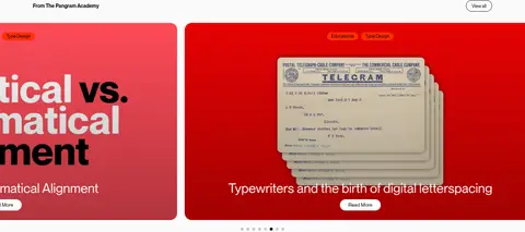
Wide rounded visual card with imagery, small category badges, a project title, and a concise Read More action.
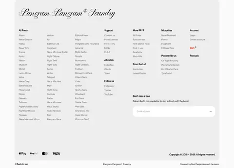
Newsletter field
Broad light input with rounded corners, black text, and a simple email-entry prompt.
Catalog action
Prominent full-width #ff2f00 link button with black text that closes the specimen grid.
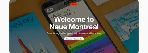
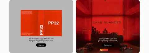
Imagery · Use large campaign photography as full-bleed or generously framed panels, with rounded corners and centered type overlays. Featured imagery ranges from mountain landscapes and citrus imagery to product and print compositions. Darken or choose images with sufficient contrast behind white specimen text. Catalog cards favor simple letterform samples on quiet neutral grounds. Keep photographic palette variation inside the artwork rather than treating it as the site’s core UI palette.
Let oversized font specimens lead each featured panel.
Use orange sparingly for badges and high-priority actions.
Give campaign photography generous rounded framing.
Use whitespace to separate major content chapters.
Keep catalog labels compact and easy to scan.
✕ 不该做
Do not add decorative gradients or heavy shadows.
Do not let interface chrome compete with the type.
Do not apply the orange accent to every link or card.
Do not use tight, crowded spacing between major sections.
Do not treat photography colors as the core UI palette.
Do not replace specimen-focused layouts with generic product tiles.
给 AI 的提示词
想快速出一个同风格的新页面,把这段话连同 DESIGN.md 一起发给 AI。
Build a new page in Pangram Pangram Foundry’s editorial font-foundry style. Use Paper Light (#fafafa) as the quiet canvas, Typeface Ink (#000000) for core text, and Soft Graphite Mist (#ededed) for specimen cards. Reserve Foundry Ember (#ff2f00) for selected badges and standout actions; Caption Gray (#666666) is for secondary copy. Structure the page with a restrained header, spacious campaign panels, and specimen-led grids. Use Neue Montreal or a close sans substitute such as Inter for interface and body text, then feature expressive, large type samples as the content itself. Frame photography in rounded panels and ensure overlay text remains legible. Keep surfaces flat, use whitespace rather than shadows for hierarchy, and make actions compact pill shapes.