North star · Let editorial-quality organic-cotton photography lead, while a white-and-ivory interface keeps shopping clear and unforced.
The page is built on a clean white canvas, with pale warm-ivory panels and occasional tan blocks separating merchandise and editorial features without heavy framing. Near-black text anchors navigation and product information; muted blue marks selected shopping or fit-guide actions, while orange appears sparingly in badges and review details. Terracotta reds and green hues are most prominent in campaign photography and should be treated as image content, not extra interface colours. FoundersGrotesk handles navigation, body copy, product labels and controls in a straightforward, compact manner. TTRamillas_Light gives section headlines a softer, editorial character. The layout alternates centered headings, product grids, category tiles and split image-copy features. Broad section breathing room offsets dense product cards, while real-life photography carries most of the visual warmth. Borders and component surfaces stay subtle; the overall effect is flat, composed and tactile.
Navigation, body copy, product details, buttons, captions and labels.
Aa 设计
TTRamillas_Light
网络字体 · 字重 400 · 占比 5%
免费替代:Cormorant Garamond
Large editorial section headings and campaign headline.
角色
示例
字号
字重
行高
字距
一级标题
Hero campaign headline in the central overlay.
Subset
42px
400
1.24
-0.01em
二级标题
Centered editorial and section titles across the homepage.
Subset
40px
400
1.24
-0.01em
三级标题
Subsection headings and selected feature titles.
The quick brown fox 敏捷的狐狸
24px
400
1.4
0
正文
Supporting descriptions and review text.
The quick brown fox 敏捷的狐狸
20px
400
1.53
0
辅助文字
Product metadata and compact supporting labels.
The quick brown fox 敏捷的狐狸
17px
400
1.53
0.025em
按钮
Shopping, fit-guide and newsletter actions.
The quick brown fox 敏捷的狐狸
15px
400
1.53
0.028em
链接
Navigation and inline shopping links.
The quick brown fox 敏捷的狐狸
20px
400
1.53
0
眉题
Small uppercase campaign and feature pre-headings.
The quick brown fox 敏捷的狐狸
16px
500
1.53
0.05em
间距与布局
基准单位 8px · 密度:适中
48px版块间距
8px元素间距
—卡片内边距
1408px内容最大宽度
2px
4px
5px
6px
8px
10px
12px
16px
24px
32px
35px
The homepage uses a broad centered canvas, with measured content width up to 1408px, and alternates full-width campaign imagery with contained merchandise grids. Product collections favor three columns; category navigation expands to four or five image tiles. Split features place image and copy side by side, while titles are typically centered. Sections have a comfortable, unhurried rhythm, with clear white intervals between blocks. Dense product-card information sits close to merchandise imagery, contrasted with spacious review and editorial areas.
圆角与层次
按钮 · 50%
没有测到阴影:页面是扁平的,层次靠底色和描边区分。
The interface is predominantly flat, with no measured shadow system. Pale ivory card surfaces and restrained borders distinguish merchandise from the white canvas without floating-card effects. The hero uses a translucent overlay above its photograph, and split campaign blocks rely on adjacent colour fields rather than depth. Keep outlines subtle and avoid decorative elevation.
组件
下面的预览按实测的按钮、输入框、徽标、卡片样式重建(字体用替代字体)。
Announcement and navigation
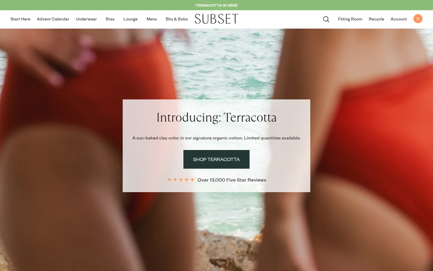
A narrow green campaign strip sits above a white navigation row, with compact links, centered wordmark, and utility actions.
Hero campaign panel
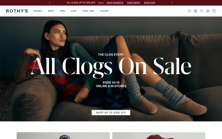
Full-width lifestyle image with a centered translucent light panel, serif headline, brief copy, dark green CTA and review proof.
Product card grid
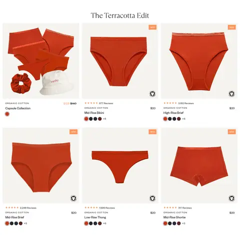
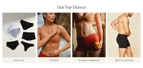
Three-column merchandise display with warm ivory card backgrounds, garment photography, concise details, colour swatches and quick-add controls.
Category tiles
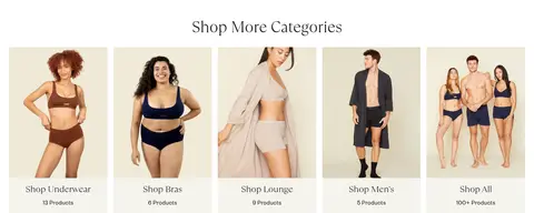
Image-led category cards with centered labels and product counts; arrange multiple cards in a single horizontal row.
Editorial split feature
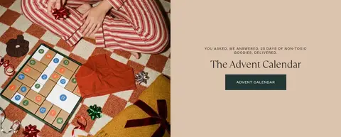
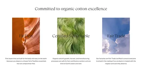
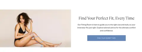
Pair a large lifestyle or campaign image with centered text and a single action on a contrasting warm panel.
Review carousel
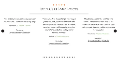
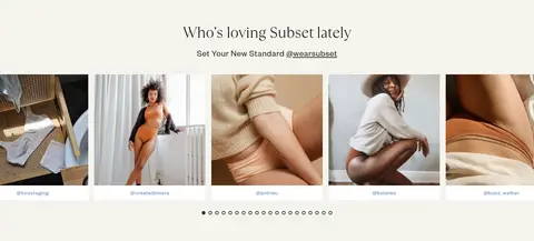
Centered serif heading, a thin divider, multiple testimonial columns, compact reviewer details and minimal pagination dots.
Newsletter signup
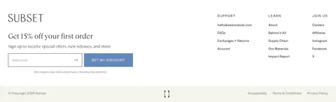
Footer signup area with a short discount headline, privacy note, email input and blue action button.
Imagery · Photography is the primary visual language: close product views show fabric and colour, while lifestyle images feature diverse models in natural poses and warm interiors. The opening hero uses a soft-focus, full-bleed campaign image behind a translucent pale text panel. Product grids use consistent, isolated garment views against warm light surfaces. Avoid illustration-led or 3D styling; let real materials and bodies provide texture.
Keep the canvas predominantly white and use ivory for quiet section or card separation.
Use the light serif face for prominent editorial headings.
Keep navigation, product information and controls in a clear sans-serif.
Let apparel and lifestyle photography provide the strongest colour.
Use blue and deep pine selectively for clear actions.
Keep cards flat, with subtle surface contrast rather than shadows.
✕ 不该做
Do not turn campaign reds from product photography into default interface colours.
Do not crowd section headings against adjacent content.
Do not use heavy shadows or raised dashboard-style cards.
Do not apply the display serif to every label and product detail.
Do not add gradients or decorative effects absent from the page.
Do not make every CTA brightly coloured or equally prominent.
给 AI 的提示词
想快速出一个同风格的新页面,把这段话连同 DESIGN.md 一起发给 AI。
Build a new Subset-style fashion storefront page with a calm editorial tone. Use Gallery White (#ffffff) as the main canvas and Linen Ivory (#f5f4ee) for soft card and section surfaces; use Soft Ink (#241f20) for readable copy. Pair TTRamillas_Light-style serif display headings with a practical FoundersGrotesk-style sans-serif for navigation, product details and controls. Lead with authentic organic-cotton lifestyle photography, then organize shopping content into clean product grids and image-led category tiles. Reserve Denim Blue (#6487ba) and Deep Pine (#233736) for clear, occasional actions; keep Apricot Signal (#ff965b) to small badges. Keep the composition flat, spacious and centered, with warm imagery, understated dividers and no ornamental shadows.