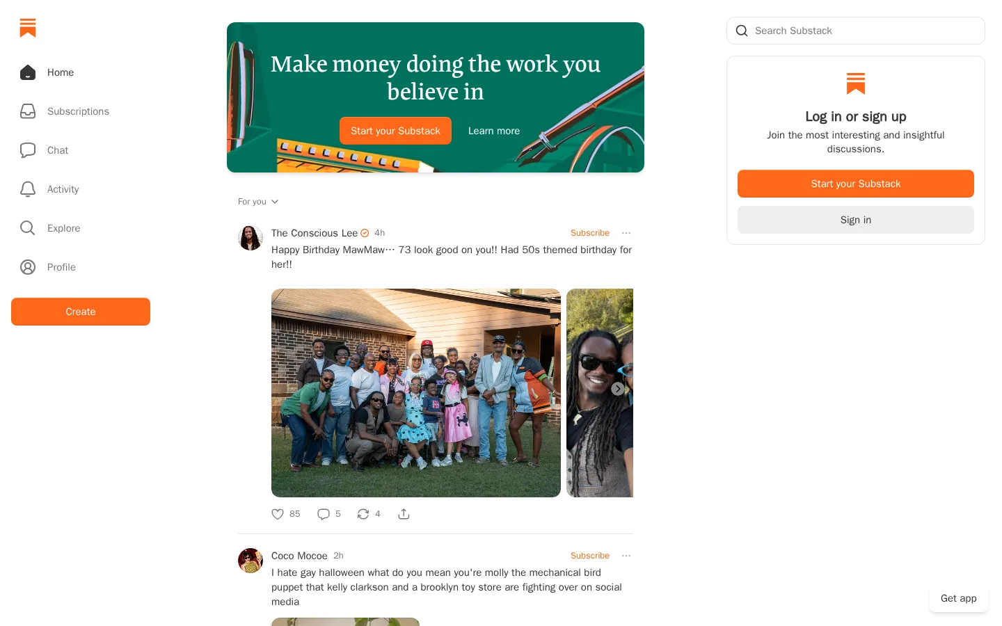
North star · Keep the interface quiet and readable so creator content leads, while orange clearly identifies the next action.
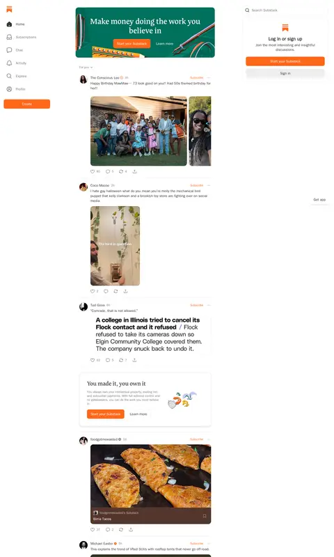
The page uses white as an expansive canvas, letting the central feed and its varied creator posts carry the visual interest. Warm orange (#ff6719) marks high-intent actions such as Create, Subscribe, and onboarding buttons, while charcoal text and muted gray metadata keep the interface legible without competing with post media. System sans-serif handles navigation, labels, and feed copy; a distinctive serif display face gives promotional headlines and selected editorial cards a publishing-oriented tone. The desktop composition separates a narrow left navigation rail, a centered content stream, and a right-side search and sign-up area, with generous whitespace around these zones. Feed items are divided by delicate gray hairlines rather than heavy containers. Photography, video, and publication-cover previews appear in varied aspect ratios, framed as creator content rather than as a unified campaign. Rounded promotional panels and pill-shaped primary actions soften the otherwise quiet, flat interface.
Navigation, body copy, labels, metadata, links, and buttons throughout the interface.
Aa 设计
-apple-system-ui-serif
系统字体 · 字重 400 · 占比 10%
免费替代:Literata
System serif fallback for editorial or promotional display text.
Aa 设计
Cahuenga
网络字体 · 字重 500 · 占比 5%
免费替代:Literata
Promotional hero and selected large editorial headings.
角色
示例
字号
字重
行高
字距
一级标题
Centered promotional banner headline, set in a distinctive serif display face.
Substack
32px
500
1.24
0
二级标题
Secondary promotional headings and editorial card titles.
The quick brown fox 敏捷的狐狸
24px
500
1.25
0
三级标题
Emphatic content or card headings, using a heavy sans-serif treatment.
The quick brown fox 敏捷的狐狸
20px
800
1.2
0
正文
Feed post text, descriptions, and supporting promotional copy.
The quick brown fox 敏捷的狐狸
15px
400
1.4
0
辅助文字
Timestamps, post details, and compact supporting labels.
The quick brown fox 敏捷的狐狸
13px
400
1.31
0
按钮
Primary action labels such as Create and Start your Substack.
The quick brown fox 敏捷的狐狸
15px
600
1.33
0
导航
Left-rail navigation labels and menu items.
The quick brown fox 敏捷的狐狸
15px
500
1.33
0
链接
Creator names, Subscribe actions, and inline navigation links.
The quick brown fox 敏捷的狐狸
15px
500
1.33
0
间距与布局
基准单位 8px · 密度:适中
—版块间距
8px元素间距
—卡片内边距
—内容最大宽度
4px
6px
8px
12px
16px
20px
24px
32px
A desktop three-zone composition places a compact navigation rail on the left, the main feed in a centered column, and search plus account onboarding on the right. The measured page is long and feed-led, with promotional banners interspersed among creator posts. Headings in the banner are centered; feed content is mostly left-aligned. Whitespace separates the rails and content rather than enclosing the whole page in a dense grid. Feed rhythm alternates text, media, engagement controls, thin dividers, and occasional promotional cards.
圆角与层次
按钮 · 9999px
输入框 · 12px
卡片 · 12px
图片 · 12px
导航 · 12px
链接 · 50%
inset · button
md · card, button
The interface is mostly flat: feed entries rely on whitespace and thin #e5e5e5 dividers rather than raised cards. Search and sign-up panels have subtle borders, and promotional cards may use a light shadow to separate them from the canvas. Primary buttons use rounded shapes and a restrained inset highlight rather than dramatic depth.
组件
下面的预览按实测的按钮、输入框、徽标、卡片样式重建(字体用替代字体)。
Left navigation rail
Vertical icon-and-label navigation on white; muted gray labels contrast with the darker active item, with an orange Create button below.
Creator feed item
Author avatar, name, time, Subscribe action, post text, media where present, and compact engagement controls; thin dividers separate entries.
Primary action button
Orange #ff6719 pill-shaped button with white, semibold system text; used for Create and account or publication calls to action.
Search field
Quiet outlined search input with a leading magnifier, charcoal text, and a rounded white surface.
Sign-up panel
Right-column bordered card with Substack mark, centered invitation copy, orange start button, and a subdued gray sign-in button.
Promotional feed card
Editorial serif heading and supporting copy paired with a small illustration or device preview; white or deep green surface with an orange action.
Imagery · Creator photography and video dominate the feed, appearing as portrait, landscape, and multi-image posts with natural, unpolished framing. Publication previews and promotional banners add designed illustrations and device mockups, but remain occasional interruptions within the stream. Images retain their own color and aspect ratios; the interface does not apply a uniform color grade or decorative overlay across ordinary posts.
Keep the page canvas white and let creator content provide color.
Use orange for clear, high-intent actions and subscription links.
Separate feed entries with fine gray rules and breathing room.
Mix serif promotional headlines with practical system sans-serif UI text.
Preserve the natural aspect ratios and varied framing of creator media.
Use muted gray for timestamps, counts, and secondary navigation.
✕ 不该做
Do not turn every feed item into a raised, heavily bordered card.
Do not use orange as a large background across ordinary feed sections.
Do not force creator photography into one uniform crop or color treatment.
Do not make metadata as prominent as author names or post copy.
Do not treat artwork-derived browns and grays as core brand colors.
Do not crowd the navigation, feed, and account panel into one dense column.
给 AI 的提示词
想快速出一个同风格的新页面,把这段话连同 DESIGN.md 一起发给 AI。
Build a new Substack-style media homepage with a quiet, white-led editorial interface. Use Gallery White (#ffffff) for the canvas, Editorial Charcoal (#363737) for primary copy, Muted Graphite (#777777) for metadata, and Quiet Rule (#e5e5e5) for delicate dividers. Reserve Substack Orange (#ff6719) for primary actions and Subscribe links; use Publication Green (#2f6d5d) only for occasional promotional panels. Create a desktop layout with a left icon-and-label navigation rail, a central creator feed, and a right search and sign-up area. Set everyday interface text in a clean system sans-serif; use a bookish serif for promotional headlines. Keep cards mostly flat, let photos and video retain varied natural framing, and intersperse promotional cards without disrupting the feed rhythm.