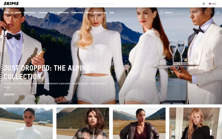
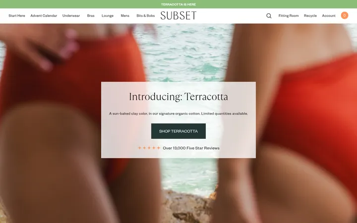
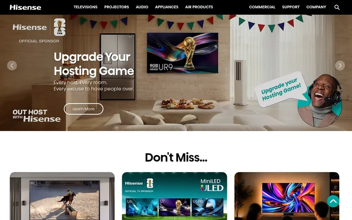
North star · Keep the interface monochrome and spacious, letting fashion photography and the contrast between oversized sans-serif and literary serif typography lead.
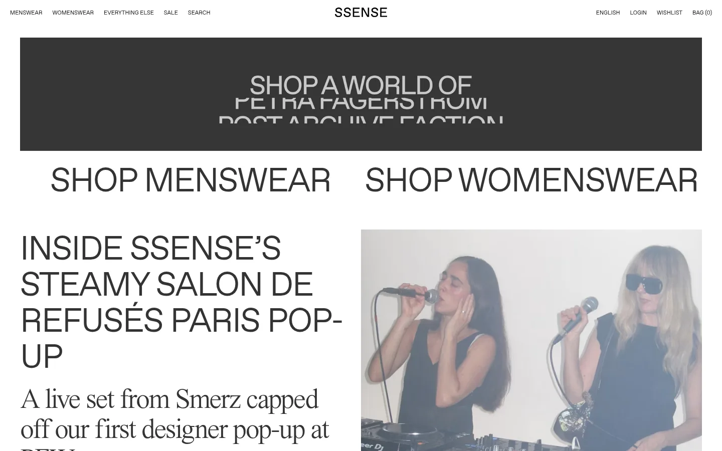
The page uses a white canvas and a quiet grayscale palette so its fashion imagery and editorial headlines carry the visual weight. A compact, uppercase navigation sits above a wide promotional banner, followed by unusually large menswear and womenswear entry links. Editorial content alternates oversized sans-serif headlines with literary serif descriptions, creating a distinctive shift between commerce and magazine storytelling. The layout is spacious but varied: split feature stories, image-card rows, product features, and broad campaign imagery break up long content feeds. Photography is presented prominently with little decorative framing; card surfaces are pale gray where present, while fine gray borders define select buttons and links. Typography relies on Favorit SSENSE variants for navigation and display text and JHA Times Now for expressive editorial copy. The overall impression is editorial, high-contrast, image-led, and deliberately flat rather than app-like.
Oversized display and uppercase sans-serif headings, including major shopping links.
Aa 设计
JHA Times Now
网络字体 · 字重 100 / 400 · 占比 31%
免费替代:Cormorant Garamond
Editorial serif headlines, descriptions, and select outlined CTA text.
Aa 设计
Favorit SSENSE Inter
网络字体 · 字重 400 · 占比 18%
免费替代:Inter
Compact uppercase navigation and small captions or metadata.
角色
示例
字号
字重
行高
字距
特大标题
Oversized uppercase shopping and campaign display headlines.
SSENSE
95px
400
0.99
-0.047em
一级标题
Large uppercase editorial story titles.
SSENSE
66.5px
400
1.08
-0.03em
二级标题
Serif-led editorial headline or story introduction.
SSENSE
56px
400
1.07
-0.04em
三级标题
Uppercase secondary feature and section headings.
SSENSE
38px
400
1.16
-0.033em
四级标题
Light uppercase subheadings and supporting labels.
SSENSE
28.5px
100
1.19
-0.018em
正文
Small uppercase supporting editorial or commerce copy.
The quick brown fox 敏捷的狐狸
14.5px
100
1.26
-0.004em
辅助文字
Compact uppercase image-card metadata and captions.
The quick brown fox 敏捷的狐狸
11px
400
1.36
0
导航
Small uppercase primary navigation and utility links.
The quick brown fox 敏捷的狐狸
11px
400
1.36
0
间距与布局
基准单位 2px · 密度:宽松
227px版块间距
20px元素间距
8px卡片内边距
1360px内容最大宽度
6px
10px
15px
20px
30px
40px
55px
64px
80px
107px
120px
121px
Use a wide desktop canvas capped at the measured 1360px page width, with full-bleed or near-full-width media within that frame. The opening sequence pairs a slim navigation row and broad banner with oversized shopping links, then shifts into asymmetrical editorial splits and multi-column image feeds. Keep generous section intervals and breathing room, while grouping related cards tightly. Align headlines to the left; let content grids and image proportions vary instead of forcing every block into one repeated template.
圆角与层次
按钮 · 10px
没有测到阴影:页面是扁平的,层次靠底色和描边区分。
The interface is predominantly flat, with no measured shadows or gradients. Separate content through white space, image placement, and pale gray surfaces rather than layered panels. Where an editorial button or card needs definition, use the measured #979797 hairline; keep card corners square and reserve the measured rounded treatment for buttons.
组件
下面的预览按实测的按钮、输入框、徽标、卡片样式重建(字体用替代字体)。
Compact global navigation
A narrow uppercase text row on white, with category and search links on the left and language, account, wishlist, and bag utilities on the right.
Promotional banner
A wide rectangular campaign area with centered uppercase messaging; let its campaign artwork supply its own tones rather than expanding the interface palette.
Shopping category links
Two oversized uppercase links for menswear and womenswear, placed side by side with ample whitespace.
Editorial feature split
Large uppercase sans-serif story title and serif dek on one side, paired with a prominent photograph on the other.
Story card feed
Image-led cards with concise uppercase metadata and serif or sans-serif story titles; organize into varied multi-column rows.
Outlined editorial button
Text-only uppercase editorial action with #333333 text, a 1px #979797 border, and a 10px radius.
Imagery · Photography is the dominant visual material: live performance, designer objects, fashion portraits, products, and cultural scenes. Images appear in large editorial splits, cropped card grids, and broad campaign banners. Keep their color and tonal character intact; the measured screenshot colors inside photographs and promotional artwork are not additional interface palette colors. Avoid decorative filters or heavy framing.
Keep the main interface palette strictly grayscale.
Use oversized uppercase sans-serif for high-priority shopping and editorial headlines.
Contrast sans-serif display text with literary serif story copy.
Give photography prominent space and preserve its original treatment.
Build editorial rows with varied splits and image-led card grids.
Use fine gray hairlines only where a control needs definition.
✕ 不该做
Do not add bright interface accent colors.
Do not turn the page into a uniform, tightly packed product grid.
Do not add shadows, gradients, or elevated card stacks.
Do not replace editorial hierarchy with generic marketing copy blocks.
Do not use rounded corners on standard image cards.
Do not make the navigation visually compete with the feature content.
给 AI 的提示词
想快速出一个同风格的新页面,把这段话连同 DESIGN.md 一起发给 AI。
Build a new luxury fashion editorial-commerce page in the SSENSE visual style. Use Gallery White (#ffffff) as the canvas, Editorial Charcoal (#333333) for story text, Navigation Ink (#000000) for compact navigation, Soft Fog (#f4f4f4) for occasional quiet surfaces, Quiet Silver (#979797) for fine control borders, and Footer Ash (#888888) for subdued footer text. Set a restrained uppercase navigation above a broad campaign banner and oversized category links. Alternate asymmetric editorial features with image-rich grids; let photography dominate without interface filters. Use a Favorit/Inter-like sans-serif for navigation and large uppercase headings, contrasted with a Times Now-like serif for editorial descriptions. Preserve generous whitespace and a flat presentation; use hairlines instead of shadows, and reserve rounded corners for outlined buttons.