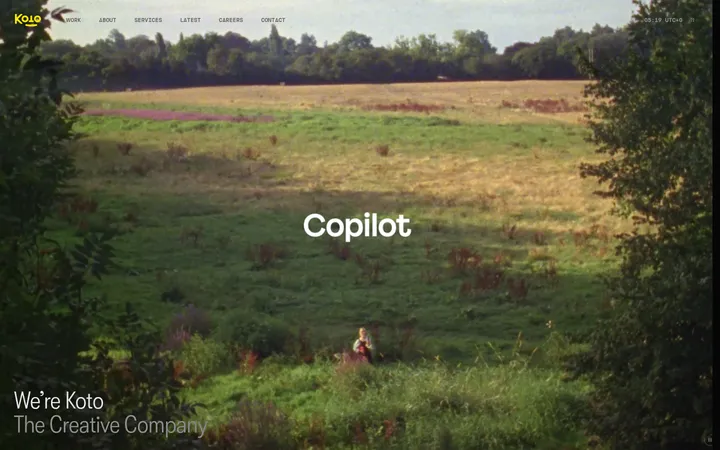
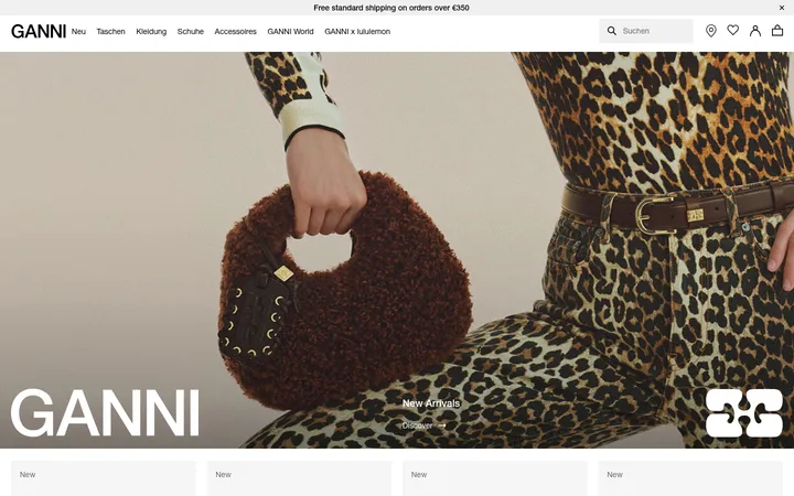
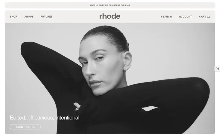
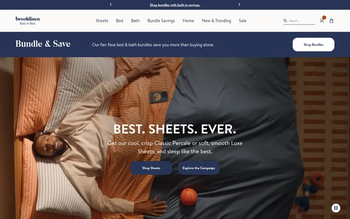
North star · Let honest product and lifestyle photography carry the colour, while typography, white space, and quiet retail structure stay restrained.
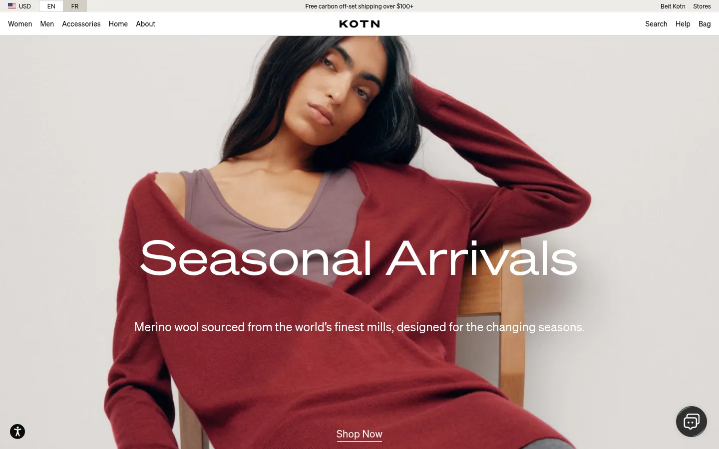
The visual system is built on a clean white canvas (#ffffff) and near-black typography (#000000, #030302), letting garment and home photography supply most of the page’s colour. Full-bleed campaign panels carry large, light-weight white headlines and understated supporting copy over carefully composed imagery. Product collections return to white, with centered headings, compact labels, and horizontally arranged merchandise imagery. A warm light-neutral footer (#edece8) provides a clear tonal close. Kotn Sohne is used throughout in a calm, unembellished sans-serif voice; the Breit cut is reserved for display-scale campaign text. Layout alternates immersive editorial imagery with measured shopping grids, category tiles, and a mission-led split section. Hairline borders and inset separators define controls and navigation without heavy card framing. Accent colours are sparse: deep burgundy and olive appear on small product controls, while orange is limited to text details.
Default family for navigation, headings, body copy, product labels, links, and controls.
Aa 设计
Kotn Sohne Breit
网络字体 · 字重 400 · 占比 2%
免费替代:Manrope
Oversized campaign display headings, especially full-bleed hero titles.
角色
示例
字号
字重
行高
字距
特大标题
Oversized titles over full-bleed seasonal and home campaign imagery.
Kotn
96px
400
1.2
0.01em
一级标题
Primary page or campaign heading where a large standalone heading is needed.
Kotn
64px
400
1.1
0.01em
二级标题
Collection and major section headings, centered or aligned to content.
Kotn
40px
400
1.1
0.013em
三级标题
Secondary collection headings and prominent editorial statements.
Kotn
32px
400
1.3
-0.031em
四级标题
Subsection titles and supporting promotional headings.
The quick brown fox 敏捷的狐狸
24px
400
1.5
0
正文
Campaign descriptions, mission copy, and general explanatory text.
The quick brown fox 敏捷的狐狸
14px
400
1.71
0
辅助文字
Compact product details, utility labels, and small supporting metadata.
The quick brown fox 敏捷的狐狸
12px
400
1
0.01em
按钮
Short action labels in retail controls and promotional actions.
The quick brown fox 敏捷的狐狸
14px
400
1.5
0
导航
Primary category and utility navigation links.
The quick brown fox 敏捷的狐狸
14px
400
1.14
0.01em
链接
Text actions such as Shop Now, Explore Our World, and footer links.
The quick brown fox 敏捷的狐狸
14px
400
1.5
0.01em
间距与布局
基准单位 4px · 密度:适中
80px版块间距
12px元素间距
—卡片内边距
1408px内容最大宽度
4px
5px
8px
12px
16px
32px
48px
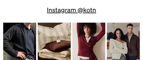
The homepage uses a centered, wide desktop composition with a measured page maximum of 1408px. A compact announcement strip and primary navigation precede a full-bleed hero. Below, centered collection headings introduce horizontally dense product rows; category imagery forms a three-column band. Large campaign panels reset the rhythm, followed by a two-column impact section and a four-image social gallery. Comfortable spacing and pronounced section breaks keep the long page from feeling crowded.
圆角与层次
按钮 · 50%
导航 · 1px
inset · button
inset · button
inset · nav
hairline · link
The page is mostly flat, with no prominent floating cards or dramatic shadows. Fine inset hairlines in warm greige divide navigation and selected controls; links use a subtle underline treatment. Product tiles rely on imagery and spacing rather than raised surfaces, while campaign text layers directly over photographs.
组件
下面的预览按实测的按钮、输入框、徽标、卡片样式重建(字体用替代字体)。
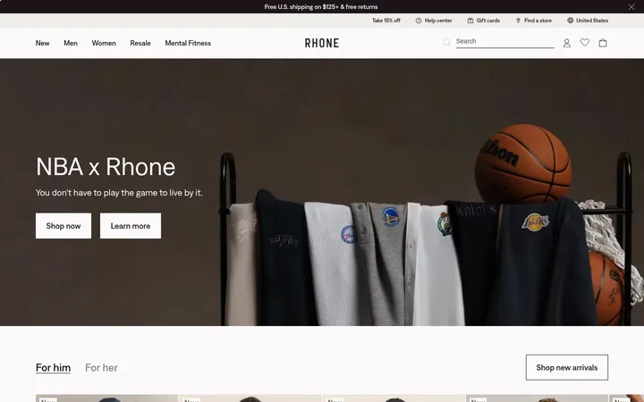
Utility and primary navigation
Thin utility announcement above a white main navigation row, with category links at left, centered Kotn wordmark, and search, help, and bag actions at right.
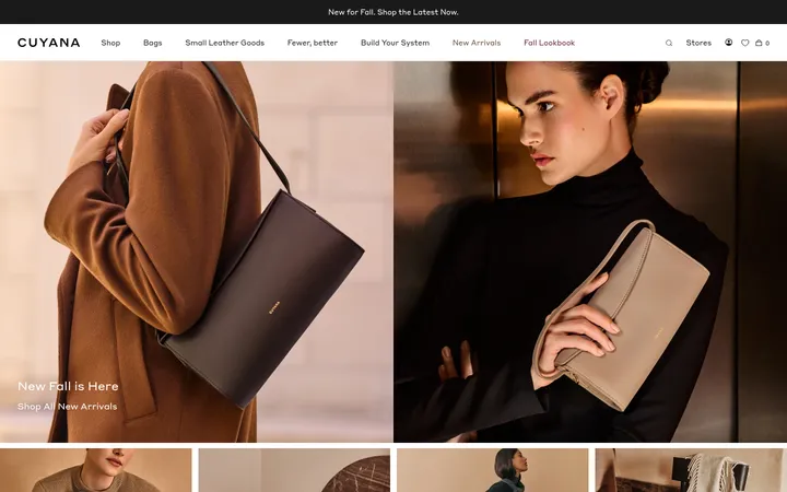
Full-bleed campaign hero
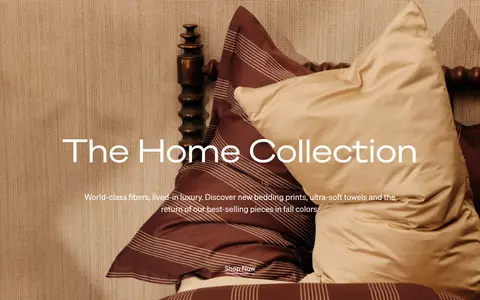
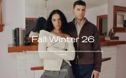
Edge-to-edge fashion photograph with a large centered white display heading, concise supporting copy, and an understated underlined Shop Now link.
Product collection carousel
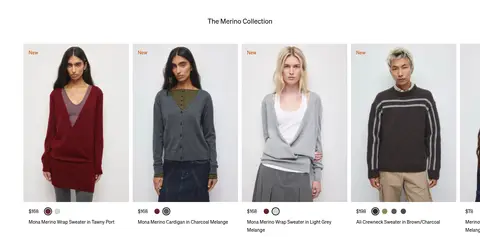
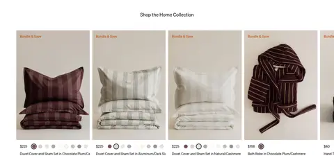
Centered collection heading above a dense horizontal product row with pale image backgrounds, compact price and name details, and small colour-option dots.
Category image tiles
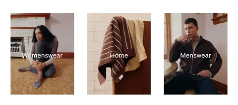
Three adjacent lifestyle photographs for Womenswear, Home, and Menswear, each with centered white category text.
Impact feature split
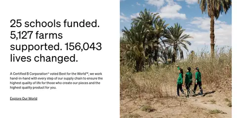
Left-aligned sustainability statistics and supporting copy paired with a large documentary photograph on the right.
Instagram gallery
Centered, underlined Instagram heading followed by a row of four closely spaced lifestyle and product photographs.
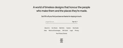
Newsletter and footer
Warm stone footer with centered brand statement, signup message and email field, followed by grouped text links and certification mark.
Imagery · Photography is the primary visual material: fashion portraits, knitwear, bedding, home textiles, and supply-chain imagery. Campaign photographs run edge to edge with centered white copy layered over them; product imagery is presented in clean, pale cards with little surrounding decoration. Category tiles use full-image crops and centered text. The imagery feels natural and tactile rather than heavily graphic or illustrative.
Use white as the default canvas and reserve warm stone for the footer.
Let full-width photography anchor campaign sections.
Use large, light campaign headlines with concise supporting copy.
Keep product labels compact and secondary to the product imagery.
Use hairline separators instead of heavy card borders.
Keep burgundy and olive accents limited to small product controls.
✕ 不该做
Do not add gradients or decorative colour fields.
Do not turn product cards into raised, shadow-heavy panels.
Do not use saturated accents as large interface surfaces.
Do not crowd campaign photography with extra interface elements.
Do not replace the spacious editorial rhythm with dense content blocks.
Do not use bold, all-caps display typography.
给 AI 的提示词
想快速出一个同风格的新页面,把这段话连同 DESIGN.md 一起发给 AI。
Build a fashion retail page with Kotn’s restrained editorial character. Use Gallery White (#ffffff) as the main canvas, True Ink (#000000) for primary copy, and Soft Black (#030302) for fine interface details. Use Linen Stone (#edece8) only for a warm footer or quiet surface; keep Warm Greige (#d3cec5) to hairlines. Reserve Merino Burgundy (#68242d), Rust Thread (#bd4800), and Olive Stitch (#898c55) for sparse product-level accents. Set most text in a clean regular sans-serif, with an airy display face for oversized campaign headings. Alternate full-bleed lifestyle photography with simple product rows, image-led category tiles, and a mission-focused split section. Keep controls understated, borders thin, and spacing generous; avoid gradients, heavy shadows, and ornamental UI.