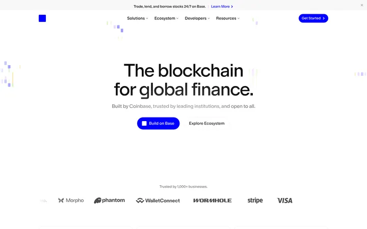
North star · Keep the interface calm and legible on white, reserving Coinbase blue for decisive actions and letting product imagery provide the visual drama.
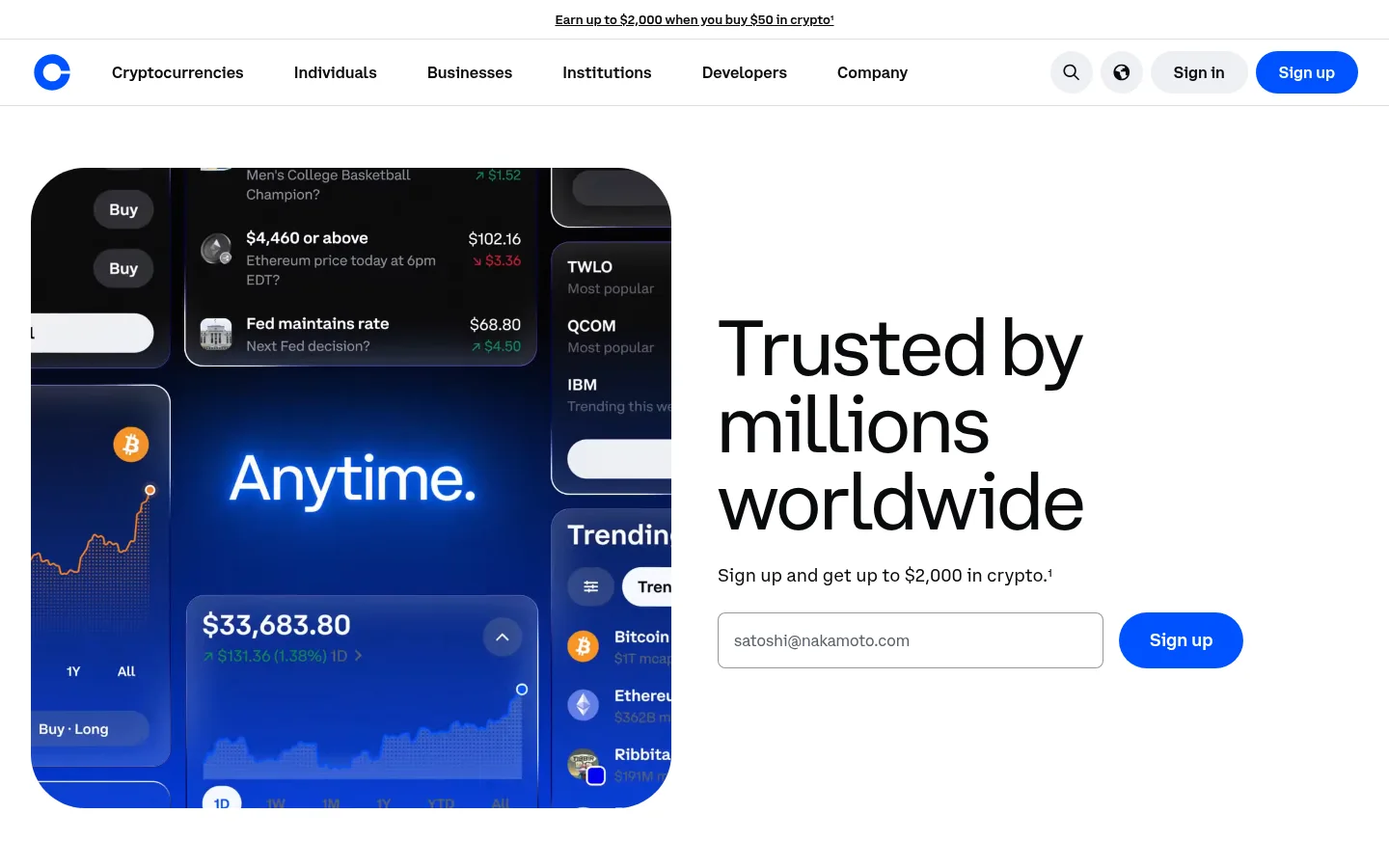
The page builds trust through a predominantly white canvas, near-black text, and restrained use of Coinbase blue for key conversion actions. Pale gray section bands break up the long homepage without competing with its content; a nearly black campaign panel introduces a focused dark interlude. Typography is clean and sans-serif, with large, regular-weight display headings and compact supporting text. The layout alternates spacious feature splits with product-led cards, keeping text and interface imagery easy to scan. Rounded media frames and pill-shaped buttons soften the financial subject matter. Product imagery carries richer blues, greens, and chart details, but these colors belong to the screens and illustrations rather than the core interface palette. Hairline borders organize navigation, cards, and controls; the overall treatment is flat, with separation coming from tonal contrast and generous whitespace rather than shadows.
Navigation, prominent headings, and button labels.
Aa 设计
CoinbaseDisplay
网络字体 · 字重 400 · 占比 5%
免费替代:DM Sans
Large display headings and feature-section titles.
角色
示例
字号
字重
行高
字距
特大标题
Oversized hero-scale promotional or campaign heading.
Coinbase
80px
400
1
0
一级标题
Primary page headline; measured family is an icon font, so verify actual rendered text.
Coinbase
64px
400
1
0
二级标题
Major feature and promotional section headings.
Coinbase
52px
400
1
0
三级标题
Feature titles and supporting section headings.
Coinbase
44px
400
1.09
0
四级标题
Smaller feature titles and card headings.
Coinbase
36px
400
1.11
0
正文
Compact descriptions, disclosures, and explanatory copy.
The quick brown fox 敏捷的狐狸
13px
400
1.54
0
导航
Top-level navigation labels and prominent controls.
The quick brown fox 敏捷的狐狸
16px
600
1.25
0
链接
Inline learn-more links and footer navigation.
The quick brown fox 敏捷的狐狸
13px
400
1.54
0
间距与布局
基准单位 8px · 密度:适中
48px版块间距
16px元素间距
—卡片内边距
1376px内容最大宽度
4px
8px
12px
16px
24px
32px
48px
80px
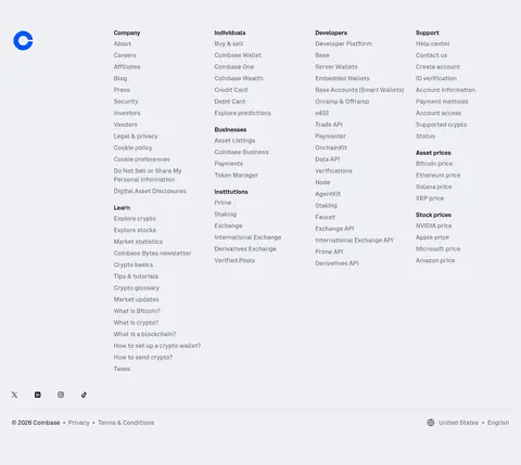
The homepage uses a wide, centered content area with a measured maximum width of 1376px and comfortable density. The first viewport pairs a large rounded product visual with a left-aligned headline and sign-up form. Farther down, alternating feature splits swap image and copy placement, while pale bands and a dark campaign panel reset the rhythm. Sections have generous vertical separation; text stays aligned to the start rather than centered. The footer becomes a dense multi-column directory, contrasting with the open promotional sections.
圆角与层次
按钮 · 9999px
卡片 · 56px
导航 · 9999px
链接 · 40px
没有测到阴影:页面是扁平的,层次靠底色和描边区分。
The interface is mostly flat: measured shadow styles are absent. Use fine neutral borders and tonal differences between white, pale-gray, and dark section surfaces to establish hierarchy. Rounded media and card frames provide the strongest sense of containment; avoid adding strong drop shadows or layered effects.
组件
下面的预览按实测的按钮、输入框、徽标、卡片样式重建(字体用替代字体)。
Primary sign-up button
Blue pill-shaped action with white semibold CoinbaseSans text; measured variants use generous horizontal padding.
Dark feature CTA
Near-black pill button with white semibold text, used for feature actions such as getting started or learning more.
Email sign-up field
Plain white, lightly bordered input with dark CoinbaseSans text, aligned beside the blue sign-up action.
Rounded product card
Large image or interface card using pale gray or near-black surfaces and strongly rounded corners.
Top navigation
White horizontal bar with a fine divider, bold dark navigation labels, compact utility controls, and a blue sign-up action.
Feature split
Left-aligned copy paired with a rounded product visual; alternate sides between successive feature sections.
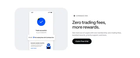
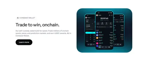
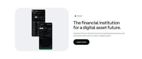
Imagery · Product interface screenshots and app mockups are the dominant imagery, framed in large rounded rectangles. Trading panels introduce saturated blue chart details against dark screens; wallet and membership visuals add device imagery. Supporting illustrations use brighter colors but sit inside restrained card layouts. Treat these vivid hues as content within product artwork, not as a replacement for the white, ink, and blue interface palette.
Reserve Coinbase Blue (#0052ff) for high-priority actions.
Set headings in clean, regular-weight sans-serif type.
Use Carbon Ink (#0a0b0d) for strong text and dark CTAs.
Alternate feature copy and product imagery to sustain page rhythm.
Use pale gray or dark section bands to separate content groups.
Keep product screens inside rounded media frames.
✕ 不该做
Do not turn illustration colors into global interface accents.
Do not add pronounced shadows to otherwise flat components.
Do not center every heading or feature block.
Do not make every section dark or heavily saturated.
Do not use blue buttons for low-priority links.
Do not crowd the spacious feature sections with unnecessary UI.
给 AI 的提示词
想快速出一个同风格的新页面,把这段话连同 DESIGN.md 一起发给 AI。
Build a new Coinbase-style page with Gallery White (#ffffff) as the main canvas, Carbon Ink (#0a0b0d) for headlines and body emphasis, and Coinbase Blue (#0052ff) reserved for the primary action. Use a clean sans-serif hierarchy: large regular display headings, compact readable supporting copy, and semibold navigation or button labels. Structure content as spacious, left-aligned feature splits with rounded product screenshots, alternating image placement. Use Cloud Gray (#eef0f3) and Frost Card (#f7f8f9) for occasional section and card contrast, with Night Panel (#141519) only for a focused dark feature. Keep controls pill-shaped, borders quiet, and shadows absent or restrained. Treat saturated colors inside mockups as artwork, not global brand colors. Preserve a calm, legible, product-led tone.