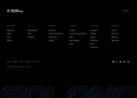
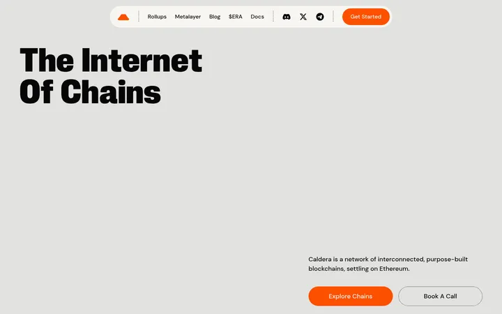
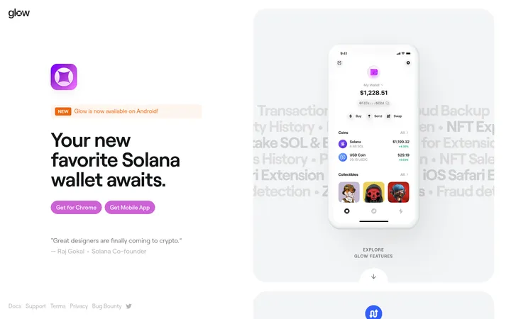
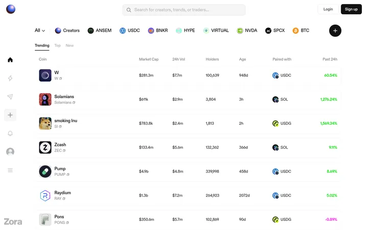
North star · Let crisp white editorial typography and meaningful content lead on a black canvas, with color reserved for vivid media and clear action.
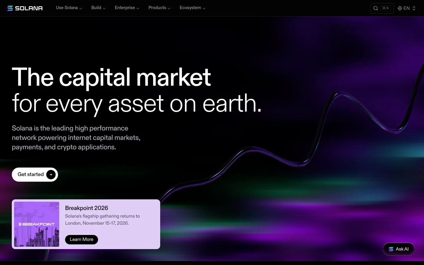
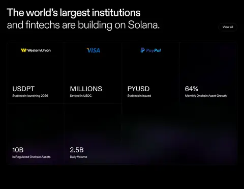
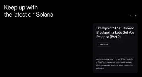
The page is built on a nearly uninterrupted black canvas, with subtle charcoal surfaces and hairline dividers separating long, spacious sections. White headlines carry the hierarchy; muted lavender-gray copy recedes without losing legibility. Diatype’s light, tightly tracked display styles give the hero and section titles an editorial, high-impact feel, while the small monospace eyebrow adds a technical counterpoint. The opening composition sets large left-aligned type against an abstract, luminous market-line visual in violet, teal, and green. Below, event cards, partner marks, metrics, news, and community actions create a proof-led story rather than a conventional feature catalog. Content grids are broad and modular, with generous dark negative space around key sections. Cards stay mostly flat, relying on subtle surface shifts and fine borders; rounded pill buttons provide the clearest interaction cue.
配色
点色块复制色值。用途说明来自对页面的实测位置(背景、文字、描边、按钮)与截图判读。
品牌色
强调色
表层色
中性色
页面底色 · Deep Canvas表层 · Charcoal Field表层 2 · Night Gradient表层 3 · Graphite Rule主文字 · Signal White次要文字 · Lavender Haze弱文字 · Soft Silver描边 · Graphite Rule
Display, headings, body copy, buttons, links, and navigation.
Aa 设计
DSemi
网络字体 · 字重 400 / 700 · 占比 1%
免费替代:IBM Plex Mono
Technical eyebrow labels and small uppercase metadata.
角色
示例
字号
字重
行高
字距
特大标题
Oversized hero messaging and prominent brand statements.
Solana
88px
300
1
-0.03em
一级标题
Primary page headline and major first-level title.
Solana
64px
300
1.13
-0.04em
二级标题
Uppercase section labels or strong section-level headings.
Solana
40px
300
1
0
三级标题
Editorial section titles and prominent card headings.
Solana
36px
500
1.22
-0.03em
四级标题
Card titles and supporting subsection headings.
The quick brown fox 敏捷的狐狸
24px
500
1.33
-0.02em
正文
Introductory descriptions and primary explanatory copy.
The quick brown fox 敏捷的狐狸
20px
500
1.5
-0.01em
辅助文字
Event details and secondary supporting text.
The quick brown fox 敏捷的狐狸
18px
400
1.33
-0.01em
按钮
Primary and secondary button labels.
The quick brown fox 敏捷的狐狸
18px
500
1.33
-0.01em
链接
Inline links and low-emphasis navigation items.
The quick brown fox 敏捷的狐狸
15px
400
1.5
0
眉题
Compact uppercase technical labels and metadata.
The quick brown fox 敏捷的狐狸
11px
400
2.18
0.16em
间距与布局
基准单位 4px · 密度:紧凑
40px版块间距
8px元素间距
32px卡片内边距
1360px内容最大宽度
2px
4px
6px
8px
10px
12px
14px
16px
24px
28px
32px
40px
48px
The page uses a broad, centered content area with a measured maximum width of 1360px, while select hero and media sections run full bleed. Most sections align content to the left and shift between open editorial compositions and modular multi-column grids. The measured spacing system is compact, but the screenshot uses generous dark negative space to separate major stories. Use fine horizontal rules to mark transitions; cards and logo rows sit within the wider grid rather than forming a uniformly boxed dashboard.
圆角与层次
按钮 · 9999px
卡片 · 12px
图片 · 4px
导航 · 4px
链接 · 12px
inset · button
inset · button
The overall interface is flat, with no strong page-wide drop shadows. Use charcoal surface changes and thin graphite borders to distinguish cards and controls. Pill buttons are the main elevated-feeling controls; retain their subtle inset highlight rather than adding prominent card shadows or layered panels.
组件
下面的预览按实测的按钮、输入框、徽标、卡片样式重建(字体用替代字体)。
Primary action
White pill-shaped Get started button with black text; it is the clearest filled control on the dark page.
Outline action
White-label pill button with a fine dark-gray outline, used for Learn more and View all actions.
Event card
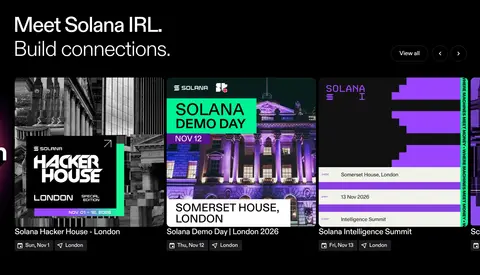
Image-led event panel with a clear title, muted supporting copy, and a compact secondary action.
Metric panel
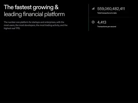
Large numeric network proof points grouped in a restrained dark layout with thin separating rules.
Logo strip
A horizontal row of partner marks on black, kept visually lighter than headline content.
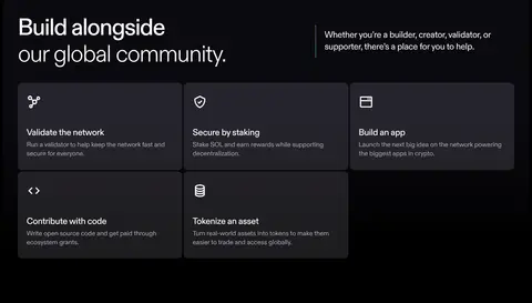
Community tiles
Dark charcoal action cards for validators, staking, apps, code, and tokenization; use a small icon and concise copy.
Global navigation
Compact dark header with Solana branding, text-based menu groups, and understated search and language utilities.
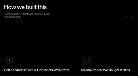
Imagery · The hero pairs its headline with a full-width abstract market visualization: a dark field crossed by a glowing, wave-like line and violet, teal, and green light. Event and editorial areas use image-led cards, while partner logos and network graphics supply ecosystem proof. Keep media dark and atmospheric, with vivid color concentrated inside artwork rather than applied as broad interface fills.
Keep the main canvas near-black and visually continuous.
Use white for headlines and high-priority actions.
Reserve muted gray for supporting text and utility links.
Let abstract violet and teal color live mainly in imagery.
Separate long sections with subtle hairlines and negative space.
Use pill shapes for key buttons and restrained corner rounding for cards.
✕ 不该做
Do not turn every section into a bordered card grid.
Do not use bright color as a broad interface background.
Do not let supporting text compete with the headline.
Do not add heavy shadows or glossy, stacked surfaces.
Do not center every section; preserve the left-aligned editorial rhythm.
Do not use monospace for general body copy.
给 AI 的提示词
想快速出一个同风格的新页面,把这段话连同 DESIGN.md 一起发给 AI。
Build a new Solana-style page on a near-black Deep Canvas (#000000), using Signal White (#ffffff) for dominant headings and actions and Lavender Haze (#ababba) for supporting copy. Use Diatype or a close sans-serif such as Inter for the editorial hierarchy; keep DSemi-like monospace labels sparse. Make the layout broad and left-aligned, with a strong opening statement, dark negative space, and clear section transitions marked by subtle Graphite Rule (#1d1c1f) lines. Use dark surfaces like Night Gradient (#0b0a10) and Charcoal Field (#121212) selectively for cards. Keep controls simple: a white filled pill for the primary action and fine outlined pills for secondary actions. Put vivid violet, teal, or green effects in artwork, not large UI fills. Favor flat compositions and useful content over decoration.