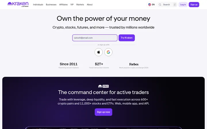
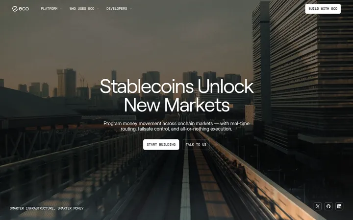
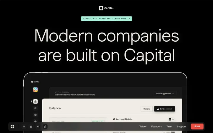
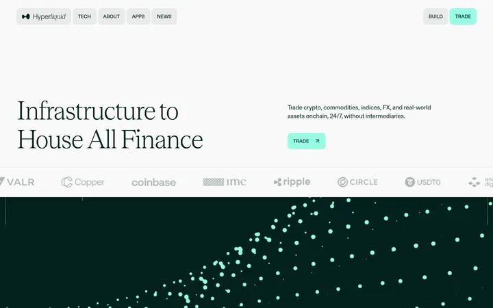
North star · Keep the near-black page quiet and use green only to direct attention toward earning or a key assurance.
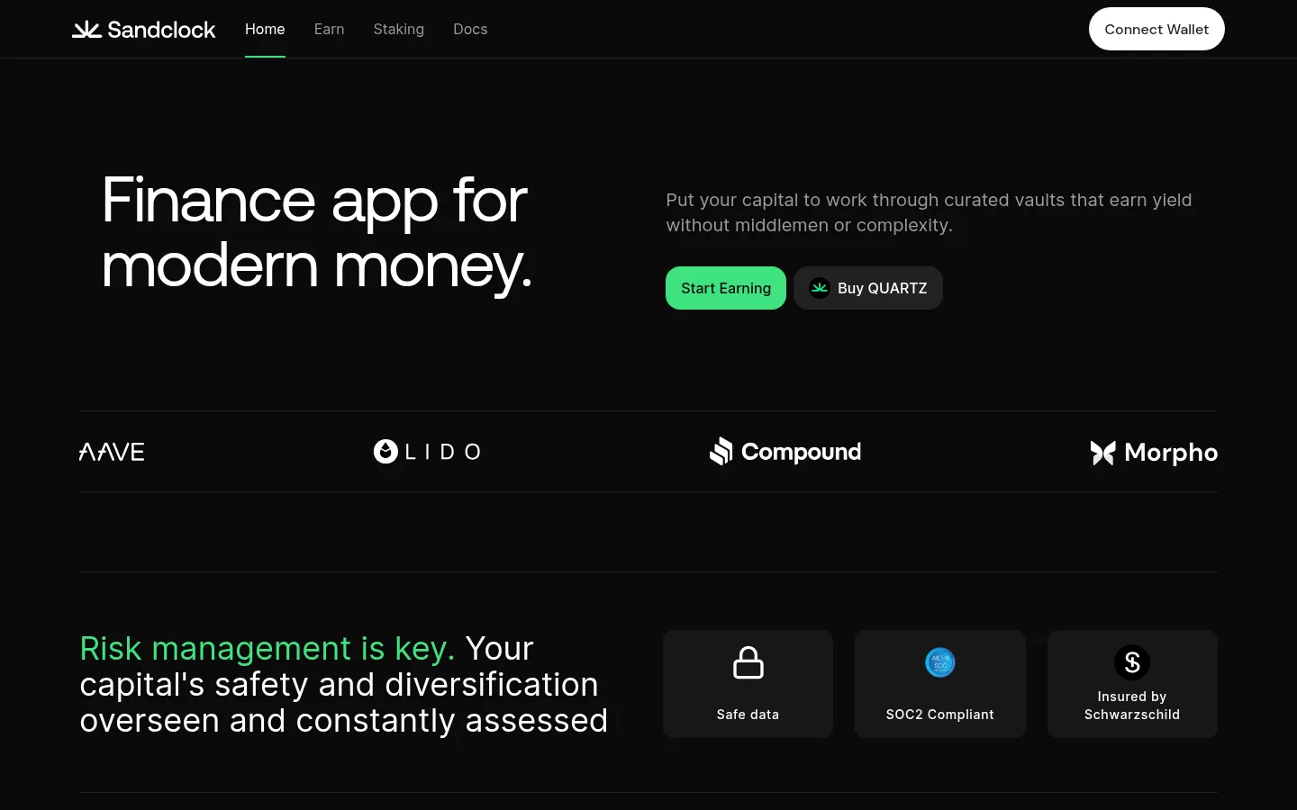
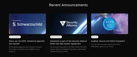
The page is built on a near-black canvas (#0a0a0a), with white typography for key messages and muted gray for navigation and supporting copy. Signal green (#3fe280) is reserved for the primary earning action and a short emphasized phrase, so it reads as a purposeful cue rather than a decorative wash. Inter carries most interface and body text; Aeonik gives the hero its large, clean display voice. The first screen uses a split hero, followed by a ruled partner-logo band and a horizontal safety feature row. Lower down, a centered announcement heading introduces three image-led cards, then a compact multi-column footer. Hairline dividers and charcoal card surfaces provide structure without bright panels or heavy shadows. Spacing feels comfortable and deliberate: generous separation around major sections offsets denser navigation, card details, and footer links. Imagery appears chiefly in announcement artwork and small security marks, while the brand identity remains typographic and restrained.
Navigation, body copy, section headings, captions, and buttons
Aa 设计
Aeonik
网络字体 · 字重 400 · 占比 3%
免费替代:Manrope
Large hero display headline
Aa 设计
DM Sans
网络字体 · 字重 500 · 占比 2%
免费替代:DM Sans
Minor interface text where detected
角色
示例
字号
字重
行高
字距
特大标题
Oversized hero headline introducing the finance product.
Sandclock
72px
400
1
-0.025em
一级标题
Primary section heading and prominent page-level message.
Sandclock
36px
400
1.11
0
二级标题
Supporting section titles and feature statements.
The quick brown fox 敏捷的狐狸
20px
400
1.4
0
正文
Explanatory copy, announcement text, and footer content.
The quick brown fox 敏捷的狐狸
16px
400
1.5
0
辅助文字
Compact announcement labels and small card metadata.
The quick brown fox 敏捷的狐狸
14px
500
1.43
0.05em
按钮
Primary and secondary action labels.
The quick brown fox 敏捷的狐狸
16px
500
1.5
0
导航
Top navigation links and related site navigation.
The quick brown fox 敏捷的狐狸
16px
400
1.5
0
间距与布局
基准单位 8px · 密度:适中
48px版块间距
8px元素间距
16px卡片内边距
1264px内容最大宽度
4px
6px
8px
12px
16px
20px
24px
32px
40px
48px
64px
80px
112px
A centered content frame uses a measured maximum width of 1264px, with wide side margins at the 1440px viewport. The hero aligns its headline left and explanatory copy with actions in a second column. A full-width partner row and safety feature split follow, then a centered announcement heading above three columns of cards. Sections are separated by thin horizontal rules and generous vertical intervals; card and footer content use tighter, more compact spacing.
圆角与层次
按钮 · 16px
卡片 · 12px
图片 · 12px
徽标 · 9999px
sm · button
The design is largely flat. Thin #222222 dividers define section edges, while #171717 surfaces distinguish assurance cards from the canvas. Cards use restrained rounding and little visual lift; the wallet control has a light surface and a subtle measured shadow. Avoid pronounced shadows, layered panels, or glossy effects.
组件
下面的预览按实测的按钮、输入框、徽标、卡片样式重建(字体用替代字体)。
Top navigation
Brand mark and compact links sit along a dark header, with the active item indicated by a short green underline and a white pill-shaped wallet action at the far right.
Hero actions
A split hero pairs a large headline with muted supporting copy. The green Start Earning button is primary; Buy QUARTZ is a dark secondary control.
Partner logo band
A single row of four partner marks is framed by subtle #222222 hairlines and evenly distributed across the content width.
Security assurances
A prominent risk statement sits beside three dark cards for safe data, SOC2 compliance, and insurance, each led by a compact icon.
Announcement cards
Three equal cards pair wide artwork with a small rounded category label, a short headline, and compact supporting copy.
Footer
A ruled, low-contrast footer groups the brand and copyright with compact legal, editorial, and social links.
Imagery · The hero includes a restrained product visual, while the partner band relies on monochrome logos. Security assurances use compact icons on dark cards. The announcement feed is the main image-led area: three wide, rounded graphic artworks sit above concise labels and copy. Treat imagery as supporting evidence, not a competing visual system; preserve the dark surroundings and avoid adding gradients or decorative imagery not shown.
Reserve #3fe280 for primary actions and brief emphasis.
Set the hero in a large Aeonik-style display face.
Use white for primary text and #9b9b9b for secondary text.
Separate major content blocks with subtle #222222 rules.
Keep cards dark, compact, and visually quiet.
✕ 不该做
Do not turn the green accent into a large background wash.
Do not introduce bright section bands or colorful gradients.
Do not make every heading oversized or display-styled.
Do not add heavy shadows or layered glass effects.
Do not let announcement art overpower its surrounding copy.
Do not replace the airy section rhythm with a dense dashboard grid.
给 AI 的提示词
想快速出一个同风格的新页面,把这段话连同 DESIGN.md 一起发给 AI。
Build a new Sandclock-style crypto finance page using Midnight Canvas (#0a0a0a) as the dominant background, Clean White (#ffffff) for primary text, and Soft Graphite (#9b9b9b) for secondary copy. Use Signal Green (#3fe280) sparingly for the main action and brief emphasis; use Boundary Charcoal (#222222) for hairline separation and Card Charcoal (#171717) for quiet feature cards. Set a large, tightly tracked Aeonik-like headline against restrained Inter-style interface typography. Keep the content in a centered wide frame, use split editorial sections, clear horizontal rules, and generous gaps between blocks. Make trust cues and concise content more prominent than decoration. Use image-led cards only where they support the story, with subdued framing and compact labels. Keep elevation low and interactions visually simple.