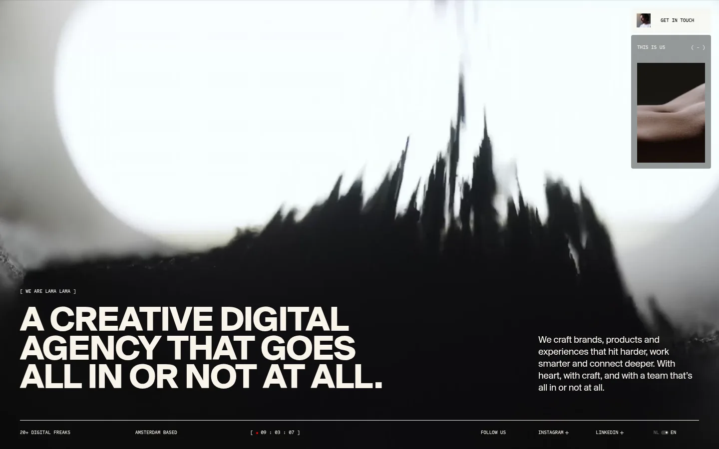
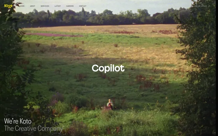
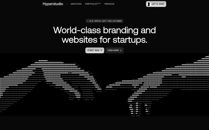
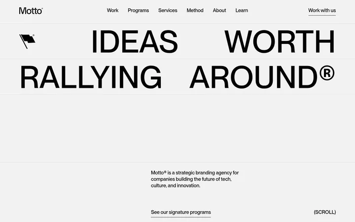
Lama Lama 首页以克制的暗色界面搭配沉浸式高对比影像。超大号大写标题与精简的功能导航共同呈现鲜明的机构个性,同时让满版视觉保持主导。
North star · Let one oversized, sharply set statement and cinematic full-bleed imagery lead; keep every control quiet and secondary.
The visual strategy is built around contrast: a near-black charcoal canvas (#1a1c1c) supports warm off-white text (#f9f4eb), while pure black (#000000) appears as a secondary surface rather than a bright accent. The first viewport is a cinematic, full-bleed video frame, with the interface and copy layered over its tonal shifts. A large, heavy uppercase headline anchors the lower-left; a short paragraph sits separately toward the lower-right, creating an editorial, asymmetric composition. SuisseBPIntl carries the prominent display voice, while Sometype handles small navigation, labels and utility copy. The type system contrasts bold scale with tiny uppercase metadata. Navigation is compact and pinned high on the right, including a small contact action and visual preview tile. A thin horizontal rule and widely distributed micro-labels close the hero. Keep spacing deliberate and compact around controls, but leave broad negative space around the primary statement.
Body copy, navigation, captions, and compact utility labels.
Aa 设计
SuisseBPIntl
网络字体 · 字重 400 / 700 · 占比 41%
免费替代:Inter
Display headline and introductory heading.
角色
示例
字号
字重
行高
字距
特大标题
Oversized all-caps hero statement.
Lama Lama
72px
700
0.8
-0.02em
一级标题
Introductory heading or supporting page headline.
The quick brown fox 敏捷的狐狸
20px
400
1.2
-0.02em
正文
Short explanatory hero paragraph.
The quick brown fox 敏捷的狐狸
16px
400
1
0
辅助文字
Small uppercase labels and metadata.
The quick brown fox 敏捷的狐狸
10px
500
1.8
-0.02em
导航
Compact uppercase navigation and contact links.
The quick brown fox 敏捷的狐狸
10px
500
1.8
-0.02em
间距与布局
基准单位 4px · 密度:紧凑
40px版块间距
4px元素间距
—卡片内边距
1360px内容最大宽度
2px
4px
8px
10px
11px
12px
16px
20px
24px
32px
40px
80px
110px
160px
Use a wide, centered composition with a measured maximum content width of 1360px. The hero fills the viewport with media, while the headline occupies the lower-left and supporting copy aligns independently on the lower-right. Keep the compact floating navigation near the top-right, distinct from the main text block. A fine horizontal rule anchors a low strip of tiny metadata and links. The measured spacing system is compact around interface details but allows substantial open areas around the headline and imagery.
圆角与层次
导航 · 4px
没有测到阴影:页面是扁平的,层次靠底色和描边区分。
The interface reads as mostly flat: no measured shadows or gradient system defines the page. Separate content through contrast, placement, and image layering rather than card elevation. Use fine rules and restrained translucent-looking navigation treatments only where visible in the screenshot; keep component edges visually quiet.
组件
下面的预览按实测的按钮、输入框、徽标、卡片样式重建(字体用替代字体)。
Floating contact navigation
Small top-right utility area with a contact link and compact visual preview; use Sometype uppercase labels and warm off-white text.
Agency statement
Oversized, bold uppercase display headline at the lower-left, set in SuisseBPIntl with tight tracking and compressed leading.
Supporting paragraph
Short body-copy block aligned separately on the lower-right to balance the large headline without forming a conventional card.
Hero metadata rail
Thin horizontal rule above a low strip of tiny uppercase labels, location details, social links, and compact status text.
Text-only action link
Use understated uppercase Sometype labels for contact and social actions; avoid filled button styling.
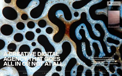
Imagery · Use full-bleed video or cinematic photographic footage as the defining surface, with high-contrast, mostly monochrome imagery and strong light-dark shapes. The first viewport shows a blurred landscape-like form; the page preview also indicates fluid, organic imagery with bright highlights. Treat the footage as a dramatic backdrop, not as a small framed card. Keep overlaid text legible against the image’s darker areas.
Use full-bleed cinematic imagery as the hero’s dominant layer.
Set the main statement in bold uppercase display type.
Keep navigation small, high-contrast, and visually secondary.
Separate headline and supporting copy into asymmetric zones.
Use Warm Chalk (#f9f4eb) for text against dark areas.
Anchor compact metadata with a fine horizontal rule.
✕ 不该做
Do not introduce bright accent colours absent from the measured palette.
Do not place the hero inside a rounded card.
Do not make utility navigation compete with the headline.
Do not use soft shadows or ornamental gradients as a defining treatment.
Do not crowd the hero statement with extra content.
Do not treat illustration-only colours in media as brand colours.
给 AI 的提示词
想快速出一个同风格的新页面,把这段话连同 DESIGN.md 一起发给 AI。
Build a new page in the Lama Lama visual style. Use Charcoal Canvas (#1a1c1c) as the underlying page ground, Warm Chalk (#f9f4eb) for high-contrast type, and True Black (#000000) only as a secondary dark surface. Lead with cinematic full-bleed video or photography; place one large, bold uppercase SuisseBPIntl-like headline in the lower-left and a concise Sometype-like paragraph in a separate lower-right zone. Keep navigation small and compact near the upper-right, with understated text-only actions and an optional visual preview tile. Finish the hero with a thin rule and a low strip of tiny uppercase metadata. Maintain an asymmetric editorial composition, quiet edges, flat surfaces, and generous breathing room around the statement. Avoid invented accent colours, decorative cards, and shadow-heavy UI.