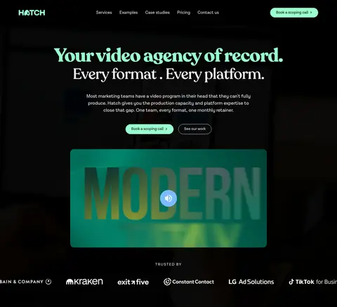
Hatch以电影感黑色画布、Recoleta大标题和醒目的薄荷绿行动按钮构成鲜明首屏。暖白内容区、视频卡片与客户案例交替呈现,让页面从服务介绍自然过渡到信任证明。
North star · Use cinematic black-and-warm-white section alternation, expressive serif headlines, and mint only for focused emphasis and primary actions.
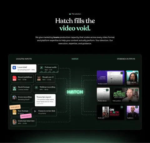
The visual strategy is built around stark alternation: black cinematic sections frame broad warm-white areas, making the page feel like an editorial portfolio rather than a conventional agency template. Mint (#99ffcc) marks primary actions and selected headline phrases, while off-white (#f5f4f0) carries the main display type and provides the light-section canvas. Recoleta supplies expressive, high-contrast serif headlines; Lota Grotes Que Alt handles navigation, body copy, labels, and controls with a restrained sans-serif voice. The hero centers its message and CTAs over dark full-bleed media, then hands off to a tiled video portfolio. Further sections use dark process graphics, numbered retainer benefits, and staggered client testimonials to vary the pace without changing the core palette. Cards are gently rounded and mostly flat, with fine borders rather than shadows. Spacious section transitions contrast with compact, information-rich media grids.
配色 点色块复制色值。用途说明来自对页面的实测位置(背景、文字、描边、按钮)与截图判读。
品牌色
Cinematic Black
#000000
Primary canvas, full-bleed hero and process sections, and dark card outlines.
强调色
Hatch Mint
#99ffcc
Primary CTA fill and selective headline or interface emphasis on dark backgrounds.
表层色
Warm Paper
#f5f4f0
Light section canvas, prominent text on black, and outlined secondary CTA.
Card White
#ffffff
Client testimonial card backgrounds and select high-contrast headings.
Night Moss
#0b0d0b
Dark service-category buttons and subtle near-black interface surfaces.
Deep Forest
#0d1b15
Dark process and comparison card surfaces within black sections.
中性色
Pale Stone
#c7c8c4
Secondary text and understated card or media details.
Charcoal Ink
#181818
Occasional heading and body text detail; subordinate to the main black and paper pairing.
功能色
Quiet Graphite
#4c4c4c
Muted text and fine badge or card borders against dark sections.
Muted Sage
#5c997a
Measured primary button border; a restrained supporting green rather than a dominant surface.
Near-Black Fade
#040404
Appears in a measured gradient; supports dark media treatment, not a distinct brand color.
Soft Ink
#1d1d1b
Readable text inside white testimonial cards and selected card content.
Border Charcoal
#2d2d2d
Fine outlines around dark comparison and content cards.
文字 背景 对比度 WCAG #f5f4f0 Warm Paper#000000 Cinematic Black19.08:1 AAA #f5f4f0 Warm Paper#ffffff Card White1.1:1 不达标 #f5f4f0 Warm Paper#0b0d0b Night Moss17.72:1 AAA #4c4c4c Quiet Graphite#000000 Cinematic Black2.45:1 不达标 #4c4c4c Quiet Graphite#f5f4f0 Warm Paper7.8:1 AAA #4c4c4c Quiet Graphite#ffffff Card White8.59:1 AAA
字体 字号阶梯:Augmented Fourth(比例约 1.38,正文 16px)。示例用免费替代字体渲染,数值为实测。
Aa 设计
Lota Grotes Que Alt 网络字体 · 字重 400 / 600 / 700 · 占比 89%
免费替代:DM Sans
Navigation, body copy, buttons, labels, badges, and supporting interface text.
Aa 设计
Recoleta 网络字体 · 字重 500 / 600 / 700 · 占比 11%
免费替代:Fraunces
Display headings, hero statements, and prominent section titles.
角色 示例 字号 字重 行高 字距 特大标题 Oversized hero statement and strongest promotional headline.
Hatch
80px 700 1.06 -0.03em 一级标题 Primary hero heading and top-level page statement.
Hatch
64px 500 1.12 -0.02em 二级标题 Major section titles, including service and testimonial headings.
Hatch
40px 500 1.2 0 三级标题 Subsection headings and individual service or benefit titles.
The quick brown fox 敏捷的狐狸
24px 500 1.5 0 四级标题 Compact card and supporting section headings.
The quick brown fox 敏捷的狐狸
20px 400 1.5 0 正文 Descriptions, navigation, testimonial copy, and button labels.
The quick brown fox 敏捷的狐狸
16px 400 1.5 0 辅助文字 Small metadata, card labels, and compact supporting details.
The quick brown fox 敏捷的狐狸
12px 400 1 0 眉题 Uppercase section labels such as service, problem, and solution.
The quick brown fox 敏捷的狐狸
16px 400 1.06 0.125em
间距与布局 基准单位 4px · 密度:适中
32px 版块间距
24px 元素间距
32px 卡片内边距
1280px 内容最大宽度
2px
6px
8px
12px
20px
24px
32px
40px
64px
128px
The page uses a centered content frame capped at the measured 1280px max width, with full-bleed media and section bands spanning the viewport. Centered hero and section introductions give way to multi-column video tiles, comparison cards, and client proof. Warm-white and black sections alternate as large visual chapters; a two-column retainer section offsets its headline from a numbered list. Overall density is comfortable: generous section breathing room balances compact, image-rich grids.
圆角与层次 没有测到阴影:页面是扁平的,层次靠底色和描边区分。
The interface is mostly flat, with no measured shadow system. Separate dark cards using subtle charcoal hairlines and light cards with clean edges; use rounded corners consistently. Media and testimonials gain depth from contrast, image content, and layered text or controls rather than floating elevation.
组件 下面的预览按实测的按钮、输入框、徽标、卡片样式重建(字体用替代字体)。
Primary CTA Mint-filled, pill-shaped button with black text and a muted sage border; use for booking a scoping call.
Outline CTA Transparent dark-section button with an off-white outline and text, used for secondary actions such as viewing work.
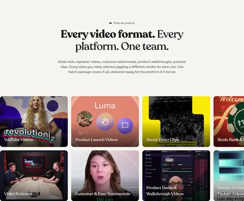
Video portfolio tile Rounded thumbnail tile with image or video content and a short overlaid category label; arrange in a dense multi-column grid.
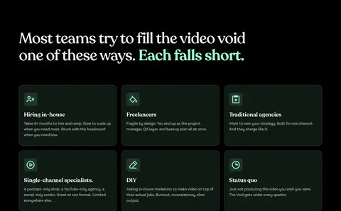
Dark comparison card Forest-dark card with a fine charcoal border, rounded corners, and compact explanatory copy for contrasting production options.
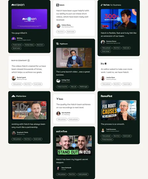
Testimonial card Rounded white card with dark copy, customer identity, compact category badges, and optional video still or logo.
Eyebrow label Small uppercase sans-serif section marker, optionally paired with a mint dot or short accent.
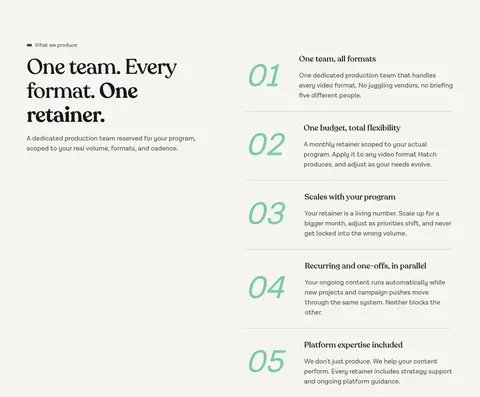
Numbered benefit row Warm-white section list pairing large mint numerals with a title and concise copy, divided by fine horizontal rules.
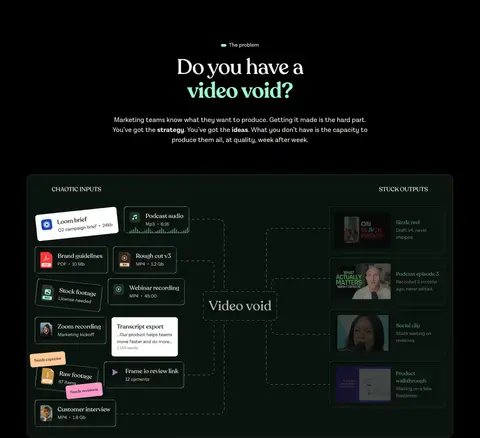
Imagery · Video is the dominant visual asset: the hero centers a large landscape player, while the portfolio uses tightly packed rounded thumbnails with overlaid labels. Process sections use dark diagram-like compositions, and testimonials mix customer portraits, company marks, and video stills. Keep embedded media visually rich and let surrounding surfaces remain restrained; vivid colors inside thumbnails belong to the content, not the brand palette.
页面版块 共 14 个版块,按页面从上到下排列,每个都标了类型、布局和交互套路。
该做与不该做 ✓ 该做 Alternate cinematic black sections with warm-paper content bands. Set display headings in Recoleta and supporting interface copy in Lota Grotes Que Alt. Reserve Hatch Mint (#99ffcc) for primary actions and selective emphasis. Keep the hero centered and let its video remain the visual anchor. Use rounded media and cards with subtle, measured borders. Let client logos, quotes, and work samples provide proof in varied grids. ✕ 不该做 Don't introduce unmeasured brand colors as interface surfaces. Don't apply mint to every heading, link, or decorative element. Don't add drop shadows or stacked floating panels. Don't flatten the page into one continuous dark or light background. Don't let thumbnail colors redefine the surrounding interface palette. Don't use generic sans-serif type for the prominent editorial headlines. 给 AI 的提示词 想快速出一个同风格的新页面,把这段话连同 DESIGN.md 一起发给 AI。
复制 Build a new Hatch-style page with an editorial, video-agency feel. Use Cinematic Black (#000000) for the hero and selected full-width story sections, alternating with Warm Paper (#f5f4f0) for service or proof content. Set prominent headlines in Recoleta or a close expressive serif; use Lota Grotes Que Alt or a clean sans-serif substitute for navigation, copy, and controls. Apply Hatch Mint (#99ffcc) sparingly to primary CTAs and key emphasis, with black CTA text. Use centered introductions, generous section transitions, and modular grids of rounded video thumbnails, dark process cards, and client testimonials. Keep card treatment flat with subtle borders, not shadows. Preserve clear contrast, concise copy, and a strong path from headline to action to visual proof.
DESIGN.md Tailwind v4 CSS 变量 Design Tokens
---
title: "Hatch design system"
variant: extended
source: https://www.hatchvideo.com/
captured_at: 2026-10-12
theme: dark
industry: agency
generator: Design DNA (https://four.wiralomi.com/style/hatch-fm)
ai_generated: true
ai_label: "本文件由 AI 辅助生成:数值取自公开网页的实测样式,命名、用途说明与建议为模型解读。商标归原所有者。 / AI-assisted content"
---
# Hatch · Design System
> Editorial storytelling, built on a dark canvas
**Theme:** dark · **Industry:** agency · **Source:** https://www.hatchvideo.com/ · **Captured:** 2026-10-12 (1440×900 desktop)
_AI-assisted content: values are measured from the public page at capture time; names, roles and guidance are model-written interpretations. Trademarks belong to their owners._
Hatch pairs a cinematic black canvas with oversized Recoleta headlines and vivid mint calls to action. Alternating warm-white content bands, video tiles, and client proof give the agency homepage a clear rhythm from pitch to evidence.
## North star
Use cinematic black-and-warm-white section alternation, expressive serif headlines, and mint only for focused emphasis and primary actions.
## Overview
The visual strategy is built around stark alternation: black cinematic sections frame broad warm-white areas, making the page feel like an editorial portfolio rather than a conventional agency template. Mint (## Colors
| Name | Hex | Token | Group | Role |
|---|---|---|---|---|
| Quiet Graphite | ` | `--color-quiet-graphite` | semantic | Muted text and fine badge or card borders against dark sections. |
| Warm Paper | ` | `--color-warm-paper` | surface | Light section canvas, prominent text on black, and outlined secondary CTA. |
| Cinematic Black | ` | `--color-cinematic-black` | brand | Primary canvas, full-bleed hero and process sections, and dark card outlines. |
| Muted Sage | ` | `--color-muted-sage` | semantic | Measured primary button border; a restrained supporting green rather than a dominant surface. |
| Card White | ` | `--color-card-white` | surface | Client testimonial card backgrounds and select high-contrast headings. |
| Near-Black Fade | ` | `--color-near-black-fade` | semantic | Appears in a measured gradient; supports dark media treatment, not a distinct brand color. |
| Soft Ink | ` | `--color-soft-ink` | semantic | Readable text inside white testimonial cards and selected card content. |
| Night Moss | ` | `--color-night-moss` | surface | Dark service-category buttons and subtle near-black interface surfaces. |
| Hatch Mint | ` | `--color-hatch-mint` | accent | Primary CTA fill and selective headline or interface emphasis on dark backgrounds. |
| Deep Forest | ` | `--color-deep-forest` | surface | Dark process and comparison card surfaces within black sections. |
| Pale Stone | ` | `--color-pale-stone` | neutral | Secondary text and understated card or media details. |
| Charcoal Ink | ` | `--color-charcoal-ink` | neutral | Occasional heading and body text detail; subordinate to the main black and paper pairing. |
| Border Charcoal | ` | `--color-border-charcoal` | semantic | Fine outlines around dark comparison and content cards. |
### Semantic aliases
`--color-canvas` → ` (Cinematic Black) · `--color-surface` → ` (Warm Paper) · `--color-surface-2` → ` (Card White) · `--color-surface-3` → ` (Night Moss) · `--color-surface-4` → ` (Deep Forest) · `--color-text` → ` (Warm Paper) · `--color-text-muted` → ` (Quiet Graphite) · `--color-text-subtle` → ` (Soft Ink) · `--color-border` → ` (Quiet Graphite) · `--color-accent` → ` (Hatch Mint) · `--color-on-accent` → ` (Cinematic Black)
### Contrast (WCAG 2.x)
| Text | Background | Ratio | Level |
|---|---|---|---|
| ` | ` | 19.08:1 | AAA |
| ` | ` | 1.1:1 | fail |
| ` | ` | 17.72:1 | AAA |
| ` | ` | 2.45:1 | fail |
| ` | ` | 7.8:1 | AAA |
| ` | ` | 8.59:1 | AAA |
| ` | ` | 2.27:1 | fail |
| ` | ` | 1.24:1 | fail |
| ` | ` | 15.34:1 | AAA |
| ` | ` | 16.88:1 | AAA |
### Gradients
- `linear-gradient(rgba(0, 0, 0, 0) 50%, rgba(0, 0, 0, 0.68) 100%)`
- `linear-gradient(135deg, rgb(210, 162, 127), rgb(93, 66, 49))`
## Typography
| Family | Token | Source | Weights | Role | Free substitute |
|---|---|---|---|---|---|
| Lota Grotes Que Alt | `--font-body` | webfont | 400, 600, 700 | Navigation, body copy, buttons, labels, badges, and supporting interface text. | DM Sans |
| Recoleta | `--font-display` | webfont | 500, 600, 700 | Display headings, hero statements, and prominent section titles. | Fraunces |
- **Lota Grotes Que Alt:** Use a clean sans-serif voice at regular weights for interface and copy; uppercase, tracked eyebrow labels contrast with sentence-case body text.
- **Recoleta:** Use expressive serif forms for large headlines, with measured tight tracking and medium-to-bold emphasis.
### Type scale — Augmented Fourth (ratio ≈ 1.38, base 16px)
| Role | Size | Weight | Line height | Letter spacing | Case | Family | Used for |
|---|---|---|---|---|---|---|---|
| display | 80px | 700 | 1.06 | -0.03em | — | Recoleta | Oversized hero statement and strongest promotional headline. |
| h1 | 64px | 500 | 1.12 | -0.02em | — | Recoleta | Primary hero heading and top-level page statement. |
| h2 | 40px | 500 | 1.2 | 0 | — | Recoleta | Major section titles, including service and testimonial headings. |
| h3 | 24px | 500 | 1.5 | 0 | — | Recoleta | Subsection headings and individual service or benefit titles. |
| h4 | 20px | 400 | 1.5 | 0 | — | Lota Grotes Que Alt | Compact card and supporting section headings. |
| body | 16px | 400 | 1.5 | 0 | — | Lota Grotes Que Alt | Descriptions, navigation, testimonial copy, and button labels. |
| caption | 12px | 400 | 1 | 0 | — | Lota Grotes Que Alt | Small metadata, card labels, and compact supporting details. |
| eyebrow | 16px | 400 | 1.06 | 0.125em | uppercase | Lota Grotes Que Alt | Uppercase section labels such as service, problem, and solution. |
## Spacing & layout
- Base unit **4px**, density **comfortable**.
- Scale (most used values): 2, 6, 8, 12, 20, 24, 32, 40, 64, 128 px.
- Section rhythm 32px · element gap 24px · card padding 32px · max content width 1280px.
The page uses a centered content frame capped at the measured 1280px max width, with full-bleed media and section bands spanning the viewport. Centered hero and section introductions give way to multi-column video tiles, comparison cards, and client proof. Warm-white and black sections alternate as large visual chapters; a two-column retainer section offsets its headline from a numbered list. Overall density is comfortable: generous section breathing room balances compact, image-rich grids.
## Shape & elevation
- Radius: button `16px` · card `16px` · media `50%` · badge `9999px` · xs `8px` · sm `16px` · pill `9999px`
- No box shadows measured: the page is flat.
- Motion: standard transition `0.4s cubic-bezier(0.645, 0.045, 0.355, 1)` on interactive elements.
The interface is mostly flat, with no measured shadow system. Separate dark cards using subtle charcoal hairlines and light cards with clean edges; use rounded corners consistently. Media and testimonials gain depth from contrast, image content, and layered text or controls rather than floating elevation.
## Imagery
Video is the dominant visual asset: the hero centers a large landscape player, while the portfolio uses tightly packed rounded thumbnails with overlaid labels. Process sections use dark diagram-like compositions, and testimonials mix customer portraits, company marks, and video stills. Keep embedded media visually rich and let surrounding surfaces remain restrained; vivid colors inside thumbnails belong to the content, not the brand palette.
## Components
### Primary CTA
Mint-filled, pill-shaped button with black text and a muted sage border; use for booking a scoping call.
### Outline CTA
Transparent dark-section button with an off-white outline and text, used for secondary actions such as viewing work.
### Video portfolio tile
Rounded thumbnail tile with image or video content and a short overlaid category label; arrange in a dense multi-column grid.
### Dark comparison card
Forest-dark card with a fine charcoal border, rounded corners, and compact explanatory copy for contrasting production options.
### Testimonial card
Rounded white card with dark copy, customer identity, compact category badges, and optional video still or logo.
### Eyebrow label
Small uppercase sans-serif section marker, optionally paired with a mint dot or short accent.
### Numbered benefit row
Warm-white section list pairing large mint numerals with a title and concise copy, divided by fine horizontal rules.
### Measured component styles
- **Primary button** (“Book a scoping call”): background ## Do
- Alternate cinematic black sections with warm-paper content bands.
- Set display headings in Recoleta and supporting interface copy in Lota Grotes Que Alt.
- Reserve Hatch Mint (## Don't
- Don't introduce unmeasured brand colors as interface surfaces.
- Don't apply mint to every heading, link, or decorative element.
- Don't add drop shadows or stacked floating panels.
- Don't flatten the page into one continuous dark or light background.
- Don't let thumbnail colors redefine the surrounding interface palette.
- Don't use generic sans-serif type for the prominent editorial headlines.
## Agent prompt
Build a new Hatch-style page with an editorial, video-agency feel. Use Cinematic Black (## Page sections (top to bottom)
| # | Type | Layout | UX patterns | UI patterns |
|---|---|---|---|---|
| 1 | hero | Full-bleed black hero with centered headline, copy, paired CTAs, and landscape video. | Primary booking CTA, Secondary work CTA, Muted video control | Mint headline emphasis, Serif display, Centered composition, Rounded media |
| 2 | gallery | Warm-paper section with centered introduction and dense, multi-column video tile grid. | Browse by video format, Media-led discovery | Warm-paper canvas, Rounded thumbnails, Overlay labels |
| 3 | integrations | Single horizontal platform strip on the warm-paper band. | Communicate platform readiness | Small uppercase caption, Monochrome platform marks |
| 4 | how-it-works | Black full-bleed section with centered title and wide process diagram. | Explain production bottleneck | Centered serif heading, Dark diagram surface, Mint emphasis |
| 5 | other | Short black spacer between adjacent dark narrative sections. | Create visual pause | Black canvas |
| 6 | comparison | Left-aligned introduction above a three-column by two-row set of dark cards. | Compare common alternatives, Surface trade-offs | Dark rounded cards, Subtle borders, Compact copy |
| 7 | how-it-works | Black section centered around a wide inputs-to-Hatch-to-outputs diagram. | Show process transformation | Dark diagram, Central brand mark, Connected media tiles |
| 8 | feature-split | Warm-paper two-column section with introduction at left and numbered benefit list at right. | Explain retainer value, Scan numbered benefits | Large mint numerals, Fine dividers, Serif section heading |
| 9 | other | Short black band separating the retainer explanation from client feedback. | Separate content chapters | Black canvas |
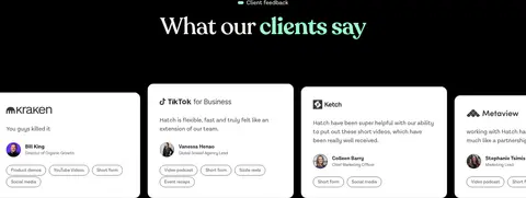
| 10 | testimonials | Black band with centered section heading above a horizontally arranged testimonial-card row. | Introduce social proof, Browse client quotes | Mint heading emphasis, White cards, Client attribution |
| 11 | other | Brief warm-paper spacer between testimonial presentation and extended client stories. | Create section pause | Warm-paper canvas |
| 12 | testimonials | Warm-paper canvas carrying a staggered, multi-column masonry-like client card grid. | Browse client stories, Scan quote and media proof | Alternating dark and white cards, Video thumbnails, Compact category badges |
| 13 | other | Short uninterrupted warm-paper band before the company logo grid. | Maintain reading rhythm | Warm-paper canvas |
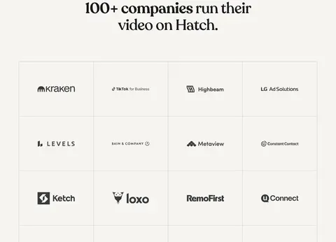
| 14 | logo-cloud | Centered heading above an evenly divided, bordered logo grid on warm paper. | Reinforce client trust | Centered serif heading, Grid hairlines, Monochrome logos |
## Source CSS custom properties (selected)
```css
--_typography---letter-spacing--normal: 0px;
--_typography---font-family--heading: Recoleta,Arial,sans-serif;
--_typography---font-weight--semi-bold: 600;
--brand--sky: