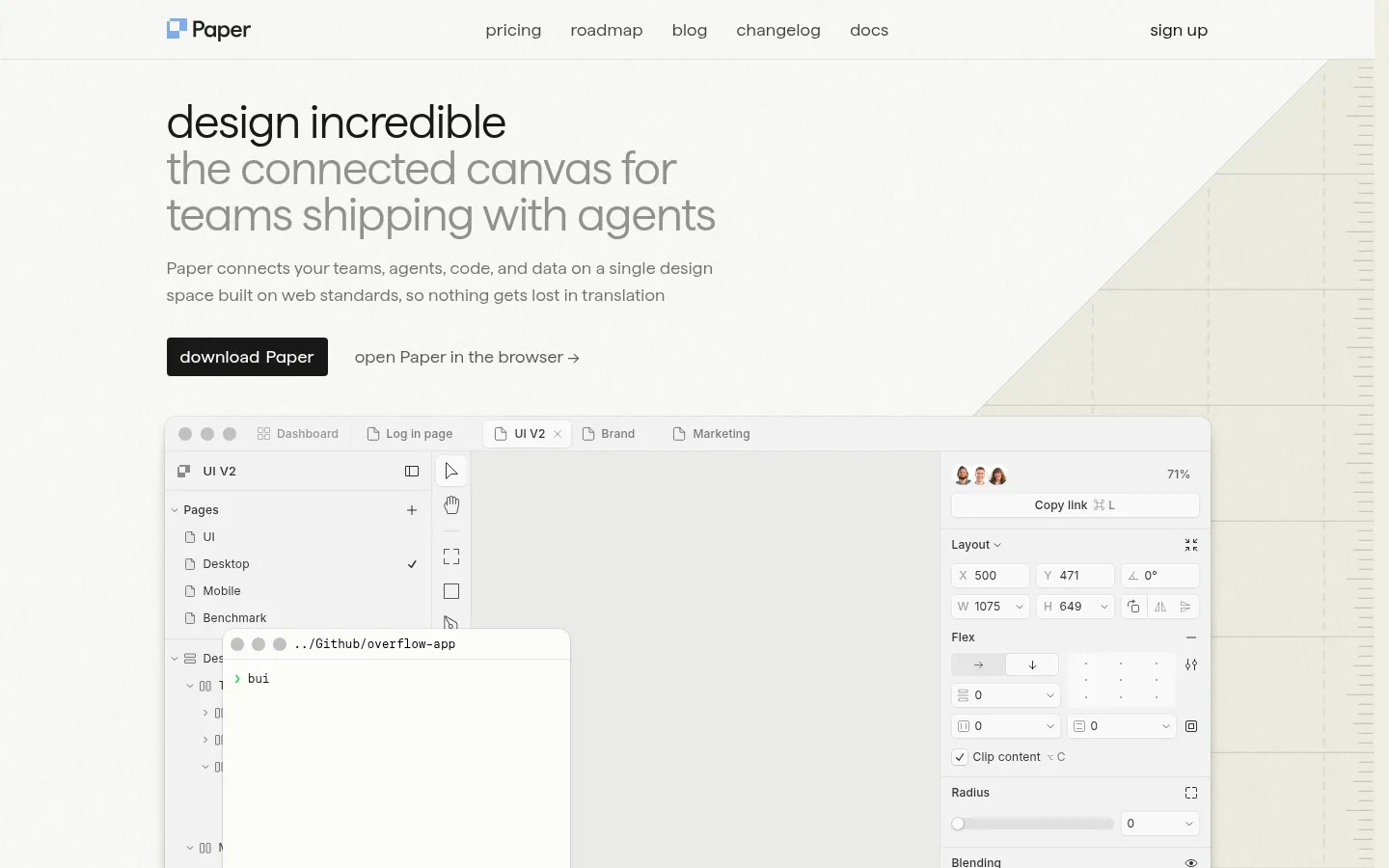
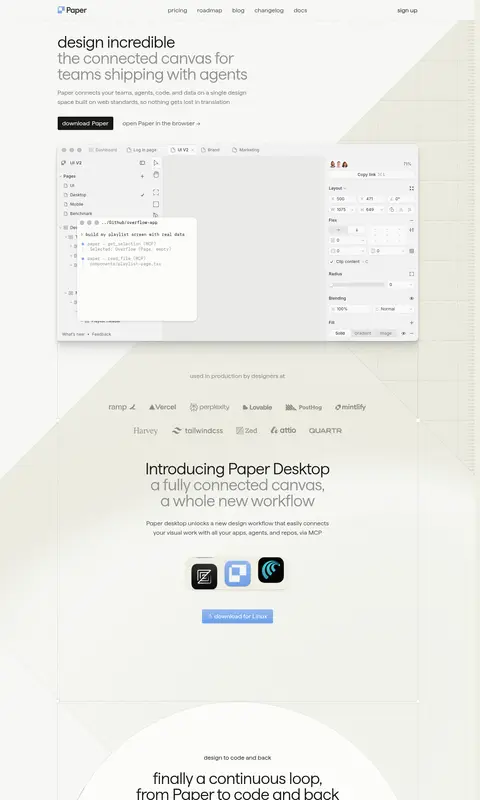
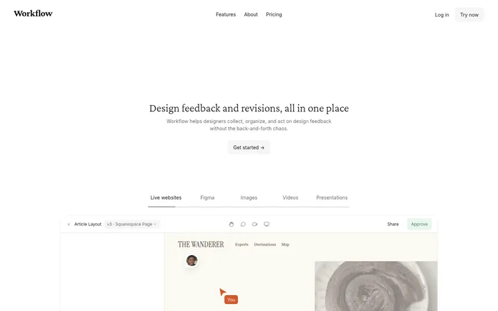
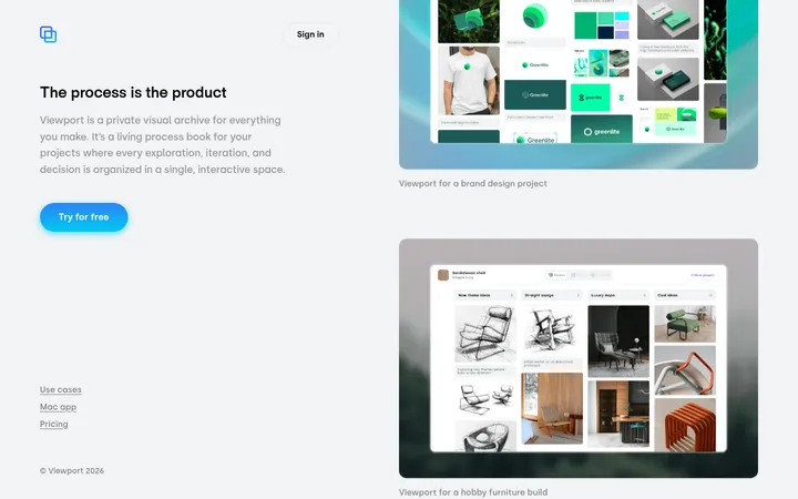
North star · Keep the warm, open canvas dominant and let precise product panels, fine grids, and restrained typography explain the product.
The page uses a warm, near-white canvas (#fcfcf9) with broad pale-beige bands (#efefe4), creating a soft contrast that keeps the product UI central. Near-black (#181818) anchors headings, navigation and solid download buttons; muted grays carry supporting copy, while thin gray borders outline large content panels. Blue accents are reserved for links and small interface details rather than turning the page into a saturated brand surface. Matter is the dominant typeface: large, light-weight headlines use tight tracking and short line lengths, balanced by calm body text and compact uppercase eyebrows. The layout is a centered, narrow editorial column inside a spacious page, with a persistent top navigation, oversized product screenshots and diagrams, then stacked feature and news panels. Delicate grid motifs and diagonal background geometry echo the canvas metaphor. Generous section spacing and very restrained shadows make the interface feel open, precise and quietly technical.
配色
点色块复制色值。用途说明来自对页面的实测位置(背景、文字、描边、按钮)与截图判读。
品牌色
强调色
表层色
中性色
功能色
页面底色 · Canvas White表层 · Warm Field表层 2 · Mist Surface主文字 · Soft Ink次要文字 · Quiet Gray弱文字 · Deep Charcoal描边 · Panel Hairline强调 · Canvas Blue强调 2 · Signal Blue
文字
背景
对比度
WCAG
#181818 Soft Ink
#fcfcf9 Canvas White
17.28:1
AAA
#181818 Soft Ink
#efefe4 Warm Field
15.34:1
AAA
#181818 Soft Ink
#eaeae7 Mist Surface
14.73:1
AAA
#666666 Quiet Gray
#fcfcf9 Canvas White
5.59:1
AA
#666666 Quiet Gray
#efefe4 Warm Field
4.96:1
AA
#666666 Quiet Gray
#eaeae7 Mist Surface
4.76:1
AA
字体
字号阶梯:Custom(比例约 1.886,正文 18px)。示例用免费替代字体渲染,数值为实测。
Aa 设计
Matter
网络字体 · 字重 400 / 360 / 550 / 480 / 500 · 占比 86%
免费替代:Inter
Primary display, headings, body copy, navigation, links, and buttons.
Aa 设计
-apple-system
系统字体 · 字重 400 / 500 · 占比 13%
免费替代:Inter
Compact captions and small product-interface labels.
角色
示例
字号
字重
行高
字距
特大标题
Large hero statements and prominent section headlines.
Paper
64px
360
1
-0.02em
一级标题
Primary page headline and major introductory headings.
Paper
48px
360
1
-0.02em
正文
Supporting descriptions and feature explanations.
The quick brown fox 敏捷的狐狸
18px
400
1.56
0.01em
辅助文字
Small product labels and image or UI annotations.
The quick brown fox 敏捷的狐狸
12px
400
1.33
0.015em
按钮
Download CTA text and other prominent action labels.
The quick brown fox 敏捷的狐狸
18px
480
1.56
0.01em
导航
Top-level navigation links.
The quick brown fox 敏捷的狐狸
18px
400
1.56
0.01em
链接
Inline and editorial links that need added emphasis.
The quick brown fox 敏捷的狐狸
18px
550
1.56
0.01em
眉题
Short uppercase labels introducing a section.
The quick brown fox 敏捷的狐狸
14px
500
2
0.05em
代码
Code snippets and technical interface text.
const style = 1;
12px
400
2.33
0.015em
间距与布局
基准单位 4px · 密度:适中
60px版块间距
8px元素间距
—卡片内边距
—内容最大宽度
1px
2px
4px
6px
8px
10px
12px
16px
20px
24px
30px
40px
Use a centered editorial column with a slim top navigation and broad side margins. Keep the hero left-aligned, followed by a large product preview that overlaps or anchors the next visual band. Stack wide content modules vertically, combining full-width framed panels with occasional two-column feature or news rows. Thin grid lines and diagonal background shapes establish structure without increasing density. Preserve generous vertical breathing room between sections; the measured page is comfortable rather than compact. Do not infer a fixed max width from the available measurements.
圆角与层次
按钮 · 4px
卡片 · 12px
图片 · 50%
链接 · 4px
inset · other
inset · other
hairline · nav
xl · section
The overall composition is mostly flat, with thin gray panel borders doing more work than shadows. Product mockups may sit above the canvas with restrained, soft layered shadows and subtle inset highlights. Avoid heavy card elevation or dramatic depth; separation comes primarily from surface shifts, hairlines, overlap, and spacious placement.
组件
下面的预览按实测的按钮、输入框、徽标、卡片样式重建(字体用替代字体)。
Top navigation
A restrained horizontal header on the light canvas, with the Paper mark at left, centered product links, and sign-up at right; use dark Matter text and a subtle bottom hairline.
Hero actions
Pair a near-black download button with a quiet text link such as “open Paper in the browser →”; the measured button uses a 4px radius and light text.
Product canvas preview
A large product-interface image framed as a desktop design workspace, with floating panels and a subtle shadow; let it dominate the hero without adding decorative color.
Feature panel
Use spacious, bordered modules with short headings and concise supporting copy; allow a large visual area above smaller two-column explanation rows.
Grid section band
A pale section surface with fine grid or diagonal geometry, creating technical texture while keeping the text area calm and high-contrast.
Editorial update cards
A two-column news-style row with image-led content, compact descriptions, and understated text links on light surfaces.
Imagery · Product UI screenshots and interface mockups are the main imagery, presented large and framed by pale panels. Supporting visuals are abstract canvas diagrams: delicate grid patterns, diagonal planes, and simple geometric marks. Keep these low-contrast so interface details and headlines remain legible. The page is not driven by lifestyle photography; imagery should feel like a clear view into a design workspace.
Keep Canvas White (#fcfcf9) and Warm Field (#efefe4) as the dominant surfaces.
Use Soft Ink (#181818) for primary text and the main download CTA.
Set hero headlines in a light, tightly tracked sans-serif style.
Use fine borders to define panels instead of heavy card shadows.
Let product UI imagery occupy substantial space within the editorial layout.
Reserve the blue accents for small links or interface details.
✕ 不该做
Do not introduce saturated color as a large background field.
Do not compress the sections into a dense dashboard layout.
Do not use heavy shadows or thick outlines on every panel.
Do not let decorative grids compete with headline or product content.
Do not replace the product interface focus with lifestyle photography.
Do not style all text with the same weight or visual emphasis.
给 AI 的提示词
想快速出一个同风格的新页面,把这段话连同 DESIGN.md 一起发给 AI。
Build a new page in Paper’s quiet, product-led design language. Use Canvas White (#fcfcf9) as the main canvas and Warm Field (#efefe4) for broad section bands; use Soft Ink (#181818) for headlines, navigation, links, and the primary dark CTA. Keep supporting copy in muted gray, borders in Panel Hairline (#d7d7d6), and use Canvas Blue (#93b8f0) or Signal Blue (#6da1ee) only as restrained accents. Set large, light-weight Matter-like headlines with tight tracking, then use calm readable body text. Center the content in an editorial column, leave generous vertical space, and alternate framed product previews with modular feature panels. Add fine grid or diagonal motifs as low-contrast background texture. Favor hairlines and subtle layering over pronounced shadows; keep the interface imagery crisp and central.