North star · Concentrate vivid color in the hero and product panels, and let spacious neutral sections keep feature content clear and scannable.
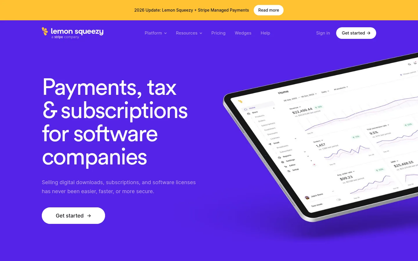
The page opens with a saturated purple hero that makes the oversized white headline and tilted product dashboard immediately legible. A narrow yellow announcement strip and compact navigation sit above it; rounded white calls to action provide high-contrast interaction points. Below, the canvas alternates between white and light gray feature bands, with occasional pale pink, blue, green, and purple panels supporting product imagery. Circular headings use a friendly geometric sans character, while Inter handles navigation, body copy, and fine labels. Large section headings are balanced by muted explanatory text and generous open space. Feature content shifts between two-column introductions, three-column text grids, and full-width interface showcases. The result feels vivid but organized: strong color is concentrated in the hero and image panels, while most reading surfaces remain quiet and neutral.
Oversized hero headline and prominent top-level display text.
Lemon Squeezy
80px
400
1
-0.04em
一级标题
Primary page headline and major section introductions.
Lemon Squeezy
56px
400
1.14
-0.03em
二级标题
Large feature-section headings and secondary statements.
Lemon Squeezy
48px
400
1.25
-0.03em
三级标题
Feature titles and prominent content headings.
Lemon Squeezy
38.5px
400
1.2
-0.02em
四级标题
Smaller feature headings within text grids.
Lemon Squeezy
36px
400
1.22
-0.02em
正文
Explanatory paragraphs and feature descriptions.
The quick brown fox 敏捷的狐狸
18px
400
1.7
0
辅助文字
Uppercase eyebrow labels and small category markers.
The quick brown fox 敏捷的狐狸
14px
500
1.6
0.143em
导航
Header links, account navigation, and menu labels.
The quick brown fox 敏捷的狐狸
15px
400
1.6
0
眉题
Compact uppercase section labels such as Ecommerce and Reporting.
The quick brown fox 敏捷的狐狸
14px
500
1.6
0.143em
间距与布局
基准单位 8px · 密度:适中
40px版块间距
24px元素间距
24px卡片内边距
1152px内容最大宽度
6px
8px
9px
12px
16px
24px
30px
32px
40px
56px
80px
120px
160px
192px
Use a centered content frame with a measured maximum width of 1152px. The page moves from a full-bleed hero and trust band into spacious editorial introductions, alternating two-column feature splits and three-column feature grids. Align headings and text to the left; place interface imagery alongside or beneath relevant copy. The measured spacing system uses an 8px base with a comfortable density, broad section gaps, and consistent gaps between related elements. Preserve substantial whitespace around large showcase panels rather than compressing the long page into dense cards.
圆角与层次
按钮 · 8px
图片 · 6px
链接 · 8px
没有测到阴影:页面是扁平的,层次靠底色和描边区分。
The page is mostly flat: rely on solid section backgrounds, whitespace, and fine dividers rather than card shadows. Product mockups supply their own depth through device frames and interface layering. Buttons are pill-shaped in the screenshots, while measured component radii also include compact 8px controls; use rounded forms selectively, not as a universal card treatment.
组件
下面的预览按实测的按钮、输入框、徽标、卡片样式重建(字体用替代字体)。
Announcement bar
A slim yellow full-width strip above the hero, with centered update text and a small white rounded Read more control.
Hero navigation
Logo at the left, compact Inter links across the center, and sign-in plus a white pill Get started action at the right.
Hero CTA
White rounded button with dark Inter text and a directional arrow, set prominently beneath the hero copy.
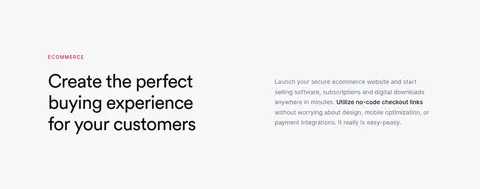
Eyebrow and feature heading
Small uppercase, tracked Inter label above a large regular-weight Circularpro book heading.
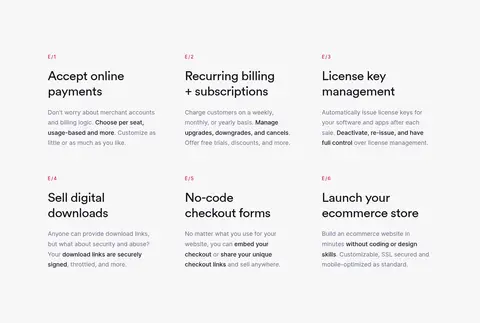
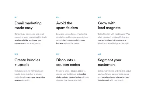
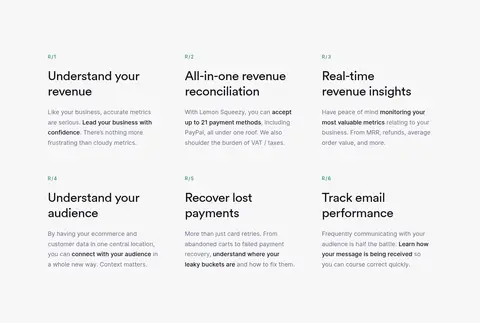
Feature text grid
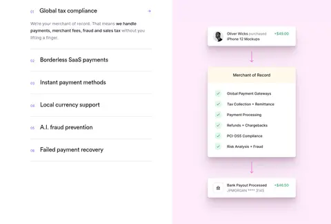
Three-column feature list with short numbered labels, dark headings, muted descriptions, and generous separation.
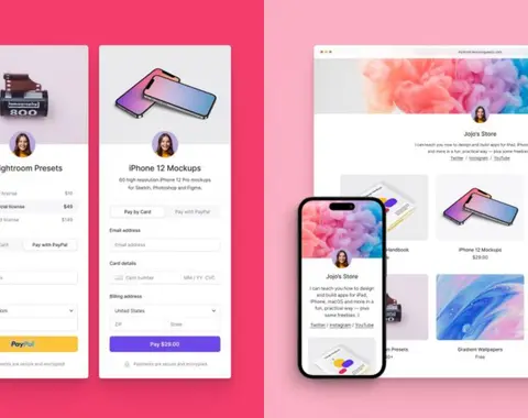
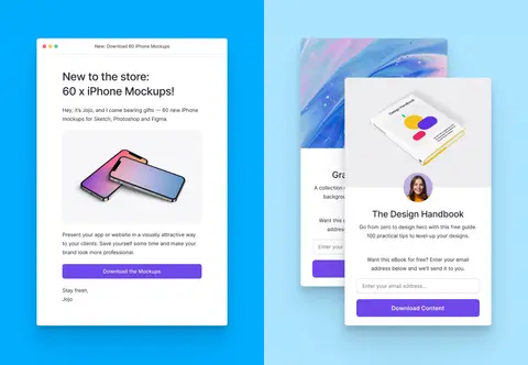
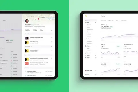
Product showcase
Large paired color panels containing commerce, marketing, or reporting interface mockups; keep imagery visually dominant.
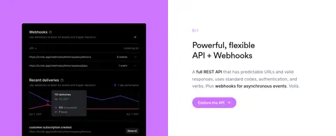
Developer CTA
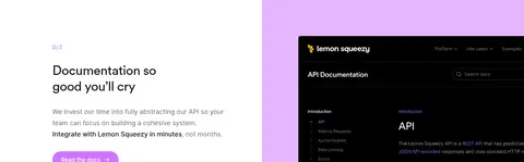
Lavender-toned rounded action near API content, contrasted against a mostly white developer section.
Imagery · Use product interface mockups as the primary visual evidence: dashboards, checkout flows, storefronts, email forms, and API documentation. Frame them as large interface compositions, often split across adjacent solid-color panels; the hero uses a tilted dashboard device cropped at the right edge. Supporting illustrations may use colorful mockup artwork, but treat their varied hues as imagery rather than expanding the core brand palette.
Use Electric Violet #5423e7 for the dominant hero field.
Keep the hero headline large, white, and left-aligned.
Set explanatory copy in Muted Slate #6c6c89.
Alternate white and Cloud Gray #f7f7f8 reading sections.
Use product mockups as large, contextual visual anchors.
Keep section labels small, uppercase, and letter-spaced.
✕ 不该做
Do not turn every section into a bordered card.
Do not use illustration colors as the default page background.
Do not crowd the hero with extra content or controls.
Do not center-align all feature headings and descriptions.
Do not replace the spacious feature grids with dense dashboards.
Do not use heavy shadows as the main source of hierarchy.
给 AI 的提示词
想快速出一个同风格的新页面,把这段话连同 DESIGN.md 一起发给 AI。
Build a new SaaS page in the Lemon Squeezy visual style. Start with a full-bleed Electric Violet #5423e7 hero, a compact announcement strip, clean navigation, a large white left-aligned headline, and a product interface mockup cropped to one side. Use Gallery White #ffffff and Cloud Gray #f7f7f8 for spacious reading sections, with Soft Ink #121217 headings and Muted Slate #6c6c89 supporting copy. Set display headings in a Circularpro-like rounded geometric sans and interface text in Inter. Alternate editorial two-column splits with three-column feature grids; use colorful panels such as Raspberry Pop #f53d6b or Sky Signal #00acff only around relevant product imagery. Keep buttons rounded, layouts open, dividers subtle, and hierarchy driven by scale, color, and whitespace rather than shadows.