North star · Use calm neutral space to frame vivid, rounded product imagery, with deep-plum type and one clear action per section.
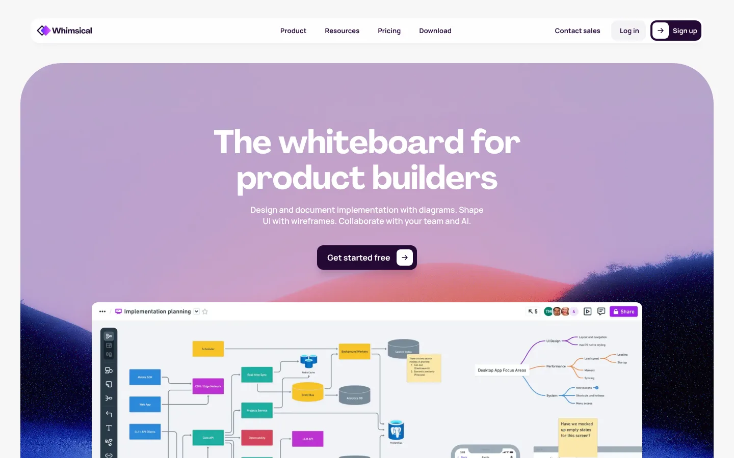
The page builds its identity around a light neutral canvas, deep plum text, and large atmospheric gradient imagery. White navigation and content cards keep the experience crisp, while lavender, rose, and blue tones create a distinctive backdrop for product previews. The hero pairs oversized centered white display type with a short supporting line and a dark, pill-like primary CTA; a large board screenshot overlaps the lower part of the scenic panel. Subsequent sections alternate between bold, sometimes gradient-filled headings, offset feature-and-screenshot layouts, and compact product cards. Agrandir gives headings a rounded, confident presence; Manrope handles navigation, body copy, links, and buttons with clear compact utility. Rounded corners recur in the hero, cards, and controls, while soft shadows are reserved for elevated interaction surfaces. The overall rhythm is airy at section level but dense inside product imagery, keeping the real interface—not decorative ornament—at the center.
Navigation, body copy, captions, buttons, and links.
Aa 设计
Agrandir-0cfc125464d8d15e
网络字体 · 字重 700 · 占比 13%
免费替代:Manrope
Display and section headings.
角色
示例
字号
字重
行高
字距
特大标题
Oversized hero or campaign headline.
Whimsical
96px
700
1
-0.01em
一级标题
Primary hero title and major page headline.
Whimsical
64px
700
1.1
-0.01em
二级标题
Large feature and section headlines.
Whimsical
48px
700
1.1
0
三级标题
Feature titles and card headings.
The quick brown fox 敏捷的狐狸
24px
700
1.1
-0.01em
正文
Explanatory copy and feature descriptions.
The quick brown fox 敏捷的狐狸
16px
500
1.4
0
辅助文字
Small labels and supporting metadata.
The quick brown fox 敏捷的狐狸
13px
700
1
0.009em
按钮
CTA labels and compact action text.
The quick brown fox 敏捷的狐狸
13px
700
1
0.009em
导航
Top navigation and compact menu labels.
The quick brown fox 敏捷的狐狸
13px
700
1
0.009em
链接
Inline product and feature links.
The quick brown fox 敏捷的狐狸
16px
700
1
0
眉题
Small uppercase section markers above headings.
The quick brown fox 敏捷的狐狸
9px
700
1.2
0.15em
间距与布局
基准单位 4px · 密度:紧凑
40px版块间距
2px元素间距
12px卡片内边距
—内容最大宽度
1px
2px
4px
8px
10px
11px
12px
16px
18px
20px
24px
32px
40px
48px
60px
64px
Use a centered, responsive content column with generous side margins and a compact horizontal navigation bar. The hero is a wide, heavily rounded scenic panel; center its message and layer a substantial product screenshot across its lower area. Follow with alternating feature rows that switch screenshot and copy alignment, then tighter multi-column feature cards. Keep section transitions spacious and uncluttered; allow dense detail inside screenshots. No measured maximum page width is available, so adapt the container to the viewport rather than assuming a fixed value.
圆角与层次
按钮 · 12px
卡片 · 8px
图片 · 9px
导航 · 12px
链接 · 16px
lg · link
md · button
md · nav
lg · card
Most sections sit flat on the pale canvas, with little emphasis on visible borders or hairlines. White navigation and product cards separate through surface contrast and restrained soft shadows. Use the stronger plum-tinted shadow for primary buttons and keep screenshots layered above scenic panels; avoid adding heavy outlines or stacking many shadow levels.
组件
下面的预览按实测的按钮、输入框、徽标、卡片样式重建(字体用替代字体)。
Top navigation
White, compact horizontal bar with brand mark, centered product links, and right-aligned account actions; text uses deep plum.
Primary CTA
Deep-plum rounded button with white bold Manrope text, a right-side arrow tile, and a soft plum shadow.
Scenic hero
Large rounded gradient/photo panel with centered white Agrandir headline, concise supporting copy, CTA, and overlapping product screenshot.
Feature split
Alternating copy-and-screenshot rows; use a large Agrandir section heading and violet feature links.
Product card grid
White rounded cards with compact interface previews, deep-plum titles, muted descriptions, and colored exploration links.
Footer panel
Rounded pale-blue scenic band containing a light footer surface, grouped link columns, and restrained utility details.
Imagery · Use product UI screenshots as the main proof of value: boards, diagrams, wireframes, and collaboration features shown inside clean white interface frames. Place them over soft scenic gradients with lavender, pink, and blue hues, using rounded framing and occasional overlap. Small feature illustrations can be colorful and blurred at the edges, but keep the underlying interface legible. Scenic color is part of the image treatment, not a replacement for the measured UI palette.
该做与不该做
✓ 该做
Keep the page canvas pale and the core interface text deep plum.
Use gradient color in scenic panels and imagery rather than everywhere.
Pair oversized rounded display headings with concise supporting copy.
Show real product interface previews prominently.
Alternate feature screenshot and copy alignment for visual rhythm.
Reserve vivid violet links for selected actions and feature navigation.
✕ 不该做
Do not treat illustration-only colors as core UI colors.
Do not make the entire page dark or heavily saturated.
Do not crowd the hero with multiple competing actions.
Do not add harsh borders to every card or section.
Do not use decorative gradients behind all body content.
Do not replace readable product screenshots with abstract decoration.
给 AI 的提示词
想快速出一个同风格的新页面,把这段话连同 DESIGN.md 一起发给 AI。
Build a new Whimsical-style SaaS page with a calm, product-led visual language. Use Cloud Canvas (#f7f7f8) as the main ground, Deep Plum (#250835) for headings and primary controls, and white (#ffffff) for navigation and cards. Add Lavender Bloom (#e9bded) and Powder Blue (#bbcfe4) through scenic image panels; reserve Electric Violet (#ab2fed) for selected links. Use bold rounded display headings, compact Manrope-like interface text, and generous section breathing room. Make product screenshots the visual evidence: frame them cleanly, layer them over gradients sparingly, and alternate their placement with concise feature copy. Keep cards and buttons rounded, use soft shadows selectively, and maintain a clear hierarchy with one prominent action at a time. Do not invent borders or overuse saturated accents.