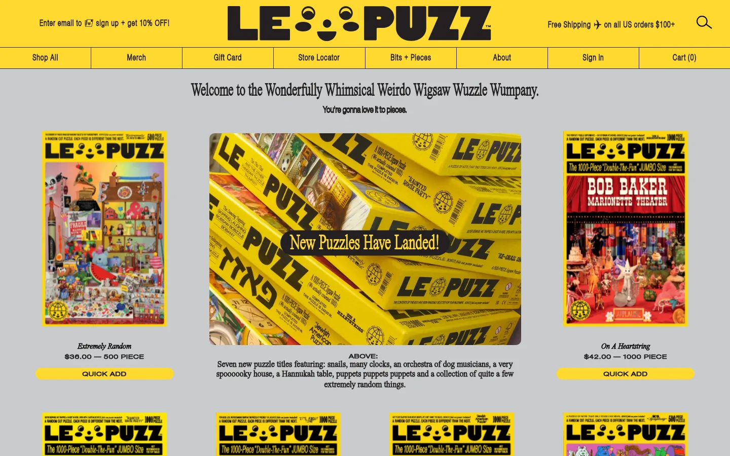
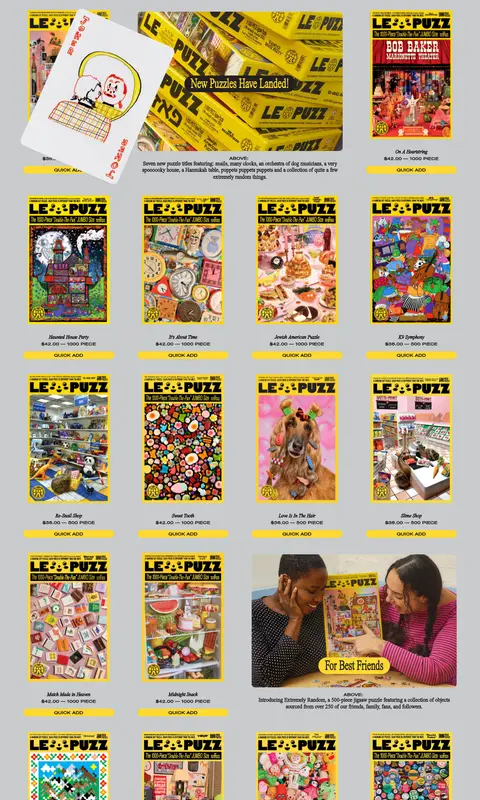
Le Puzz 将丰富的拼图商品目录、灰色底色、标志性亮黄和富有表现力的衬线字体组合在一起。俏皮的编辑式图片与直观的购物控件,让首页像一本搬到网上的热闹印刷商品目录。
North star · Let a calm gray canvas and tightly repeated catalog structure make the signature yellow, oddball puzzle artwork, and editorial serif moments stand out.
The page is anchored by a cool gray canvas (#c8cbcd), creating a quiet backdrop for the bright yellow (#ffd931) header, navigation, product packaging, and quick-add controls. Near-black (#231f20) provides the main branded ink for navigation, buttons, and dark callouts, while black (#000000) appears in some text and product-card treatments; white (#ffffff) is a secondary surface rather than the dominant page background. Typography mixes expressive Times Now serif headings and body copy with Helvetica and Helvetica Neue for navigation, labels, and compact uppercase actions. A narrow centered introductory headline gives way to a long, dense product catalog with repeated puzzle-cover images and yellow pill-shaped buttons. Editorial interludes, customer imagery, press marks, and social tiles interrupt the grid, keeping the scroll varied without abandoning the catalog-first structure. The product artwork supplies many additional colors, but the brand system itself stays restrained and consistent.
Light navigation, body copy, and larger lightweight headings.
Aa 设计
Times Now
网络字体 · 字重 400 / 100 · 占比 35%
免费替代:Bodoni Moda
Expressive page headings, product names, and editorial body copy.
Aa 设计
Helvetica Neue
网络字体 · 字重 400 / 100 · 占比 29%
免费替代:Inter
Compact uppercase buttons, eyebrow labels, and utility text.
角色
示例
字号
字重
行高
字距
一级标题
Main welcome headline above the product catalog.
Le Puzz
47px
400
0.9
0
二级标题
Large lightweight section titles and editorial headings.
Le Puzz
40px
100
0.9
0
三级标题
Prominent serif titles for promotional blocks and stories.
The quick brown fox 敏捷的狐狸
27px
400
1.93
0
四级标题
Smaller serif subheads and supporting editorial titles.
The quick brown fox 敏捷的狐狸
23px
400
1.15
0
正文
Product descriptions, story copy, and other reading text.
The quick brown fox 敏捷的狐狸
16px
400
1.15
0
辅助文字
Compact, tracked labels and image or product captions.
The quick brown fox 敏捷的狐狸
11px
400
1.15
0.091em
按钮
Small uppercase quick-add and shopping actions.
The quick brown fox 敏捷的狐狸
11px
400
2.27
0.073em
导航
Primary navigation and header utility links.
The quick brown fox 敏捷的狐狸
16px
300
2.63
0.063em
眉题
Small uppercase introductory labels and overlines.
The quick brown fox 敏捷的狐狸
11px
400
1.15
0.073em
间距与布局
基准单位 1px · 密度:宽松
70px版块间距
50px元素间距
—卡片内边距
615px内容最大宽度
1px
5px
10px
11px
15px
20px
25px
30px
40px
50px
70px
The homepage uses a full-width header and a centered catalog region measured at a 615px page max width, with the screenshot showing product groups spread broadly across the canvas. A short centered welcome statement sits above a dense, repeated product grid; editorial images and feature copy occasionally span multiple grid cells. The long catalog scroll is broken up by review, press, social, and image-led sections. Spacing is spacious between major sections, while product cards themselves are compact and repetitive.
圆角与层次
按钮 · 9999px
卡片 · 10px
图片 · 10px
没有测到阴影:页面是扁平的,层次靠底色和描边区分。
The interface is mostly flat: broad gray and yellow color fields do the structural work, with no measured shadow system. Product images and cards sit directly on the canvas. Fine dark rules divide header navigation cells, while rounded corners are reserved for buttons, select media, and occasional cards rather than being used as a universal treatment.
组件
下面的预览按实测的按钮、输入框、徽标、卡片样式重建(字体用替代字体)。
Header and navigation
A yellow announcement and brand area sits above a yellow segmented navigation row. Use near-black text and thin dark dividers between links.
Puzzle product card
A compact catalog item pairs an upright puzzle-cover image with a serif product name, concise price and piece-count details, and a yellow quick-add action.
Quick-add button
Small uppercase Helvetica Neue label on a yellow pill with near-black text; repeated consistently beneath available products.
Promotional image block
Large puzzle or lifestyle image with a centered rounded caption pill, supported by a short editorial explanation.
Editorial review block
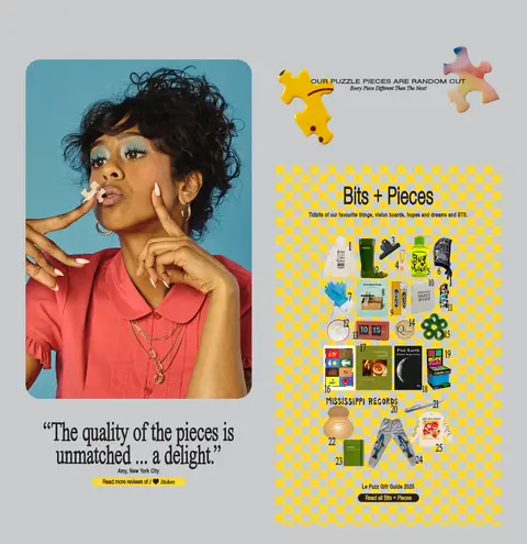
A large portrait, oversized serif quotation, attribution, and compact review link sit alongside a checkerboard-backed product-story graphic.
Social tiles
Four image-led social previews appear in a row with prominent platform labels beneath them, against the continuing gray canvas.
Imagery · Puzzle box covers and product photographs dominate, often shown as upright rectangular cards with bright yellow packaging. Large lifestyle photographs and editorial collages punctuate the catalog, with playful captions placed over images in rounded yellow or dark pills. Artwork inside puzzle products is intentionally colorful and varied; it is product content, not a reason to expand the core brand palette.
Use signature yellow for primary shopping actions and key highlights.
Make the product catalog repetitive and image-led.
Use serif display and editorial text for a print-catalog feel.
Keep utility buttons small, uppercase, and clearly legible.
Break up long product runs with occasional editorial imagery.
✕ 不该做
Do not turn product-art colors into the core brand palette.
Do not add gradients or ornamental shadows.
Do not replace the catalog with oversized minimalist product cards.
Do not make every heading use the same typeface.
Do not use rounded corners indiscriminately.
Do not hide pricing or quick-add actions beneath decorative imagery.
给 AI 的提示词
想快速出一个同风格的新页面,把这段话连同 DESIGN.md 一起发给 AI。
Build a new Le Puzz-style ecommerce page with a muted Puzzle Gray (#c8cbcd) canvas and a strong Puzz Yellow (#ffd931) header, navigation, and primary shopping actions. Use Soft Ink (#231f20) for branded text, dark callouts, and thin dividers; reserve Paper White (#ffffff) for occasional light surfaces and Print Black (#000000) for clear product text. Pair expressive serif editorial typography with clean sans-serif navigation and compact uppercase utility labels. Make the main content a dense, consistent puzzle product grid with prominent cover art, simple product details, and repeated quick-add pills. Add a few image-led editorial or customer-story blocks to vary the long scroll, but keep the catalog dominant. Keep the interface flat, avoid shadows and gradients, and use rounded corners selectively.