North star · Keep the interface nearly invisible: plain black monospace text on white, with project imagery carrying the visual variety.
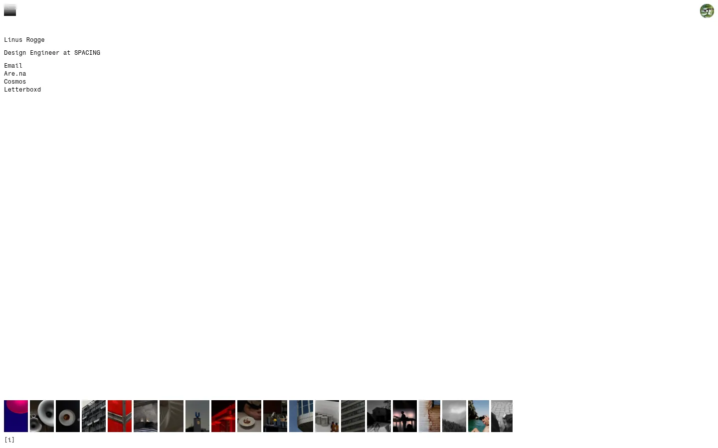
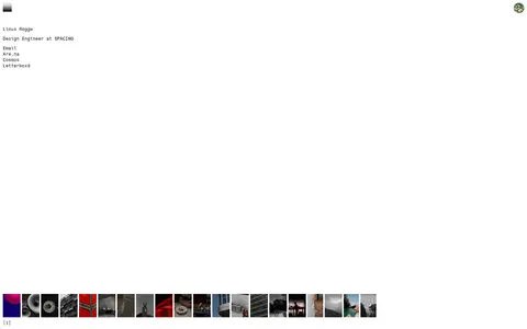
The page uses a pure white canvas and black text as its entire measured brand palette. That restraint makes the small identity block feel almost like a plain text note, while the vivid colors in the image strip read as project-specific content rather than interface accents. Fragment M is used consistently for the name, role, links, and the small [i] control; the compact monospaced setting gives the page a utilitarian, carefully composed tone. The layout is intentionally sparse: a narrow, left-aligned introduction sits near the upper-left, with a tiny circular image at the opposite corner and a horizontal ribbon of thumbnails near the bottom of the viewport. The thumbnail row supplies nearly all the page’s visual variety. Avoid adding decorative color, cards, borders, or oversized headings; the contrast between expansive white space, terse text, and tightly grouped imagery is the defining strategy.
Identity text, role, links, and small interface labels
角色
示例
字号
字重
行高
字距
正文
Compact introduction and role description
The quick brown fox 敏捷的狐狸
12px
400
1.33
0
按钮
Small [i] information control
The quick brown fox 敏捷的狐狸
12px
400
1.33
0
链接
Email and external profile links
The quick brown fox 敏捷的狐狸
12px
400
1.33
0
间距与布局
基准单位 8px · 密度:紧凑
32px版块间距
4px元素间距
—卡片内边距
1424px内容最大宽度
4px
8px
10px
32px
40px
A single, open canvas holds a left-aligned introduction near the upper-left and a small circular image at the upper-right. A narrow horizontal strip of project thumbnails sits close to the bottom of the first viewport, leaving a large uninterrupted gap between text and images. The measured page max width is 1424px, with a compact density and 32px section gap. Preserve the asymmetry and broad negative space rather than imposing a conventional centered grid.
圆角与层次
没有测到阴影:页面是扁平的,层次靠底色和描边区分。
The interface is flat: measured data shows no shadows, card styling, gradients, or decorative borders. Keep the page on one white plane and avoid adding layers around the project images. The images themselves provide the only noticeable visual depth and tonal variation.
组件
下面的预览按实测的按钮、输入框、徽标、卡片样式重建(字体用替代字体)。
Identity block
Left-aligned name followed by a concise role line, set in regular 12px Fragment M.
External links
Email and profile destinations appear as plain black text links without button treatment.
Project thumbnail strip
A tight horizontal sequence of rectangular project images anchors the lower part of the viewport.
Information control
A small [i] label appears directly beneath the image strip, using black 12px monospace text.
Corner image
A tiny circular image sits at the upper-right, balancing the text block without a visible frame.
Imagery · A compact, edge-to-edge-feeling row of small rectangular project thumbnails is the main visual content. The images vary in subject and color, including architectural, object, and atmospheric scenes; keep them as unframed photographic crops in a consistent horizontal sequence. A tiny circular image appears near the upper-right. Treat image colors as portfolio content, not as brand palette.
Use project images as the primary source of color.
Preserve generous empty space between content groups.
Keep links plain and black.
✕ 不该做
Do not introduce accent colors into interface elements.
Do not enlarge the identity into a display headline.
Do not wrap thumbnails in cards or frames.
Do not add shadows, gradients, or ornamental borders.
Do not center the composition or fill its empty space.
Do not mistake image colors for brand palette colors.
给 AI 的提示词
想快速出一个同风格的新页面,把这段话连同 DESIGN.md 一起发给 AI。
Build a new page in the Linus Rogge portfolio style. Use Gallery White (#ffffff) as a broad, flat canvas and Ink (#000000) for all interface text and links. Use a compact regular-weight monospace such as Fragment M, or IBM Plex Mono if unavailable. Arrange a short, left-aligned identity or page introduction near the upper-left, with secondary links as plain text. Leave substantial negative space, then place a horizontal strip of consistently cropped project imagery near the lower edge. Let the images provide the color; do not create interface accents from their palette. Keep the layout asymmetric and sparse, with no cards, shadows, gradients, decorative rules, or oversized headings. Maintain small, utilitarian controls and understated interaction labels.