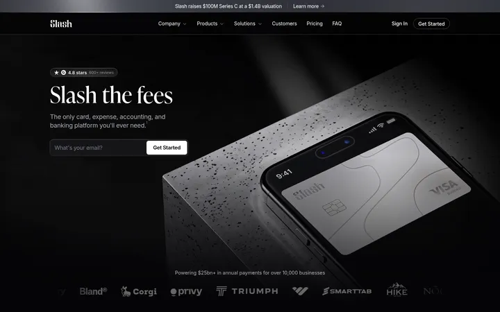
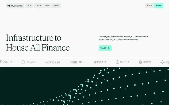
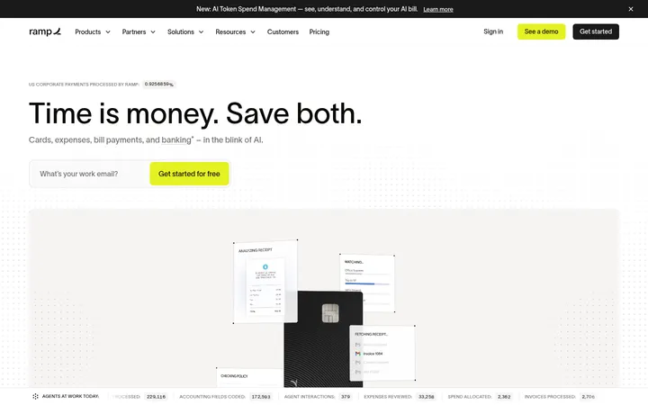
North star · Keep the page predominantly white and highly legible, then use deliberate black panels, precise typography, and restrained orange or mint accents to make complex infrastructure feel approachable.
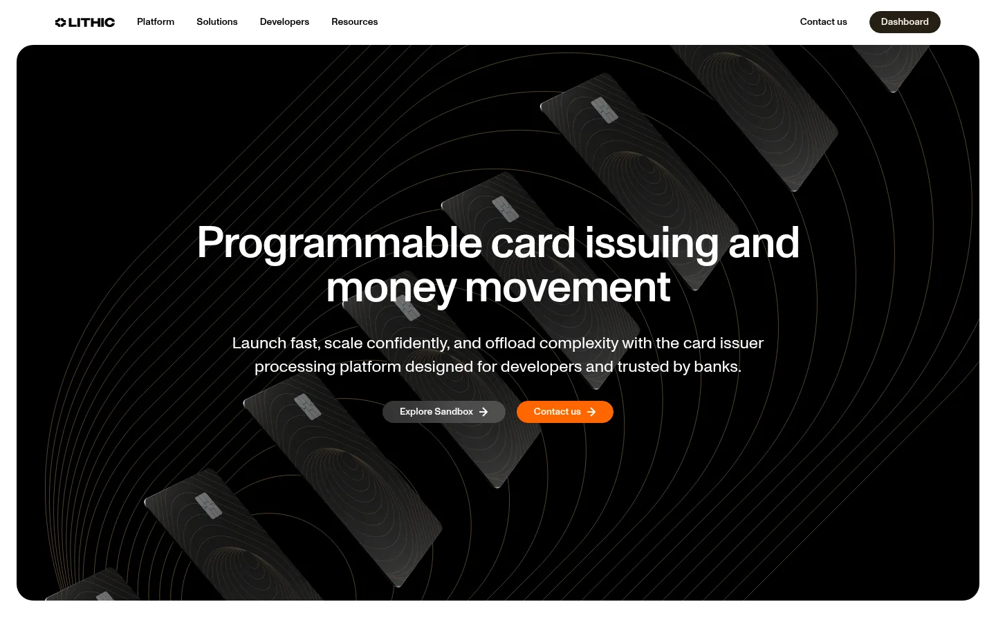
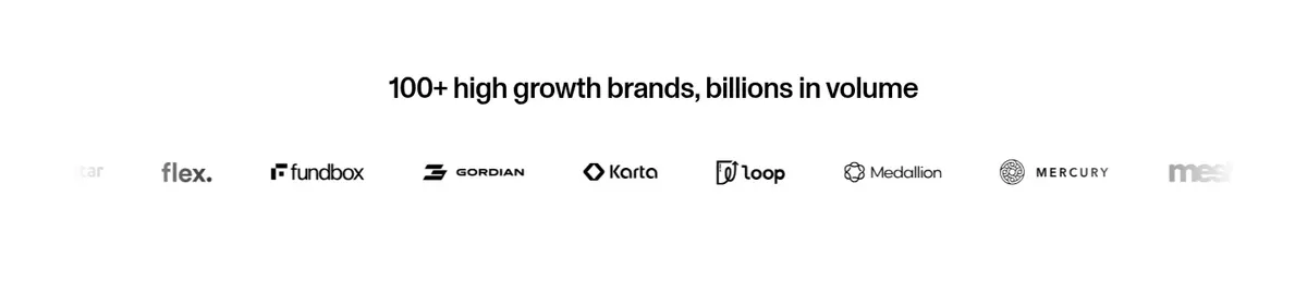
The page builds contrast through large areas of white canvas and a few dramatic black panels, especially the card-issuing hero and service-options section. Orange is reserved for the primary Contact us action; mint and pale cream or lilac appear as quiet section and card surfaces rather than a loud, all-over palette. ABC Monument Grotesk keeps navigation, headings, and explanatory copy visually consistent, with medium-weight display text and compact supporting text. The layout alternates broad, centered statements with modular cards and split content, keeping the infrastructure story scannable. Rounded corners soften the dense financial subject matter, while thin contour patterns, card mockups, partner marks, and interface imagery add depth and proof. Use generous whitespace around sections, but keep information-rich feature groups compact and orderly.
Single family across display headings, body copy, navigation, buttons, and links.
角色
示例
字号
字重
行高
字距
特大标题
Large centered hero statement and prominent campaign-style headings.
Lithic
64px
500
1
-0.02em
一级标题
Primary page and section headlines.
Lithic
32px
500
1.2
-0.02em
二级标题
Secondary section headings and large feature statements.
The quick brown fox 敏捷的狐狸
24px
400
1.4
0
三级标题
Feature-card and subsection titles.
The quick brown fox 敏捷的狐狸
20px
400
1.4
0
正文
Introductory copy, feature explanations, and general content.
The quick brown fox 敏捷的狐狸
16px
400
1.4
0
辅助文字
Small supporting details, labels, and compact metadata.
The quick brown fox 敏捷的狐狸
14px
400
1.4
0
导航
Top navigation labels and compact menu items.
The quick brown fox 敏捷的狐狸
14px
500
1.2
0
链接
Action links such as documentation and learn-more prompts.
The quick brown fox 敏捷的狐狸
16px
500
1.4
0
间距与布局
基准单位 8px · 密度:紧凑
40px版块间距
8px元素间距
40px卡片内边距
1184px内容最大宽度
8px
10px
12px
16px
24px
32px
38px
40px
48px
64px
80px
Use a centered content frame with a measured maximum width of 1184px and a compact overall density. The page alternates a large centered hero, horizontally arranged trust marks, two-column credibility cards, single-column product storytelling, and multi-column service cards. Keep section transitions clear with generous white canvas between major bands; use the measured 40px section gap as a rhythm reference. Align text to the left inside cards and feature sections, while keeping hero and selected resource callouts centered.
圆角与层次
按钮 · 9999px
卡片 · 24px
图片 · 22px
链接 · 24px
lg · card, link
lg · media
The page is mostly flat: separation comes from white space, surface color, and rounded cards rather than heavy outlines. Use the measured 24px card radius and dark inverse card treatment where appropriate. Shadows are visible on select dark cards and media, while light cards stay quiet and surface-led.
组件
下面的预览按实测的按钮、输入框、徽标、卡片样式重建(字体用替代字体)。
Primary action
Use a bright orange pill-shaped Contact us button with white medium-weight text; it is the clearest accent and should remain visually isolated.
Dashboard action
A dark pill in the navigation with warm cream text; keep it quieter than the orange primary action.
Trust cards
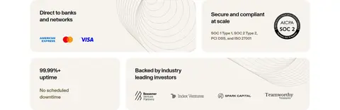
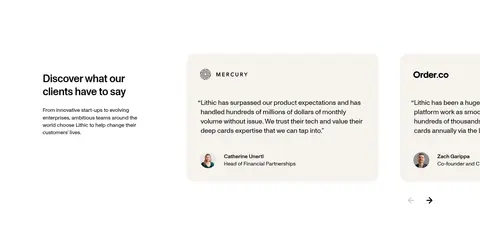
Arrange credibility points in soft cream or white cards, pairing concise headings with certification, network, or investor marks.
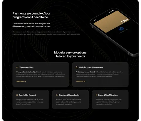
Dark service cards
Use charcoal inverse cards with white text, rounded corners, and clear service labels; keep supporting copy restrained.
Product showcase
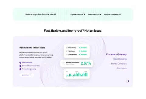
Place feature copy alongside interface or network visuals within a softly tinted, rounded product panel.
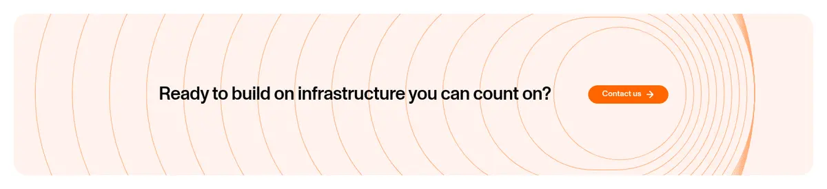
Contour CTA band
Set a short conversion message and orange pill action over a pale patterned background, with the decorative lines kept low contrast.
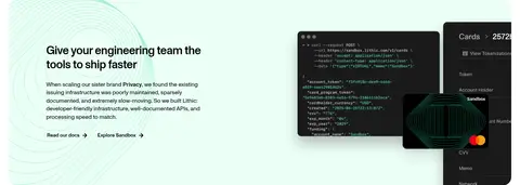
Imagery · Use dark, premium card mockups and abstract contour-line patterns for the hero and service area, with the lines staying subtle against black. Product panels can include clean interface screenshots, simplified dashboard details, and small brand or network marks. Keep imagery framed inside large rounded modules; pale mint and lilac backgrounds belong to specific product or developer showcases, not the entire page.
Reserve orange for high-priority conversion actions.
Use black panels to create deliberate contrast, not as a default background.
Keep pale mint, cream, and lilac on localized cards or bands.
Use consistent rounded card and pill-button treatments.
Pair concise headings with clearly subordinate explanatory copy.
✕ 不该做
Do not spread orange across large backgrounds.
Do not add gradients that are not present in the measured style.
Do not make contour patterns compete with text.
Do not use several unrelated font families.
Do not outline every card with a strong border.
Do not turn the light page into a uniformly dark layout.
给 AI 的提示词
想快速出一个同风格的新页面,把这段话连同 DESIGN.md 一起发给 AI。
Build a new fintech infrastructure page in Lithic’s visual style. Use a clean white canvas (#ffffff), Core Ink (#000000) for primary text and navigation, and Signal Orange (#ff6600) only for the main conversion action. Organize content in a centered frame with generous whitespace, alternating clear editorial headings and compact, scannable feature modules. Introduce dark feature panels with Panel Charcoal (#1a1a1a) or black surfaces, and use Warm Cream (#f6f3ee), Mint Wash (#ebfef6), or Lilac Mist (#f6f1fe) only for localized card and product bands. Set all text in a restrained geometric grotesk such as Inter, favoring regular body copy and medium-weight headings. Use rounded cards, pill actions, subtle contour-line artwork, and polished card or dashboard imagery. Keep interactions obvious, details credible, and decoration subordinate to content.