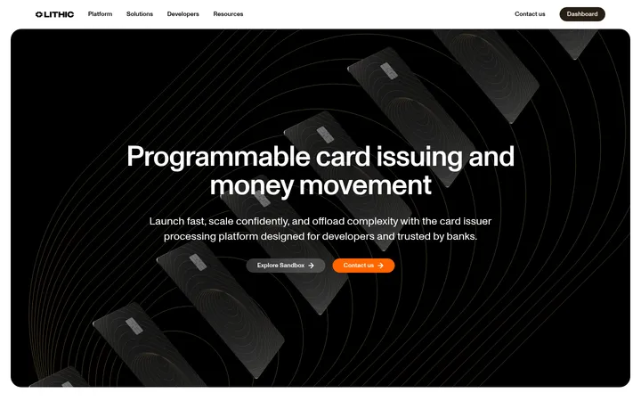
North star · Keep the page almost entirely near-black, then use editorial serif headlines and carefully lit financial-product imagery to create contrast without visual noise.
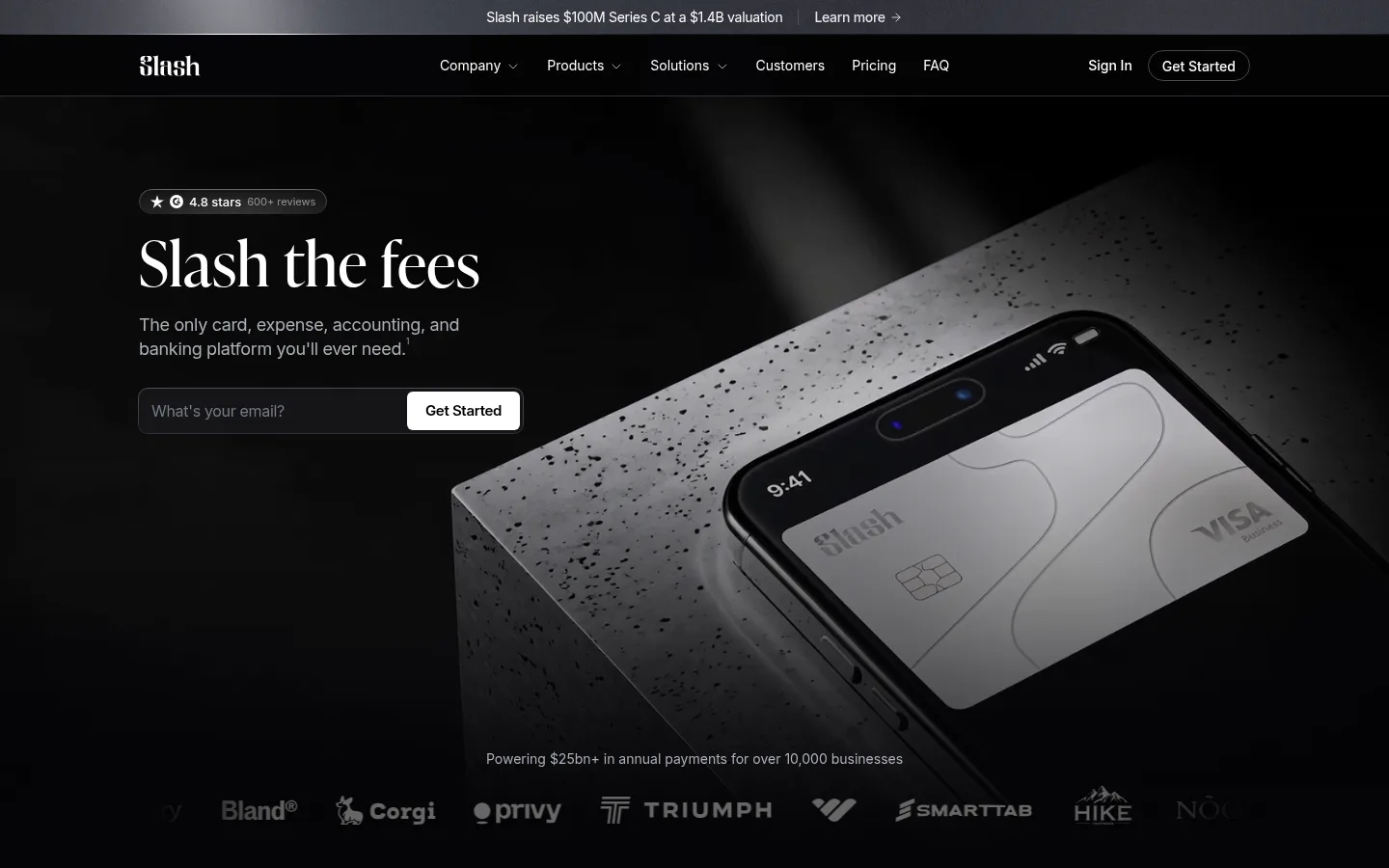
The visual system is anchored by Canvas Black (#040406), used across nearly the entire page, with a slightly lifted footer surface (#08080a) and dark media panels separating content without relying on bright section bands. White (#ffffff) carries the main headlines, navigation, and high-contrast calls to action; muted gray text supports descriptions and dense legal content. Copper (#cc9166) is a restrained editorial-link accent, not a broad UI fill. IvyPresto-style serif typography gives the large headlines an editorial, financial-publication character, while Inter handles navigation, controls, captions, and body copy. The hero combines a left-aligned message and email form with a large, darkened card-and-phone photograph. Below, centered feature introductions alternate with modular media cards, metrics, pricing columns, FAQ rows, and article tiles. Generous vertical intervals keep the long page calm; thin borders and rounded pills define controls and badges without adding prominent shadows.
Interface and supporting copy: navigation, body text, buttons, labels, and links.
Aa 设计
__ivyPresto_6eafe2
网络字体 · 字重 400 / 500 · 占比 8%
免费替代:Cormorant Garamond
Display and large editorial headings throughout the hero and major sections.
角色
示例
字号
字重
行高
字距
特大标题
Oversized editorial display statements in major hero or section moments.
Slash
64px
400
1.05
0.01em
一级标题
Primary hero headline and page-level statement.
Slash
52px
400
1.13
0.01em
二级标题
Major section headings, often centered or split across lines.
Slash
44px
400
1.38
0.01em
三级标题
Feature-card headings and prominent subsection titles.
The quick brown fox 敏捷的狐狸
24px
500
1.38
-0.04em
四级标题
Compact card, pricing, and FAQ subsection headings.
The quick brown fox 敏捷的狐狸
20px
500
1.38
-0.04em
正文
Descriptions, feature explanations, and standard paragraph copy.
The quick brown fox 敏捷的狐狸
14px
400
1.5
-0.02em
辅助文字
Small uppercase-like category labels, dates, and compact metadata.
The quick brown fox 敏捷的狐狸
13px
600
1
-0.02em
按钮
CTA labels and other interactive control text.
The quick brown fox 敏捷的狐狸
16px
400
1.38
-0.02em
导航
Top-level navigation items and menu labels.
The quick brown fox 敏捷的狐狸
16px
400
1.38
-0.02em
链接
Prominent inline links and editorial or product destinations.
The quick brown fox 敏捷的狐狸
20px
500
1.38
-0.04em
间距与布局
基准单位 4px · 密度:宽松
224px版块间距
6px元素间距
—卡片内边距
1152px内容最大宽度
2px
4px
6px
8px
9px
10px
12px
14px
16px
20px
22px
24px
32px
40px
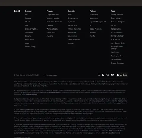
Use a spacious, long-form desktop layout within the measured 1152px maximum content width. The 12-column hero aligns its copy and email capture to the left while full-bleed product media occupies the remaining canvas. Later sections shift among centered introductions, two- to four-column feature arrangements, split trust and security areas, and two-column pricing. Keep generous measured section intervals and avoid crowding; use compact gaps only inside cards, lists, and controls. The footer is denser and organized into multiple link columns.
圆角与层次
按钮 · 9999px
输入框 · 9999px
图片 · 10px
徽标 · 9999px
导航 · 2px
链接 · 2px
hairline · media
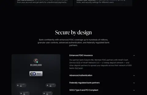
The page is predominantly flat and relies on tonal separation rather than drop shadows. Use near-black surfaces and media panels for layering, with thin, low-contrast borders around pills, badges, FAQ rows, and controls. A measured hairline media shadow can define an edge, but avoid floating-card effects or conspicuous elevation.
组件
下面的预览按实测的按钮、输入框、徽标、卡片样式重建(字体用替代字体)。
Announcement and navigation
A narrow announcement strip sits above a dark horizontal nav; white brand and primary links contrast with muted secondary items and a bordered pill CTA.
Hero email capture
Pair a large serif headline and short muted description with a pill-shaped email field and compact white Get Started button; place over the dark product-photo hero.
Trust media cards
Use a row of customer video or image cards with dark overlays, small attribution, and concise proof points beneath.
Feature media tiles
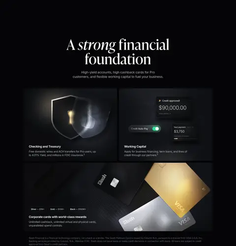
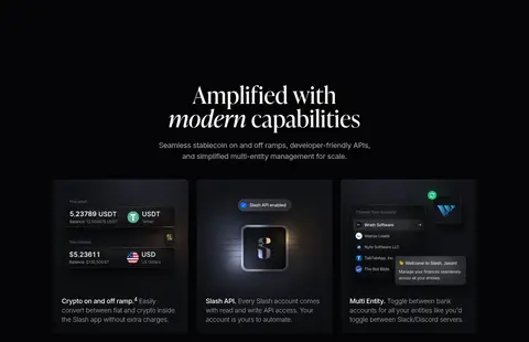
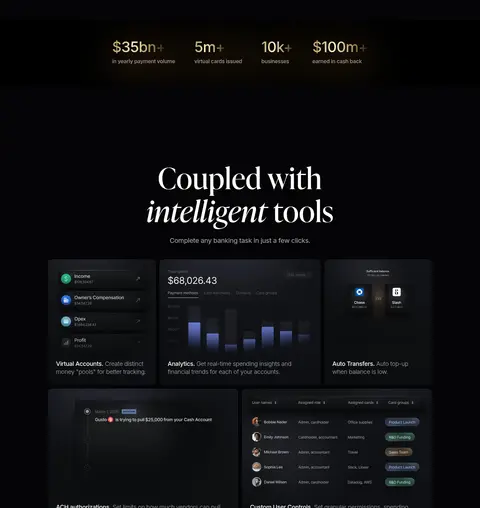
Arrange product capabilities in dark modular panels with concise sans-serif headings, subdued copy, and embedded product or interface imagery.
Pricing columns
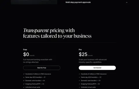
Present Free and Pro in side-by-side plans with prominent prices, short descriptions, outlined or white pill actions, and dense checkmarked feature lists.
FAQ rows
Set a serif section heading beside a stacked list of question rows with fine separators and compact disclosure indicators.
Editorial cards
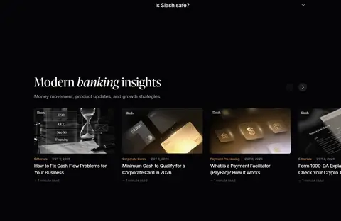
Show a horizontal article feed with wide image thumbnails, small copper category links, dates, and readable white titles.
Imagery · Lead with cinematic product photography: a phone displaying a Slash card on a textured pedestal, framed large and darkened into the canvas. Customer videos and testimonials add human proof, while later sections use product-card photography, interface mockups, and chart-like visuals. Keep imagery low-key, with controlled highlights and black fades; grayscale logos and subdued thumbnails preserve the page's monochrome atmosphere.
Keep the page canvas at #040406 and reserve #08080a for subtle surface shifts.
Set major statements in an editorial serif and supporting UI in Inter.
Use white as the primary text and CTA color, with muted grays for hierarchy.
Keep #cc9166 limited to small editorial or contextual accents.
Use cinematic dark product photography with controlled highlights.
Preserve generous section breathing room and sparse, low-contrast borders.
✕ 不该做
Do not introduce bright section backgrounds or saturated accent colors.
Do not use copper as a large CTA fill or dominant surface.
Do not replace the serif display voice with a uniform sans-serif system.
Do not add heavy shadows, glossy cards, or elevated dashboard-style panels.
Do not crowd the page with dense grids or excessive decorative elements.
Do not brighten product photography until it competes with headlines.
给 AI 的提示词
想快速出一个同风格的新页面,把这段话连同 DESIGN.md 一起发给 AI。
Build a new Slash-style fintech page on Canvas Black (#040406), with Lifted Charcoal (#08080a) reserved for subtle footer or panel separation. Use large IvyPresto-like serif headings and Inter for navigation, body copy, labels, and controls. Keep primary text Paper White (#ffffff), secondary copy in Soft Pewter (#acafb9) or Quiet Slate (#5e616e), and use Editorial Copper (#cc9166) only for small editorial links. Compose the page within the measured 1152px content width, with spacious section rhythm, restrained borders, and low visual density. Lead with cinematic dark financial-product imagery; follow with modular feature media, trust proof, pricing, FAQ, and editorial content. Favor flat tonal layering, pill-shaped CTAs, subtle dividers, and clearly tiered text. Avoid bright fills, heavy shadows, and decorative clutter.