North star · Keep serious product messaging crisp and editorial, while using sparse pastel light and generous white space to soften the experience.
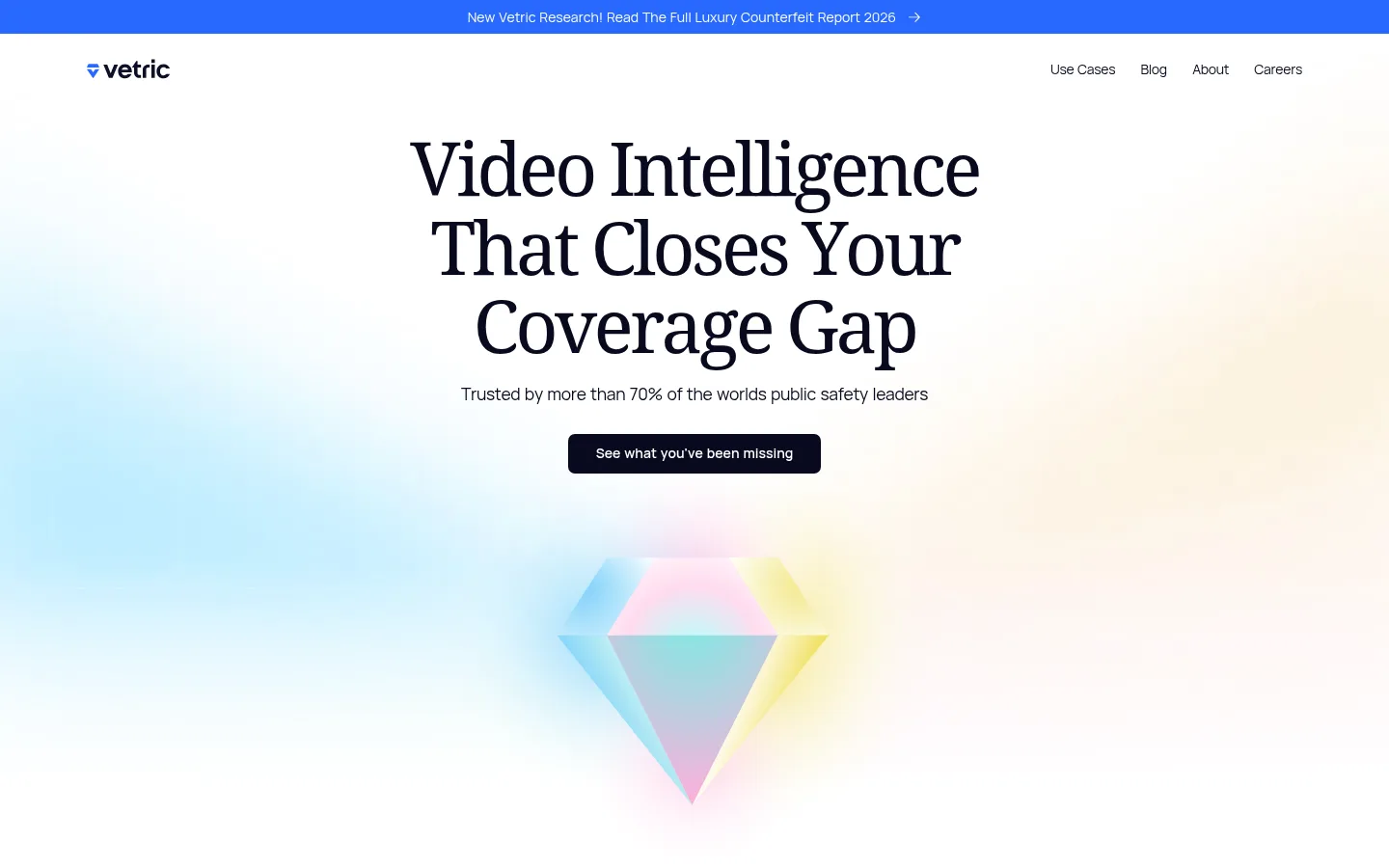
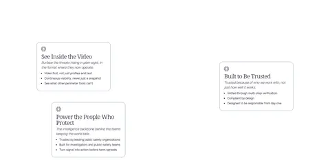
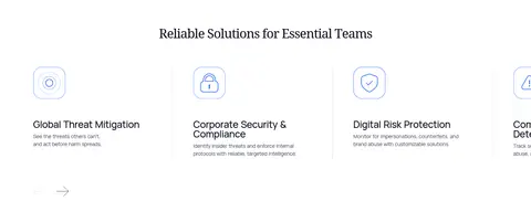
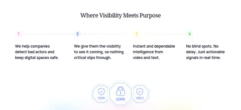
The page builds a calm, trustworthy identity from a white canvas, near-black text, and soft ambient colour rather than dense interface chrome. A centered announcement strip in vivid blue sits above restrained navigation. The hero uses a large Noto Serif headline and a compact dark CTA, with a diffuse blue-to-warm pastel glow and a faceted iridescent emblem behind it. Manrope handles navigation, explanatory copy, labels, and metrics; serif headings add an editorial, human tone to a serious intelligence product. Below the hero, generous white space separates small outlined feature cards, a four-column solutions row, pastel metric tiles, and a numbered process strip. Accent blue, pink, and yellow distinguish links and data but remain supporting details. The ending repeats the soft luminous colour field around a centered CTA, then transitions to a compact footer with a playful illustrated character. Borders are delicate; the overall composition feels flat and open.
Navigation, body copy, captions, labels, buttons, and supporting product information.
Aa 设计
Noto Serif
网络字体 · 字重 400 / 300 · 占比 14%
免费替代:Noto Serif
Display and section headings, including the large centered hero statement.
角色
示例
字号
字重
行高
字距
特大标题
Editorial display headline and major brand statements.
Vetric
77px
400
1.06
-0.05em
一级标题
Primary hero headline, measured in Manrope but visually serif-led in the screenshot.
Vetric
70px
500
0.79
-0.06em
二级标题
Large section headings, including the outcomes and process sections.
Vetric
63px
400
1.33
-0.05em
三级标题
Subsection and card-group headings.
Vetric
49px
400
1.43
-0.04em
四级标题
Smaller feature titles and supporting editorial headings.
Vetric
35px
400
1.2
-0.04em
正文
Feature descriptions, section copy, and CTA supporting text.
The quick brown fox 敏捷的狐狸
14px
400
1.5
-0.02em
辅助文字
Compact labels, footnotes, and small supporting annotations.
The quick brown fox 敏捷的狐狸
12.5px
400
1.5
0
导航
Header navigation links and compact menu items.
The quick brown fox 敏捷的狐狸
14px
400
1.5
-0.02em
间距与布局
基准单位 1px · 密度:适中
42px版块间距
4px元素间距
19px卡片内边距
1260px内容最大宽度
4px
7px
9px
11px
14px
18px
19px
21px
25px
26px
28px
29px
35px
42px
44px
56px
Use a centered content frame with a measured page max width of 1260px and a comfortable, open density. The first viewport centers its headline, supporting line, and CTA beneath a slim announcement bar and compact navigation. Keep section headings centered where the content is grouped; use four columns for the solutions and process steps, and a two-part layout for the results section. The section rhythm is spacious, with a measured 42px section gap and mostly white bands. Let the hero and closing CTA breathe rather than filling every region.
圆角与层次
按钮 · 7px
卡片 · 25px
没有测到阴影:页面是扁平的,层次靠底色和描边区分。
The page is largely flat: no measured shadows, heavy overlays, or stacked panels. Cards use thin blue-gray outlines and rounded corners, while metric tiles use pale colour fills instead of elevation. Keep the hero artwork visually layered through gradients and transparency, not drop shadows; use delicate hairlines only where they clarify card boundaries.
组件
下面的预览按实测的按钮、输入框、徽标、卡片样式重建(字体用替代字体)。
Announcement bar
A full-width Signal Blue strip above the header, with centered white research-link text and a small arrow.
Primary navigation
Compact white header with the Vetric mark at left and understated Manrope links aligned to the right.
Hero
Centered Noto Serif statement, short Manrope proof line, Midnight Ink CTA with a 7px radius, and softly glowing faceted artwork.
Feature cards
Concise capability cards with a white fill, thin #8496b8 outline, rounded corners, small icon, and compact supporting copy.
Solutions row
Four horizontally arranged use-case items, each led by a simple outlined icon and followed by a concise title and description.
Metric tiles
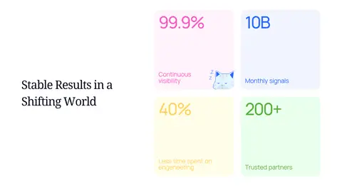
A grouped set of four pastel data cards using blush, blue, yellow, and mint surfaces with oversized colour-coded figures.
Closing CTA and footer
Centered closing headline and dark button over a pastel glow; compact footer includes company links and a character illustration.
Imagery · The hero relies on a luminous, faceted geometric emblem rather than photography, set against a diffuse pastel glow. Small icons support the feature cards and solutions row; metric tiles include restrained illustrative details. The closing CTA uses another hazy colour field and a subtle technical pattern. A playful illustrated character appears in the footer. Keep imagery isolated, softly blended into white, and subordinate to the headline and information.
Reserve vivid blue for the announcement and select links.
Use pastel surfaces to distinguish metrics and select cards.
Keep card borders delicate and flat.
✕ 不该做
Do not make the page feel like a dense dashboard.
Do not replace the white canvas with a saturated section background.
Do not use heavy shadows to separate cards.
Do not let decorative gradients compete with the headline.
Do not use pink or yellow as dominant interface colours.
Do not crowd the hero with extra copy or controls.
给 AI 的提示词
想快速出一个同风格的新页面,把这段话连同 DESIGN.md 一起发给 AI。
Build a new Vetric-style page with an airy white canvas (#ffffff), Midnight Ink text and CTA (#090a1e), and compact Manrope navigation and body copy. Use Noto Serif for large editorial headings, keeping their tracking tight and their line breaks deliberate. Make the hero centered and spacious, with one clear supporting sentence and a dark rounded CTA. Add diffuse pastel light and restrained geometric illustration rather than stock photography. Use Signal Blue (#2969ff) sparingly for announcements and links; reserve Blush Veil (#fff3fb), Cloud Blue (#f1f5ff), Mint Haze (#eaffed), and Lemon Mist (#fffdea) for select cards or metrics. Organize content in clean columns with generous white separation, fine #8496b8 borders, and no heavy shadows. Keep decorative elements secondary to readable product messaging.