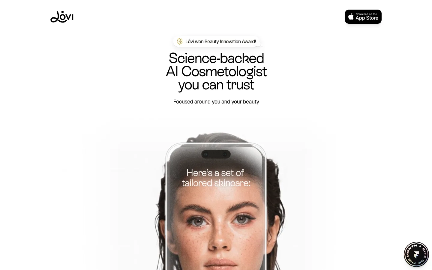
Lóvi 将 AI 护肤建议与柔和、具有美妆编辑感的视觉呈现结合。页面以近白色背景、淡紫灰分区和圆角产品卡片营造轻盈感,并突出真实肌肤与应用界面。
North star · Keep the interface quiet and spacious so real skin, useful product examples, and clear AI guidance remain the focus.
The page builds its identity from a white canvas, black typography, and broad pale lavender-gray section bands rather than strong decorative colour. A restrained periwinkle accent marks interactive AI moments and selected links, while warm skin tones belong mainly to photography and product imagery. Large, compact display headings use ES Rebond Grotesque with close tracking; Geist and Inter handle supporting text and small labels. The composition alternates a narrow, centered narrative with full-bleed skincare imagery and clusters of floating app screens. Rounded white cards create clear, quiet groupings against the subtly tinted sections. Spacious gaps let each demonstration, testimonial, or expert portrait read distinctly, while soft shadows give selected cards separation without relying on visible borders. The overall effect is clinical but approachable: minimal interface chrome, human faces, and practical product examples.
配色
点色块复制色值。用途说明来自对页面的实测位置(背景、文字、描边、按钮)与截图判读。
强调色
表层色
中性色
功能色
页面底色 · Gallery White表层 · Lavender Mist主文字 · Soft Ink次要文字 · Warm Pebble弱文字 · Deep Taupe强调 · Periwinkle Signal
Small captions, labels, and secondary interface details.
Aa 设计
Inter-Medium
系统字体 · 字重 500 · 占比 12%
免费替代:Inter
System-font medium variant for small supporting labels.
Aa 设计
ES Rebond Grotesque Medium
网络字体 · 字重 400 · 占比 8%
免费替代:DM Sans
Prominent link-style statements and selected display text.
Aa 设计
ES Rebond Grotesque Regular
网络字体 · 字重 400 · 占比 5%
免费替代:DM Sans
Main page headings from hero through section titles.
角色
示例
字号
字重
行高
字距
一级标题
Hero headline introducing the science-backed AI cosmetologist.
Lóvi
48px
400
0.92
-0.042em
二级标题
Major feature and section headlines.
Lóvi
44px
400
0.91
-0.023em
三级标题
Subsection headings for demonstrations and editorial blocks.
Lóvi
32px
400
1.06
-0.031em
四级标题
Smaller card and supporting section headings.
Lóvi
28px
400
1.14
-0.036em
正文
Explanatory copy, feature descriptions, and conversation text.
The quick brown fox 敏捷的狐狸
16px
400
1.38
-0.031em
辅助文字
Compact labels, metadata, and product or expert details.
The quick brown fox 敏捷的狐狸
12px
500
1.33
-0.025em
链接
Prominent linked statements and larger interactive text.
The quick brown fox 敏捷的狐狸
22px
400
1.09
-0.045em
间距与布局
基准单位 4px · 密度:宽松
120px版块间距
8px元素间距
16px卡片内边距
659px内容最大宽度
2px
4px
6px
8px
10px
12px
14px
16px
20px
24px
32px
40px
48px
Use a narrow, centered content column within a much wider, mostly white page; measured page max width is 659px. The measured section rhythm is spacious, with a 120px section gap and compact 8px element gap. Center headlines above product or app demonstrations, then use two-column card groupings and horizontally presented testimonials where needed. Alternate white and pale lavender-gray bands to distinguish long feature sequences. Keep media prominent and allow generous empty space around major moments.
圆角与层次
按钮 · 24px
卡片 · 24px
图片 · 24px
链接 · 48px
lg · card, other
md · card
xl · other
lg · card
Most surfaces feel flat, with no prominent border system. White cards stand out against pale section bands through rounded corners and subtle, diffuse shadows; reserve stronger layering for app screens and cards that need separation. Keep depth restrained so the page retains its airy, clinical calm.
组件
下面的预览按实测的按钮、输入框、徽标、卡片样式重建(字体用替代字体)。
Centered hero
Small award callout above a tightly tracked, multi-line headline and concise supporting line; keep the surrounding white space generous.
Phone showcase
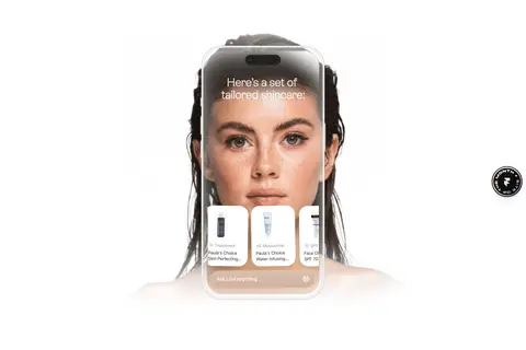
Large app-screen device mockup paired with skincare imagery; softly blend its edges into the white canvas.
Feature card
White card with a measured 24px radius and 16px padding; group app scans, ingredient checks, and related demonstrations.
AI chat demonstration
Stack conversational bubbles and recommendation product cards on a pale lavender-gray section, using periwinkle sparingly for interaction emphasis.
Testimonial cards
Present customer quotes in rounded, lightly elevated white cards with compact author and verification details.
Expert portrait card
Use a wide, rounded white container with portrait photography and restrained professional captions.
Compact choice buttons
Place concise response options in rounded white controls; preserve the simple black-text treatment shown in the page.
Imagery · Use close-up beauty photography with natural skin texture, alongside realistic phone mockups showing the skincare app. Product bottles and diagnostic screens appear as examples inside the interface imagery, not as a separate decorative palette. Keep portraits large, softly lit, and often centered; fade or blend media edges into white where shown. Supporting visuals are clean app captures and product cards rather than ornamental illustration.
Use pale lavender-gray bands to mark feature sequences.
Set display headlines in a closely tracked grotesque sans.
Center the main headline and major app demonstrations.
Give white cards rounded corners and restrained shadows.
Use real-looking skin and app imagery as the main visual focus.
✕ 不该做
Do not introduce a strong multicolour brand palette.
Do not crowd the page with dense navigation or interface chrome.
Do not outline every card with visible borders.
Do not use decorative gradients as a substitute for photography.
Do not let product mockup colours redefine the page palette.
Do not make the small supporting copy compete with the headline.
给 AI 的提示词
想快速出一个同风格的新页面,把这段话连同 DESIGN.md 一起发给 AI。
Build a new page in Lóvi’s calm AI-skincare style. Use Gallery White (#ffffff) as the main canvas and Lavender Mist (#f6f6fa) for broad, quiet feature bands. Set primary text in Soft Ink (#000000), with Warm Pebble (#a4a3a0) and Deep Taupe (#292824) reserved for secondary copy. Apply Periwinkle Signal (#5263ff) sparingly to AI-related highlights. Use a tightly tracked, regular grotesque display face for centered headlines, with clean sans-serif body text and compact captions. Compose a narrow centered narrative with generous whitespace, large realistic skincare photography, and phone-interface demonstrations. Group details in rounded white cards with soft shadows rather than borders. Keep layouts simple, human, and editorial; let app screens and natural skin imagery carry the visual interest.