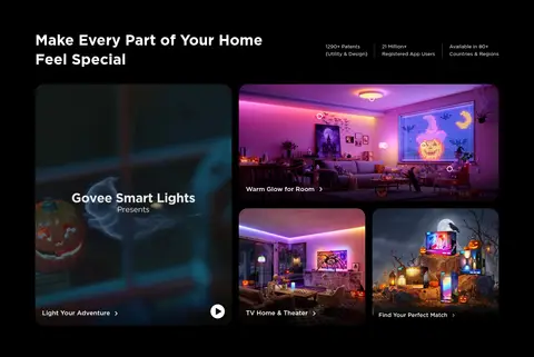
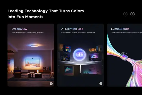
North star · Keep the interface itself nearly black and let vivid, full-bleed lighting imagery—not extra UI color—create the drama.
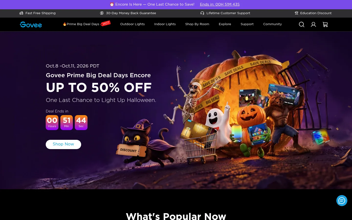
The page uses #000000 as its main canvas, giving the full-bleed Halloween campaign and luminous product imagery room to dominate. Most commerce sections stay on black, while testimonials and the footer shift to #161617 for a subtle banded rhythm. Gotham sans-serif keeps navigation, headings, cards, and controls consistent; bold white headings provide clear hierarchy, with muted gray supporting copy. Cyan #00a0df anchors prominent shopping actions and brand cues, while #19a7f0 highlights secondary links. Product cards use charcoal surfaces and restrained borders rather than bright containers. The composition alternates centered discovery areas, four-column product rows, category tiles, and asymmetric lifestyle features. Large media blocks create visual pauses between compact information grids. Seasonal artwork supplies purple, orange, and other saturated colors, but those belong to campaign imagery rather than the core interface palette. Spacing feels comfortable, with broad gaps between major sections and tighter grouping within cards.
Site-wide type for navigation, headings, product copy, links, and controls.
角色
示例
字号
字重
行高
字距
一级标题
Primary campaign headline and prominent page-level message.
Govee
40px
700
1.5
0
二级标题
Section headings such as product discovery and reviews.
Govee
28.5px
500
1.2
0
三级标题
Product, category, and feature titles.
The quick brown fox 敏捷的狐狸
22.5px
400
1.2
0
四级标题
Smaller feature headings and card subheads.
The quick brown fox 敏捷的狐狸
21px
500
1.5
0
正文
Product descriptions, supporting copy, and general page text.
The quick brown fox 敏捷的狐狸
15px
400
1.5
0
辅助文字
Compact labels, dates, and secondary card details.
The quick brown fox 敏捷的狐狸
13.5px
400
1.43
0
按钮
Shopping and form actions, generally capitalized.
The quick brown fox 敏捷的狐狸
13.5px
400
1.43
0
导航
Primary navigation and announcement links.
The quick brown fox 敏捷的狐狸
15px
400
1.5
0
链接
Inline actions, product links, and section-level text links.
The quick brown fox 敏捷的狐狸
15px
400
1.5
0
间距与布局
基准单位 1px · 密度:适中
85px版块间距
4px元素间距
5px卡片内边距
1288px内容最大宽度
2px
3px
4px
6px
8px
9px
11px
14px
15px
19px
23px
27px
28px
30px
38px
57px
A wide desktop storefront centers content within a measured 1288px maximum width, while hero art and selected campaign panels span the viewport. Product browsing uses four-column grids, category navigation forms a dense row, and lifestyle features mix large media with smaller tiles. Section headings are centered in discovery and testimonial areas, while feature narratives align left. Long black stretches and broad section gaps alternate with compact cards and link clusters, creating comfortable overall density.
圆角与层次
按钮 · 15px
输入框 · 2px
卡片 · 11px
图片 · 8px
inset · card
hairline · button
md · other
The interface is mostly flat, with separation coming from black versus graphite section bands and charcoal cards. Borders are restrained and low contrast. Product and testimonial cards have rounded corners; select cards use a subtle inset blue-toned shadow. Avoid prominent global shadows or layered glass effects.
组件
下面的预览按实测的按钮、输入框、徽标、卡片样式重建(字体用替代字体)。
Announcement and navigation
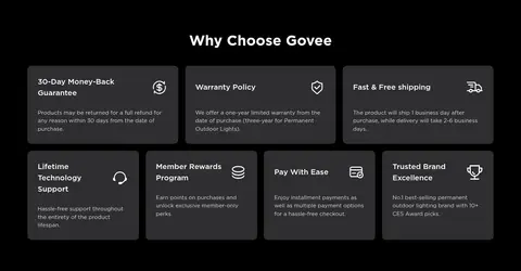
A thin promotional strip sits above compact service benefits and the main black navigation; white labels and cyan branding keep it legible.
Campaign hero
Full-bleed seasonal artwork pairs a left-aligned offer, countdown, and rounded white shopping CTA with vivid Halloween lighting imagery.
Product cards
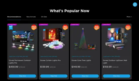
Four-column commerce cards use charcoal surfaces, product media, compact offer badges, pricing, and cyan shopping buttons.
Category tiles
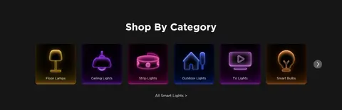
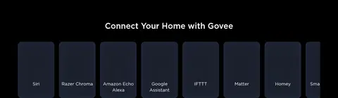
A centered category section presents a horizontal row of dark, image-led tiles with glowing product illustrations and short labels.
Lifestyle feature mosaic
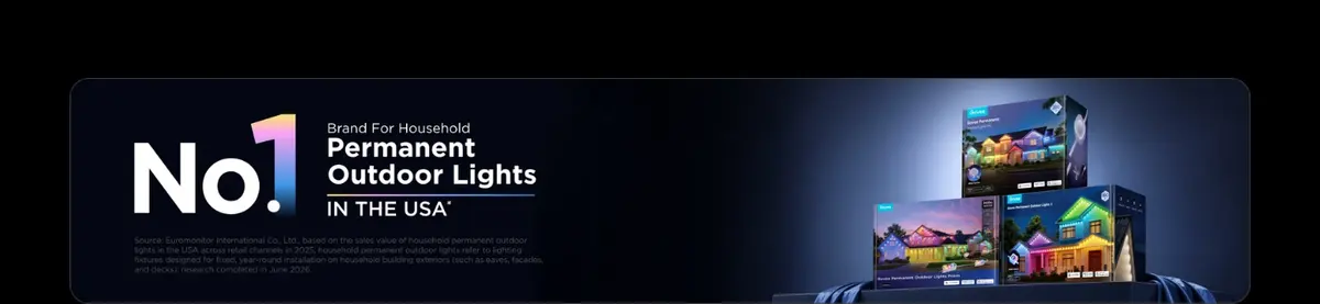
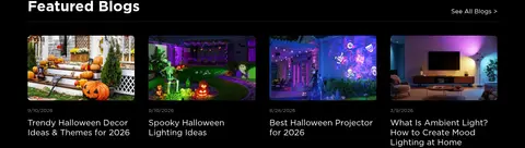
One prominent media tile combines with smaller room and entertainment scenes; short labels sit directly over or beneath imagery.
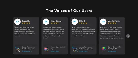
Review cards
Graphite testimonial cards group a circular customer initial, name, stars, compact quote, and linked product reference.
Newsletter banner
A wide illustrated offer panel combines a short email form, cyan action button, consent copy, and a bright coupon graphic.
Footer link columns
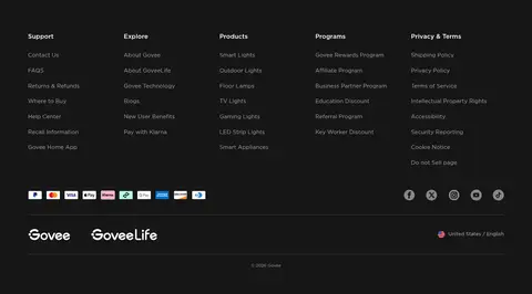
A graphite footer organizes support, explore, products, programs, and legal links into compact columns above payment and social marks.
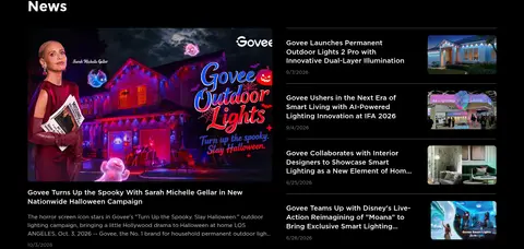
Imagery · Large campaign artwork and lifestyle photography show smart lights in vivid home, gaming, and seasonal settings. The opening Halloween banner is cinematic and full bleed, with text anchored on one side and elaborate themed imagery on the other. Product cards use isolated product photography against dark surfaces; category tiles use glowing product icons. Video and editorial images provide variety. Purple, orange, and multicolor light effects are image content, not a reason to tint the surrounding interface.
Reserve graphite bands for clearly grouped lower-page sections.
Use Govee Cyan for primary shopping actions.
Keep supporting copy muted and secondary to white headings.
Let luminous product imagery provide most of the color.
Use compact card layouts within spacious section rhythm.
✕ 不该做
Do not turn the page into a light theme.
Do not use saturated purple as a general UI accent.
Do not crowd full-width campaign imagery with extra framing.
Do not make card borders brighter than their content.
Do not replace the Gotham-like geometric sans-serif with a serif.
Do not apply heavy shadows to every component.
给 AI 的提示词
想快速出一个同风格的新页面,把这段话连同 DESIGN.md 一起发给 AI。
Build a new Govee-style commerce page on a near-black #000000 canvas, using Gotham or a close geometric sans-serif. Use Bright White #ffffff for headings and primary text, Soft Silver #cccccc for supporting copy, and Govee Cyan #00a0df for main shopping actions; reserve Link Blue #19a7f0 for secondary links. Keep most sections visually flat, with charcoal cards in #2e2e30 and occasional broad Footer Graphite #161617 bands. Establish hierarchy through full-bleed, vivid product or lifestyle imagery, not decorative UI gradients. Use wide centered content areas, compact multi-column product grids, varied media-led feature layouts, and generous gaps between major sections. Keep card copy concise, borders subtle, corners rounded, and controls clear. Treat seasonal purple and orange as image colors, not core interface colors.