North star · Keep a generous white canvas and let strong black headlines, vivid blue actions, and tangible product demonstrations carry the story.
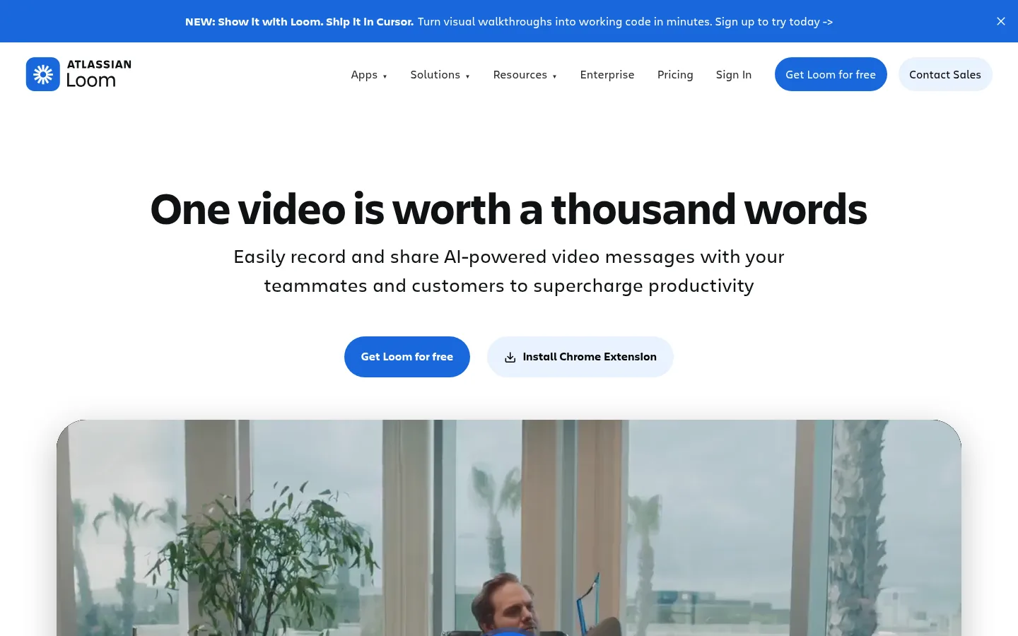
The page is built on a white canvas, with saturated blue reserved for the announcement strip, primary buttons, selected promotional panels, and links. Black headings and charcoal body text provide strong contrast; pale blue appears in secondary button fills, testimonial surfaces, and the footer. The lime accent and lavender are measured in the palette but are not core brand surfaces; treat them as minor gradient or product-art colors. Charlie Display gives headlines a heavy, compact presence, while Charlie Text handles navigation, paragraphs, and controls. The layout alternates centered statements with spacious feature demonstrations and broad promotional panels. Product imagery is presented as video, interface mockups, and photographic moments, often inside softly rounded frames. Large gaps separate sections, while rounded buttons and cards soften the otherwise simple geometry. Keep the main canvas calm so each blue action and product visual reads clearly.
配色
点色块复制色值。用途说明来自对页面的实测位置(背景、文字、描边、按钮)与截图判读。
品牌色
强调色
表层色
中性色
功能色
页面底色 · Gallery White表层 · Pale Sky表层 2 · Near Black表层 3 · Charcoal表层 4 · Deep Navy主文字 · Near Black次要文字 · Gallery White弱文字 · Charcoal描边 · Soft Divider强调 · Loom Blue强调 2 · Citrus Tint强调 3 · Deep Navy
Navigation, body copy, captions, buttons, and links.
Aa 设计
Charlie Display
网络字体 · 字重 700 · 占比 35%
免费替代:Manrope
Display headlines and major section headings.
角色
示例
字号
字重
行高
字距
特大标题
Largest campaign headline or high-impact promotional title.
Loom
63.5px
700
1.03
0
一级标题
Primary hero headline and prominent page-level title.
Loom
44px
700
1.14
0
二级标题
Major feature, proof, and use-case section headings.
Loom
32.5px
700
1.27
0
三级标题
Supporting feature titles and explanatory subheads.
The quick brown fox 敏捷的狐狸
26.5px
400
1.52
0
四级标题
Secondary promotional or card heading.
The quick brown fox 敏捷的狐狸
25.5px
700
1.33
0
正文
Main explanatory copy and section descriptions.
The quick brown fox 敏捷的狐狸
18.5px
400
1.65
0
辅助文字
Small supporting labels, attribution, and metadata.
The quick brown fox 敏捷的狐狸
15.5px
400
1.71
0
按钮
Primary and secondary CTA labels.
The quick brown fox 敏捷的狐狸
15.5px
700
1.71
0
导航
Header navigation and announcement copy.
The quick brown fox 敏捷的狐狸
18.5px
400
1.65
0
链接
Inline actions such as feature links and article links.
The quick brown fox 敏捷的狐狸
18px
700
1.5
0
间距与布局
基准单位 4px · 密度:适中
36px版块间距
16px元素间距
111px卡片内边距
1368px内容最大宽度
1px
2px
6px
8px
16px
23px
24px
32px
36px
40px
71px
91px
111px
Use a centered content frame capped at the measured 1368px page width, with generous whitespace and a comfortable density. The page alternates centered headline sections with left-aligned feature explanations and split product demonstrations. Keep the announcement and header as compact horizontal bands, then let the hero breathe above a wide media frame. Use measured spacing tokens rather than inventing new values; the observed base unit is 4px, with larger section gaps and broad card padding. Full-width promotional panels and the footer create occasional visual anchors within the otherwise white page.
圆角与层次
按钮 · 9999px
卡片 · 69px
图片 · 50%
导航 · 9999px
链接 · 69px
xl · media, other
hairline · button
xl · card
xl · button
Most sections remain flat against white, with hierarchy created through spacing and color rather than borders. Media and selected cards use soft layered shadows; measured hairlines are subtle. Rounded cards and pill controls distinguish interactive elements, while dark and blue panels provide depth through contrast rather than heavy outlines.
组件
下面的预览按实测的按钮、输入框、徽标、卡片样式重建(字体用替代字体)。
Announcement strip
Full-width blue band above the white header, with centered compact announcement copy and a close affordance.
Pill CTA
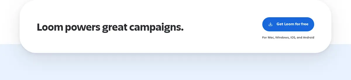
Primary buttons use #1868db, white bold Charlie Text, and a 9999px radius; secondary actions use pale blue.
Hero media
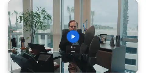
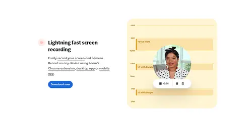
Wide video preview beneath a centered headline and supporting copy, framed with rounded corners and soft shadow.
Feature split
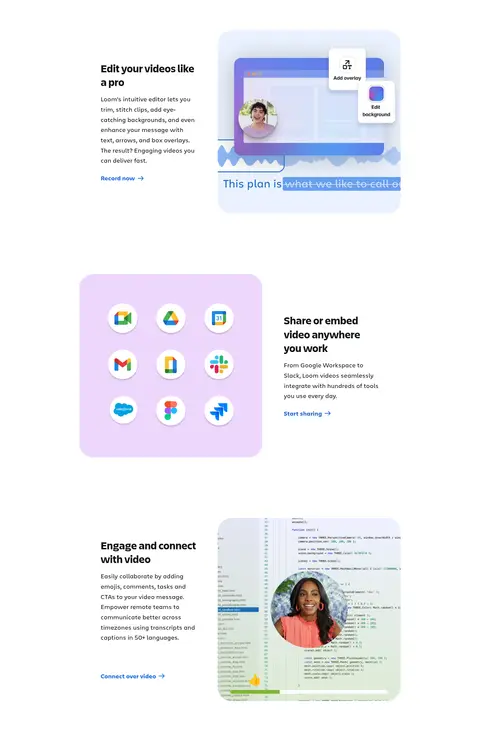
Alternate concise copy and product imagery across spacious sections; links use blue text and arrow cues.
Promotional panel
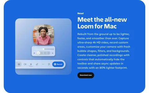
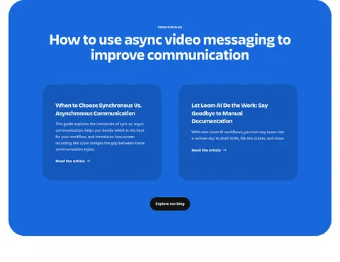
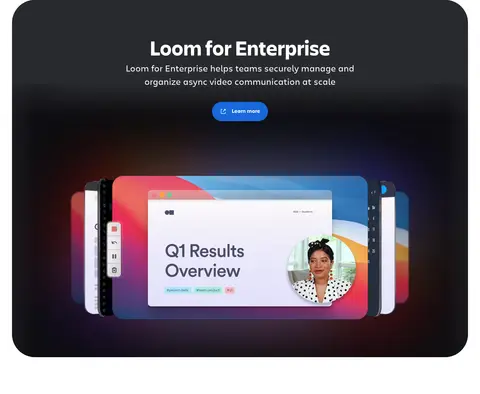
Large rounded blue or near-black feature surface with white text, product visual, and a contrasting CTA.
Use-case cards
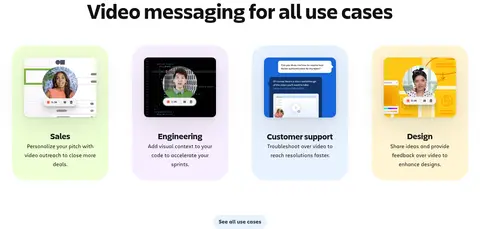
Four-column set of illustrated use cases; artwork supplies varied pastel color while card copy stays compact.
Customer proof
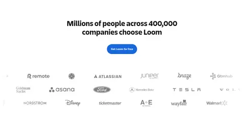
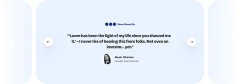
Logo cloud, customer testimonial carousel, and campaign CTA reinforce trust with pale blue surfaces and restrained controls.
Imagery · Lead with a wide photographic video preview, then mix customer logos, screen recordings, interface mockups, and use-case illustrations. Product visuals show real UI controls and faces inside the experience, while promotional cards use brighter blue or dark surfaces. Frame media with soft, generous rounding and restrained depth; avoid treating decorative colors inside mockups as page-wide brand colors.
Use Loom Blue for primary actions and key emphasis.
Set major headings in a bold display face.
Give product demonstrations generous space.
Use rounded pill controls and soft media corners.
Keep secondary copy dark and highly legible.
✕ 不该做
Do not turn every section into a colored panel.
Do not use lime or lilac as dominant brand colors.
Do not crowd the hero with extra UI.
Do not add heavy outlines around cards.
Do not make body copy compete with the headline.
Do not flatten product imagery into generic decoration.
给 AI 的提示词
想快速出一个同风格的新页面,把这段话连同 DESIGN.md 一起发给 AI。
Build a new Loom-style SaaS page with a bright Gallery White (#ffffff) canvas, Near Black (#101214) headlines, and Loom Blue (#1868db) for the main CTA, links, and occasional emphasis. Use Charlie Display for bold, compact headings and Charlie Text for navigation, body copy, and controls; use Inter and Manrope only as practical substitutes. Keep a centered, spacious layout with short announcement and navigation bands, a clear hero, and product-led sections featuring video or interface imagery. Use Pale Sky (#e9f2fe) for secondary surfaces, and reserve charcoal or Deep Navy (#123263) panels for intentional contrast. Round buttons into pills and soften media frames with generous corners and restrained shadows. Maintain clear hierarchy, roomy section transitions, and concise copy. Treat Citrus Tint (#b3df72) and Lilac Mist (#eed7fc) as artwork accents, not page-wide colors.