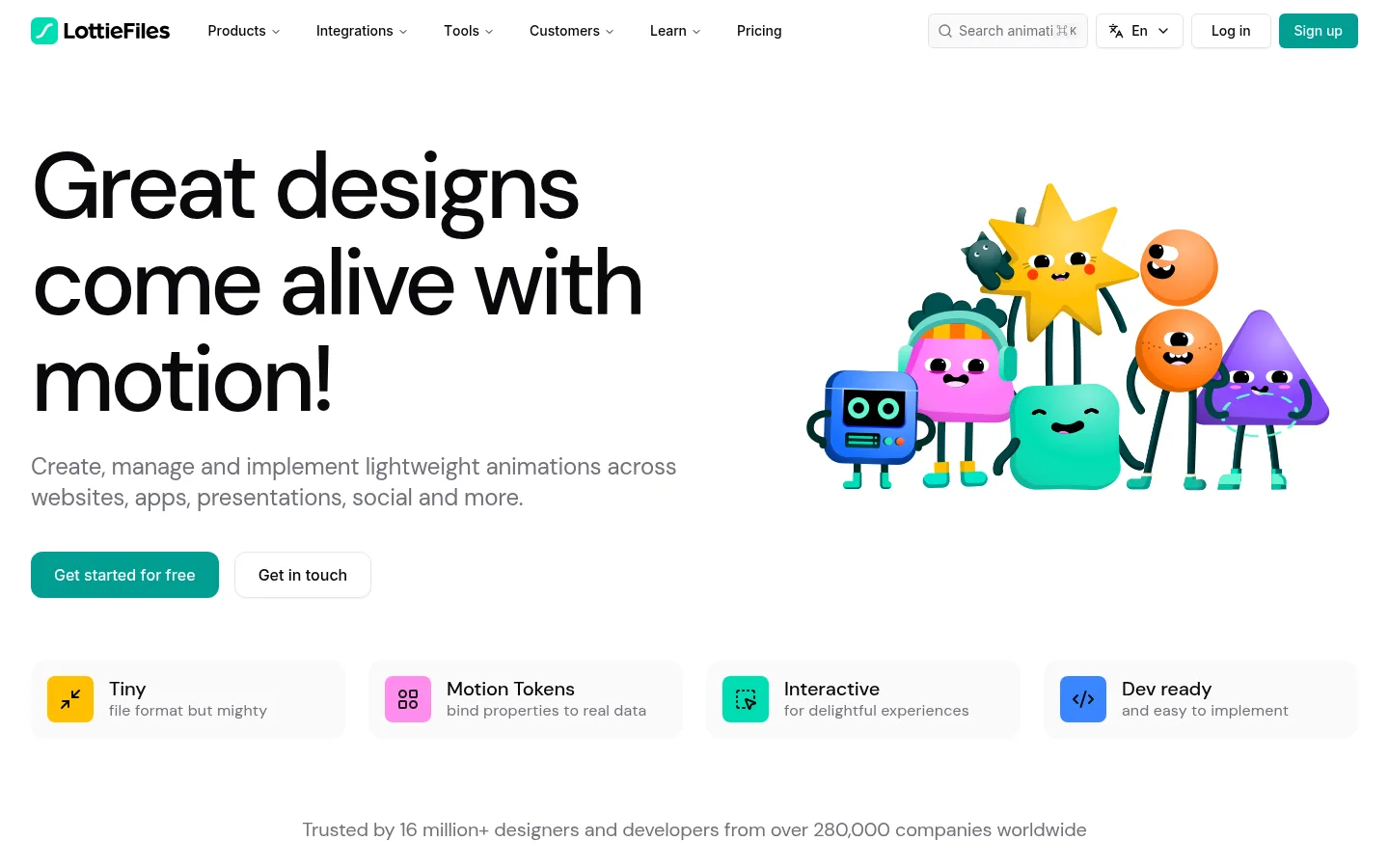
LottieFiles以干净的白色画布和醒目的大字呈现动效预览与产品功能。青绿色按钮贯穿页面,深色和黄色功能区则为长页面带来鲜明节奏。
North star · Keep the page bright and spacious, using oversized black type, teal actions, and vivid motion previews to make product stories easy to scan.
The page uses white as its continuous canvas, letting product previews and animation artwork provide most of the color. Near-black headings create strong contrast, while teal marks primary actions and occasional yellow panels identify creative or AI-focused content. DM Sans LF carries expressive, large headings and readable body copy; Inter LF appears in navigation, controls, captions, and utility text. The opening hero is an asymmetrical split: oversized copy and paired actions on the left, character artwork on the right. Later sections alternate centered introductions, logo and animation galleries, and product-feature layouts. Light-gray cards organize dense interface previews without breaking the bright overall surface. Large rounded dark panels create deliberate contrast for creator and runtime demonstrations. Generous gaps between major content groups keep the lengthy page scannable, while compact cards and interface details communicate product depth. Artwork is colorful and lively, but stays within clearly bounded feature and gallery regions.
配色 点色块复制色值。用途说明来自对页面的实测位置(背景、文字、描边、按钮)与截图判读。
品牌色
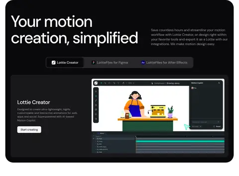
Motion Teal
#019d91
Primary signup and get-started buttons; the recurring action color in the white interface.
强调色
Signal Yellow
#f0b100
Prominent yellow creative and AI feature panel; not a general page background.
Soft Leaf
#94d19f
Small link accent; secondary to teal and mainly seen in limited interface details.
表层色
Gallery White
#ffffff
Primary canvas across the hero, galleries, feature sections, and most of the long page.
Mist Panel
#f4f4f5
Soft gray feature and testimonial card backgrounds that separate content without heavy borders.
Panel Charcoal
#18181b
Dark product cards and interface previews nested in feature presentations.
中性色
Ink Black
#09090b
Main heading and body text, plus the footer and high-contrast feature panels.
Slate Gray
#71717b
Muted supporting copy and explanatory text beneath headings.
Quiet Gray
#9f9fa9
Subdued footer and secondary text where lower emphasis is needed.
Pure Black
#000000
Occasional deep dark link or interface detail; the footer is measured as #09090b.
功能色
Divider Gray
#ebebee
Fine borders and separators around controls, links, and light interface elements.
Badge Gray
#e4e4e7
Subtle badge and button edge detail, visible in small interface elements.
文字 背景 对比度 WCAG #09090b Ink Black#ffffff Gallery White19.9:1 AAA #09090b Ink Black#f4f4f5 Mist Panel18.1:1 AAA #09090b Ink Black#18181b Panel Charcoal1.12:1 不达标 #71717b Slate Gray#ffffff Gallery White4.83:1 AA #71717b Slate Gray#f4f4f5 Mist Panel4.39:1 AA-large #71717b Slate Gray#09090b Ink Black4.12:1 AA-large
字体 字号阶梯:Perfect Fourth(比例约 1.369,正文 20px)。示例用免费替代字体渲染,数值为实测。
Aa 设计
DM Sans LF 网络字体 · 字重 400 / 500 / 600 · 占比 74%
免费替代:DM Sans
Display, heading, and body copy
Aa 设计
Inter LF 网络字体 · 字重 400 / 500 · 占比 26%
免费替代:Inter
Navigation, buttons, captions, and utility labels
角色 示例 字号 字重 行高 字距 特大标题 Oversized hero or campaign headlines where present.
LottieFiles
96px 500 1.04 -0.05em 一级标题 Primary hero headline and major page-level feature title.
LottieFiles
64px 500 1.15 -0.04em 二级标题 Centered section titles and large product-story headings.
LottieFiles
48px 500 1.15 -0.04em 三级标题 Feature headings and prominent card titles.
LottieFiles
32px 500 1.1 0 四级标题 Subsection headings within product and workflow areas.
The quick brown fox 敏捷的狐狸
24px 500 1.12 -0.01em 正文 Hero descriptions and primary explanatory copy.
The quick brown fox 敏捷的狐狸
20px 400 1.4 -0.01em 辅助文字 Supporting details, card descriptions, and compact labels.
The quick brown fox 敏捷的狐狸
16px 400 1.5 0 按钮 Primary and secondary action labels.
The quick brown fox 敏捷的狐狸
14px 500 1.43 0 导航 Header navigation and menu labels.
The quick brown fox 敏捷的狐狸
14px 500 1.43 0 链接 Inline links and feature navigation actions.
The quick brown fox 敏捷的狐狸
16px 500 1.5 0
间距与布局 基准单位 8px · 密度:紧凑
32px 版块间距
8px 元素间距
— 卡片内边距
1376px 内容最大宽度
4px
6px
8px
12px
16px
20px
24px
32px
64px
80px
The measured content uses a maximum page width of 1376px and an 8px-based spacing system. The hero is a broad split layout with left-aligned copy and right-side artwork; later sections shift between centered introductions, product splits, and multi-column galleries. Large white intervals separate major stories, while compact card groupings add detail. Most content stays on the white canvas, with occasional full-width or inset dark and yellow feature panels. The overall density is compact within cards but relaxed between sections.
圆角与层次 hairline · button, text
hairline · button
sm · button
The interface is mostly flat, relying on white space, pale-gray card surfaces, and thin gray borders rather than pronounced shadows. Rounded feature cards organize previews; large near-black panels provide contrast and a sense of depth without ornamental effects. Controls may use a restrained hairline shadow, but avoid layered, floating-card styling.
组件 下面的预览按实测的按钮、输入框、徽标、卡片样式重建(字体用替代字体)。
Header navigation Compact horizontal navigation on white, with brand mark, menu links, search, locale, login, and a teal signup action.
Primary action Teal button with light text; measured signup variants use compact padding and a small rounded corner.
Hero feature row Large left-aligned headline and muted intro copy paired with colorful character artwork and two contrasting actions.
Benefit tiles Four pale feature tiles with small colorful square icons, short labels, and muted supporting text.
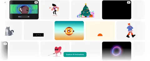
Animation gallery Dense, multi-column preview grid with varied artwork thumbnails and a centered browse action.
Dark product panel Large near-black rounded feature area containing white headings and framed product-interface previews.
Feature card Pale gray rounded card for workspace, workflow, or testimonial content, with media or interface detail.
Imagery · The page mixes playful, colorful character animation artwork with product-interface captures, customer logos, case-study cards, and a few photo or video previews. Artwork appears as clean, isolated compositions beside hero copy or inside galleries; interface screenshots are framed in rounded cards and feature panels. Bright animation colors belong primarily to the media itself, not the core interface palette. Avoid adding generic stock imagery where product visuals are needed.
页面版块 共 15 个版块,按页面从上到下排列,每个都标了类型、布局和交互套路。
首页
首屏 动效创意首屏
Split hero with left-aligned headline and actions, right-side animation artwork, followed by four benefit tiles.
品牌墙 客户品牌展示
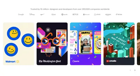
Centered trust statement, company logos, and a horizontal case-study media strip.
商品网格 动效资源库
Centered title and search above a wide multi-column animation gallery.
图集 动画精选
Dense twelve-column preview gallery with a prominent browse action.
产品展示 创作工具展示
Large rounded dark panel with headline, product tabs, and interface preview.
使用步骤 团队协作流程
Centered introduction and actions above a two-column feature area.
功能网格 工作区功能
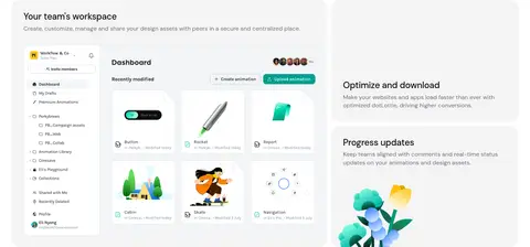
Three stacked feature stories with product-interface visuals.
功能网格 开发与集成
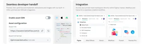
Two feature blocks pairing developer handoff and integrations.
图文交替 数字资产管理
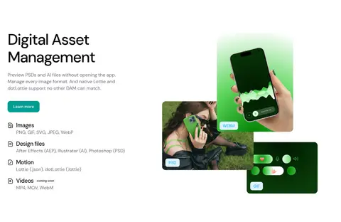
Left-aligned explanation and format list alongside a right-side media composition.
对比表 格式性能优势
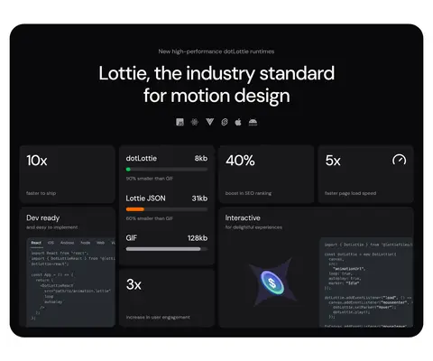
Centered headline above a dark dashboard of metrics, formats, and code previews.
集成生态 设计工具集成
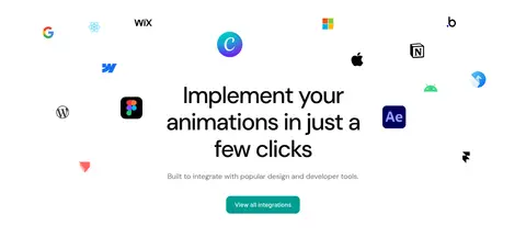
Centered headline and action surrounded by loosely arranged integration logos.
功能网格 AI创作工具
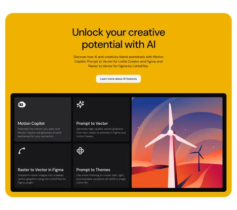
Yellow feature panel with centered introduction above a dark four-part product showcase.
用户评价 客户案例
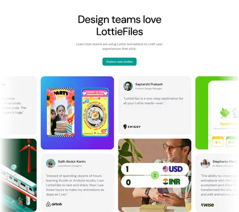
Centered section intro above a horizontally arranged case-study and testimonial gallery.
行动号召 免费开始创作
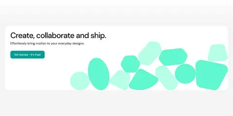
Wide light-gray closing band with left-aligned copy and an abstract mint animation on the right.
页脚 页脚导航
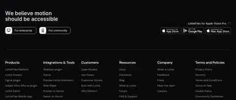
Full-width near-black footer with accessibility message, utility links, and six navigation columns.
该做与不该做 ✓ 该做 Use Gallery White #ffffff as the dominant page canvas. Set major headings in DM Sans-style typography with strong visual scale. Reserve Motion Teal #019d91 for primary actions and clear interactive emphasis. Use Slate Gray #71717b for supporting copy rather than competing headline colors. Group product screenshots and animation previews into rounded cards or panels. Use dark panels selectively to frame product demonstrations. Keep generous separation between major sections while allowing dense card grids. ✕ 不该做 Do not turn every section into a colored background band. Do not use Signal Yellow #f0b100 as the default CTA color. Do not add heavy shadows or decorative borders to every card. Do not make the whole page dark; reserve dark surfaces for select feature areas and the footer. Do not let vivid artwork colors replace the restrained interface palette. Do not compress the hero into a small headline or center all content indiscriminately. 给 AI 的提示词 想快速出一个同风格的新页面,把这段话连同 DESIGN.md 一起发给 AI。
复制 Build a new LottieFiles-style page on a predominantly white #ffffff canvas. Use large, tightly tracked DM Sans-like headings in Ink Black #09090b, with Inter-like typography for navigation, controls, captions, and buttons. Keep supporting copy in Slate Gray #71717b. Make Motion Teal #019d91 the clear primary-action color, and use pale Mist Panel #f4f4f5 cards to group product details. Structure the page with a broad editorial hero, alternating centered introductions and product-feature splits, and rounded galleries for animation or interface previews. Use Panel Charcoal #18181b and near-black sections selectively for product demonstrations; reserve Signal Yellow #f0b100 for a distinct creative feature. Keep borders subtle, shadows minimal, and section spacing generous. Let colorful motion artwork supply visual energy without changing the core UI palette.
DESIGN.md Tailwind v4 CSS 变量 Design Tokens
---
title: "LottieFiles design system"
variant: extended
source: https://lottiefiles.com/
captured_at: 2026-10-12
theme: light
industry: design
generator: Design DNA (https://four.wiralomi.com/style/lottiefiles-com)
ai_generated: true
ai_label: "本文件由 AI 辅助生成:数值取自公开网页的实测样式,命名、用途说明与建议为模型解读。商标归原所有者。 / AI-assisted content"
---
# LottieFiles · Design System
> A bright canvas for motion, tools, and creative workflows
**Theme:** light · **Industry:** design · **Source:** https://lottiefiles.com/ · **Captured:** 2026-10-12 (1440×900 desktop)
_AI-assisted content: values are measured from the public page at capture time; names, roles and guidance are model-written interpretations. Trademarks belong to their owners._
LottieFiles pairs a clean white canvas and oversized typography with colorful animation previews and compact product storytelling. Teal calls to action and occasional dark or yellow feature panels give the long homepage a clear visual cadence.
## North star
Keep the page bright and spacious, using oversized black type, teal actions, and vivid motion previews to make product stories easy to scan.
## Overview
The page uses white as its continuous canvas, letting product previews and animation artwork provide most of the color. Near-black headings create strong contrast, while teal marks primary actions and occasional yellow panels identify creative or AI-focused content. DM Sans LF carries expressive, large headings and readable body copy; Inter LF appears in navigation, controls, captions, and utility text. The opening hero is an asymmetrical split: oversized copy and paired actions on the left, character artwork on the right. Later sections alternate centered introductions, logo and animation galleries, and product-feature layouts. Light-gray cards organize dense interface previews without breaking the bright overall surface. Large rounded dark panels create deliberate contrast for creator and runtime demonstrations. Generous gaps between major content groups keep the lengthy page scannable, while compact cards and interface details communicate product depth. Artwork is colorful and lively, but stays within clearly bounded feature and gallery regions.
## Colors
| Name | Hex | Token | Group | Role |
|---|---|---|---|---|
| Gallery White | ` | `--color-gallery-white` | surface | Primary canvas across the hero, galleries, feature sections, and most of the long page. |
| Mist Panel | ` | `--color-mist-panel` | surface | Soft gray feature and testimonial card backgrounds that separate content without heavy borders. |
| Ink Black | ` | `--color-ink-black` | neutral | Main heading and body text, plus the footer and high-contrast feature panels. |
| Motion Teal | ` | `--color-motion-teal` | brand | Primary signup and get-started buttons; the recurring action color in the white interface. |
| Slate Gray | ` | `--color-slate-gray` | neutral | Muted supporting copy and explanatory text beneath headings. |
| Quiet Gray | ` | `--color-quiet-gray` | neutral | Subdued footer and secondary text where lower emphasis is needed. |
| Divider Gray | ` | `--color-divider-gray` | semantic | Fine borders and separators around controls, links, and light interface elements. |
| Panel Charcoal | ` | `--color-panel-charcoal` | surface | Dark product cards and interface previews nested in feature presentations. |
| Signal Yellow | ` | `--color-signal-yellow` | accent | Prominent yellow creative and AI feature panel; not a general page background. |
| Pure Black | ` | `--color-pure-black` | neutral | Occasional deep dark link or interface detail; the footer is measured as ` | `--color-badge-gray` | semantic | Subtle badge and button edge detail, visible in small interface elements. |
| Soft Leaf | ` | `--color-soft-leaf` | accent | Small link accent; secondary to teal and mainly seen in limited interface details. |
### Semantic aliases
`--color-canvas` → ` (Gallery White) · `--color-surface` → ` (Mist Panel) · `--color-surface-2` → ` (Ink Black) · `--color-surface-3` → ` (Panel Charcoal) · `--color-surface-4` → ` (Pure Black) · `--color-text` → ` (Ink Black) · `--color-text-muted` → ` (Slate Gray) · `--color-text-subtle` → ` (Quiet Gray) · `--color-border` → ` (Divider Gray) · `--color-accent` → ` (Motion Teal) · `--color-accent-2` → ` (Signal Yellow) · `--color-accent-3` → ` (Soft Leaf) · `--color-on-accent` → `
### Contrast (WCAG 2.x)
| Text | Background | Ratio | Level |
|---|---|---|---|
| ` | ` | 19.9:1 | AAA |
| ` | ` | 18.1:1 | AAA |
| ` | ` | 1.12:1 | fail |
| ` | ` | 4.83:1 | AA |
| ` | ` | 4.39:1 | AA-large |
| ` | ` | 4.12:1 | AA-large |
| ` | ` | 3.67:1 | AA-large |
| ` | ` | 2.62:1 | fail |
| ` | ` | 2.39:1 | fail |
| ` | ` | 7.59:1 | AAA |
### Gradients
- `linear-gradient(oklch(1 0 0) 0%, oklch(0.967 0.001 286.375) 20%)`
- `linear-gradient(to top, oklch(1 0 0) 0%, rgba(0, 0, 0, 0) 100%)`
- `linear-gradient(to right, oklch(1 0 0) 0%, rgba(0, 0, 0, 0) 100%)`
- `linear-gradient(to left, oklch(1 0 0) 0%, rgba(0, 0, 0, 0) 100%)`
## Typography
| Family | Token | Source | Weights | Role | Free substitute |
|---|---|---|---|---|---|
| DM Sans LF | `--font-body` | webfont | 400, 500, 600 | Display, heading, and body copy | DM Sans |
| Inter LF | `--font-inter-lf` | webfont | 400, 500 | Navigation, buttons, captions, and utility labels | Inter |
- **DM Sans LF:** Medium-weight headings use tight negative tracking; large hero text is sentence case, with readable regular body copy.
- **Inter LF:** Compact interface typography at regular or medium weight; generally neutral tracking and sentence-case labels.
### Type scale — Perfect Fourth (ratio ≈ 1.369, base 20px)
| Role | Size | Weight | Line height | Letter spacing | Case | Family | Used for |
|---|---|---|---|---|---|---|---|
| display | 96px | 500 | 1.04 | -0.05em | — | DM Sans LF | Oversized hero or campaign headlines where present. |
| h1 | 64px | 500 | 1.15 | -0.04em | — | DM Sans LF | Primary hero headline and major page-level feature title. |
| h2 | 48px | 500 | 1.15 | -0.04em | — | DM Sans LF | Centered section titles and large product-story headings. |
| h3 | 32px | 500 | 1.1 | 0 | — | Inter LF | Feature headings and prominent card titles. |
| h4 | 24px | 500 | 1.12 | -0.01em | — | DM Sans LF | Subsection headings within product and workflow areas. |
| body | 20px | 400 | 1.4 | -0.01em | — | DM Sans LF | Hero descriptions and primary explanatory copy. |
| caption | 16px | 400 | 1.5 | 0 | — | Inter LF | Supporting details, card descriptions, and compact labels. |
| button | 14px | 500 | 1.43 | 0 | — | Inter LF | Primary and secondary action labels. |
| nav | 14px | 500 | 1.43 | 0 | — | Inter LF | Header navigation and menu labels. |
| link | 16px | 500 | 1.5 | 0 | — | Inter LF | Inline links and feature navigation actions. |
## Spacing & layout
- Base unit **8px**, density **compact**.
- Scale (most used values): 4, 6, 8, 12, 16, 20, 24, 32, 64, 80 px.
- Section rhythm 32px · element gap 8px · card padding — · max content width 1376px.
The measured content uses a maximum page width of 1376px and an 8px-based spacing system. The hero is a broad split layout with left-aligned copy and right-side artwork; later sections shift between centered introductions, product splits, and multi-column galleries. Large white intervals separate major stories, while compact card groupings add detail. Most content stays on the white canvas, with occasional full-width or inset dark and yellow feature panels. The overall density is compact within cards but relaxed between sections.
## Shape & elevation
- Radius: button `6px` · card `24px` · media `12px` · badge `6px` · nav `6px` · link `16px` · xs `4px` · sm `6px` · md `8px` · lg `12px` · xl `16px` · 2xl `24px` · pill `9999px`
- Shadow `hairline` (button, text): `rgba(0, 0, 0, 0) 0px 0px 0px 0px, rgba(0, 0, 0, 0) 0px 0px 0px 0px, rgba(0, 0, 0, 0) 0px 0px 0px 0px, rgba(0, 0, 0, 0) 0px 0px 0px 0px, rgba(0, 0, 0, 0.05) 0px 1px 2px 0px`
- Shadow `hairline-2` (button): `rgba(0, 0, 0, 0) 0px 0px 0px 0px, rgba(0, 0, 0, 0) 0px 0px 0px 0px, rgba(0, 0, 0, 0) 0px 0px 0px 0px, rgba(0, 0, 0, 0) 0px 0px 0px 0px, rgba(0, 0, 0, 0) 0px 0px 0px 0px`
- Shadow `sm` (button): `rgba(0, 0, 0, 0) 0px 0px 0px 0px, rgba(0, 0, 0, 0) 0px 0px 0px 0px, rgba(0, 0, 0, 0) 0px 0px 0px 0px, rgba(0, 0, 0, 0) 0px 0px 0px 0px, rgba(0, 0, 0, 0.1) 0px 1px 3px 0px, rgba(0, 0, 0, 0.1) 0px 1px 2`
- Motion: standard transition `0.3s cubic-bezier(0.4, 0, 0.2, 1)` on interactive elements.
The interface is mostly flat, relying on white space, pale-gray card surfaces, and thin gray borders rather than pronounced shadows. Rounded feature cards organize previews; large near-black panels provide contrast and a sense of depth without ornamental effects. Controls may use a restrained hairline shadow, but avoid layered, floating-card styling.
## Imagery
The page mixes playful, colorful character animation artwork with product-interface captures, customer logos, case-study cards, and a few photo or video previews. Artwork appears as clean, isolated compositions beside hero copy or inside galleries; interface screenshots are framed in rounded cards and feature panels. Bright animation colors belong primarily to the media itself, not the core interface palette. Avoid adding generic stock imagery where product visuals are needed.
## Components
### Header navigation
Compact horizontal navigation on white, with brand mark, menu links, search, locale, login, and a teal signup action.
### Primary action
Teal button with light text; measured signup variants use compact padding and a small rounded corner.
### Hero feature row
Large left-aligned headline and muted intro copy paired with colorful character artwork and two contrasting actions.
### Benefit tiles
Four pale feature tiles with small colorful square icons, short labels, and muted supporting text.
### Animation gallery
Dense, multi-column preview grid with varied artwork thumbnails and a centered browse action.
### Dark product panel
Large near-black rounded feature area containing white headings and framed product-interface previews.
### Feature card
Pale gray rounded card for workspace, workflow, or testimonial content, with media or interface detail.
### Measured component styles
- **Primary button** (“Get started for free”): background ## Do
- Use Gallery White ## Don't
- Do not turn every section into a colored background band.
- Do not use Signal Yellow ## Agent prompt
Build a new LottieFiles-style page on a predominantly white ## Page sections (top to bottom)
| # | Type | Layout | UX patterns | UI patterns |
|---|---|---|---|---|
| 1 | hero | Split hero with left-aligned headline and actions, right-side animation artwork, followed by four benefit tiles. | primary and secondary CTA, benefit highlights | oversized heading, character artwork, teal button, pale feature tiles |
| 2 | logo-cloud | Centered trust statement, company logos, and a horizontal case-study media strip. | social proof, browse case studies | logo row, media cards, carousel controls |
| 3 | product-grid | Centered title and search above a wide multi-column animation gallery. | search animations, browse library | centered heading, search field, preview grid |
| 4 | gallery | Dense twelve-column preview gallery with a prominent browse action. | explore collection, select preview | animation thumbnails, varied tiles, teal browse action |
| 5 | product-showcase | Large rounded dark panel with headline, product tabs, and interface preview. | switch product context, start creating | dark panel, product tabs, editor screenshot |
| 6 | how-it-works | Centered introduction and actions above a two-column feature area. | view features, contact sales | centered heading, paired CTAs, feature cards |
| 7 | feature-grid | Three stacked feature stories with product-interface visuals. | scan capabilities, review workflow updates | feature headings, interface previews, soft gray cards |
| 8 | feature-grid | Two feature blocks pairing developer handoff and integrations. | configure asset delivery, choose integration | settings preview, code details, integration cards |
| 9 | feature-split | Left-aligned explanation and format list alongside a right-side media composition. | learn more, review supported formats | text-and-media split, format list, overlapping previews |
| 10 | comparison | Centered headline above a dark dashboard of metrics, formats, and code previews. | compare file sizes, inspect performance claims | dark rounded panel, metric tiles, code snippets |
| 11 | integrations | Centered headline and action surrounded by loosely arranged integration logos. | view integrations, identify compatible tools | floating brand marks, centered copy, teal button |
| 12 | feature-grid | Yellow feature panel with centered introduction above a dark four-part product showcase. | learn about AI features, explore tools | yellow panel, dark product cards, creative preview |
| 13 | testimonials | Centered section intro above a horizontally arranged case-study and testimonial gallery. | explore case studies, browse customer stories | testimonial cards, image and video tiles, carousel-like row |
| 14 | cta | Wide light-gray closing band with left-aligned copy and an abstract mint animation on the right. | start for free | closing CTA, mint abstract shapes, soft background band |
| 15 | footer | Full-width near-black footer with accessibility message, utility links, and six navigation columns. | browse footer links, enterprise and community paths | dark background, link columns, store badges, separator |
## Source CSS custom properties (selected)
```css
--cc-modal-border-radius: .5rem;
--cc-btn-border-radius: .4rem;
--cc-modal-transition-duration: .25s;
--cc-link-color: