浅色主题健康医疗senior living EHR SaaS homepage编辑感暖调中性色衬线标题照护者摄影色块设计原网页 augusthealth.com ↗ · 2026-10-12 采集 · 1440×900 桌面端
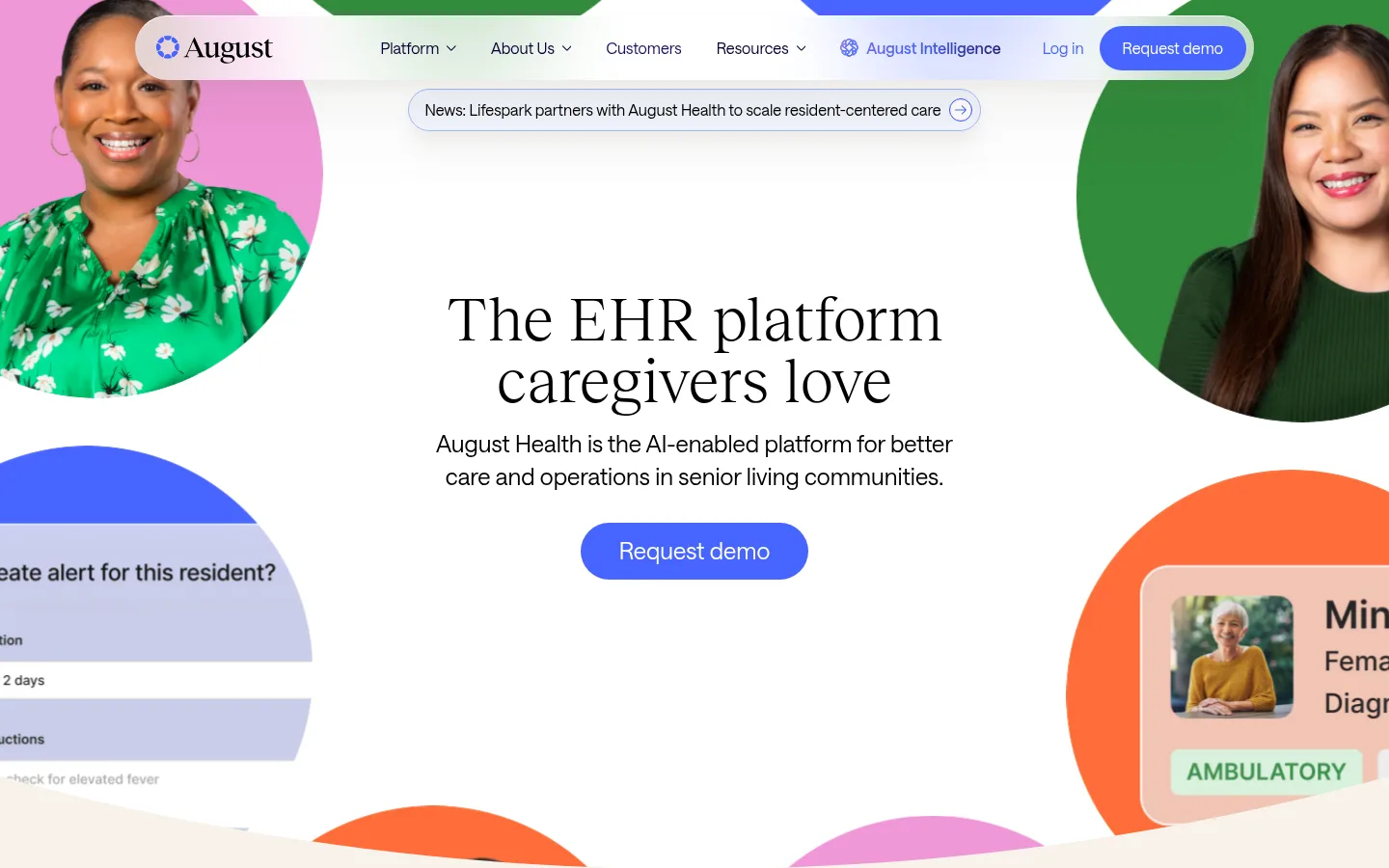
August Health 以编辑感衬线标题和开阔布局,呈现面向养老社区的照护软件。明亮的蓝色行动按钮与鲜艳的产品卡片点亮白色和奶油色页面,照护者照片则让科技表达更有人情味。
North star · Let editorial serif headlines and generous white space humanize the healthcare software, with saturated accents reserved for focused actions and feature storytelling.
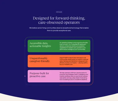
The page balances a white canvas with warm cream section bands and deep indigo panels. Black and near-black text keeps the presentation clear, while vivid blue is reserved for key demo actions and link accents. Green, orange, pink, and pale blue appear in feature cards and decorative product imagery rather than as a uniform interface palette. Reckless Neue gives large headlines an editorial, care-oriented character; Saans handles navigation, body copy, and controls with a clean, practical voice. The centered hero leaves generous breathing room around its message and CTA, framed by circular photos and cropped interface imagery at the edges. Later sections alternate spacious white content, a dark values panel, and a soft cream case-study area. Rounded pills, cards, and media frames soften the software presentation. Keep the measured spacing and generous section rhythm; avoid compressing the content into a dense dashboard-like layout.
Navigation, body copy, buttons, captions, and smaller headings.
Aa 设计
Reckless Neue
网络字体 · 字重 400 · 占比 30%
免费替代:Cormorant Garamond
Display headlines and primary section headings.
角色
示例
字号
字重
行高
字距
特大标题
Large editorial display headlines, especially prominent hero messaging.
August Health
64px
400
1
0
一级标题
Primary hero headline and major page-level statement.
August Health
48px
400
1.1
0
二级标题
Section titles such as platform and values introductions.
August Health
32px
400
1.1
0
三级标题
Feature titles and prominent supporting headings.
The quick brown fox 敏捷的狐狸
24px
400
1.6
0
四级标题
Smaller content headings within cards or supporting sections.
The quick brown fox 敏捷的狐狸
20px
400
1.6
0
正文
Explanatory copy, descriptions, and general paragraph text.
The quick brown fox 敏捷的狐狸
16px
400
1.6
0
辅助文字
Compact uppercase section labels and badges.
The quick brown fox 敏捷的狐狸
12px
500
1
0
按钮
Request demo and other action labels.
The quick brown fox 敏捷的狐狸
16px
400
1.1
0
导航
Header navigation links and menu labels.
The quick brown fox 敏捷的狐狸
16px
400
1.6
0
间距与布局
基准单位 8px · 密度:适中
80px版块间距
16px元素间距
24px卡片内边距
1160px内容最大宽度
8px
10px
12px
16px
24px
26px
32px
40px
64px
128px
Use a centered content frame with a measured maximum width of 1160px, but let hero artwork and selected media extend toward the edges. The hero is centrally aligned, with its headline, short supporting copy, and CTA surrounded by cropped imagery. Alternate broad, airy sections rather than maintaining a rigid repeated grid: the platform area uses two columns, the values area pairs copy with a card presentation, and the case-study content centers media. The 8px-based spacing scale and 80px section gap support a comfortable, unhurried rhythm.
圆角与层次
按钮 · 9999px
卡片 · 16px
图片 · 50%
徽标 · 9999px
导航 · 9999px
链接 · 16px
xl · link
md · other
xl · nav
lg · link
The visual system is mostly flat, relying on large color fields and whitespace instead of outlines. Use subtle, soft shadows to lift selected links, media, and cards. Cards have measured 16px radii, while pill controls use fully rounded ends; avoid adding heavy borders or strong elevation throughout.
组件
下面的预览按实测的按钮、输入框、徽标、卡片样式重建(字体用替代字体)。
Primary CTA
Signal Blue (#4865ff) pill with white Saans text; measured Request demo control uses 14px vertical and 24px horizontal padding in the common variant.
Navigation
Light header with Saans links in dark ink; menu items are compact and supported by a rounded Request demo action.
Section badge
Small uppercase Saans label inside a pill, used to introduce areas such as THE PLATFORM and OUR VALUES.
Feature card
Rounded 16px feature cards use distinct green (#328a3b) and coral (#ff6d39) fills, white or black text, and comfortable internal padding.
Outcome card
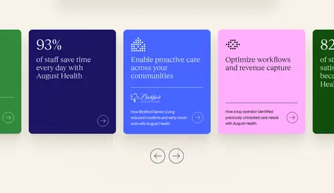
Rounded link or metric card can use Deep Moss (#114e0b) with white copy and a soft, broad shadow.
Case-study media
Large rounded video image with centered play affordance, testimonial quotation, and compact attribution beneath.
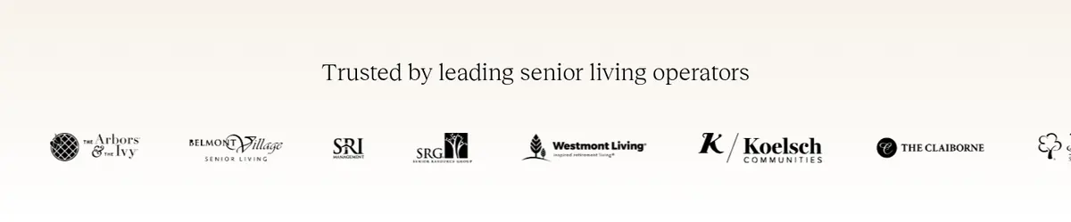
Logo cloud
Centered customer heading followed by a horizontal row of partner marks on a light background.
Imagery · Use warm, authentic caregiver and senior-living photography, with portraits cropped into circular or rounded media compositions. Product-interface snippets can sit in colorful, oversized shapes around the hero, but should read as supporting imagery rather than a dense software dashboard. The case-study section uses a large video still with a centered play control; feature cards carry concise product or outcome content.
Use cream bands to warm transitions between white sections.
Reserve Signal Blue for prominent actions and selected accents.
Use deep indigo as a deliberate full-width section surface.
Frame software with authentic caregiver and community imagery.
Preserve generous whitespace and comfortable section rhythm.
✕ 不该做
Do not turn the page into a dense dashboard layout.
Do not use bright card colors as the default page background.
Do not substitute a heavy geometric sans for the editorial serif headlines.
Do not add unmeasured spacing, type sizes, or corner radii.
Do not overuse shadows or decorative borders.
Do not treat illustration-only colors as the core brand palette.
给 AI 的提示词
想快速出一个同风格的新页面,把这段话连同 DESIGN.md 一起发给 AI。
Build a new August Health page as a calm, editorial healthcare SaaS experience. Use Gallery White (#ffffff) for the main canvas and Oat Cream (#f8f3eb) for warm section transitions. Set prominent headlines in Reckless Neue or a close free serif, and use Saans or Inter for navigation, body, and controls. Keep content centered within the measured 1160px maximum frame, with generous whitespace and a measured 80px section rhythm. Use Midnight Indigo (#1b1463) for occasional full-width emphasis, Signal Blue (#4865ff) for primary pill CTAs, and dark Ink Indigo (#080331) for text. Introduce authentic senior-living photography and restrained product imagery; use Leaf Green (#328a3b), Care Coral (#ff6d39), and Orchid Pop (#ffaefe) only as feature-card or artwork accents. Favor soft elevation, rounded cards, and a human, uncluttered presentation.