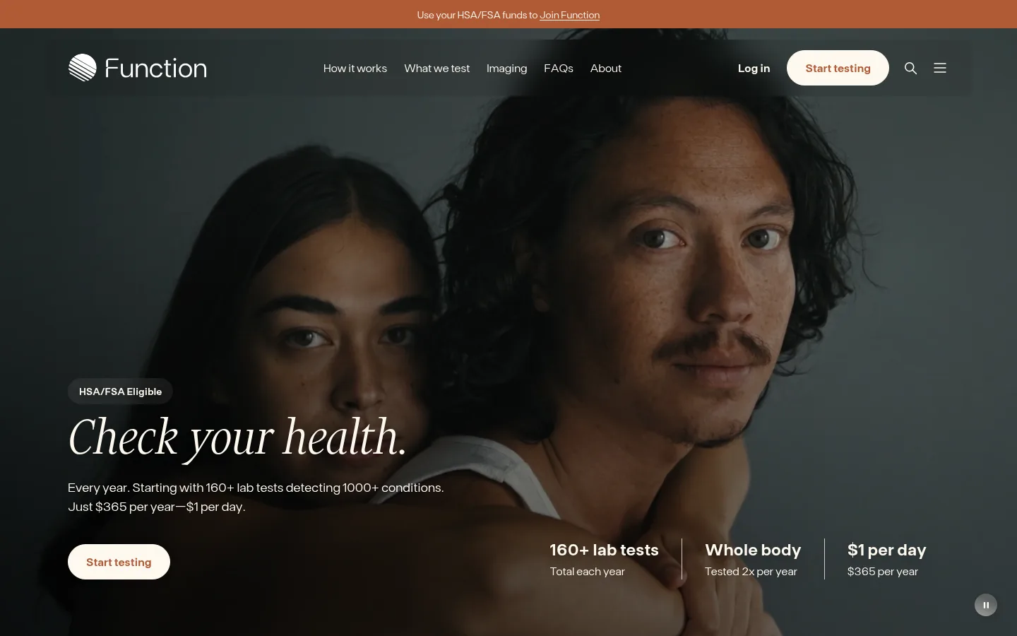
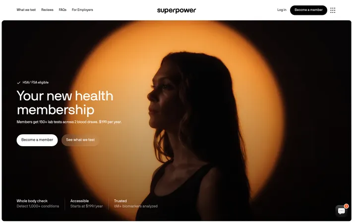
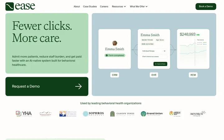
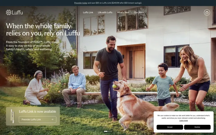
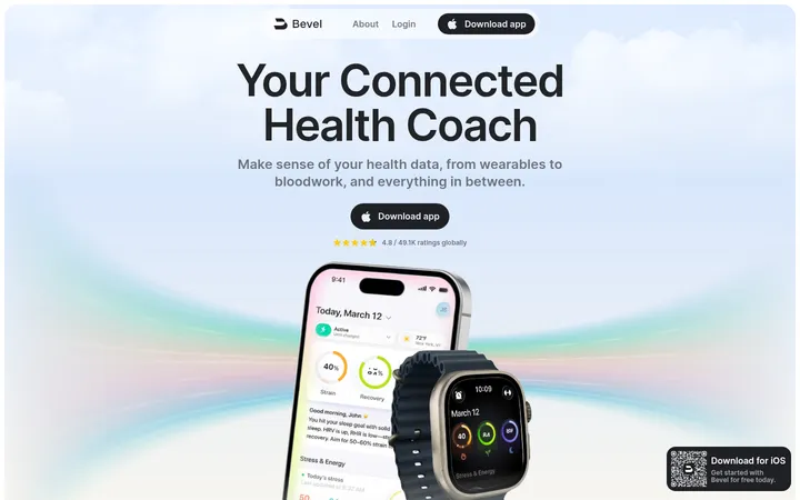
Function Health 以暖米白、深色文字和克制的铁锈色点缀,呈现主动健康检测服务。轻盈的大号衬线标题与宽松的版面节奏相结合,通过真实人物影像、用户故事、服务对比和会员方案,让专业健康信息更亲近易读。
North star · Make complex preventive-health information feel calm and personal through warm cream, editorial serif headings, and clear, spacious structure.
The page uses #fef9ef Gallery Cream as its dominant canvas, making the long homepage feel warm rather than clinical. #2a2b2f supplies the main ink for copy and headings, while #b05a36 Rust provides the signature action color for buttons, selected links, and occasional emphasis; #d9a487 is a softer companion visible in accent treatments. A restrained Financier Display serif gives headlines an editorial, human tone, contrasted with FT Base for navigation, body copy, controls, and dense lists. Sections largely retain the same pale canvas, with #f5eee1 creating a distinct closing CTA and footer band. Wide, spacious compositions alternate centered statements and grids with split content and full-bleed human photography. Cards, lab-result examples, testimonials, and comparison tables make the service tangible without shifting the overall quiet visual hierarchy.
配色 点色块复制色值。用途说明来自对页面的实测位置(背景、文字、描边、按钮)与截图判读。
品牌色
Rust Signal
#b05a36
Signature rust for primary Start testing buttons, selected links, and occasional emphasized text.
Health Ink
#2a2b2f
Primary heading and body text, dark content surfaces, and footer text.
强调色
Clay Blush
#d9a487
Soft warm accent, including gradient treatments and illustration details; not a dominant page surface.
表层色
Gallery Cream
#fef9ef
Main page canvas and light text on dark imagery or rust buttons.
Linen Surface
#f5eee1
Softly differentiated cards and the closing call-to-action and footer bands.
Oat Card
#ddd6ca
Secondary card fill, notably a variation among testimonial and content cards.
Pale Parchment
#ebe4d9
Minor pale control and navigation treatment; a subtle variation within the warm neutral system.
中性色
Quiet Graphite
#515151
Secondary and muted copy where hierarchy calls for less emphasis than main ink.
功能色
Stone Hairline
#d1c9bf
Fine card and component borders that separate content without strong contrast.
Near Black
#111110
Dark gradient or image-overlay tone; chiefly supports photography and visual treatments.
Charcoal Detail
#242424
Minor dark text detail; the primary typography color remains #2a2b2f.
Control Gray
#737373
Measured input-border color, used for form-control delineation rather than brand emphasis.
文字 背景 对比度 WCAG #2a2b2f Health Ink#fef9ef Gallery Cream13.47:1 AAA #2a2b2f Health Ink#f5eee1 Linen Surface12.26:1 AAA #2a2b2f Health Ink#ddd6ca Oat Card9.79:1 AAA #515151 Quiet Graphite#fef9ef Gallery Cream7.56:1 AAA #515151 Quiet Graphite#f5eee1 Linen Surface6.88:1 AA #515151 Quiet Graphite#2a2b2f Health Ink1.78:1 不达标
字体 字号阶梯:Perfect Fourth(比例约 1.32,正文 16px)。示例用免费替代字体渲染,数值为实测。
Aa 设计
FT Base 网络字体 · 字重 300 / 600 / 400 · 占比 94%
免费替代:Inter
Primary sans-serif for body copy, navigation, buttons, links, labels, and dense health-test information.
Aa 设计
Financier Display 网络字体 · 字重 300 · 占比 6%
免费替代:Cormorant Garamond
Light editorial serif for display and section headings, including the hero headline.
角色 示例 字号 字重 行高 字距 特大标题 Oversized editorial headline treatment for prominent statements.
Function Health
64px 300 1 0 一级标题 Hero headline and primary page-level title.
Function Health
45px 300 1 0 二级标题 Major section headings across the long homepage.
Function Health
34px 300 1.15 0 三级标题 Subsection and content-card headings.
The quick brown fox 敏捷的狐狸
27.5px 300 1.1 0 四级标题 Compact card, product, and supporting headings.
The quick brown fox 敏捷的狐狸
20px 300 1.2 0 正文 Standard explanatory copy, quotes, and service descriptions.
The quick brown fox 敏捷的狐狸
16px 300 1.5 0 辅助文字 Small supporting labels and secondary details.
The quick brown fox 敏捷的狐狸
11.5px 300 1.45 0 按钮 Semibold CTA text in pill-shaped controls.
The quick brown fox 敏捷的狐狸
16px 600 1.5 0 导航 Light navigation links and menu labels.
The quick brown fox 敏捷的狐狸
16px 300 1.5 0 链接 Inline or supporting links, commonly rust-colored.
The quick brown fox 敏捷的狐狸
14px 300 1.5 0 眉题 Uppercase, tracked short labels such as eligibility or section markers.
The quick brown fox 敏捷的狐狸
11px 400 1.2 0.1em 代码 Monospaced uppercase micro-labels and compact data-like annotations.
const style = 1;
11px 400 1.2 0.1em
间距与布局 基准单位 4px · 密度:宽松
99px 版块间距
12px 元素间距
— 卡片内边距
1248px 内容最大宽度
2px
4px
6px
8px
12px
14px
16px
20px
24px
25px
32px
40px
56px
64px
80px
99px
Build a spacious, long-form page with a centered content region guided by the measured 1248px page max width. Alternate centered editorial headings with two-, three-, and four-column content, split sections, and wide photographic moments. The section rhythm is deliberately open, while related cards and lists stay compact enough to scan. Keep the measured 4px-based spacing vocabulary, with a spacious overall density and clear separation between page bands.
圆角与层次 lg · button
xl · card, footer
md · button
sm · button
The visual system is mostly flat: warm canvas, restrained card fills, and fine borders do most of the structural work. Use the measured 12px card radius and pill controls. Reserve soft, broad shadows for select elevated cards or controls, and use dark image overlays for text legibility rather than unnecessary UI depth.
组件 下面的预览按实测的按钮、输入框、徽标、卡片样式重建(字体用替代字体)。
Primary CTA Pill-shaped Start testing control with #b05a36 fill, #fef9ef text, and a matching measured border; alternate cream-filled versions appear over dark imagery.
Outlined action Pill-shaped secondary action with rust text and border, used for See how it works and similar lower-emphasis actions.
Testimonial card Warm neutral cards pair compact FT Base quotes with a portrait or story image; measured backgrounds include #f5eee1 and #ddd6ca.
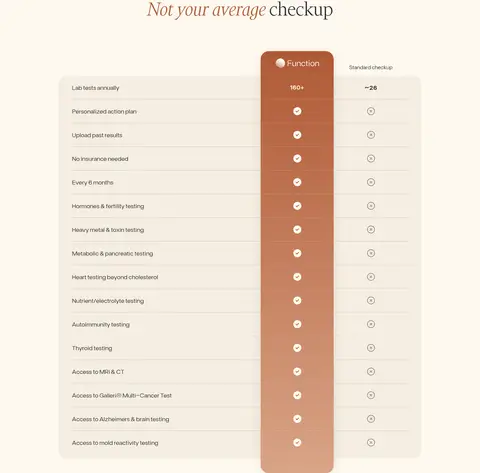
Health comparison A broad, lightly surfaced feature comparison contrasts Function and standard checkups, with a distinct rust-gradient Function column.
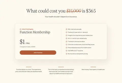
Membership offer A contained membership card combines pricing, a prominent join action, and a concise benefits list on a warm neutral surface.
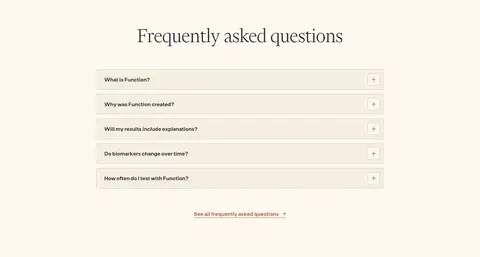
FAQ rows Centered FAQ section with stacked, lightly separated question rows and a rust-colored link to see all frequently asked questions.
Zip-code form Rounded input and submit action support location lookup; measured input styling uses a pale field, dark text, and a restrained border.
Imagery · Use human-centered photography as the emotional counterpoint to lab-data content: the hero is full-bleed and darkened for legible overlaid copy, while testimonials and medical-board profiles use distinct portrait cards. Include restrained charts and test-result visuals as supporting evidence, not as the brand's dominant aesthetic. Video-story cards show recognizable faces and concise captions; crop imagery intentionally and avoid generic clinical stock scenes.
页面版块 共 14 个版块,按页面从上到下排列,每个都标了类型、布局和交互套路。
首页
首屏 健康检测主视觉
Full-bleed photographic hero with overlaid header, left-aligned message, and lower-right service highlights.
使用步骤 检测流程
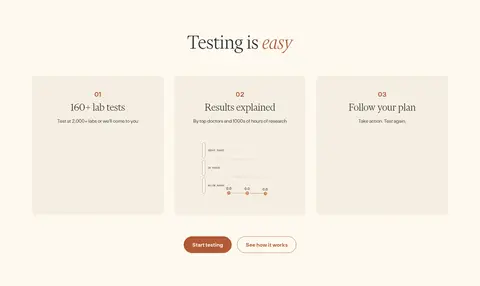
Centered heading above a three-column sequence and paired actions.
数据亮点 长期健康追踪
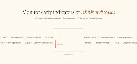
Centered headline and supporting indicators above a wide, two-column data visualization.
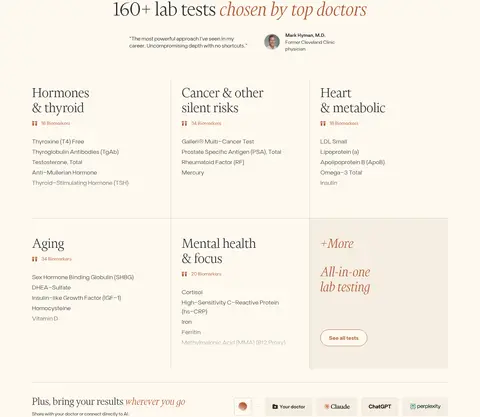
商品网格 检测项目清单
Centered title and endorsement followed by a multi-column grid of test categories.
用户评价 媒体与用户评价
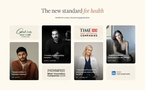
Centered section title above a multi-column mosaic of press, portrait, and quote tiles.
其他 内容播放控制
Short, sparse control row between adjacent content sections.
视频 真实用户故事
Centered heading above a four-column row of portrait video cards.
图文交替 检测地点与覆盖
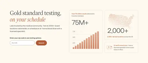
Left-aligned explanatory copy and form beside two testing-coverage visual cards.
对比表 服务对比表
Centered heading above a broad comparison table with an emphasized central membership column.
团队 医学顾问团队
Centered title and subtitle above a multi-column grid of medical-board profile cards.
价格方案 会员价格方案
Centered price statement above a wide membership card with details in two columns.
常见问题 常见问题
Centered heading above a single column of stacked question rows.
行动号召 底部行动号召
Centered short headline, supporting line, and two pill-shaped actions in a tinted band.
页脚 网站页脚
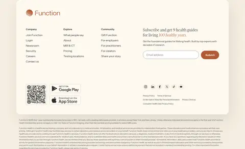
Warm footer band containing a rounded multi-column panel, newsletter form, app links, and legal details.
该做与不该做 ✓ 该做 Keep the main canvas warm cream, not stark white. Use light editorial serif headings for major statements. Reserve rust for primary actions and selected emphasis. Use FT Base for controls, navigation, and readable body copy. Alternate centered content with split and grid layouts. Let real people and specific health information lead imagery. Separate cards with quiet borders and softly tinted fills. ✕ 不该做 Do not make every section a tinted band. Do not use rust as a large, dominant background by default. Do not crowd the long-form section rhythm. Do not replace human photography with generic medical iconography. Do not style every heading in the same sans-serif. Do not add heavy shadows to every card. Do not invent new palette colors or measured dimensions. 给 AI 的提示词 想快速出一个同风格的新页面,把这段话连同 DESIGN.md 一起发给 AI。
复制 Create a new Function Health page in a warm, editorial health-service style. Use Gallery Cream (#fef9ef) as the main canvas, Health Ink (#2a2b2f) for readable text, and Rust Signal (#b05a36) sparingly for primary actions and selected links. Use Linen Surface (#f5eee1) for a limited set of cards or closing bands, with Stone Hairline (#d1c9bf) for quiet separators. Set major headings in a light editorial serif similar to Financier Display; use a clean sans like Inter for body, navigation, and controls. Favor generous whitespace, a centered wide content region, balanced grids and split layouts, rounded cards, and pill buttons. Let authentic human photography make the page feel personal; keep charts and health data clear, secondary, and easy to scan.
DESIGN.md Tailwind v4 CSS 变量 Design Tokens
---
title: "Function Health design system"
variant: extended
source: https://www.functionhealth.com/
captured_at: 2026-10-12
theme: light
industry: health
generator: Design DNA (https://four.wiralomi.com/style/functionhealth-com)
ai_generated: true
ai_label: "本文件由 AI 辅助生成:数值取自公开网页的实测样式,命名、用途说明与建议为模型解读。商标归原所有者。 / AI-assisted content"
---
# Function Health · Design System
> Editorial warmth for proactive health
**Theme:** light · **Industry:** health · **Source:** https://www.functionhealth.com/ · **Captured:** 2026-10-12 (1440×900 desktop)
_AI-assisted content: values are measured from the public page at capture time; names, roles and guidance are model-written interpretations. Trademarks belong to their owners._
Function Health presents preventive lab testing through a calm, editorial visual system grounded in warm cream, dark ink, and restrained rust accents. Large, light serif headlines and generous section spacing balance clinical information with human photography, testimonials, comparison content, and a clear membership offer.
## North star
Make complex preventive-health information feel calm and personal through warm cream, editorial serif headings, and clear, spacious structure.
## Overview
The page uses ## Colors
| Name | Hex | Token | Group | Role |
|---|---|---|---|---|
| Rust Signal | ` | `--color-rust-signal` | brand | Signature rust for primary Start testing buttons, selected links, and occasional emphasized text. |
| Gallery Cream | ` | `--color-gallery-cream` | surface | Main page canvas and light text on dark imagery or rust buttons. |
| Health Ink | ` | `--color-health-ink` | brand | Primary heading and body text, dark content surfaces, and footer text. |
| Linen Surface | ` | `--color-linen-surface` | surface | Softly differentiated cards and the closing call-to-action and footer bands. |
| Quiet Graphite | ` | `--color-quiet-graphite` | neutral | Secondary and muted copy where hierarchy calls for less emphasis than main ink. |
| Stone Hairline | ` | `--color-stone-hairline` | semantic | Fine card and component borders that separate content without strong contrast. |
| Clay Blush | ` | `--color-clay-blush` | accent | Soft warm accent, including gradient treatments and illustration details; not a dominant page surface. |
| Near Black | ` | `--color-near-black` | semantic | Dark gradient or image-overlay tone; chiefly supports photography and visual treatments. |
| Oat Card | ` | `--color-oat-card` | surface | Secondary card fill, notably a variation among testimonial and content cards. |
| Charcoal Detail | ` | `--color-charcoal-detail` | semantic | Minor dark text detail; the primary typography color remains ` | `--color-control-gray` | semantic | Measured input-border color, used for form-control delineation rather than brand emphasis. |
| Pale Parchment | ` | `--color-pale-parchment` | surface | Minor pale control and navigation treatment; a subtle variation within the warm neutral system. |
### Semantic aliases
`--color-canvas` → ` (Gallery Cream) · `--color-surface` → ` (Linen Surface) · `--color-surface-2` → ` (Health Ink) · `--color-surface-3` → ` (Oat Card) · `--color-text` → ` (Health Ink) · `--color-text-muted` → ` (Quiet Graphite) · `--color-text-subtle` → ` (Gallery Cream) · `--color-border` → ` (Stone Hairline) · `--color-accent` → ` (Rust Signal) · `--color-accent-2` → ` (Clay Blush) · `--color-on-accent` → ` (Gallery Cream)
### Contrast (WCAG 2.x)
| Text | Background | Ratio | Level |
|---|---|---|---|
| ` | ` | 13.47:1 | AAA |
| ` | ` | 12.26:1 | AAA |
| ` | ` | 9.79:1 | AAA |
| ` | ` | 7.56:1 | AAA |
| ` | ` | 6.88:1 | AA |
| ` | ` | 1.78:1 | fail |
| ` | ` | 5.5:1 | AA |
| ` | ` | 1.1:1 | fail |
| ` | ` | 13.47:1 | AAA |
| ` | ` | 1.38:1 | fail |
### Gradients
- `linear-gradient(rgb(176, 90, 54), rgba(216, 161, 131, 0.96))`
- `linear-gradient(rgba(0, 0, 0, 0) 4%, rgba(0, 0, 0, 0.92) 100%)`
- `linear-gradient(202deg, rgba(254, 249, 239, 0) 52.18%, rgba(254, 249, 239, 0.4) 135.96%)`
- `linear-gradient(201.98deg, rgba(254, 249, 239, 0.12) 28%, rgba(254, 249, 239, 0.68) 135.96%), none`
## Typography
| Family | Token | Source | Weights | Role | Free substitute |
|---|---|---|---|---|---|
| FT Base | `--font-body` | webfont | 300, 600, 400 | Primary sans-serif for body copy, navigation, buttons, links, labels, and dense health-test information. | Inter |
| Financier Display | `--font-display` | webfont | 300 | Light editorial serif for display and section headings, including the hero headline. | Cormorant Garamond |
- **FT Base:** Mostly light weights for reading; use semibold for primary buttons and selected links. Sentence case predominates.
- **Financier Display:** Use a light, untracked display style; occasional italic emphasis adds contrast within otherwise understated headlines.
### Type scale — Perfect Fourth (ratio ≈ 1.32, base 16px)
| Role | Size | Weight | Line height | Letter spacing | Case | Family | Used for |
|---|---|---|---|---|---|---|---|
| display | 64px | 300 | 1 | 0 | — | Financier Display | Oversized editorial headline treatment for prominent statements. |
| h1 | 45px | 300 | 1 | 0 | — | Financier Display | Hero headline and primary page-level title. |
| h2 | 34px | 300 | 1.15 | 0 | — | Financier Display | Major section headings across the long homepage. |
| h3 | 27.5px | 300 | 1.1 | 0 | — | Financier Display | Subsection and content-card headings. |
| h4 | 20px | 300 | 1.2 | 0 | — | FT Base | Compact card, product, and supporting headings. |
| body | 16px | 300 | 1.5 | 0 | — | FT Base | Standard explanatory copy, quotes, and service descriptions. |
| caption | 11.5px | 300 | 1.45 | 0 | — | FT Base | Small supporting labels and secondary details. |
| button | 16px | 600 | 1.5 | 0 | — | FT Base | Semibold CTA text in pill-shaped controls. |
| nav | 16px | 300 | 1.5 | 0 | — | FT Base | Light navigation links and menu labels. |
| link | 14px | 300 | 1.5 | 0 | — | FT Base | Inline or supporting links, commonly rust-colored. |
| eyebrow | 11px | 400 | 1.2 | 0.1em | uppercase | Fragment Mono | Uppercase, tracked short labels such as eligibility or section markers. |
| code | 11px | 400 | 1.2 | 0.1em | uppercase | Fragment Mono | Monospaced uppercase micro-labels and compact data-like annotations. |
## Spacing & layout
- Base unit **4px**, density **spacious**.
- Scale (most used values): 2, 4, 6, 8, 12, 14, 16, 20, 24, 25, 32, 40, 56, 64, 80, 99 px.
- Section rhythm 99px · element gap 12px · card padding — · max content width 1248px.
Build a spacious, long-form page with a centered content region guided by the measured 1248px page max width. Alternate centered editorial headings with two-, three-, and four-column content, split sections, and wide photographic moments. The section rhythm is deliberately open, while related cards and lists stay compact enough to scan. Keep the measured 4px-based spacing vocabulary, with a spacious overall density and clear separation between page bands.
## Shape & elevation
- Radius: button `50%` · input `9999px` · card `12px` · nav `12px` · xs `4px` · sm `6px` · md `12px` · lg `24px` · pill `9999px`
- Shadow `lg` (button): `rgba(0, 0, 0, 0.15) 0px 0px 32px 0px`
- Shadow `xl` (card, footer): `rgba(42, 43, 47, 0.1) 12px 32px 80px 0px`
- Shadow `md` (button): `rgba(0, 0, 0, 0.1) 0px 2px 12px 0px`
- Shadow `sm` (button): `rgba(0, 0, 0, 0.16) 1.6px 1.6px 8px 0px`
- Shadow `lg-2` (card): `rgba(0, 0, 0, 0.1) 0px 4px 30px 0px`
- Motion: standard transition `0.2s ease` on interactive elements.
The visual system is mostly flat: warm canvas, restrained card fills, and fine borders do most of the structural work. Use the measured 12px card radius and pill controls. Reserve soft, broad shadows for select elevated cards or controls, and use dark image overlays for text legibility rather than unnecessary UI depth.
## Imagery
Use human-centered photography as the emotional counterpoint to lab-data content: the hero is full-bleed and darkened for legible overlaid copy, while testimonials and medical-board profiles use distinct portrait cards. Include restrained charts and test-result visuals as supporting evidence, not as the brand's dominant aesthetic. Video-story cards show recognizable faces and concise captions; crop imagery intentionally and avoid generic clinical stock scenes.
## Components
### Primary CTA
Pill-shaped Start testing control with ### Outlined action
Pill-shaped secondary action with rust text and border, used for See how it works and similar lower-emphasis actions.
### Testimonial card
Warm neutral cards pair compact FT Base quotes with a portrait or story image; measured backgrounds include ### Health comparison
A broad, lightly surfaced feature comparison contrasts Function and standard checkups, with a distinct rust-gradient Function column.
### Membership offer
A contained membership card combines pricing, a prominent join action, and a concise benefits list on a warm neutral surface.
### FAQ rows
Centered FAQ section with stacked, lightly separated question rows and a rust-colored link to see all frequently asked questions.
### Zip-code form
Rounded input and submit action support location lookup; measured input styling uses a pale field, dark text, and a restrained border.
### Measured component styles
- **Primary button** (“Start testing”): background ## Do
- Keep the main canvas warm cream, not stark white.
- Use light editorial serif headings for major statements.
- Reserve rust for primary actions and selected emphasis.
- Use FT Base for controls, navigation, and readable body copy.
- Alternate centered content with split and grid layouts.
- Let real people and specific health information lead imagery.
- Separate cards with quiet borders and softly tinted fills.
## Don't
- Do not make every section a tinted band.
- Do not use rust as a large, dominant background by default.
- Do not crowd the long-form section rhythm.
- Do not replace human photography with generic medical iconography.
- Do not style every heading in the same sans-serif.
- Do not add heavy shadows to every card.
- Do not invent new palette colors or measured dimensions.
## Agent prompt
Create a new Function Health page in a warm, editorial health-service style. Use Gallery Cream (## Page sections (top to bottom)
| # | Type | Layout | UX patterns | UI patterns |
|---|---|---|---|---|
| 1 | hero | Full-bleed photographic hero with overlaid header, left-aligned message, and lower-right service highlights. | Primary testing CTA, HSA/FSA eligibility cue, Key service and price summary | Dark photo overlay, Cream pill button, Transparent over-image navigation |
| 2 | how-it-works | Centered heading above a three-column sequence and paired actions. | Numbered steps, Explain process before commitment | Soft neutral cards, Small rust highlights, Pill actions |
| 3 | stats | Centered headline and supporting indicators above a wide, two-column data visualization. | Long-term baseline framing, Disease indicators | Minimal chart, Fine labels, Open canvas |
| 4 | product-grid | Centered title and endorsement followed by a multi-column grid of test categories. | Grouped test browsing, See all tests link | Fine dividers, Compact lists, Editorial category headings |
| 5 | testimonials | Centered section title above a multi-column mosaic of press, portrait, and quote tiles. | Third-party credibility, Expert and customer quotes | Image-led cards, Varied tile formats, Press-name row |
| 6 | other | Short, sparse control row between adjacent content sections. | Pause or resume motion | Single compact button |
| 7 | video | Centered heading above a four-column row of portrait video cards. | Play video stories, Relatable health outcomes | Portrait crops, Play icons, Bottom-aligned captions |
| 8 | feature-split | Left-aligned explanatory copy and form beside two testing-coverage visual cards. | Zip-code lookup, At-home and lab options | Rounded form field, Rust submit button, Illustrated data cards |
| 9 | comparison | Centered heading above a broad comparison table with an emphasized central membership column. | Compare included services, Highlight membership benefits | Soft row separators, Rust-gradient feature column, Check and status icons |
| 10 | team | Centered title and subtitle above a multi-column grid of medical-board profile cards. | Expert credibility, Scrollable profile browsing | Portrait cards, Compact credentials, Carousel navigation |
| 11 | pricing | Centered price statement above a wide membership card with details in two columns. | Annual price clarity, Membership benefits list, Join membership CTA | Warm bordered card, Prominent price, Rust pill action |
| 12 | faq | Centered heading above a single column of stacked question rows. | Expandable questions, Link to all FAQs | Quiet row separators, Small expand controls, Rust supporting link |
| 13 | cta | Centered short headline, supporting line, and two pill-shaped actions in a tinted band. | Repeat primary action, Offer secondary exploration | Linen background, Centered content, Rust and outlined buttons |
| 14 | footer | Warm footer band containing a rounded multi-column panel, newsletter form, app links, and legal details. | Newsletter signup, Grouped site navigation, App downloads | Warm neutral panel, Rust submit control, Compact footer links |
## Source CSS custom properties (selected)
```css
--font-serif: "Financier Display", Georgia, serif;
--font-sans: "FT Base", system-ui, sans-serif;
--font-mono: "Fragment Mono", monospace;
--text-xxl: clamp(1.8125rem, .4699vw + 1.7021rem, 2.125rem);
--text-xl: clamp(1.125rem, .5639vw + .9925rem, 1.5rem);
--text-lg: clamp(1.125rem, .188vw + 1.0808rem, 1.25rem);
--text-md: clamp(1rem, .188vw + .9558rem, 1.125rem);
--text-regular: 1rem;
--text-sm: .875rem;
--text-xs: .75rem;
--text-04: