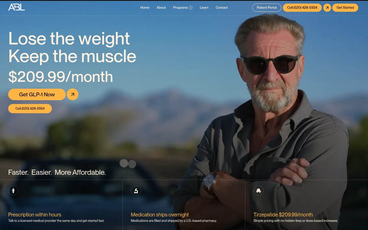
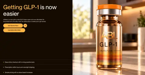
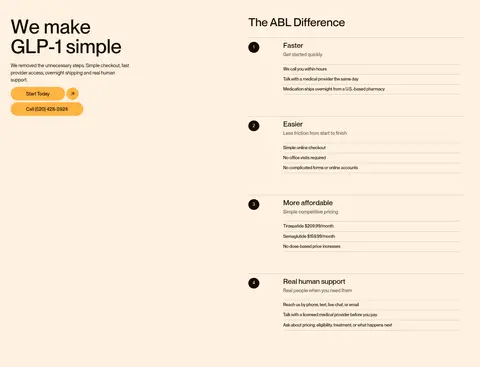
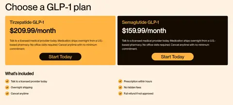
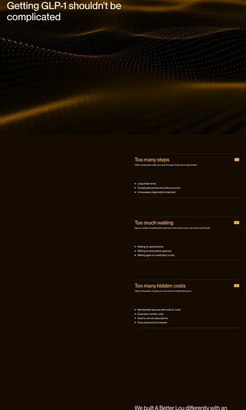
A Better Lou 以近黑浓咖色为底,搭配奶油色内容区和醒目的琥珀色行动按钮。大字号标题、真实人物影像与清楚的套餐价格,让远程医疗显得亲切直接。
North star · Use warm contrast and clear, human photography to make each healthcare decision feel simple and trustworthy.
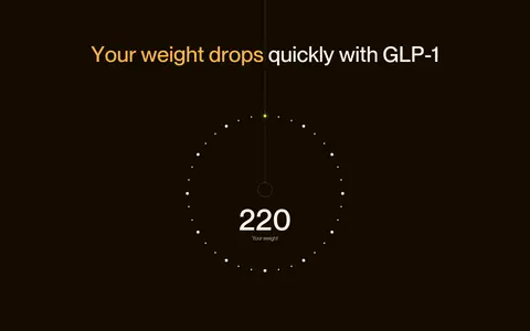
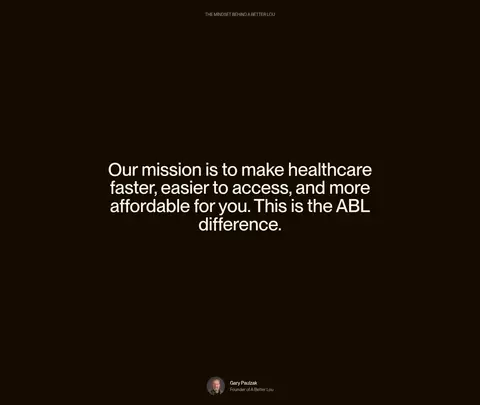
The visual identity alternates a deep espresso canvas (#140b00) with broad cream panels (#fff1e0), creating strong section-level contrast rather than a uniformly dark page. Amber (#ffb442) marks primary actions, selected phrases, and small numbered badges; borders stay subdued and warm. PP Neue Montreal supplies a restrained sans-serif voice: large, tightly tracked medium-weight headlines contrast with compact, comfortably spaced body copy. The hero is a full-bleed photograph with darkening overlays, cream text, and amber pill-shaped actions. Further down, pale sections organize team portraits, plan cards, comparison rows, and FAQs, while dark sections carry long-form storytelling and image-led content. The layout favors large open fields around key messages, then switches to compact, aligned data and pricing blocks. Most UI stays flat, using hairlines and minimal rounding instead of prominent shadows.
Site-wide typeface for display headlines, body copy, navigation, buttons, and labels.
角色
示例
字号
字重
行高
字距
特大标题
Large editorial statements and prominent campaign messaging.
A Better Lou
59px
500
1.1
-0.002em
一级标题
Hero headline and primary page-level message.
A Better Lou
54.5px
500
1
-0.003em
二级标题
Section headings, including team, plans, and FAQ.
A Better Lou
43px
500
1.1
-0.003em
三级标题
Subsection titles and prominent explanatory content.
A Better Lou
33px
400
1.1
-0.004em
四级标题
Plan, comparison, and supporting feature headings.
A Better Lou
30px
500
1
-0.005em
正文
Explanatory copy, pricing details, and standard content.
The quick brown fox 敏捷的狐狸
14.5px
400
1.5
0
辅助文字
Compact supporting labels and image or card metadata.
The quick brown fox 敏捷的狐狸
13px
500
1
-0.011em
导航
Header links and compact navigation actions.
The quick brown fox 敏捷的狐狸
13.5px
500
1
-0.011em
间距与布局
基准单位 1px · 密度:紧凑
32px版块间距
11px元素间距
3px卡片内边距
1376px内容最大宽度
2px
4px
5px
6px
7px
8px
9px
10px
11px
12px
13px
14px
16px
17px
18px
22px
The page uses a wide desktop canvas capped at a measured maximum width of 1376px, with the hero treated as full-bleed media. Content aligns mostly to the start edge; sections shift between single-column storytelling, two-column plan or comparison layouts, and a four-column team row. A compact 1px-based spacing scale supports tight interface details, while broad section bands create the main rhythm. Dark and cream sections alternate, with generous open areas in long-form storytelling and denser, orderly content in pricing and FAQ blocks.
圆角与层次
按钮 · 9999px
卡片 · 6px
徽标 · 4px
导航 · 50%
md · other
The interface is predominantly flat. Warm, thin borders divide comparison rows and cards, while dark sections use low-contrast brown rules. Rounded amber pills and small badges provide the main shape contrast; cards remain square or subtly rounded. Avoid prominent drop shadows: the measured gold glow is isolated rather than a defining elevation style.
组件
下面的预览按实测的按钮、输入框、徽标、卡片样式重建(字体用替代字体)。
Amber pill CTA
Use a #ffb442 fill with #140b00 text, medium weight, and a fully rounded pill silhouette; paired arrow actions may sit beside the main button.
Header navigation
Compact PP Neue Montreal links sit over the hero image in cream, with outlined patient access and amber contact or start actions.
Plan cards
Two side-by-side price panels on cream: one amber and one Espresso Ink, each with clear monthly pricing and a contrasting rounded Start Today action.
Comparison rows
Align numbered badges, short headings, and compact explanatory rows; separate items with thin warm borders rather than raised cards.
Team portraits
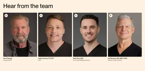
Show a four-column row of tightly framed headshots with compact names and role labels on a cream section.
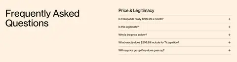
FAQ list
Place the section heading beside a structured question list, with warm hairlines and a small plus affordance for each item.
Imagery · Photography is central: a full-bleed hero portrait, team headshots, a product-style vial image, and a wide human-interest image support the story. Several team portraits are presented as video thumbnails. Hero and dark editorial media use layered black gradients for legible cream text; the hero's blue landscape and skin tones are photographic content, not brand palette colors.
Alternate Espresso Ink and Clinic Cream section bands.
Reserve Signal Amber for actions and purposeful emphasis.
Keep hero copy legible over imagery with a dark gradient.
Use PP Neue Montreal or a close sans-serif substitute.
Build plans and comparisons from aligned, clearly labeled rows.
Keep borders warm, subtle, and low contrast.
✕ 不该做
Don't introduce cool interface colors from the hero photograph.
Don't use large shadows to lift ordinary cards.
Don't crowd large editorial headlines with dense copy.
Don't make secondary links compete with the amber CTA.
Don't round every panel; reserve strong rounding for pills.
Don't obscure medication pricing in decorative treatments.
给 AI 的提示词
想快速出一个同风格的新页面,把这段话连同 DESIGN.md 一起发给 AI。
Build a new telehealth page in A Better Lou's visual style. Use Espresso Ink (#140b00) as the principal dark canvas and Clinic Cream (#fff1e0) for light content bands; apply Signal Amber (#ffb442) selectively to pill-shaped actions, prices, and small emphasis details. Set all text in a clean geometric sans-serif similar to PP Neue Montreal, with large medium-weight editorial headings and compact, readable body copy. Organize content into wide section bands, alternating dark storytelling areas with cream information panels. Use authentic, human photography with restrained dark overlays wherever text sits on an image. Present pricing and benefits in simple aligned rows with fine warm borders, not raised cards. Keep navigation compact, spacing purposeful, and the overall interface flat, warm, and direct.