North star · Keep the interface quiet and spacious so one expressive, interactive media centerpiece commands attention.
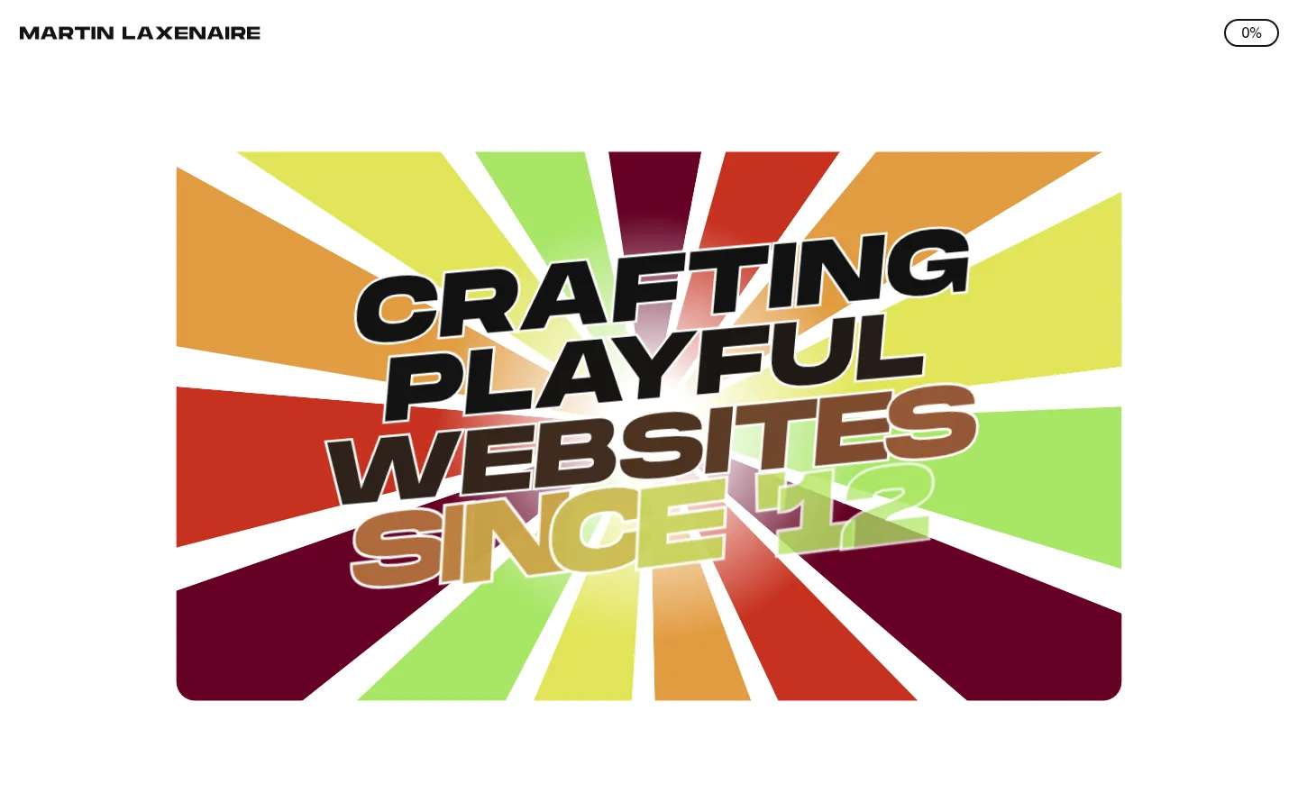
The page uses a clean white canvas and near-black typography to keep the interface quiet around a central, full-bleed-feeling video composition. The opening artwork is a radial burst of saturated colors behind oversized, slanted display lettering; these colors belong to the embedded creative work rather than the core interface palette. MonumentExtended UltraBold carries the visual voice through large, uppercase display text, while Swiss provides restrained interface and supporting text. The header stays compact: the name sits at the upper left and a small outlined progress pill at the upper right. Generous open space around the central media gives the artwork room to dominate without adding decorative UI. Measured pale green appears in the footer rather than the visible opening canvas. The overall strategy is deliberately sparse, using contrast, motion, and a single vivid media focal point instead of cards, gradients, or shadows.
配色
点色块复制色值。用途说明来自对页面的实测位置(背景、文字、描边、按钮)与截图判读。
强调色
表层色
中性色
页面底色 · Pale Leaf表层 · Gallery White主文字 · Near Black描边 · Near Black强调 · Leather Brown强调 2 · Cedar Brown强调 3 · Copper Brown
Oversized hero display and uppercase section headings
Aa 设计
Swiss
网络字体 · 字重 400 · 占比 4%
免费替代:Inter
Navigation, interface labels, and supporting text
角色
示例
字号
字重
行高
字距
正文
Oversized uppercase display lettering anchoring the opening hero artwork.
Martin Laxenaire
104.5px
400
0.85
0
辅助文字
Compact uppercase supporting labels and secondary interface text.
The quick brown fox 敏捷的狐狸
21px
400
1.2
0
导航
Header name and navigation or progress-related interface labels.
The quick brown fox 敏捷的狐狸
21px
400
1.2
0
间距与布局
基准单位 1px · 密度:适中
63px版块间距
21px元素间距
—卡片内边距
925px内容最大宽度
4px
8px
10px
21px
42px
63px
67px
157px
A single broad white canvas centers attention on a large media composition, with a compact header aligned to opposite top corners. The measured content max width is 925px; the screenshot shows the artwork centered with generous white margins. The opening viewport is visually sparse and media-led, without visible cards or column-based content blocks. Use comfortable spacing and clear separation between interface chrome and the hero. A measured section gap of 63px and element gap of 21px suggest a deliberate rhythm, not a dense dashboard.
圆角与层次
按钮 · 9999px
没有测到阴影:页面是扁平的,层次靠底色和描边区分。
The visible interface is predominantly flat: white canvas, black text, and simple outlined controls. No measured shadows or gradients define the design. Layering comes from the embedded artwork itself, where lettering overlays the radial burst, rather than from raised cards. Keep borders crisp and minimal; the progress control is outlined in dark ink.
组件
下面的预览按实测的按钮、输入框、徽标、卡片样式重建(字体用替代字体)。
Compact identity header
Place the uppercase site name at the upper left, with generous surrounding white canvas and no enclosing bar.
Progress pill
A small outlined, fully rounded control at the upper right displays the current completion percentage in dark text.
Hero media
Center a large video composition with vivid radial artwork and prominent slanted display lettering.
Interactive progress experience
Use interaction to reveal or unlock additional content, with completion status presented as a concise interface cue.
Outlined action button
Measured button styling uses dark text, a 2px dark border, uppercase text, and a pill-like radius.
Imagery · The hero is a video-led graphic rather than conventional photography: a radial burst of colored wedges sits behind bold, slanted lettering. The artwork is framed as a centered rectangular composition with rounded lower corners visible in the screenshot. Treat its vivid reds, greens, yellows, and warm tones as content imagery, not as the site’s interface palette. Motion and interactive progression are part of the experience.
Keep the page canvas bright white and visually quiet.
Use Monument-style heavy display lettering for expressive hero text.
Give the central media generous breathing room.
Keep navigation and progress controls compact.
Use near-black for text and crisp outlines.
Treat vivid colors as artwork unless the page evidence shows otherwise.
✕ 不该做
Do not turn the interface into a dense dashboard.
Do not use shadows to create card-heavy elevation.
Do not make the artwork palette the default UI palette.
Do not crowd the hero with explanatory copy.
Do not replace the restrained header with a large navigation bar.
Do not invent extra palette colors or measured dimensions.
给 AI 的提示词
想快速出一个同风格的新页面,把这段话连同 DESIGN.md 一起发给 AI。
Build a new portfolio page in the style of Martin Laxenaire’s homepage. Use a Gallery White (#ffffff) canvas, Near Black (#121212) text and outlines, and a compact header with identity at left and a small outlined progress pill at right. Make one centered, expressive media composition the hero: oversized, slanted uppercase display lettering over vivid graphic artwork. Keep artwork colors inside the media rather than spreading them across interface surfaces; Pale Leaf (#e9f9d9) is appropriate only for a footer-like band. Use MonumentExtended UltraBold or a close heavy display substitute for hero typography and restrained Swiss-like sans-serif interface text. Preserve generous whitespace, flat surfaces, crisp borders, and simple interaction cues. Avoid card grids, shadows, gradients, and dense supporting copy.