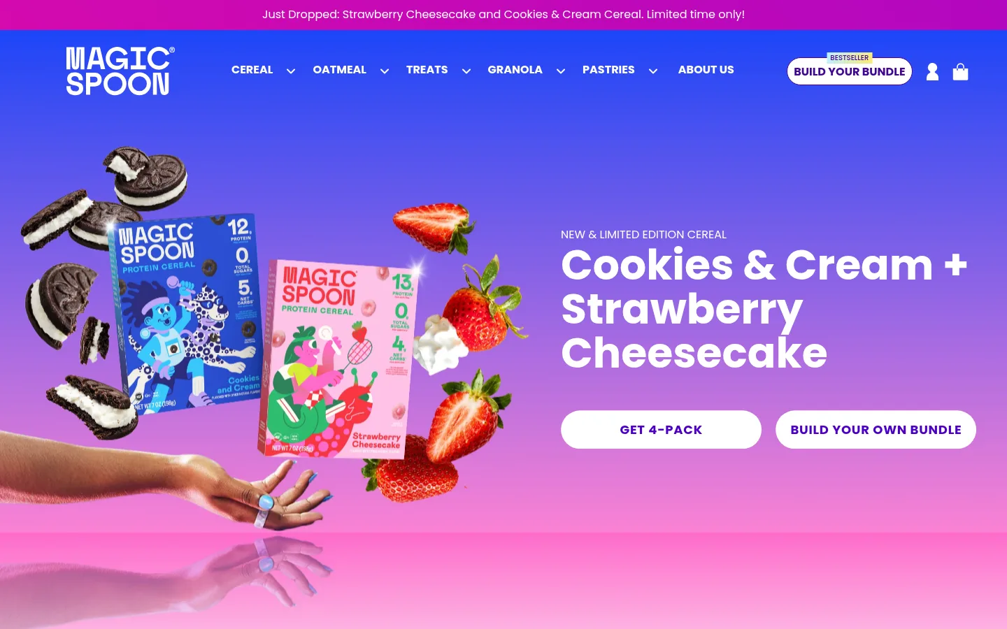
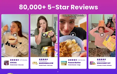
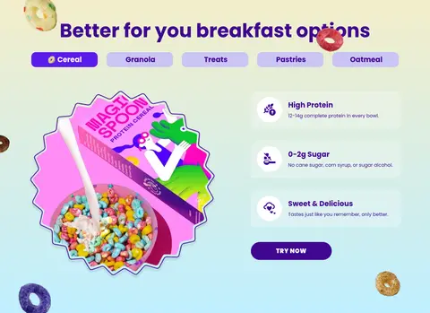
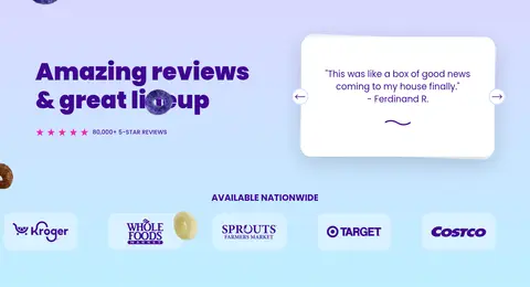
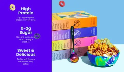
North star · Let bold purple typography and immersive colour fields frame appetizing product imagery, while keeping shopping actions obvious.
The page uses vivid gradients and product colour to create an energetic cereal-shop identity, anchored by deep purple #3f0791 text and crisp white surfaces. The measured palette includes several gradient stops, while the screenshots show the gradients as broad, full-width section treatments rather than a restrained accent. Poppins supplies a consistent geometric sans-serif voice: heavy, large headings contrast with compact uppercase navigation and smaller supporting copy. The hero pairs oversized product-and-ingredient imagery with a clear text-and-CTA column; later sections alternate product grids, reviews, benefit panels, and split layouts. Spacious section breaks give promotional stories room, while denser card rows make browsing and shopping direct. Rounded pill CTAs and image cards soften the strong colour blocks. Product photography, creator videos, packaging, and cereal cutouts provide most of the visual character; the decorative palette within those assets should not be mistaken for core interface colours. The black footer provides a firm close.
All measured display, heading, body, navigation, button, and caption text.
角色
示例
字号
字重
行高
字距
特大标题
Oversized promotional display headlines.
Magic Spoon
80px
700
1
0
一级标题
Primary hero headline and major page titles.
Magic Spoon
64px
700
1
0
二级标题
Large section headings, especially product and review areas.
Magic Spoon
60px
700
1.05
0
三级标题
Product names and prominent feature headings.
Magic Spoon
48px
700
1
0
四级标题
Uppercase product and category titles.
Magic Spoon
32px
700
1.25
0
正文
Standard product, feature, and supporting copy.
The quick brown fox 敏捷的狐狸
16px
400
1
0
辅助文字
Review counts and small product details.
The quick brown fox 敏捷的狐狸
14px
400
1
0
按钮
CTA labels and shopping actions.
The quick brown fox 敏捷的狐狸
16px
400
1.4
0
导航
Bold uppercase primary navigation labels.
The quick brown fox 敏捷的狐狸
16px
700
1
0
眉题
Small uppercase introductory labels above headings.
The quick brown fox 敏捷的狐狸
18px
700
3.28
0.04em
间距与布局
基准单位 2px · 密度:宽松
100px版块间距
5px元素间距
50px卡片内边距
1408px内容最大宽度
2px
4px
5px
8px
9px
10px
15px
16px
18px
20px
22px
25px
30px
32px
40px
50px
The measured page max width is 1408px, with a spacious section rhythm and a two-column hero pairing full-bleed product imagery with copy and actions. The remaining blocks move between split feature layouts, multi-column product cards, and horizontally dense review or category rows. Most content is centered or aligned to a clear column edge. The screenshot shows strong full-width colour bands, with white and pastel sections alternating against saturated gradients. Preserve generous separation between major stories while keeping product grids compact and scannable.
圆角与层次
按钮 · 9999px
输入框 · 9999px
卡片 · 13px
图片 · 10px
导航 · 9999px
inset · footer, input, button
xl · other
xl · card
Most section bands are flat colour or gradient fields. Product and review cards sit on light surfaces with rounded corners; testimonial cards use a noticeable soft shadow. Use borders sparingly, including the blue CTA outline and fine contrast edges around selected media. Rounded pill controls create emphasis without requiring heavy shadows.
组件
下面的预览按实测的按钮、输入框、徽标、卡片样式重建(字体用替代字体)。
Primary shopping CTA
Use the measured blue #2491c4 Shop Cereal button with white Poppins text and a thin matching outline; bundle actions may use purple or white pill treatments.
Product card
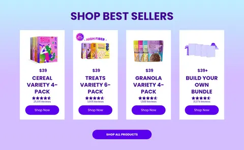
Present a clear product image, price, uppercase product title, rating or review count, and a direct Shop Now link on a light card.
Category strip
Show a row of compact product cutouts with short labels; distinguish a category control with lavender treatment.
Review video tiles
Use portrait creator videos in rounded light frames, with a play affordance and concise product and review metadata.
Benefit panel
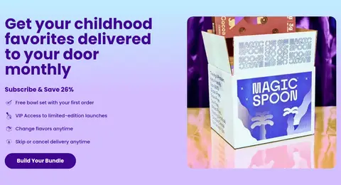
Pair a large product or food composition with short benefit statements and simple icon markers; use contrasting gradient or pastel fields.
Newsletter footer
Close on black with white brand and legal links, an email input, and a concise subscription action.
Imagery · Use bright, cutout-style packaging and cereal imagery as the hero focal point, supported by ingredients and playful floating product details. Product cards use clear pack shots on light grounds; customer-review sections use portrait-format creator videos. Keep imagery colourful and crisp, with layered or collage-like compositions in promotional areas. Palette variation inside packaging, food, and photography is illustrative, not a replacement for the measured interface colours.
Use Magic Purple #3f0791 for primary headings and links.
Reserve full-width gradients for promotional story sections.
Keep shopping actions visually distinct and easy to scan.
Use Poppins consistently across interface text.
Pair product pack shots with clear names and prices.
Keep major sections spacious and product rows compact.
✕ 不该做
Do not use every palette colour as a competing text colour.
Do not mistake package or food colours for interface tokens.
Do not crowd the hero with multiple competing messages.
Do not make product cards feel heavy or overly bordered.
Do not use generic monochrome imagery in place of cereal assets.
Do not let decorative gradients reduce CTA contrast.
给 AI 的提示词
想快速出一个同风格的新页面,把这段话连同 DESIGN.md 一起发给 AI。
Build a new Magic Spoon-style ecommerce page with Poppins or a close geometric sans-serif. Anchor text and links in Magic Purple #3f0791, with white canvas areas and bold, full-width gradient story bands using measured palette colours such as Electric Violet #5b00ed, Cereal Sky #bfefff, and Berry Magenta #c231a9. Give the hero a clear split between oversized, colourful cereal packaging imagery and a concise headline with prominent shopping actions. Use rounded product cards, pack-shot photography, compact ratings, and scannable product grids. Mix in creator-video reviews and benefit-led split panels. Keep the layout spacious across major sections but information-dense within browsing rows. Use white text on saturated bands and preserve clear contrast for every CTA. Finish with a black footer and white links, controls, and subscription form.