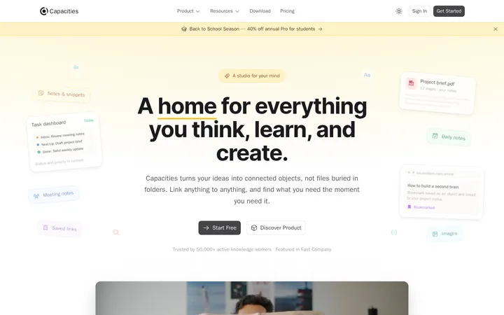
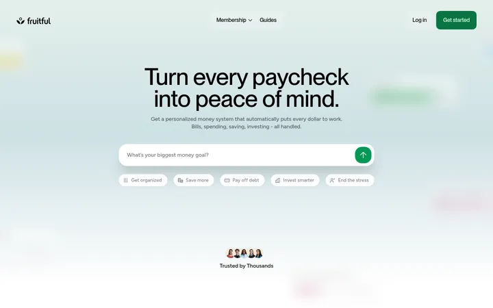
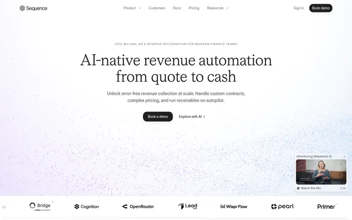
North star · Keep the product interface and message crisp on a quiet white canvas, then use color only as a small, playful supporting accent.
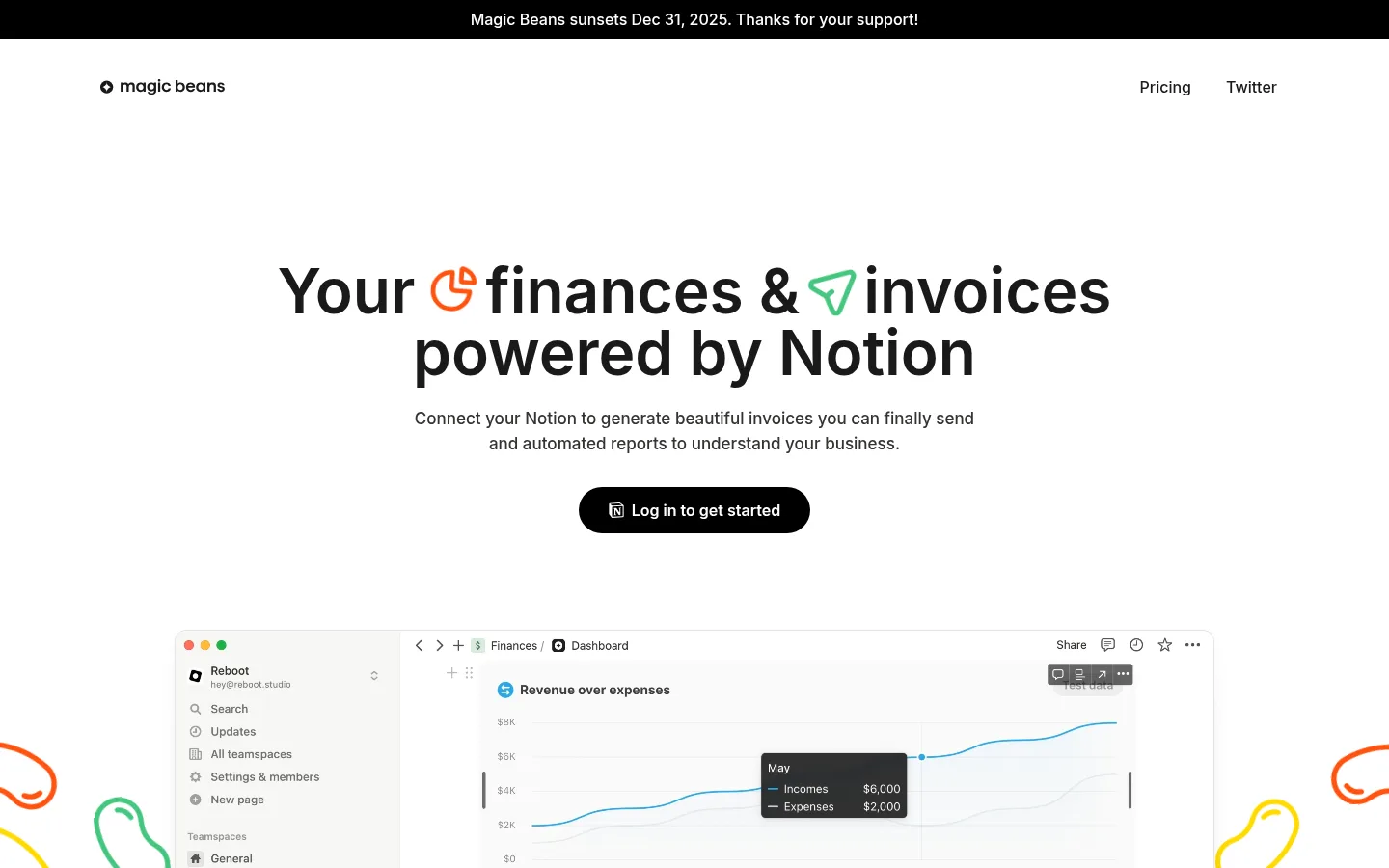
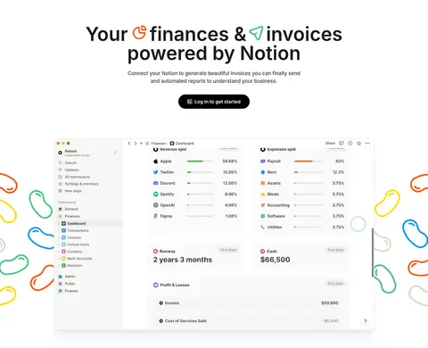
The page is built on a white canvas with dark, highly legible text and pale warm-gray surfaces for selected cards and the closing call to action. Near-black pill buttons provide the strongest interface contrast; green appears sparingly in a small status badge and product details, while brighter colors belong mainly to decorative bean illustrations rather than the core palette. Inter is used throughout, with bold centered hero typography, compact section labels, and readable supporting copy. The layout alternates centered product-led presentation with left-aligned feature introductions and broad interface previews, leaving generous whitespace between content groups. Screenshots and dashboard mockups are treated as the primary proof of the product, framed by subtle borders or restrained shadows. Playful hand-drawn shapes sit around the hero and footer, counterbalancing the otherwise quiet, precise SaaS aesthetic.
All interface and marketing text, including navigation, headings, body copy, labels, and buttons.
角色
示例
字号
字重
行高
字距
特大标题
Large centered hero headline, visually dominant above the product preview.
Magic Beans
64px
600
1
0
一级标题
Primary page and feature-section headings.
Magic Beans
40px
600
1.2
0
二级标题
Secondary feature headings and prominent card titles.
The quick brown fox 敏捷的狐狸
24px
600
1.33
0
正文
Explanatory paragraphs and product-focused descriptions.
The quick brown fox 敏捷的狐狸
16px
500
1.5
0
辅助文字
Compact labels, badges, and supporting interface notes.
The quick brown fox 敏捷的狐狸
15px
500
1.5
0
导航
Header links such as Pricing and Twitter.
The quick brown fox 敏捷的狐狸
16px
500
1.5
0
间距与布局
基准单位 8px · 密度:宽松
60px版块间距
40px元素间距
32px卡片内边距
1408px内容最大宽度
4px
6px
8px
12px
16px
20px
24px
32px
40px
64px
80px
140px
The page uses a centered content frame with a measured maximum width of 1408px and a spacious density. The hero is centered, pairing a prominent message and CTA with a large dashboard preview; later sections alternate left-aligned introductions, wide product screenshots, and three-column feature groups. The measured spacing system is based on an 8px unit, with generous section gaps and substantial card padding. Most sections retain the white canvas; the closing CTA and footer shift to a warm off-white band. Content alignment changes by purpose rather than using a rigid repeated template.
圆角与层次
按钮 · 9999px
卡片 · 16px
徽标 · 9999px
导航 · 8px
xl · card
lg · card
Cards rely on clean edges, pale surfaces, and occasional subtle hairlines rather than strong shadows. Measured card corners include a 16px radius, while pills such as buttons and badges are fully rounded. Where product previews overlap or sit above the canvas, use restrained soft elevation so the interface reads as a panel without competing with its contents.
组件
下面的预览按实测的按钮、输入框、徽标、卡片样式重建(字体用替代字体)。
Announcement strip
A full-width black strip at the top with centered white notice text, visually distinct from the main navigation.
Header navigation
Minimal white header with the Magic Beans mark at left and simple dark Pricing and Twitter links at right.
Hero CTA
Centered headline and supporting copy above a black or near-black pill button with white text.
Product preview cards
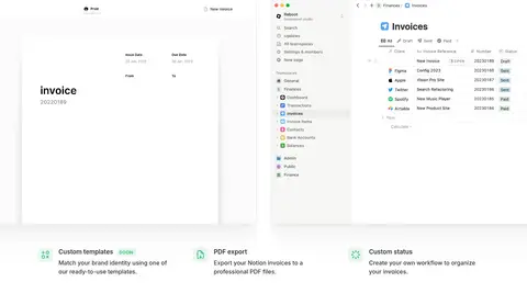
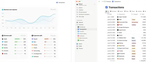
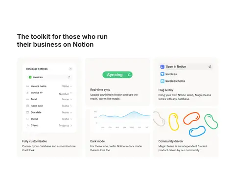
Wide Notion-style dashboard, invoice, and report previews on white or warm-gray surfaces, with subtle borders or soft elevation.
Feature badge
Small green-on-pale-green uppercase SOON pill, used as a minor status signal rather than a major brand color.
Closing CTA band
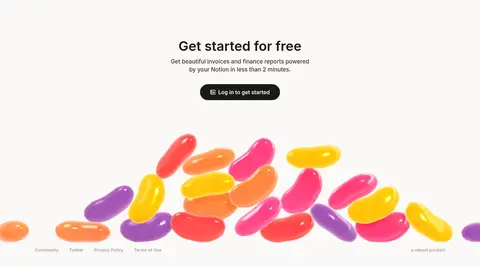
Warm off-white full-width ending with centered free-start messaging, a dark pill button, decorative bean artwork, and compact footer links.
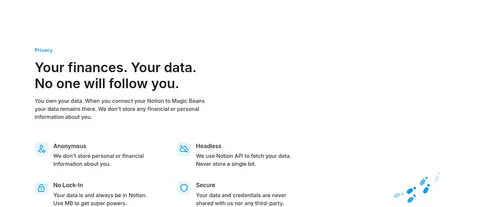
Imagery · Product screenshots and embedded video previews show Notion-based dashboards, invoice layouts, reports, and transactions; these are the main visual evidence and are presented as broad, clean interface panels. Colorful outlined bean-like doodles frame the hero, while glossy multicolor beans decorate the footer. The page has no photography-led storytelling: illustration is playful and peripheral, while product UI remains the focal point.
Keep headings and navigation dark and easy to scan.
Give product previews ample surrounding whitespace.
Use warm off-white for selected cards and the closing band.
Reserve green for small status and product details.
Use playful bean artwork as framing, not as interface structure.
✕ 不该做
Do not turn the page into a saturated color-block layout.
Do not use decorative illustrations as the main product explanation.
Do not add heavy shadows to every card.
Do not crowd the hero with multiple competing CTAs.
Do not use bright accent colors for long passages of text.
Do not force every section into the same alignment or card grid.
给 AI 的提示词
想快速出一个同风格的新页面,把这段话连同 DESIGN.md 一起发给 AI。
Build a new SaaS landing page in the Magic Beans visual style. Use Gallery White (#ffffff) as the primary canvas, Bean Ink (#1a1a19) for headings and interface text, and Soft Graphite (#333331) for supporting copy. Warm Porcelain (#faf9f7) can distinguish selected cards or a closing CTA; use Quiet Hairline (#e5e5e5) and Cloud Border (#f0f0f0) sparingly. Keep Fresh Sprout (#44c67f) for minor status details and Announcement Black (#000000) for a high-contrast pill CTA or notice strip. Use Inter throughout, with bold concise headings and medium-weight readable copy. Create a spacious centered hero, then alternate left-aligned feature introductions with broad product UI previews and compact feature grids. Favor subtle edges and soft elevation. Add playful bean-like illustration only as peripheral framing.