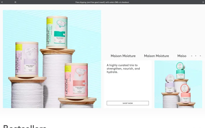
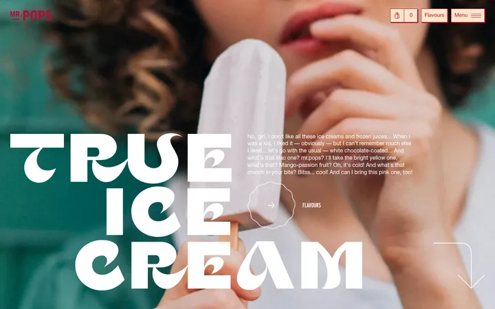
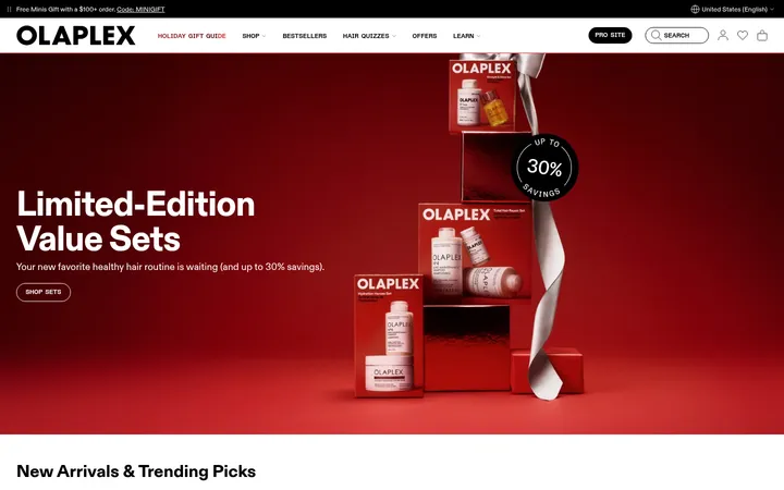
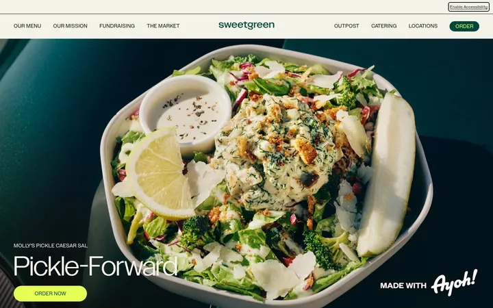
North star · Let flavor-led imagery and nostalgic display typography stand out against calm cream surfaces, while botanical green anchors navigation and shopping actions.
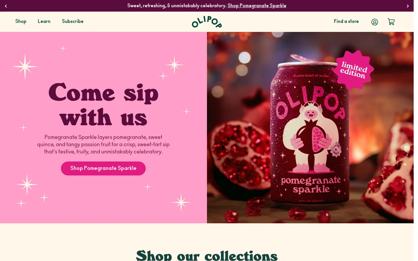
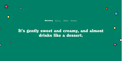
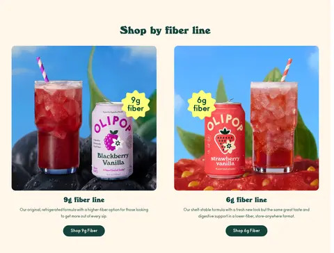
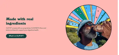
The visual system balances a warm, airy canvas with confident blocks of flavor color. White and cream establish calm shopping surfaces; dark botanical green carries navigation, headings, links, and many purchase actions. Pink and coral distinguish campaign and editorial bands, while the brighter green appears in prominent feature or footer areas. Large WindsorEF display lettering gives headings a playful, nostalgic silhouette, contrasted with compact, bold Ano body copy and clean navigation. The first-screen hero pairs a pink text panel with richly lit product photography, making the can the focal point while keeping the message and CTA legible. Subsequent sections alternate cream product browsing, illustrated or photographic education, green testimonial-style content, and split feature panels. Layouts are generous and modular rather than uniformly gridded: centered headings and product rows give way to split editorial compositions. Components stay mostly flat, with pill-shaped buttons and restrained outlines instead of heavy shadows.
Body copy, navigation, buttons, captions, and links
Aa 设计
WindsorEF
网络字体 · 字重 800 / 900 · 占比 18%
免费替代:Fraunces
Display headlines and section headings
角色
示例
字号
字重
行高
字距
特大标题
Oversized campaign and hero display headlines.
OLIPOP
90px
800
0.95
0
一级标题
Primary hero and major page headings.
OLIPOP
54px
800
1
0
二级标题
Section titles such as shopping and brand-story headings.
OLIPOP
52px
800
1
0
三级标题
Feature and editorial subsection headings.
OLIPOP
48px
800
1.1
0
四级标题
Smaller bold editorial or product-line headings.
OLIPOP
32px
900
1.1
0
正文
Product descriptions, brand explanations, and general copy.
The quick brown fox 敏捷的狐狸
16px
700
1.4
0
辅助文字
Small supporting notes, product details, and utility text.
The quick brown fox 敏捷的狐狸
14px
700
1.8
0
按钮
Purchase, subscription, and section CTA labels.
The quick brown fox 敏捷的狐狸
14px
700
1.8
0
导航
Header and footer navigation links.
The quick brown fox 敏捷的狐狸
16px
400
1.5
0
链接
Inline product, collection, and informational links.
The quick brown fox 敏捷的狐狸
16px
700
1.4
0
间距与布局
基准单位 4px · 密度:适中
86px版块间距
6px元素间距
70px卡片内边距
—内容最大宽度
1px
2px
3px
5px
6px
8px
10px
12px
16px
20px
24px
32px
40px
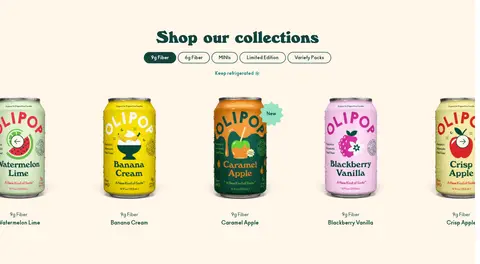
The page is a long, comfortable-density storefront with full-width color and image bands, alternating with centered shopping areas. The opening hero uses a two-column split: text on pink and product photography beside it. Product discovery uses a centered heading, compact category pills, and a horizontal product row. Educational sections switch to centered copy or two-column editorial splits. Section boundaries are created by background changes and imagery rather than cards or heavy dividers. No measured maximum content width is provided; preserve the broad, spacious compositions visible in the screenshots.
圆角与层次
按钮 · 9999px
输入框 · 9999px
图片 · 16px
链接 · 16px
hairline · button
hairline · link, button
The design is predominantly flat: color fields, photographs, and spacing provide separation rather than stacked shadows. Buttons are pill-shaped and typically filled with deep green, while links and small badges can use a measured forest-ink outline. Avoid adding strong card shadows or generic floating panels; use rounded media corners where appropriate.
组件
下面的预览按实测的按钮、输入框、徽标、卡片样式重建(字体用替代字体)。
Announcement bar
A narrow dark berry strip above the cream navigation, with centered promotional copy and an underlined shopping link.
Primary navigation
Cream header with forest-green text links, centered OLIPOP mark, and compact store, account, and cart utilities.
Hero campaign panel
Split pink-and-photo composition with a large WindsorEF headline, centered supporting copy, and a rounded flavor-specific CTA.
Product collection row
Centered collection heading and compact category pills above a horizontal lineup of cans, flavor labels, and add-to-cart actions.
Pill CTA
Fully rounded button shape; common purchase buttons use #034638 with white text, while campaign actions may use a measured flavor accent.
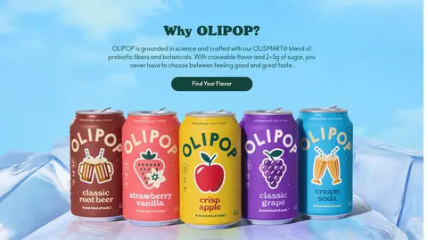
Editorial feature band
Full-width colored or photographic section pairing a bold display heading and short copy with product, ingredient, or lifestyle imagery.
Newsletter footer
Dark green footer with a prominent signup prompt, rounded white email field, bright Subscribe action, social links, and grouped utility navigation.
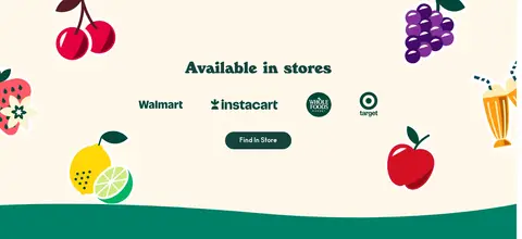
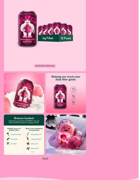
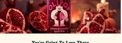
Imagery · Use polished, colorful can photography as the primary product proof, framed in flavor-specific scenes with fruit, condensation, and warm or cool atmospheric light. Lifestyle photography appears in rounded or circular editorial framing. Supporting illustrations and decorative fruit or sparkles add playful character, especially in store and feature areas. Treat imagery as bold, edge-to-edge or panel-contained content; it is not a subdued background texture.
Use #14433d or #034638 for primary text and core shopping actions.
Reserve #fff6ea for warm, calm shopping and navigation surfaces.
Give flavor campaigns their own focused pink or fruit-colored field.
Pair heavy WindsorEF headings with legible Ano supporting copy.
Use pill-shaped CTAs and clearly named shopping actions.
Alternate product rows with editorial and educational section formats.
✕ 不该做
Do not make every section the same white background.
Do not use campaign magenta or lemon yellow as universal CTA colors.
Do not bury product imagery beneath decorative overlays.
Do not replace the expressive display face with generic geometric headings.
Do not add heavy shadows or dense bordered card grids.
Do not invent extra colors, dimensions, spacing, or border radii.
给 AI 的提示词
想快速出一个同风格的新页面,把这段话连同 DESIGN.md 一起发给 AI。
Build a new OLIPOP-style storefront page with a warm, playful food-and-beverage identity. Use Vanilla Cream (#fff6ea) and Clean White (#ffffff) as calm surfaces, Forest Ink (#14433d) for core text, and Botanical Pine (#034638) for navigation links and primary pill CTAs. Use Peach Fizz (#ffb8b3), Garden Teal (#008168), and Bubblegum Pink (#ff9ec8) as deliberate editorial bands, not decoration everywhere. Set expressive heavy WindsorEF-like display headings against readable, rounded Ano-like sans copy. Compose broad full-width sections with generous breathing room, centered product discovery, and occasional split image-and-copy features. Make product cans and fruit-led photography visually prominent; use illustrations sparingly for warmth. Keep components flat, with measured pill buttons and light outlines rather than heavy shadows. Preserve a clear path from campaign discovery to product browsing and signup.