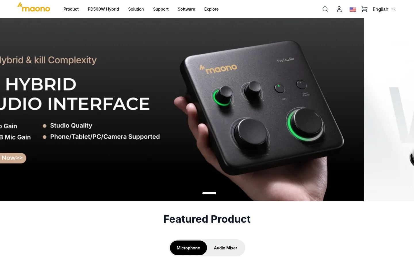
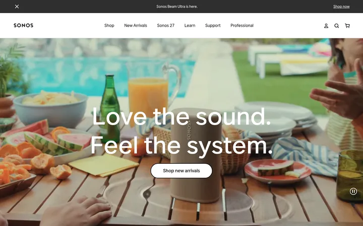
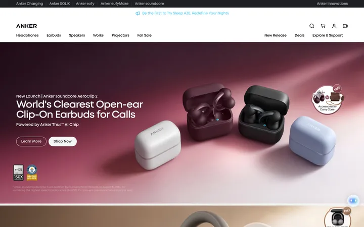
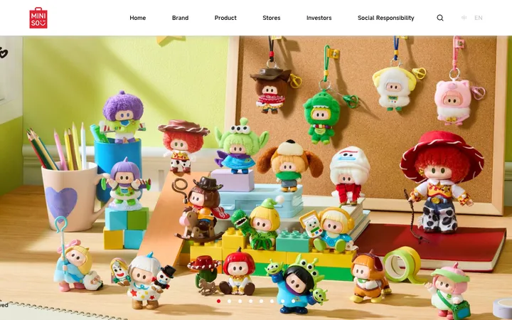
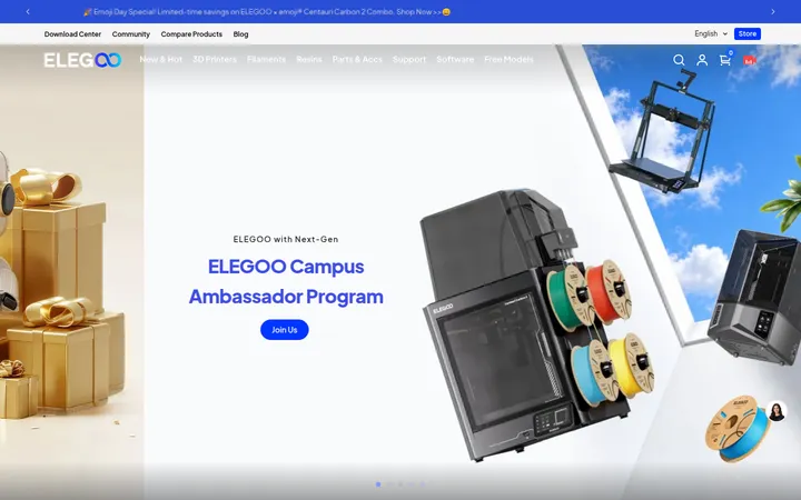
North star · Keep the storefront white and typographically crisp, letting large, authentic audio-product imagery lead each section.
The page uses a white canvas to keep a long sequence of retail sections visually light, with black headings and navigation providing clear contrast. Pale gray product cards and occasional black media areas create shifts in tone without introducing heavy decorative styling. Warm amber and yellow are reserved for the logo, selected CTAs, and collaboration cards; they punctuate rather than dominate the mostly monochrome storefront. Inter is used throughout, with bold centered section headings and compact, medium-weight navigation and buttons. The layout alternates full-bleed campaign media with centered product grids, image-led interest cards, editorial split content, proof points, and review panels. Generous section gaps separate these modules, while rounded cards and pill-shaped controls soften the otherwise clean geometry. Product photography and creator videos carry most of the visual character, so UI chrome stays quiet and consistent.
配色
点色块复制色值。用途说明来自对页面的实测位置(背景、文字、描边、按钮)与截图判读。
品牌色
强调色
表层色
中性色
功能色
页面底色 · Gallery White表层 · Soft Fog表层 2 · Studio Ink主文字 · Studio Ink次要文字 · Slate Gray弱文字 · Footer Mist描边 · Footer Rule强调 · Signal Yellow强调 2 · Maono Amber
Site-wide headings, body copy, navigation, buttons, product cards, and footer.
角色
示例
字号
字重
行高
字距
一级标题
Large bold campaign headline in the hero.
Maono
40px
700
1.25
0
二级标题
Bold headings for major storefront sections.
Maono
36px
700
1.11
0
三级标题
Product and editorial subsection headings.
Maono
30px
700
1.2
0
四级标题
Compact card titles and lower-level content headings.
The quick brown fox 敏捷的狐狸
24px
700
1.25
0
正文
Product descriptions and supporting editorial copy.
The quick brown fox 敏捷的狐狸
18px
400
1.56
0
辅助文字
Small labels, badges, and secondary explanatory text.
The quick brown fox 敏捷的狐狸
16px
400
1.63
0
按钮
Medium-weight CTA labels and purchase actions.
The quick brown fox 敏捷的狐狸
14px
500
1.14
0
导航
Compact medium-weight primary navigation links.
The quick brown fox 敏捷的狐狸
14px
500
1.43
0
链接
Supporting links in cards, content, and footer.
The quick brown fox 敏捷的狐狸
16px
400
1.5
0
间距与布局
基准单位 8px · 密度:适中
72px版块间距
8px元素间距
60px卡片内边距
1088px内容最大宽度
4px
8px
12px
16px
24px
32px
48px
60px
72px
176px
The header anchors a broad, centered storefront, followed by a full-bleed campaign hero and modular sections. Content shifts between centered product grids, image-led category cards, split editorial layouts, horizontally browsable proof and review panels, and a multi-column footer. The measured page max width is 1088px, with a comfortable density and a measured 72px section gap. Headings tend to center over grids, while editorial copy aligns to its image or column. Large media areas provide contrast against the otherwise white page.
圆角与层次
按钮 · 50%
输入框 · 6px
卡片 · 24px
徽标 · 4px
链接 · 16px
hairline · card
md · card
sm · card
hairline · button
Cards are mostly flat, with pale gray fills and occasional subtle shadows rather than strong outlines. Measured card corners are generously rounded, and controls use pill-like shapes. Hairline separators appear more in the footer than in the bright content sections. Dark media panels and the black footer supply the strongest depth contrast.
组件
下面的预览按实测的按钮、输入框、徽标、卡片样式重建(字体用替代字体)。
Primary navigation
White horizontal header with the warm Maono wordmark, compact Inter links, and utility icons for search, account, locale, and cart.
Campaign hero
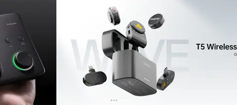
Full-bleed media carousel with oversized product imagery, high-contrast campaign copy, a CTA, and simple slide controls.
Featured product cards
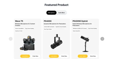
Centered product selector above a multi-column row of #f5f5f5 cards, with product image, concise specs, and purchase actions.
Interest tiles
Four portrait creator-image cards for content creation, podcasting, gaming, and streaming, with rounded image crops and overlaid labels.
Proof and review panels
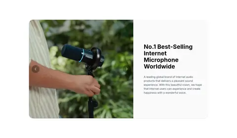
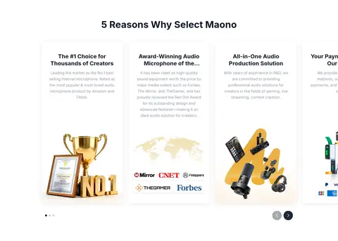
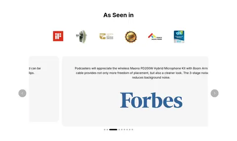
Editorial credibility sections combine awards, press logos, partner metrics, and review quotes in light, image-led layouts.
Collaboration cards
Three rounded CTA panels; warm #f5b335 fills alternate with a pale neutral card, with centered copy and compact actions.
Dark footer
Black multi-column footer with compact link lists, muted text, newsletter input, social icons, and a fine divider.
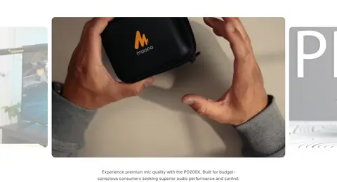
Imagery · Large product photography and campaign videos dominate the page, showing microphones, mixers, accessories, and creators using equipment. Images are often presented as wide campaign panels or rounded card crops; category tiles use portrait photography. Product images remain clean and prominent, while interface overlays—badges, carousel controls, and CTA buttons—stay restrained. Editorial proof cards incorporate partner logos and award imagery.
Reserve #f5b335 and #ffca28 for selective emphasis.
Separate major content modules with generous whitespace.
Use pale gray rounded cards for product browsing.
✕ 不该做
Do not let accent yellow overwhelm the page.
Do not add gradients absent from the measured design.
Do not use decorative display fonts or all-caps body copy.
Do not frame every section with strong borders.
Do not crowd product imagery with extra interface decoration.
Do not replace the bright storefront with dark section bands.
给 AI 的提示词
想快速出一个同风格的新页面,把这段话连同 DESIGN.md 一起发给 AI。
Build a new Maono-style storefront page with a bright, product-first retail aesthetic. Use Gallery White (#ffffff) as the main canvas, Studio Ink (#000000) for navigation and strong text, and Soft Fog (#f5f5f5) for quiet product-card surfaces. Apply Maono Amber (#f5b335) and Signal Yellow (#ffca28) sparingly to brand accents and key actions. Use Inter throughout, with bold headings, compact medium-weight controls, and readable supporting copy. Structure content in a centered, comfortable-width layout with generous gaps: combine campaign media, product cards, creator imagery, editorial proof, and a dark footer. Keep imagery large and authentic; keep borders and shadows subtle, corners rounded, and controls simple. Avoid gradients, excessive decoration, or dense text-heavy layouts.