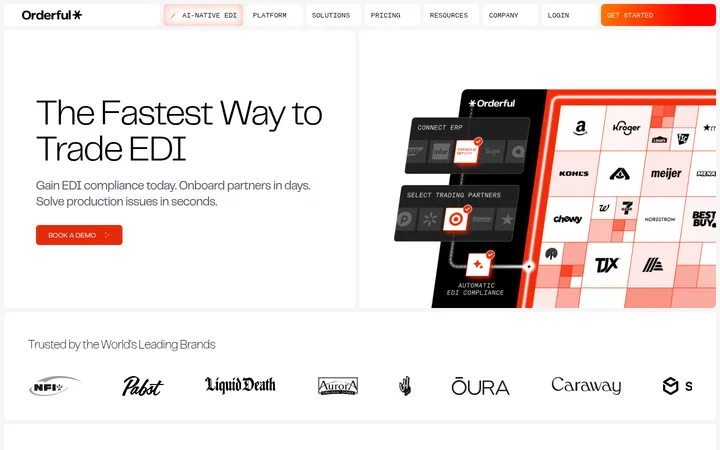
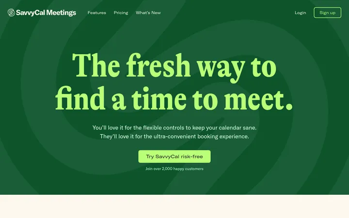
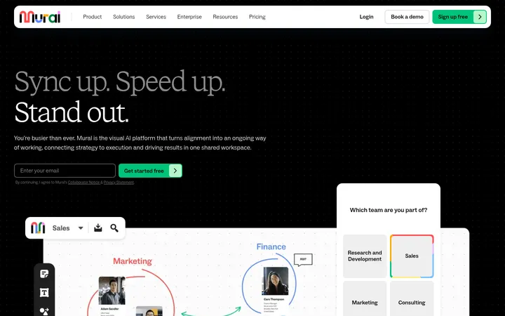
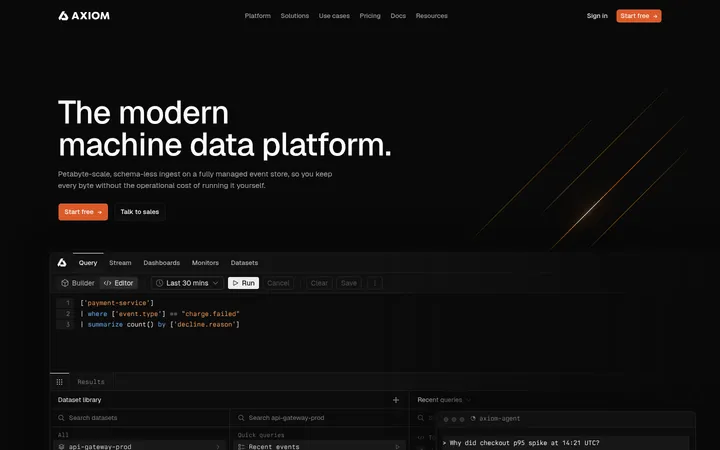
North star · Keep the dark canvas dominant; use mint sparingly for actions and let bright product UI carry the visual contrast.
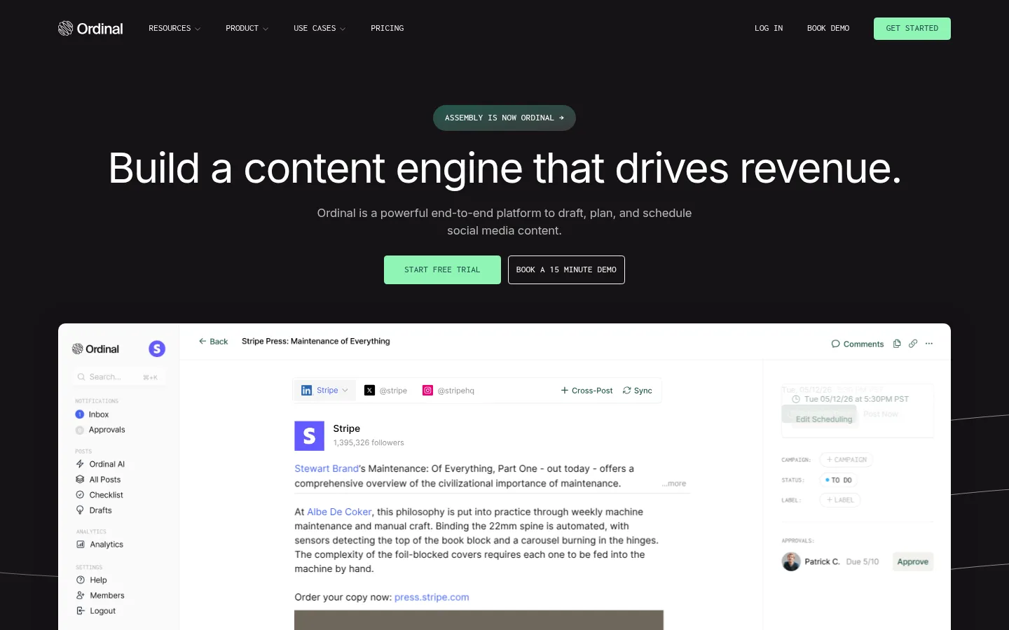
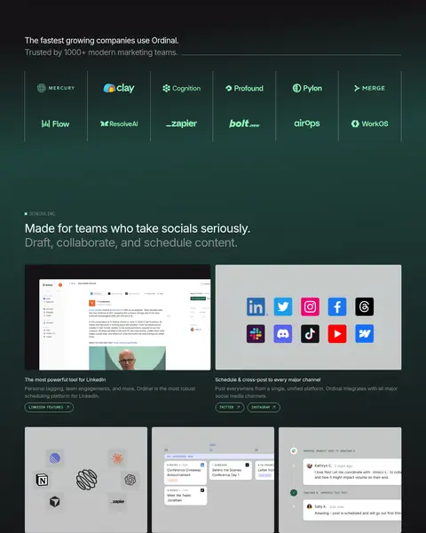
The page uses a nearly uniform charcoal-black canvas, with white headings, muted grey supporting copy, and a pale mint green reserved for primary actions, small labels, and selective emphasis. A subtle deep-green gradient appears behind the trust and feature area, creating a change of mood without breaking the dark foundation. Inter carries the large, regular-weight headline and readable body copy; Inconsolata adds a compact, uppercase technical voice to navigation, labels, and buttons. The layout is centered and spacious at the top, then shifts into aligned feature columns, product demonstrations, a testimonial, and resource cards. Software screenshots are the main visual contrast: pale interfaces sit within dark surroundings, framed rather than heavily decorated. Hairline grey borders, restrained corner rounding, and occasional soft shadow define controls and media. The page favors generous section breathing room over dense decoration, using mint details and carefully placed interface imagery to guide scanning.
Display and heading typography, navigation links, and body copy.
Aa 设计
inconsolata
网络字体 · 字重 500 / 400 · 占比 8%
免费替代:Inconsolata
Compact uppercase navigation, buttons, and section captions.
角色
示例
字号
字重
行高
字距
特大标题
Large display messaging in the hero and major page statements.
Ordinal
60px
400
1.2
-0.03em
一级标题
Primary hero heading.
Ordinal
53.5px
400
1
-0.01em
二级标题
Feature and section headline.
Ordinal
40px
400
1.2
-0.03em
三级标题
Feature titles and subordinate content headings.
The quick brown fox 敏捷的狐狸
26.5px
400
1.5
-0.03em
正文
Paragraphs, descriptions, testimonial text, and supporting copy.
The quick brown fox 敏捷的狐狸
16.5px
400
1.5
-0.01em
辅助文字
Small uppercase category labels and section markers.
The quick brown fox 敏捷的狐狸
13.5px
500
1
0.01em
导航
Compact uppercase navigation and utility labels.
The quick brown fox 敏捷的狐狸
13.5px
400
1
0
间距与布局
基准单位 1px · 密度:宽松
107px版块间距
8px元素间距
—卡片内边距
1273px内容最大宽度
3px
5px
8px
10px
11px
12px
13px
15px
16px
17px
20px
25px
27px
33px
35px
50px
Use a centered content area capped at the measured 1273px maximum width. The hero is centered and open, followed by broad full-width product imagery and a logo band. Later sections alternate between two-column feature layouts, three-column cards, and centered testimonial content. Keep the measured spacious density and roughly 107px section rhythm; align feature headings to the start, and reserve borders for meaningful separations. The footer returns to a broad, multi-column arrangement.
圆角与层次
按钮 · 4px
图片 · 5px
链接 · 10px
lg · other
The interface is mostly flat: dark sections rely on contrast and spacing rather than stacked cards. Use thin graphite borders for button outlines and section separators, with subtle rounding on buttons and media. Reserve soft shadow for occasional floating or layered product imagery; avoid strong elevation that competes with the screenshots.
组件
下面的预览按实测的按钮、输入框、徽标、卡片样式重建(字体用替代字体)。
Primary CTA
Mint-filled button with Pine Ink uppercase Inconsolata text, a thin matching border, and compact corner rounding.
Outlined demo CTA
Transparent dark-canvas button with Warm Paper text and a thin Warm Paper outline; pair beside the primary action.
Top navigation
Compact uppercase links across the header, with the logo at left and utility actions plus a mint CTA at right.
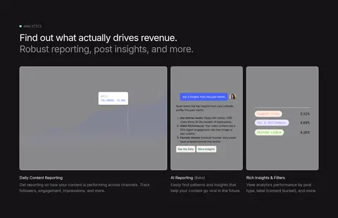
Product preview
Large pale software screenshot framed by a subtly rounded edge, strongly contrasted against the dark canvas.
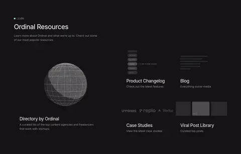
Feature cards
Aligned feature imagery and copy, using restrained borders and spacing rather than prominent card shadows.
Section marker
Small uppercase Inconsolata label with a mint indicator above a larger Inter section heading.
Testimonial
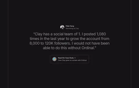
Centered customer quote and attribution, visually isolated by fine vertical rules and generous surrounding space.
Imagery · Product-interface captures are the primary imagery: large pale application screens are set against the dark page, with modest rounded corners and little surrounding ornament. Feature previews include channel logos and reporting panels; these belong to the product content rather than the core palette. Use occasional brand or customer marks and restrained abstract line art in the footer, keeping imagery crisp and well-framed.
Keep the near-black canvas continuous across sections.
Reserve Signal Mint for primary actions and selective highlights.
Use Inter for headlines and readable body copy.
Use Inconsolata for compact uppercase labels and controls.
Give product screenshots strong contrast against the dark page.
Separate content with whitespace and fine graphite rules.
✕ 不该做
Do not introduce unmeasured palette colors.
Do not fill every section with cards or borders.
Do not use mint as a large background field.
Do not let decorative imagery overpower product previews.
Do not crowd the page with dense copy or tight section spacing.
Do not apply heavy shadows or oversized rounded containers.
给 AI 的提示词
想快速出一个同风格的新页面,把这段话连同 DESIGN.md 一起发给 AI。
Build a new page in Ordinal’s visual style. Use Ordinal Charcoal (#151316) as the dominant canvas, Gallery White (#ffffff) for primary text, Soft Ash (#8e8e8e) or Silver Mist (#b9b9b9) for subdued copy, and Signal Mint (#8ef5b5) sparingly for primary actions. Use Pine Ink (#24574d) for text on mint buttons. Set headlines and body in Inter; use Inconsolata for compact uppercase labels, navigation, and buttons. Center content within the measured 1273px maximum width and preserve spacious section rhythm. Let bright product-interface previews create contrast; frame them simply, with restrained rounding and thin Graphite Rule (#595657) outlines where useful. Use Deep Pine (#20433d) only as a subtle gradient accent. Favor clear alignment, open space, fine rules, and flat surfaces over decorative cards or heavy shadows.