North star · Use spacious cream editorial sections as a calm frame for bold color bands and crisp, product-focused demonstrations.
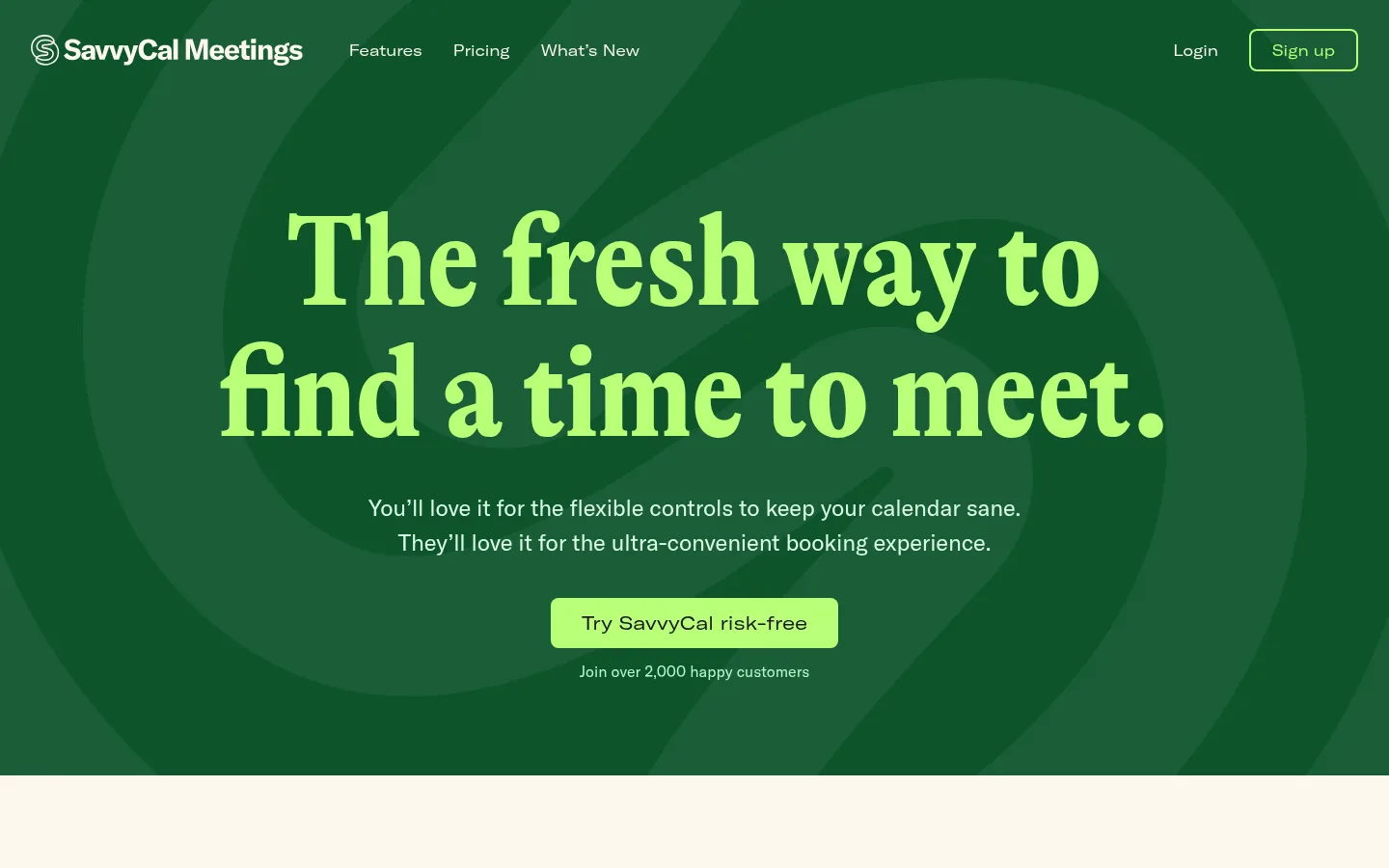
The page balances a warm cream canvas with saturated, full-width green, blush, and near-black bands. The opening hero reverses that balance: layered green imagery fills the viewport, while a bright lime serif headline and compact navigation sit above a centered CTA. GT-Alpina-Condensed gives display headings an expressive editorial character; GT-America-Standard handles readable body copy, with condensed and extended cuts reserved for headings, navigation, and actions. Content sections are centered and spacious, with product demos framed by thin coral outlines and feature summaries arranged in three columns. Testimonial rows pair portraits with restrained quote typography. Rather than relying on gradients or heavy shadows, the page uses clear color changes, generous breathing room, and crisp borders to establish hierarchy. The footer returns to the cream canvas, separates its link columns with a coral hairline, and finishes with playful red line art.
配色
点色块复制色值。用途说明来自对页面的实测位置(背景、文字、描边、按钮)与截图判读。
品牌色
强调色
表层色
中性色
功能色
页面底色 · Warm Parchment表层 · Blush Wash表层 2 · Night Ink表层 3 · Forest Green主文字 · Night Ink次要文字 · Soft Graphite弱文字 · Cloud Gray描边 · Signal Coral强调 · Electric Lime强调 2 · Forest Green强调 3 · Signal Coral
Body copy, feature descriptions, testimonials, and supporting headings.
Aa 设计
GT-America-Condensed
网络字体 · 字重 400 · 占比 13%
免费替代:Roboto Condensed
Section headings and uppercase eyebrow labels.
Aa 设计
GT-Alpina-Condensed
网络字体 · 字重 700 · 占比 5%
免费替代:Lora
Large hero and editorial display headings.
Aa 设计
GT-America-Extended
网络字体 · 字重 400 · 占比 3%
免费替代:Space Grotesk
Navigation links, buttons, and action links.
角色
示例
字号
字重
行高
字距
特大标题
Oversized hero-style display headline treatment.
SavvyCal
136px
700
1
0
一级标题
Primary hero and major section headlines.
SavvyCal
96px
700
1.08
0
二级标题
Section titles and secondary editorial headings.
SavvyCal
38px
400
1.38
-0.025em
三级标题
Feature titles and compact subsection headings.
The quick brown fox 敏捷的狐狸
24px
400
1.5
0
正文
Introductory copy, feature descriptions, and testimonials.
The quick brown fox 敏捷的狐狸
18px
400
1.56
0
辅助文字
Attributions, supporting notes, and small labels.
The quick brown fox 敏捷的狐狸
16px
400
1.5
0
按钮
Primary and secondary CTA labels.
The quick brown fox 敏捷的狐狸
20px
400
1
0
链接
Navigation, feature links, and footer links.
The quick brown fox 敏捷的狐狸
16px
400
1
0
眉题
Uppercase category labels above section headings.
The quick brown fox 敏捷的狐狸
18px
400
1.56
0.05em
间距与布局
基准单位 8px · 密度:宽松
104px版块间距
32px元素间距
—卡片内边距
1360px内容最大宽度
2px
6px
12px
16px
24px
32px
40px
48px
64px
104px
The page uses a spacious, centered composition within a measured 1360px maximum page width. Full-bleed color bands separate major themes; within them, centered headline-and-copy groups lead into wide product demonstrations. Feature summaries sit in three columns, while testimonials use a two-column portrait-and-quote arrangement. The measured spacing scale is based on an 8px unit, with a spacious density and a 104px section rhythm. Keep navigation compact and let large editorial headings provide the strongest alignment cue.
圆角与层次
按钮 · 8px
链接 · 8px
inset · link
The visual system is mostly flat: large background-color changes create section depth instead of drop shadows. Product demonstrations are distinctly layered within outlined frames, with a light inner edge visible around the media. Buttons use solid fills and modest rounded corners. A measured inset lime ring appears on a link state; avoid adding unmeasured shadow treatments.
组件
下面的预览按实测的按钮、输入框、徽标、卡片样式重建(字体用替代字体)。
Hero navigation
Compact links and account actions sit across the top of the green hero; the sign-up action is outlined in lime.
Hero CTA
Centered lime button with dark text and rounded corners, followed by a small customer-count reassurance.
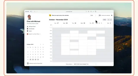
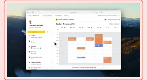
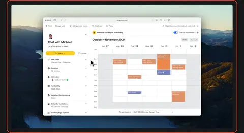
Product demo frame
Wide video or product image framed by a thin coral outline and a light inner border.
Three-column feature row
Three compact feature summaries with bold titles, short descriptions, and occasional Read more links.
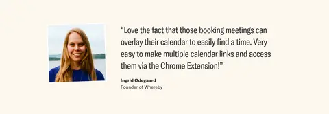
Customer testimonial
Portrait and customer quote sit side by side, with the customer name and role beneath the quote.
Pricing CTA
Centered offer on the cream canvas with a coral pricing button and a compact money-back reassurance.
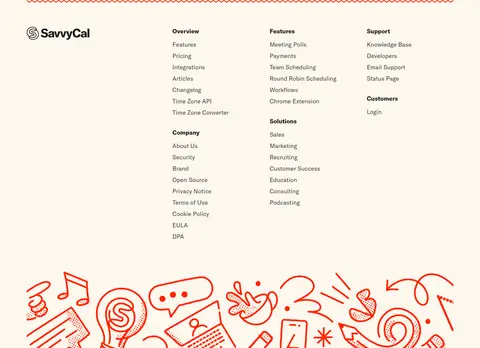
Footer link columns
Brand mark and grouped link columns sit below a thin coral decorative rule, followed by red line-art illustration.
Imagery · Product videos are the main visual evidence: wide scheduling-interface views sit over scenic landscape imagery and are enclosed by fine coral outlines. Small customer portraits accompany testimonial quotes. The opening hero uses a large, abstract layered green graphic rather than photography. The footer adds hand-drawn coral line art; keep decorative imagery secondary to the product UI.
Use the cream canvas to give long content sections a warm, calm base.
Reserve the lime accent for high-priority actions and hero emphasis.
Separate major themes with full-width color bands.
Frame product demonstrations with crisp coral outlines.
Pair display serif headings with readable sans-serif body copy.
Keep feature descriptions and navigation labels concise.
Use generous whitespace to preserve the spacious editorial rhythm.
✕ 不该做
Don't add gradients as a substitute for the page's solid color bands.
Don't use heavy drop shadows to create hierarchy.
Don't make every section dark or highly saturated.
Don't let decorative illustrations compete with product demonstrations.
Don't replace the expressive display serif with generic bold sans-serif headings.
Don't crowd feature columns or testimonial layouts.
Don't introduce colors outside the measured palette.
给 AI 的提示词
想快速出一个同风格的新页面,把这段话连同 DESIGN.md 一起发给 AI。
Build a new SaaS page in SavvyCal's spacious editorial style. Use Warm Parchment (#fcf7ed) as the main content canvas, with Forest Green (#0d542b), Blush Wash (#ffe3e3), and Night Ink (#18181b) as deliberate full-width section bands. Set large headlines in an expressive condensed serif, with clean sans-serif body copy and extended-style interface labels. Make the primary action Electric Lime (#b9ff78) with dark text; use Signal Coral (#f54320) for demo outlines, fine rules, and a secondary CTA. Center section introductions, give product media a wide outlined frame, and organize feature summaries into calm columns. Pair testimonial portraits with readable quotes. Keep surfaces flat, spacing generous, and decoration subordinate to the product. Avoid gradients, heavy shadows, and unmeasured colors.