North star · Keep the page calm and highly legible, using vivid red-orange only to direct attention to action or product proof.
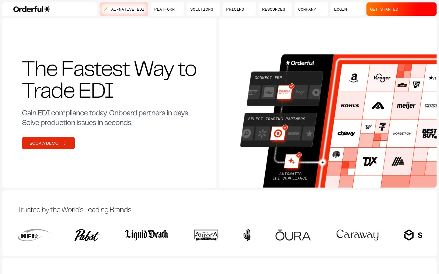
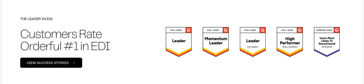
The page builds its identity from a mostly white canvas, pale-gray feature bands, and a single deep charcoal network section. Black headlines are large, light, and tightly tracked, while muted gray supporting copy keeps the dense B2B message readable. The primary red-orange CTA is compact and unmistakable; a red-to-orange gradient is reserved for the closing conversion banner and selected product artwork. A wide, centered content frame supports varied layouts: split hero, horizontal logo row, product cards, dark metrics panel, integrations, and testimonial content. Generous gaps between these blocks create a measured rhythm, while card borders and subtle separators define structure without heavy shadows. Imagery is primarily interface-led: partner grids, dashboard-like product panels, company marks, and customer proof. The result feels technical and confident, but remains approachable through simple geometry, restrained color, and clear CTA hierarchy.
Main display and interface type across headings, body copy, navigation, and buttons.
Aa 设计
modernGothic
网络字体 · 字重 300 · 占比 2%
免费替代:Space Mono
Occasional uppercase AI-native EDI link or label.
角色
示例
字号
字重
行高
字距
特大标题
Large, light display headlines for prominent page statements.
Orderful
72px
300
1
-0.03em
一级标题
Main hero headline and primary page-level heading.
Orderful
60px
100
1
-0.025em
二级标题
Major section titles such as product, network, and customer headings.
Orderful
48px
100
1
-0.025em
三级标题
Subsection headings and product or business-category titles.
Orderful
30px
300
1.38
0
四级标题
Compact card titles and supporting feature headings.
The quick brown fox 敏捷的狐狸
24px
400
1.33
-0.03em
正文
Descriptions, explanatory paragraphs, and testimonial copy.
The quick brown fox 敏捷的狐狸
14px
400
1.63
0
辅助文字
Small supporting labels, footnotes, and secondary metadata.
The quick brown fox 敏捷的狐狸
12px
400
1.33
0
按钮
CTA labels and other button text, commonly uppercase.
The quick brown fox 敏捷的狐狸
14px
400
1.43
0
导航
Top navigation labels and links.
The quick brown fox 敏捷的狐狸
14px
400
1.43
0
间距与布局
基准单位 8px · 密度:适中
48px版块间距
16px元素间距
24px卡片内边距
1280px内容最大宽度
4px
8px
12px
16px
24px
32px
40px
48px
64px
Use a centered, wide content frame with a measured maximum width of 1280px. Build sections from simple columns: a split hero, horizontal logo row, product-card grid, dark metrics band, integration panel, and customer proof. Alternate white and pale-gray bands sparingly, with one charcoal feature section and a vivid closing CTA. Align headings to the left in editorial and proof sections, center the product introduction, and keep cards and interface details neatly grouped. The measured spacing system is comfortable, with consistent gaps and section breathing room rather than dense stacking.
圆角与层次
按钮 · 6px
输入框 · 4px
卡片 · 8px
图片 · 8px
sm · card, button
inset · other
The page is mostly flat: white and pale-gray bands, thin borders, and clear changes in surface color do most of the structural work. Cards have restrained rounding, with little or no visible shadow. Layer interface imagery and logos within their containers rather than adding ornamental depth; the dark network block and gradient CTA provide the strongest visual separation.
组件
下面的预览按实测的按钮、输入框、徽标、卡片样式重建(字体用替代字体)。
Primary demo button
Compact red-orange button with white uppercase Telegraf text, a fine matching border, and lightly rounded corners.
Dark secondary button
Black button with white uppercase text, matching the primary CTA's compact, rounded shape.
Top navigation
A horizontal row of compact links and separated light panels, with a vivid gradient treatment for the prominent get-started action.
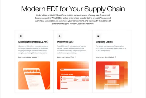
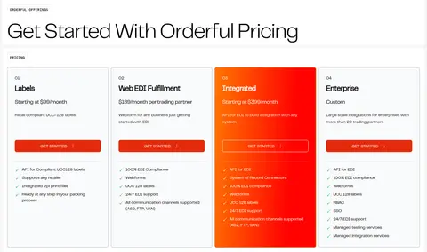
Product cards
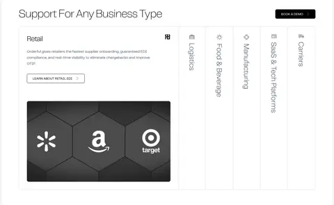
White cards group a small icon, heading, short explanation, link, and warm product-interface artwork.
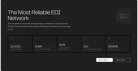
Network metrics panel
Charcoal section with introductory copy and a horizontal row of bordered metric cells, followed by contrasting actions.
Newsletter form
Simple email input with a fine cool-gray outline and a red-orange submit button.
Closing CTA banner
Full-width red-to-orange gradient block with centered light headline, brief subline, and a compact dark button.
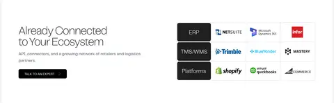
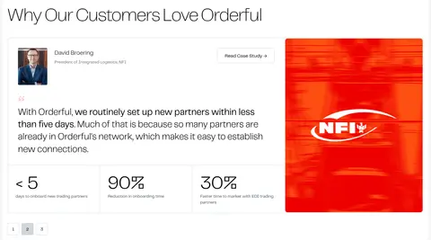
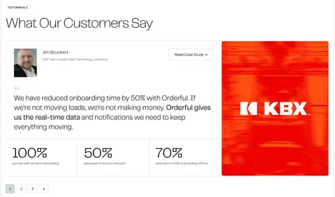
Imagery · Prioritize crisp product-interface visuals: partner selection grids, compliance panels, product cards, and ecosystem logos. Pair these with customer marks and restrained portrait or case-study imagery where relevant. Product illustrations use vivid red-orange accents, but those hues inside illustrations should not become extra page-wide color fields. Keep images neatly framed within the modular layout, with minimal decorative effects.
Keep the main canvas white and the alternate bands pale gray.
Use black for prominent headings and muted slate for explanatory copy.
Reserve red-orange for primary actions and selective product emphasis.
Give large headings a light weight and tight tracking.
Use modular cards and clear column groupings for product details.
Make the network metrics section distinctly charcoal.
Leave generous visual breathing room between major blocks.
✕ 不该做
Do not add unmeasured colors to the brand palette.
Do not fill every section with gradients or saturated color.
Do not use heavy shadows to define cards.
Do not crowd supporting copy against large headlines.
Do not turn customer logos or interface artwork into background decoration.
Do not use bold, dense display typography in place of the measured light headline style.
给 AI 的提示词
想快速出一个同风格的新页面,把这段话连同 DESIGN.md 一起发给 AI。
Build a new B2B SaaS page in Orderful's restrained, modular visual style. Use Gallery White (#ffffff) as the main canvas, Soft Mist (#f5f5f5) for occasional section bands, and Ink (#000000) for large, light-weight headlines. Set supporting copy in Slate Copy (#4a5565). Use Action Vermilion (#e42b0c) for the primary CTA; reserve Signal Red (#ff0201) and Bright Tangerine (#ff7802) together for a selective gradient moment, not broad page fills. Structure content in a wide centered frame with clear columns, generous breathing room, thin Cool Divider (#d1d5dc) rules, and mostly flat cards. Add one Graphite (#1f1f1f) proof or metrics section. Use product-interface imagery and customer marks as contained proof. Maintain clear hierarchy, compact uppercase buttons, and simple, readable interactions.