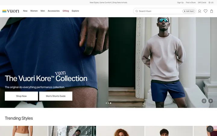
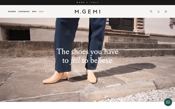
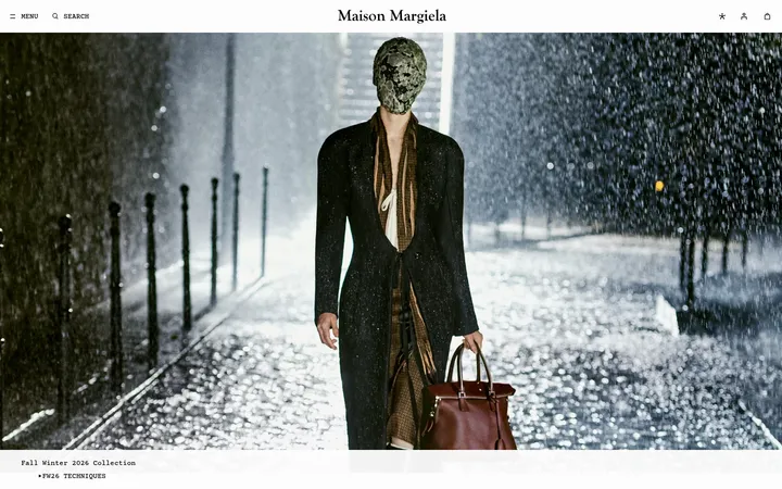
North star · Let clean black-and-white structure frame the photography, and reserve lime for a few high-impact story moments.
The visual strategy is built on sharp contrast: white page space and black type provide a quiet frame for high-impact, full-bleed jewelry and lifestyle photography. Lime green (#deff9d) is a deliberate highlight rather than a general background color, appearing prominently in the hero lettering and the Salmon Gold story band. SyndicatGrotesk carries uppercase headings, links, and calls to action with generous letter spacing; SimonMono gives supporting copy a compact, technical counterpoint. Sections alternate between immersive imagery, two-column editorial content, and practical store cards, with broad white gaps preserving an unhurried cadence. Black panels create a strong interruption for the Los Angeles store message, while product and store imagery supplies most of the softer colors. The interface stays flat, using fine rules and restrained outlines rather than shadows or rounded UI. This balance lets the jewelry remain the visual focus while keeping the storefront easy to scan.
配色
点色块复制色值。用途说明来自对页面的实测位置(背景、文字、描边、按钮)与截图判读。
品牌色
强调色
表层色
中性色
功能色
页面底色 · Gallery White表层 · Deep Ink表层 2 · Studio Grey表层 3 · Warm Pewter主文字 · Deep Ink次要文字 · Soft Black弱文字 · Gallery White描边 · Deep Ink
Monospaced supporting copy, captions, search text, and compact editorial descriptions.
Aa 设计
SyndicatGrotesk
网络字体 · 字重 500 / 400 / 420 / 700 · 占比 43%
免费替代:Manrope
Navigation, headings, body labels, links, and calls to action.
角色
示例
字号
字重
行高
字距
特大标题
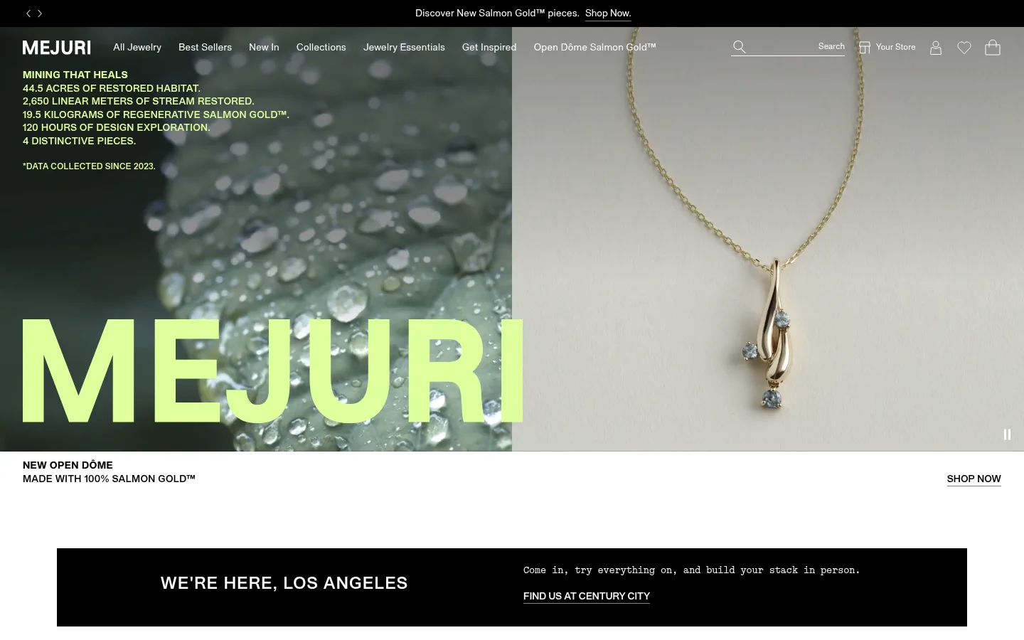
Oversized uppercase hero wordmark layered over the campaign video.
Mejuri
64px
500
1
0.05em
一级标题
Primary editorial or campaign headings.
Mejuri
32px
500
1.33
0.05em
二级标题
Section titles such as Essentials and sustainability.
The quick brown fox 敏捷的狐狸
24px
500
1
0.05em
正文
Compact uppercase labels and short interface or promotional copy.
The quick brown fox 敏捷的狐狸
14px
500
1.33
0.02em
辅助文字
Monospaced supporting descriptions and fine-print details.
The quick brown fox 敏捷的狐狸
12px
400
1.33
-0.01em
按钮
Uppercase action labels with tracked lettering.
The quick brown fox 敏捷的狐狸
14px
500
1.43
0.071em
导航
Small, restrained navigation labels.
The quick brown fox 敏捷的狐狸
12px
400
1.33
0.02em
链接
Uppercase shop and store-finder links.
The quick brown fox 敏捷的狐狸
14px
500
1.33
0
眉题
Emphasized uppercase introductory labels.
The quick brown fox 敏捷的狐狸
24px
500
1
0.05em
代码
Monospaced utility and detail text.
const style = 1;
12px
400
1.33
-0.01em
间距与布局
基准单位 8px · 密度:适中
56px版块间距
4px元素间距
20px卡片内边距
1280px内容最大宽度
4px
8px
12px
16px
24px
32px
40px
48px
56px
64px
80px
88px
188px
A full-width storefront uses a compact overlay navigation above an edge-to-edge campaign hero, then shifts into centered editorial bands and image-led blocks. Content alternates between two-column stories, a two-card category feature, three-column store cards, and a split brand statement. The measured layout allows a 1280px maximum content width, with section spacing that feels generous and comfortable rather than dense. Most section backgrounds stay white; the black store callout and lime story band create clear changes of pace. Alignment is generally left-led, with ample open space around copy.
圆角与层次
图片 · 2px
没有测到阴影:页面是扁平的,层次靠底色和描边区分。
The page is predominantly flat: there are no measured shadows, and cards rely on imagery and color fields instead of raised surfaces. Borders and hairlines use black or near-black for definition, while buttons remain square-cornered and restrained. The hero overlays navigation and type over video; otherwise, section bands and image blocks establish hierarchy without decorative layering.
组件
下面的预览按实测的按钮、输入框、徽标、卡片样式重建(字体用替代字体)。
Overlay navigation
Compact white navigation and utility icons sit over the hero imagery, alongside a narrow black announcement strip.
Campaign hero
Full-bleed split video imagery carries oversized lime uppercase lettering and small campaign details; a white caption row follows.
Black store callout
A wide black rectangle pairs a prominent Los Angeles heading with monospaced store copy and an underlined white location link.
Salmon Gold story band
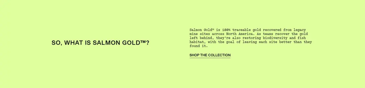
Two-column editorial block on #deff9d, with a short uppercase heading, monospaced explanatory copy, and a shop link.
Category feature tiles
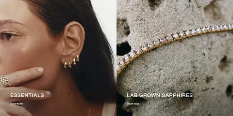
Two side-by-side lifestyle and product images use uppercase overlay titles and compact shop links.
Store cards
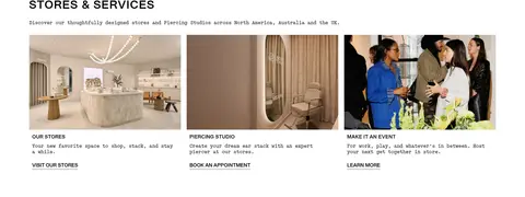
Three image-led cards introduce stores, piercing, and events, with brief monospaced descriptions and understated links.
Footer
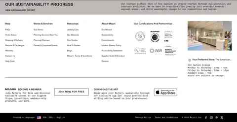
Dense multi-column help and brand links sit above membership, app, location, and legal details; mostly white with a dark closing strip.
Imagery · The hero uses video with a dramatic split between a nature-textured close-up and a jewelry product view, overlaid with oversized lime lettering. Further sections use editorial lifestyle and product photographs: jewelry on a model, close-up stones, and polished store interiors. Images are large, often edge-to-edge or arranged in simple columns; their natural tones provide color beyond the restrained interface palette.
Use #deff9d as a selective campaign accent, not a default UI fill.
Let large jewelry and lifestyle imagery lead the composition.
Use uppercase, tracked grotesk type for headings and actions.
Pair concise monospaced copy with editorial headings.
Create hierarchy with broad white space and flat color bands.
✕ 不该做
Do not add decorative shadows or raised cards.
Do not round buttons or card corners.
Do not spread lime across every section.
Do not crowd the hero with dense text.
Do not replace product photography with generic illustrations.
Do not use heavy borders where simple space suffices.
给 AI 的提示词
想快速出一个同风格的新页面,把这段话连同 DESIGN.md 一起发给 AI。
Build a refined fine-jewelry storefront page using Mejuri’s restrained editorial language. Use Gallery White (#ffffff) as the main canvas and Deep Ink (#000000) for typography, utility details, and occasional inverse panels. Reserve Salmon Lime (#deff9d) for a small number of campaign highlights or a distinct story band. Use bold jewelry and lifestyle photography as the main visual material, with full-bleed hero imagery followed by calm two-column stories and simple image cards. Set headings and action labels in an uppercase, tracked grotesk similar to Manrope; use a regular monospaced face similar to IBM Plex Mono for supporting descriptions. Keep the layout flat and spacious, with square corners, minimal hairlines, no shadows, and a clear scan path from campaign to categories, stores, and brand information.