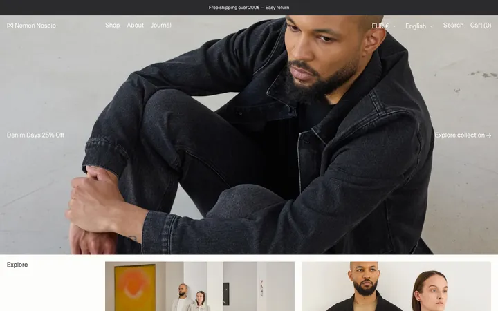
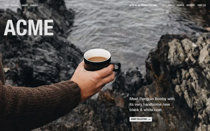
North star · Let restrained black-and-white commerce UI frame large, tactile Italian footwear imagery and elegant serif editorial copy.
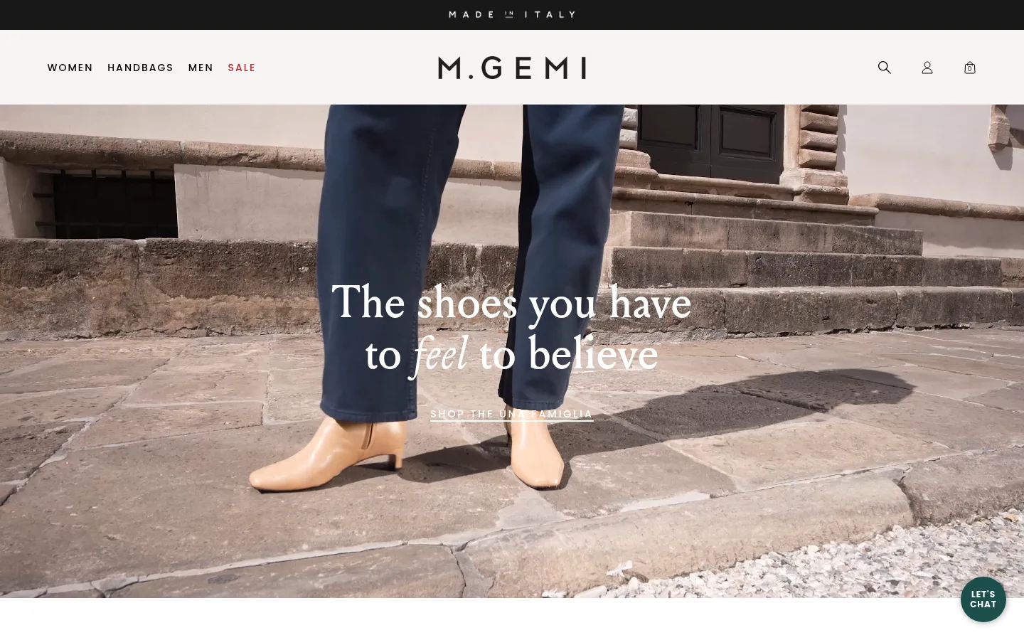
The page relies on a near-monochrome interface: Gallery White (#ffffff) forms the main canvas, Ink (#000000) carries navigation and copy, and Soft Gray (#f2f2f2) marks subtle section surfaces and product-image backdrops. The measured palette is intentionally restrained; warm stone, leather, and skin tones belong to the photography rather than the UI system. Louize’s expressive serif gives headlines an editorial, fashion-magazine voice, balanced by lightweight Poppins for body copy and widely tracked uppercase navigation and labels. A narrow dark announcement strip and pale header introduce a full-bleed video hero with centered white copy. Below, product cards, paired image stories, and a four-item essentials row alternate with generous white space. The overall rhythm is comfortable rather than dense, with broad media blocks and simple text links. Thin gray footer dividers provide structure without decorative shadows or heavy card framing.
Body copy, navigation, product labels, buttons, captions, and utility links.
Aa 设计
205TF Louize
网络字体 · 字重 400 · 占比 21%
免费替代:Cormorant Garamond
Display and section headlines, including the hero statement and editorial product-story copy.
Aa 设计
Times New Roman
系统字体 · 字重 400 · 占比 6%
免费替代:Libre Baskerville
Measured fallback on some product and navigation links; not the intended dominant brand face.
角色
示例
字号
字重
行高
字距
特大标题
Large hero and campaign statements over video or photography.
M.Gemi
64px
400
1.13
0
一级标题
Primary page or campaign headline.
M.Gemi
56px
400
1.14
0
二级标题
Major collection and editorial section headings.
M.Gemi
48px
400
normal
0
三级标题
Secondary story and promotional headlines.
M.Gemi
40px
400
1.2
0
四级标题
Smaller editorial and product-story titles.
M.Gemi
32px
400
1.31
0
正文
Descriptions, supporting copy, and footer information.
The quick brown fox 敏捷的狐狸
14px
300
1.57
0.018em
辅助文字
Compact product details and image captions.
The quick brown fox 敏捷的狐狸
10px
300
1.67
0.01em
按钮
Small, understated CTA labels.
The quick brown fox 敏捷的狐狸
10px
300
1.67
0.01em
导航
Uppercase primary navigation labels.
The quick brown fox 敏捷的狐狸
14px
500
1.14
0.143em
链接
Product names and secondary commerce links.
The quick brown fox 敏捷的狐狸
12px
500
2.5
0.067em
眉题
Uppercase collection labels above editorial copy.
The quick brown fox 敏捷的狐狸
14px
500
1.71
0.214em
间距与布局
基准单位 4px · 密度:适中
64px版块间距
20px元素间距
—卡片内边距
1312px内容最大宽度
2px
5px
8px
10px
12px
16px
20px
24px
25px
32px
39px
40px
50px
64px
88px
A broad, centered storefront uses a slim announcement bar above a horizontal header, then opens into edge-to-edge video. Content sections sit within a wide page frame, with three-column bestseller merchandising, paired two-column editorial image stories, and a centered four-item essentials row. Alignment shifts deliberately: centered hero copy, left-aligned product and story text, and centered footer headings. Large media areas and generous white intervals keep the comfortable density from becoming crowded; the footer resolves into three columns.
圆角与层次
没有测到阴影:页面是扁平的,层次靠底色和描边区分。
The design is essentially flat: avoid drop shadows, floating cards, and conspicuous rounded containers. Product images sit directly in the page flow, while whitespace and alignment define the groups. Use fine, quiet gray dividers in the footer and a strong dark announcement strip for contrast. The circular chat control is a small utility exception.
组件
下面的预览按实测的按钮、输入框、徽标、卡片样式重建(字体用替代字体)。
Announcement bar
A narrow, full-width dark strip above the header, carrying a centered, compact light-colored message.
Store header
Pale horizontal header with tracked uppercase category links, centered M.Gemi wordmark, and small search, account, and bag utilities.
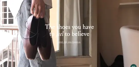
Video hero
Edge-to-edge lifestyle video with centered Louize headline and a small uppercase, tracked commerce link in white.
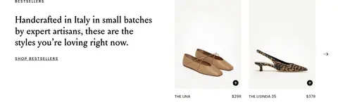
Bestseller showcase
Editorial introduction beside a three-column product selection, with concise product names and prices beneath imagery.
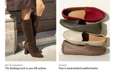
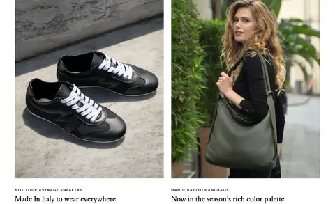
Editorial image pair
Two broad side-by-side image stories, each followed by an uppercase Poppins eyebrow and a Louize headline.
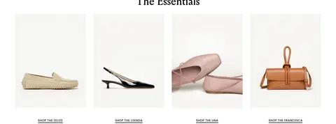
Essentials product row
Centered serif heading above four evenly aligned isolated products, each followed by a compact underlined shop link.
Three-column footer
Contact, sharing, and company link groups with centered headings, fine vertical dividers, and small utility text.
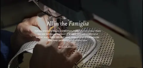
Imagery · Use real, tactile fashion photography and video: shoes worn on Italian streets, close views of leather and artisan work, and clean isolated product shots. The hero and artisan story are full-bleed moving-image moments with centered white overlay copy. Collection imagery alternates lifestyle framing with simple product presentation on pale neutral backgrounds. Preserve natural warm stone, leather, and skin tones; these are photographic content, not interface palette additions.
Keep the interface predominantly Gallery White (#ffffff) and Ink (#000000).
Use Louize-style serif headlines for editorial moments.
Set navigation and category eyebrows in tracked uppercase Poppins.
Give lifestyle video and product photography room to dominate.
Use Soft Gray (#f2f2f2) only as a quiet supporting surface.
Separate content through whitespace and alignment rather than card effects.
✕ 不该做
Do not introduce unmeasured accent colors into interface elements.
Do not turn warm photographic tones into brand UI colors.
Do not add prominent shadows, gradients, or decorative card borders.
Do not crowd product imagery with dense copy or controls.
Do not replace editorial serif headlines with a generic heavy sans.
Do not make navigation oversized or visually louder than the campaign image.
给 AI 的提示词
想快速出一个同风格的新页面,把这段话连同 DESIGN.md 一起发给 AI。
Build a new M.Gemi-style fashion storefront page using a restrained editorial system. Use Gallery White (#ffffff) as the main canvas and Ink (#000000) for navigation, copy, and links; reserve Soft Gray (#f2f2f2) for subtle image or section surfaces and Quiet Silver (#b1b1b1) for fine dividers. Set campaign and collection headlines in an elegant Louize-like serif, with lightweight Poppins-style body text and widely tracked uppercase navigation and eyebrows. Start with a slim dark announcement band and pale header, then prioritize a full-width lifestyle image or video. Follow with spacious product grids and paired editorial image stories, keeping product labels compact. Let authentic leather, footwear, and artisan imagery supply the warmth. Keep surfaces flat, avoid unnecessary shadows, and use generous whitespace to establish hierarchy.