North star · Keep the interface monochrome and spacious, using editorial photography and irregular product placement—not decorative UI—to create drama.
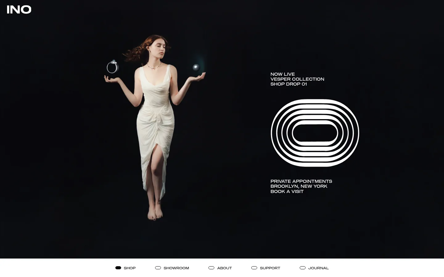
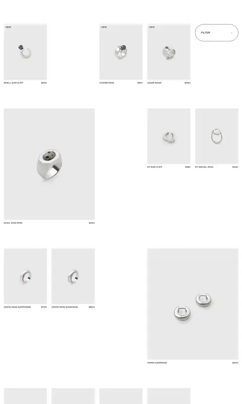
The page sets up a strong tonal contrast: a near-black, full-viewport campaign scene opens the experience, followed by a white catalog where the jewelry is presented against pale image backdrops. The measured interface palette is strictly monochrome: white for the main canvas, near-black for the dominant text, and gray for restrained borders and secondary details. The darker hero is a photographic and campaign-led exception, not a reason to recolor the shopping interface. Sequel100Wide supplies the distinctive, wide geometric voice across navigation, headings, labels, and product information; uppercase microcopy makes even small controls feel deliberate. The product grid avoids conventional uniform rows, using varied image sizes and broad gaps to create a loose editorial rhythm. Fine outlines define filter controls and navigation markers without adding shadows or colored cards. The large INO footer mark provides a bold final typographic anchor.
Primary display and interface face for headings, navigation, product details, and uppercase labels.
Aa 设计
Arial
系统字体 · 字重 400 · 占比 9%
免费替代:Arial
Button labels, including the outlined catalog category controls.
角色
示例
字号
字重
行高
字距
一级标题
Campaign or primary page heading, in regular Sequel100Wide.
INO
32px
400
1.1
0
正文
Uppercase product and supporting copy.
The quick brown fox 敏捷的狐狸
13.5px
400
1.2
0
辅助文字
Compact uppercase product labels and secondary details.
The quick brown fox 敏捷的狐狸
11px
400
1
0
按钮
Uppercase category and filter button labels in Arial.
The quick brown fox 敏捷的狐狸
11px
400
1
0
导航
Uppercase primary shop navigation.
The quick brown fox 敏捷的狐狸
11px
400
1
0
链接
Uppercase editorial and shopping links.
The quick brown fox 敏捷的狐狸
13.5px
400
1.2
0
眉题
Small uppercase campaign or section lead-in.
The quick brown fox 敏捷的狐狸
11px
400
1
0.04em
间距与布局
基准单位 1px · 密度:宽松
144px版块间距
28px元素间距
38px卡片内边距
1395px内容最大宽度
2px
4px
11px
14px
18px
23px
28px
34px
36px
38px
43px
144px
146px
The page begins with a full-width campaign hero, then shifts to a broad white product catalog and a compact two-column footer. The measured maximum content width is 1395px, with spacious section rhythm and large gaps between product groupings. Product tiles form an intentionally irregular editorial grid: small pieces sit beside oversized images, with generous empty space between them. Align labels closely to their images and keep navigation visually distinct from the catalog.
圆角与层次
卡片 · 9999px
导航 · 9999px
没有测到阴影:页面是扁平的,层次靠底色和描边区分。
The interface is flat, with no measured shadows or gradients. Use whitespace and image scale for depth rather than layered cards. Thin gray or black outlines define controls; catalog photos sit directly on the white page with pale backdrops contained within the image treatment.
组件
下面的预览按实测的按钮、输入框、徽标、卡片样式重建(字体用替代字体)。
Campaign hero
Full-width near-black opening scene with a white INO mark, model photography, concise campaign copy, and a centered concentric motif.
Primary navigation
A separate white navigation band below the hero; uppercase Sequel100Wide labels pair with small outlined or filled oval markers.
Product tile
Jewelry image on a pale gray ground with compact uppercase product name and price placed close beneath.
Filter control
Outlined, pill-shaped filter panel with category options; measured card styling uses a thin black border.
Category buttons
Uppercase Arial labels with restrained gray outlines, minimal fill treatment, and no visible shadow.
Footer
Large INO wordmark balances compact newsletter, policy, and metal-price information in a sparse two-column composition.
Imagery · The hero uses a dramatic campaign photograph: a model in a pale dress is isolated against a nearly black field, paired with a simple concentric graphic. The catalog switches to clean jewelry product photography on pale gray image grounds, with both small and oversized crops. Treat imagery as the main visual content; avoid adding decorative illustration beyond campaign-specific artwork.
Preserve the near-black campaign hero against the white catalog.
Use the measured monochrome palette for interface elements.
Set interface labels in regular-weight uppercase Sequel100Wide.
Keep product imagery dominant and its captions compact.
Use irregular tile sizes and generous whitespace for editorial rhythm.
Define controls with fine outlines instead of filled cards.
✕ 不该做
Do not turn the catalog into a dense, uniform retail grid.
Do not introduce unmeasured accent colors into the interface.
Do not add shadows, gradients, or layered card effects.
Do not treat hero-image colors as brand UI colors.
Do not enlarge product captions into prominent promotional copy.
Do not crowd the navigation or product groupings.
给 AI 的提示词
想快速出一个同风格的新页面,把这段话连同 DESIGN.md 一起发给 AI。
Build a new INO-style jewelry page with a restrained monochrome interface and editorial pacing. Use Gallery White (#ffffff) as the catalog canvas, Soft Ink (#212123) for primary text, Quiet Graphite (#999999) for subtle control borders and secondary text, and Outline Black (#000000) for fine structural strokes. Reserve Footer Haze (#a6a6a7) for low-emphasis footer details. Use a wide geometric sans such as Space Grotesk to approximate Sequel100Wide, mostly regular weight and uppercase for navigation, labels, and product details. Pair a bold campaign image area with a clean, asymmetrical product grid, pale image grounds, and broad whitespace. Keep controls flat and outlined, avoid shadows, and let varied product-image scale provide the visual rhythm.