North star · Use bold, oversized display type over expansive, sharply contrasting color fields, and keep actions simple and pill-shaped.
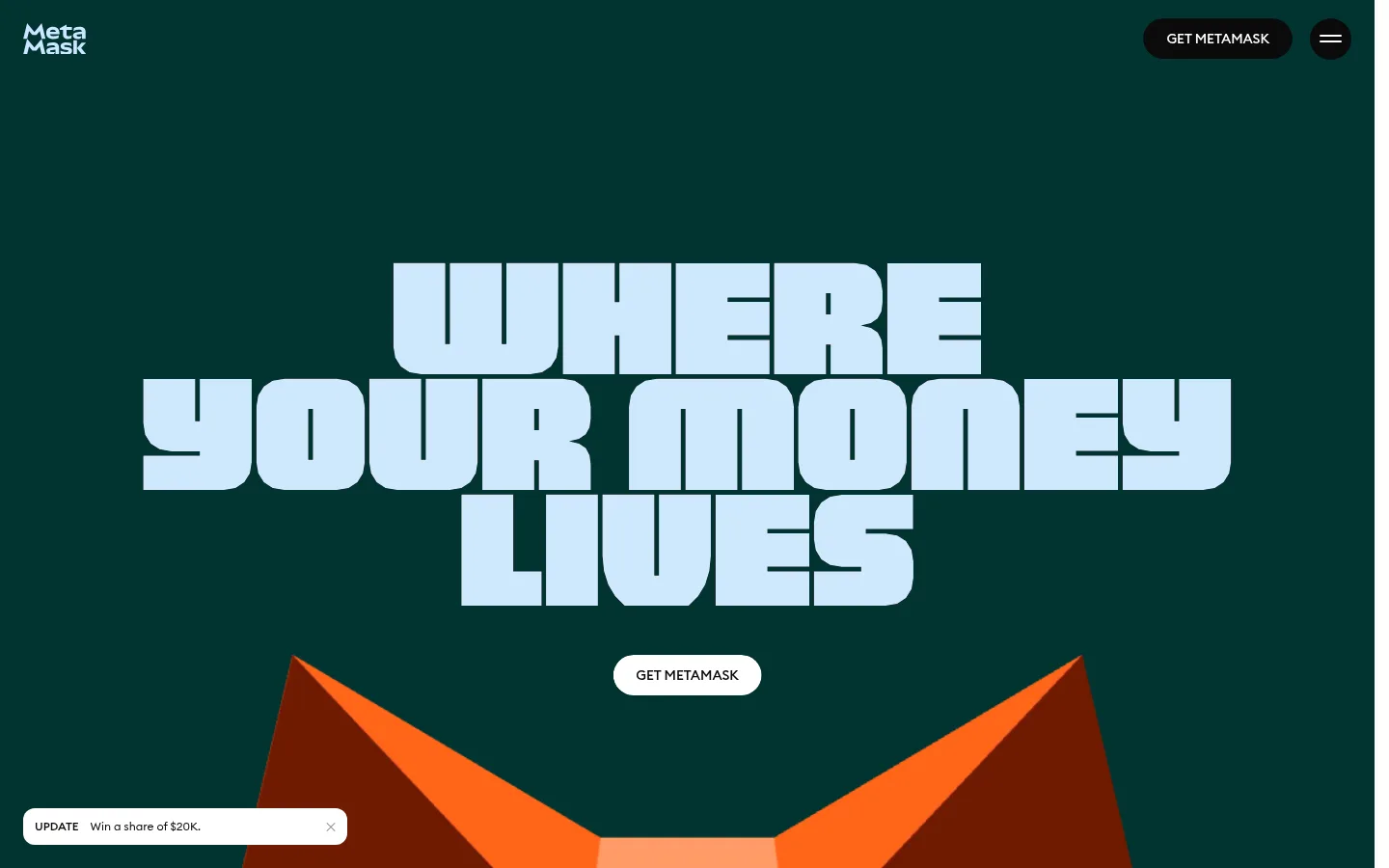
The page opens with a full-bleed deep teal hero, setting pale blue, tightly stacked display lettering against a quiet dark canvas. The headline is the focal point; a compact white pill CTA sits directly beneath it, while a minimal logo and dark pill navigation stay near the edges. Below, the long page uses strong color-block transitions rather than a uniform background: saturated purple supports floating coin artwork, then warm peach frames wallet and security content, with pale blue, lime, lavender, and dark teal appearing in cards. Typography combines the expressive, heavy-feeling MetaMask display face with a clean sans-serif for supporting copy and navigation. Content shifts between centered statements, product imagery, and compact card grids. The visual system favors broad open fields and clear separation between sections, then concentrates detail inside rounded cards. Illustrations and 3D-style assets add energy without replacing the headline-led hierarchy.
Navigation, captions, and compact interface labels
Aa 设计
MMPolyVariable
网络字体 · 字重 400 · 占比 6%
免费替代:Bowlby One SC
Display headline and major hero statements
角色
示例
字号
字重
行高
字距
特大标题
Large decorative display statements and hero-scale typography.
MetaMask
120px
400
1
0
一级标题
Primary hero headline, set as stacked display lettering.
MetaMask
104px
400
1
0
正文
Supporting page copy and feature descriptions.
The quick brown fox 敏捷的狐狸
24px
400
1
0
辅助文字
Compact card labels, utility copy, and short annotations.
The quick brown fox 敏捷的狐狸
14px
500
1
0
导航
Header navigation and concise navigation actions.
The quick brown fox 敏捷的狐狸
14px
500
1
0
间距与布局
基准单位 8px · 密度:适中
—版块间距
16px元素间距
24px卡片内边距
—内容最大宽度
4px
5px
8px
9px
10px
11px
12px
15px
16px
17px
20px
22px
24px
32px
40px
The page alternates expansive full-bleed color bands with denser content sections. The hero centers its oversized headline and CTA, while the compact logo and navigation align to opposite edges. Later sections mix centered feature statements, two-column security content, and grouped proof cards. The measured page uses a comfortable density, a 16px element gap, and 24px card padding. Favor generous open canvas around key messages, then tighten spacing inside cards. No fixed maximum content width is established by the measurements.
圆角与层次
按钮 · 9999px
卡片 · 16px
导航 · 9999px
链接 · 40px
hairline · other
The design is mostly flat: large color fields establish hierarchy instead of shadows. Cards use measured 16px corner radii and restrained outlines; buttons and navigation use pill silhouettes. Layered illustrations create visual depth, but avoid adding generic drop shadows or heavy border treatments.
组件
下面的预览按实测的按钮、输入框、徽标、卡片样式重建(字体用替代字体)。
Header navigation
A minimal logo at the upper left balances a dark rounded Get MetaMask action and circular menu control at the upper right.
Hero statement
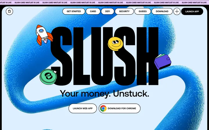
Centered, stacked uppercase display typography in pale blue sits on a deep teal full-bleed canvas, with a white pill CTA below.
Floating coin artwork
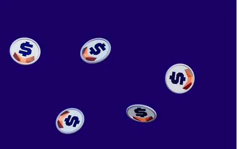
A purple section uses scattered illustrated crypto coins as decorative foreground elements against an uninterrupted saturated background.
Feature cards
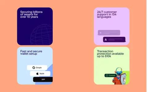
Security and support messages appear in compact rounded cards using contrasting indigo, lavender, pale blue, and lime treatments.
Trust proof cards
App rating, download, security, and transaction claims are presented as colorful cards with short, prominent text.
Announcement toast
A small white update pill sits close to the lower-left viewport edge, pairing a short label with brief promotional copy.
Imagery · Use expressive crypto illustrations and polished 3D-style assets rather than relying on conventional photography. The opening hero features large cropped wallet artwork entering from below; a purple band uses floating coin imagery. The peach feature area pairs a device outline with small, colorful security and app cards. Keep imagery prominent but subordinate to headline hierarchy.
Build the hero around a single oversized, stacked headline.
Use Deep Teal (#013330) and Cloud Blue (#cce7ff) for the opening visual contrast.
Separate major content areas with bold, full-bleed color bands.
Keep primary actions short and pill-shaped.
Use colorful illustrations to support, not obscure, the message.
Group proof points into rounded, high-contrast cards.
✕ 不该做
Don't flatten the page into one continuous white background.
Don't replace the display headline with generic small headings.
Don't add gradients that aren't present in the measured design.
Don't use heavy shadows to create hierarchy.
Don't crowd the hero with extra navigation or body copy.
Don't treat illustration-only colors as the core brand palette.
给 AI 的提示词
想快速出一个同风格的新页面,把这段话连同 DESIGN.md 一起发给 AI。
Create a new MetaMask-style page with a high-impact, full-bleed hero and clear color-blocked sections. Use Deep Teal (#013330) as the primary dark canvas, Cloud Blue (#cce7ff) for oversized display lettering, and Gallery White (#ffffff) for a simple pill CTA. Bring in Wallet Indigo (#190066), Peach Signal (#ffa680), Citrus Glow (#e5ffc3), and Orchid Mist (#eac2ff) selectively for section bands and cards. Use an expressive display face for large, stacked headlines, with clean sans-serif body copy and compact navigation labels. Keep the header minimal, sections spacious, and content centered or arranged in clean feature grids. Use colorful crypto-inspired illustrations as supporting focal points. Favor flat surfaces, rounded cards, and pill controls; avoid gradients, heavy shadows, and generic corporate layouts.