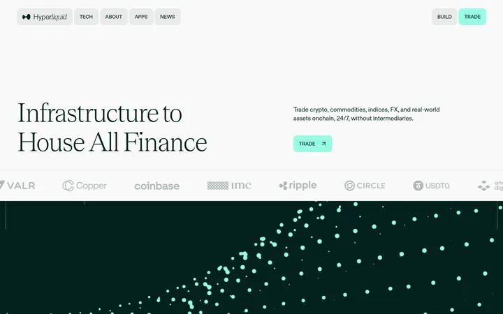
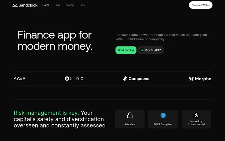
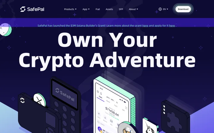
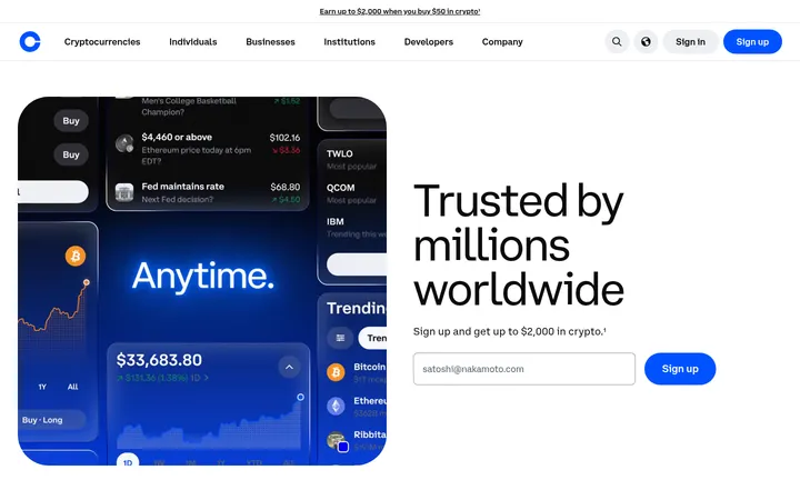
North star · Use warm dark-and-white section contrast, editorial serif headlines, and blue only where it signals action or network energy.
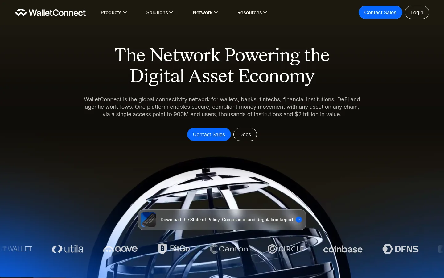
The page alternates between a warm, near-black canvas and clean white content bands, giving the dark hero and closing areas a cinematic, institutional presence. Electric blue is reserved for primary actions and network-like gradients, while charcoal text, muted gray copy, and pale hairlines keep the information legible without adding visual noise. Large editorial serif headlines establish a distinctive voice; Inter carries navigation, body copy, buttons, and dense explanatory content in a practical sans-serif rhythm. The opening pairs centered messaging with a large metallic network orb and a subdued partner-logo row. Below, left-aligned statements and metrics lead into cards, product browsing, and compact security features. Generous section breathing room offsets the denser grids. Soft card shadows, fine borders, rounded cards, and pill-shaped controls provide just enough depth and tactility. The footer gradient is a branded accent field, not a signal to tint every section.
Primary interface sans for navigation, body copy, buttons, and most headings.
Aa 设计
Exact
网络字体 · 字重 400 · 占比 5%
免费替代:DM Serif Display
Editorial display and section headings, including the large hero headline.
角色
示例
字号
字重
行高
字距
特大标题
Editorial hero-scale headline and prominent brand statements.
WalletConnect
64px
400
1.05
-0.015em
一级标题
Primary page headline, especially hero messaging.
WalletConnect
56px
400
1.14
-0.02em
二级标题
Major section headings and editorial statements.
WalletConnect
45px
400
1.15
-0.015em
三级标题
Feature and product group headings.
WalletConnect
40px
400
1.1
-0.015em
四级标题
Card and subsection titles, often with stronger sans weight.
WalletConnect
32px
600
1.25
0
正文
Explanatory copy, descriptions, and supporting content.
The quick brown fox 敏捷的狐狸
16px
400
1.5
0
辅助文字
Compact labels, metadata, and card footnotes.
The quick brown fox 敏捷的狐狸
12px
400
1.33
0
按钮
Primary and secondary action labels.
The quick brown fox 敏捷的狐狸
16px
400
1
0
导航
Top navigation and compact menu links.
The quick brown fox 敏捷的狐狸
14px
400
1.43
0
间距与布局
基准单位 8px · 密度:宽松
96px版块间距
8px元素间距
—卡片内边距
1240px内容最大宽度
4px
8px
9px
12px
16px
18px
20px
24px
28px
32px
40px
48px
64px
96px
Use a spacious, centered page frame with a measured maximum width of 1240px. The hero is centered and cinematic; most later sections switch to left-aligned editorial headings above structured grids. Alternate full-width dark and white bands, with generous section gaps and more compact spacing inside cards. Product content uses a centered title and browsing controls, while solutions and security distribute compact items across columns. Keep alignment deliberate and allow white space to separate dense information rather than adding decoration.
圆角与层次
按钮 · 50%
卡片 · 16px
链接 · 16px
md · card
hairline · other
Most content sits flat on white or warm dark bands. Cards use fine pale borders, rounded corners, and occasional soft, restrained shadows rather than dramatic elevation. Pill buttons and outlined secondary actions add tactile separation. The hero orb and footer gradient supply the strongest depth and layering, while card layouts remain quiet and legible.
组件
下面的预览按实测的按钮、输入框、徽标、卡片样式重建(字体用替代字体)。
Primary pill CTA
Use Signal Blue #0666ff with white text, a fully rounded capsule shape, and a subtle blue border. Contact Sales is the recurring action.
Outlined secondary action
Pair a dark or light transparent pill with a thin contrasting outline for Login and Docs beside primary actions.
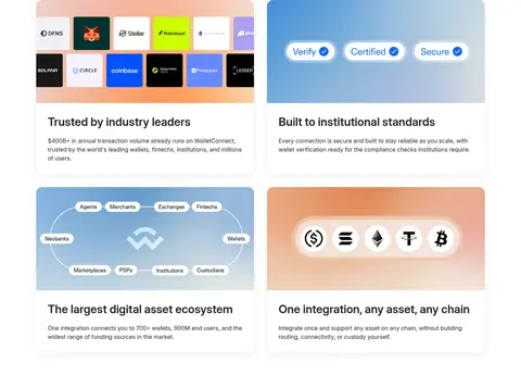
Feature cards
Light cards use a #ececec hairline border, a 16px radius, and illustrative media above concise charcoal titles and muted copy.
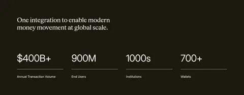
Metrics row
Set four large figures in a row on a dark band, with short labels and understated horizontal dividers.
Product browser
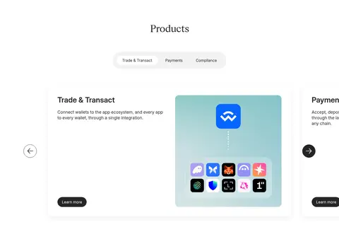
Center the Products heading and compact category selector above a horizontally browsable product feature with directional controls.
Solutions grid
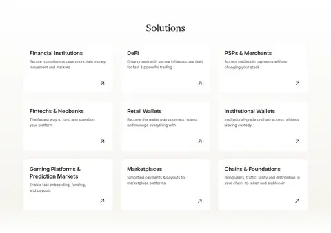
Present compact linked solution tiles in multiple columns, with concise descriptions and a small directional arrow.
Security features
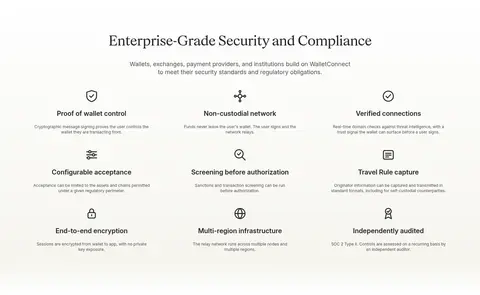
Arrange nine security benefits in a clean multi-column grid with simple line icons, short headings, and small explanatory text.
Partner banner
Overlay a subdued report link and partner wordmarks on the lower portion of the hero’s network artwork.
Imagery · The hero uses a large metallic, globe-like network visual that overlaps a blue atmospheric glow, with partner logos running across its lower edge. Product and feature cards use clean illustrations, logos, and diagrams rather than lifestyle photography. A case-study panel pairs concise copy with a prominent brand mark. Treat illustrative colors as content-specific; keep the interface palette restrained around them.
Alternate warm near-black bands with crisp white content sections.
Use blue for primary actions and purposeful network accents.
Pair editorial serif headlines with practical Inter interface text.
Give major sections generous breathing room.
Keep cards light, bordered, and visually quiet.
Let hero artwork and footer gradients carry the strongest visual drama.
✕ 不该做
Do not turn every section blue or gradient-filled.
Do not use the illustration palette as the global interface palette.
Do not crowd headings, metrics, or card copy.
Do not replace the serif display voice with heavy sans headlines.
Do not add strong shadows to every panel.
Do not use decorative imagery where concise diagrams or logos suffice.
给 AI 的提示词
想快速出一个同风格的新页面,把这段话连同 DESIGN.md 一起发给 AI。
Build a new page in the WalletConnect visual style using a spacious, centered content frame and clear alternating light and dark bands. Use Warm Obsidian #1c180d for selective hero or CTA surfaces, Gallery White #ffffff for primary content, and Charcoal Ink #252525 with Muted Graphite #4f4f4f for readable text. Reserve Signal Blue #0666ff for primary actions and focused network accents. Pair editorial serif display headlines with Inter for navigation, body copy, and controls. Organize content into generous sections, concise grids, and restrained cards with Quiet Line #ececec borders and soft elevation only where useful. Favor network diagrams, logos, and polished technical illustrations over lifestyle photography. Keep forms and navigation understated, buttons pill-shaped, and the overall hierarchy institutional, calm, and legible.