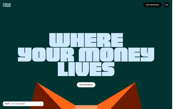
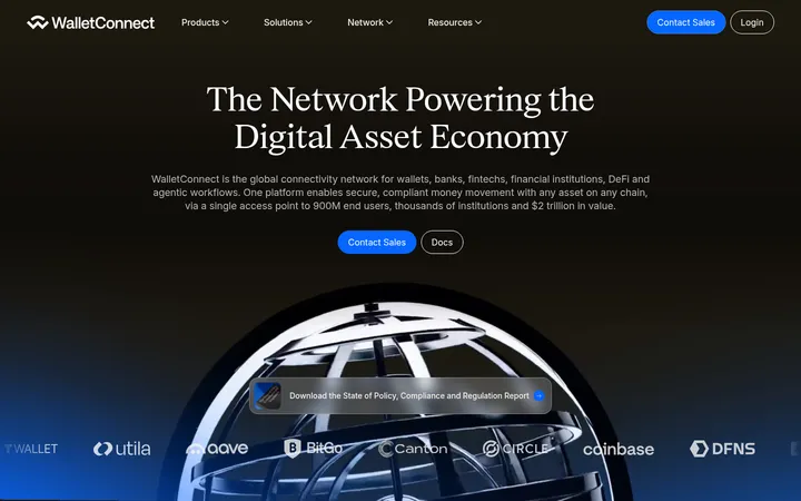
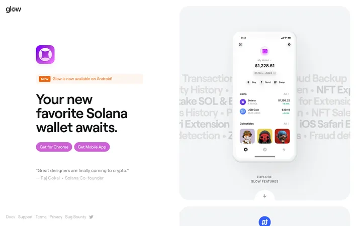
North star · Keep the interface quiet and spacious so friendly illustrations and product details—not decoration—carry the story.
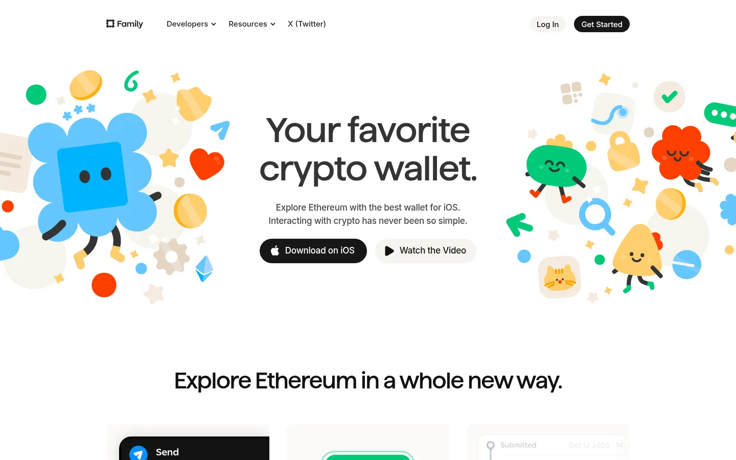
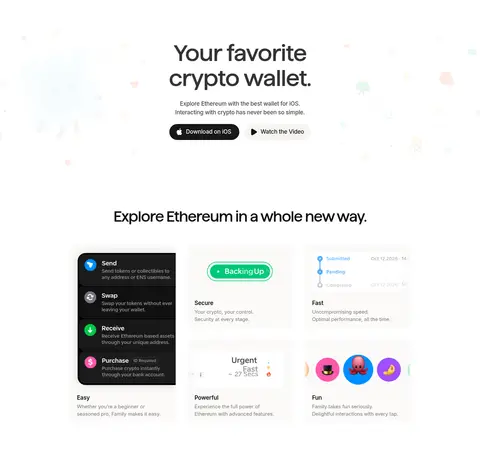
The visual strategy starts with an almost entirely white canvas, using warm gray text and fine pale borders to keep the interface quiet and legible. A restrained blue appears in link text and select headings, while green, orange, and other vivid hues are mostly contained in product screens and character illustrations rather than treated as core interface colours. Custom Family display lettering gives the hero and major headlines a soft, distinctive voice; Inter handles navigation, body copy, labels, and controls with compact, highly readable forms. The centered hero combines a large two-line headline, concise supporting copy, and pill-shaped actions, framed by friendly illustrated characters. Below, the page alternates feature grids and split product showcases with roomy white intervals and a warm off-white information band. Subtle inset hairlines and low-contrast card shadows separate interface examples without making the page feel heavy.
Navigation, body copy, buttons, links, labels, and most feature-section headings.
Aa 设计
Family
网络字体 · 字重 500 · 占比 4%
免费替代:Inter
Custom display lettering for the hero headline and primary page heading.
角色
示例
字号
字重
行高
字距
特大标题
Oversized centered hero headline.
Family
68px
500
1.1
-0.02em
一级标题
Primary page headline and prominent feature statements.
Family
44px
500
1.09
-0.031em
二级标题
Section headings and feature titles.
The quick brown fox 敏捷的狐狸
23px
500
1.09
-0.019em
正文
Explanatory copy, product descriptions, and testimonial text.
The quick brown fox 敏捷的狐狸
17px
400
1.53
-0.013em
辅助文字
Compact labels, metadata, and small emphasized notes.
The quick brown fox 敏捷的狐狸
15px
600
1.47
-0.009em
按钮
Pill CTA labels and secondary action text.
The quick brown fox 敏捷的狐狸
17px
500
1
-0.013em
导航
Header navigation and compact menu labels.
The quick brown fox 敏捷的狐狸
15px
500
1.47
-0.009em
链接
Inline links and standalone text actions.
The quick brown fox 敏捷的狐狸
17px
500
1.53
-0.013em
间距与布局
基准单位 4px · 密度:宽松
104px版块间距
8px元素间距
32px卡片内边距
1024px内容最大宽度
2px
3px
4px
6px
7px
8px
10px
11px
12px
15px
16px
20px
23px
24px
32px
48px
Use a centered content frame capped at the measured 1024px maximum, with a spacious 12-column structure for broad sections and two-column feature bands. The hero is centered; later feature copy and product imagery alternate sides, while cards and testimonials align in tidy grids. Preserve generous vertical separation, a measured 104px section gap, and light content density. The feature-information band uses warm off-white to distinguish a dense block without introducing a strong divider.
圆角与层次
按钮 · 9999px
卡片 · 10px
图片 · 50%
导航 · 6px
链接 · 12px
inset · card
inset · button
hairline · nav
md · card
The page is mostly flat: white and warm off-white bands provide the main structure. Cards use subtle inset hairlines and restrained soft shadows, while navigation has a faint hairline edge. Keep layering limited to product mockups and cards; avoid heavy outlines, deep shadows, or dramatic floating panels.
组件
下面的预览按实测的按钮、输入框、徽标、卡片样式重建(字体用替代字体)。
Header navigation
Compact horizontal brand and link row on white; 15px Inter navigation, with a softly rounded light Log In button and dark Get Started pill.
Hero actions
Centered copy followed by adjacent pill actions; the 17px Inter iOS download action is dark with white text, alongside a lighter video action.
Product feature cards
Wallet capabilities presented with product screenshots and copy; measured cards use 10px corners, 32px padding, and subtle inset hairlines.
Feature band
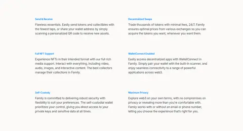
Two-column feature descriptions on a #fbfaf9 surface, using small blue labels and warm, low-contrast separation from the white canvas.
Product showcase
Alternating split layouts pair phone or wallet UI imagery with a headline, short explanation, and compact feature links or checks.
Testimonials
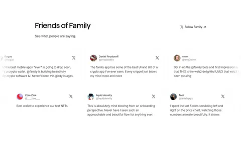
A spacious Friends of Family section with a heading, follow link, and compact multi-column social quotes on the white canvas.
FAQ list
Simple question rows with small plus markers and a warm-accented more-FAQs link; keep the presentation quiet and uncluttered.
Closing CTA
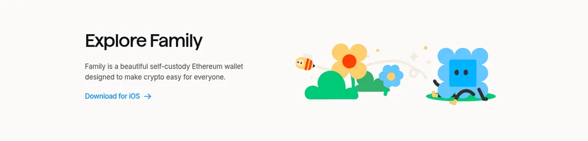
Warm off-white Explore Family band pairs concise wallet copy and a blue download link with a small, friendly character illustration.
Imagery · Use friendly, colourful character illustrations around the hero and in the closing CTA, with product UI and phone mockups as the main evidence for wallet features. Screens show real interface states, tokens, and transaction details; keep them on clean, pale grounds. Use product imagery as contained compositions, not full-bleed photography. Vivid colours belong chiefly to these illustrations and UI examples.
Let wallet screenshots explain the product features.
Keep hero copy centered with clear action buttons.
Use generous whitespace between major content blocks.
Reserve vivid colours mainly for illustrations and mockups.
✕ 不该做
Do not introduce large saturated colour backgrounds.
Do not make cards look heavy or deeply elevated.
Do not crowd feature copy against product imagery.
Do not use generic gradients as decorative fills.
Do not turn the character art into interface decoration everywhere.
Do not replace the restrained palette with mockup colours.
给 AI 的提示词
想快速出一个同风格的新页面,把这段话连同 DESIGN.md 一起发给 AI。
Build a new page in Family’s friendly crypto-wallet style. Use Gallery White (#ffffff) as the dominant canvas, Soft Graphite (#474645) for readable copy, and Warm Hairline (#f2f0ed) for subtle borders. Reserve Wallet Blue (#1a88f8) and Bright Link Blue (#0090ff) for sparse links or labels; use Headline Ink (#121212) for strong type and dark CTAs. Set major display headlines in a distinctive rounded display face, with Inter for navigation, body, and controls. Create a centered hero with short supporting copy and pill actions, then alternate spacious feature grids and split layouts pairing product UI with concise explanations. Use playful character illustrations selectively; keep other vivid colours inside mockups. Add warm off-white feature or CTA bands, fine inset card edges, and restrained shadows. Keep everything crisp, approachable, and uncluttered.